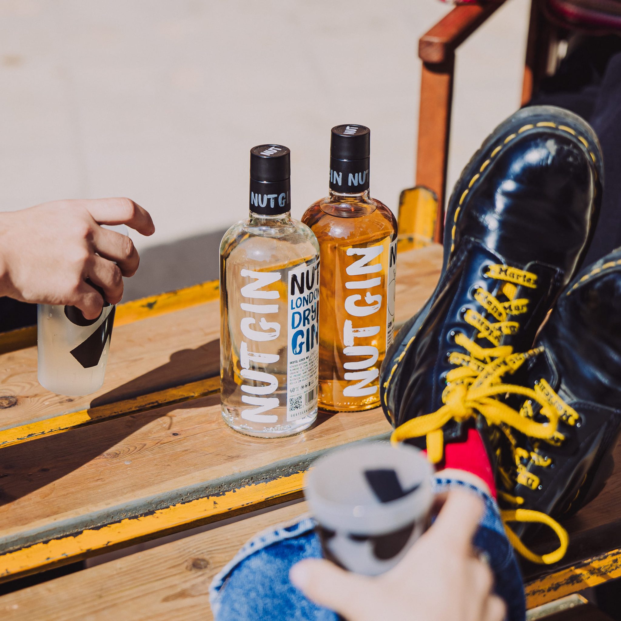

The original packaging was technically clean but emotionally disconnected, a quiet design in a category increasingly defined by rigid minimalism or expected heritage. For a brand wanting to speak to young creatives and festival-goers, it lacked the “rebel” pulse necessary to stand out. Our design challenge was to pivot from a passive, polished product to an active, accessible experience. We wanted to dismantle the boundaries of traditional spirits branding to reach those bored by the “perfect” and the minimal, replacing clinical distance with a raw, human energy that celebrates self-expression over silent tradition.
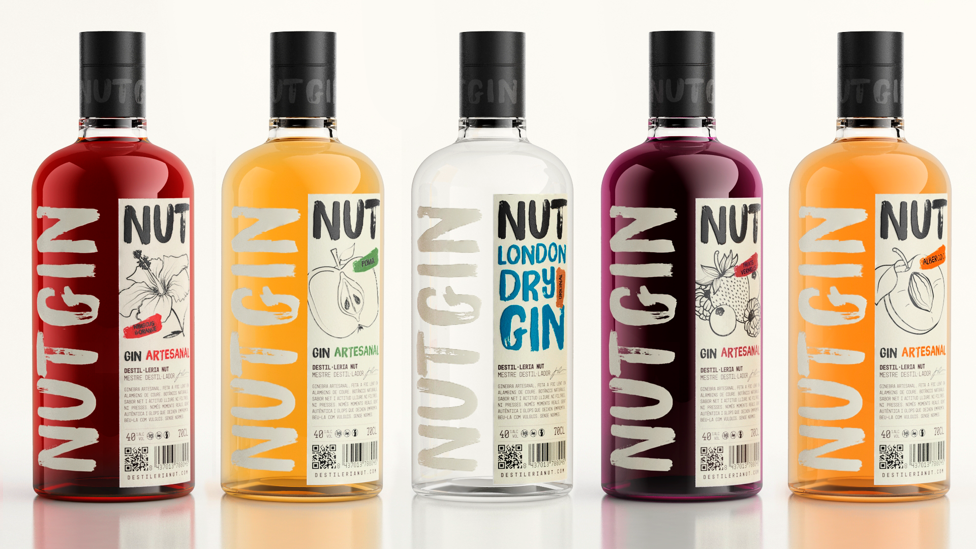
We abandoned clean, rigid lines to embrace a raw and beautifully chaotic energy. The design centers on brushed typography and hand-drawn illustrations, purposefully chosen to evoke a sense of “realness” and human connection. By moving away from clinical fonts, these handmade elements serve as a protest against AI-generated perfection, grounding the brand in authenticity. This tactile, artistic approach ensures NUT feels vibrant, accessible, and full of life.
Through the “NUT & Paint” concept, each bottle becomes a collaborative canvas. By encouraging consumers to paint directly onto the glass, we strip away “classic seriousness” and empower creativity. NUT is no longer just a product to be looked at, but an experience to be shared.
No stereotypes, gin for real people who wants to be creative and have fun.


 Andrea Del Prete
 Le Studio G
 Julia M.
 eliza
eliza B&WGraphicLab
 Opime Studio
 monther al omari
 Akim Melnik Design Studio
 Oksana
 vitoramockup
 Studio Wrapd.
 CJMartins
 Carreto Concepts Design Studio
 LogoSayLove
 Koolbrand
 Jeremiah Haastrup
 Creative Branding Agency
 Expand Buzz
 estudioe
 Heramb Arora