
ABOUT
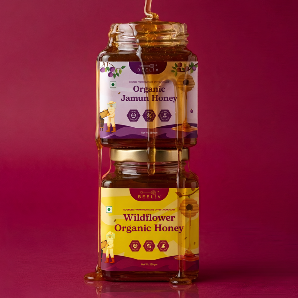
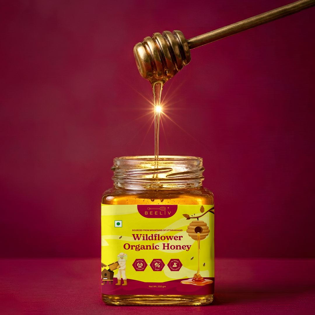
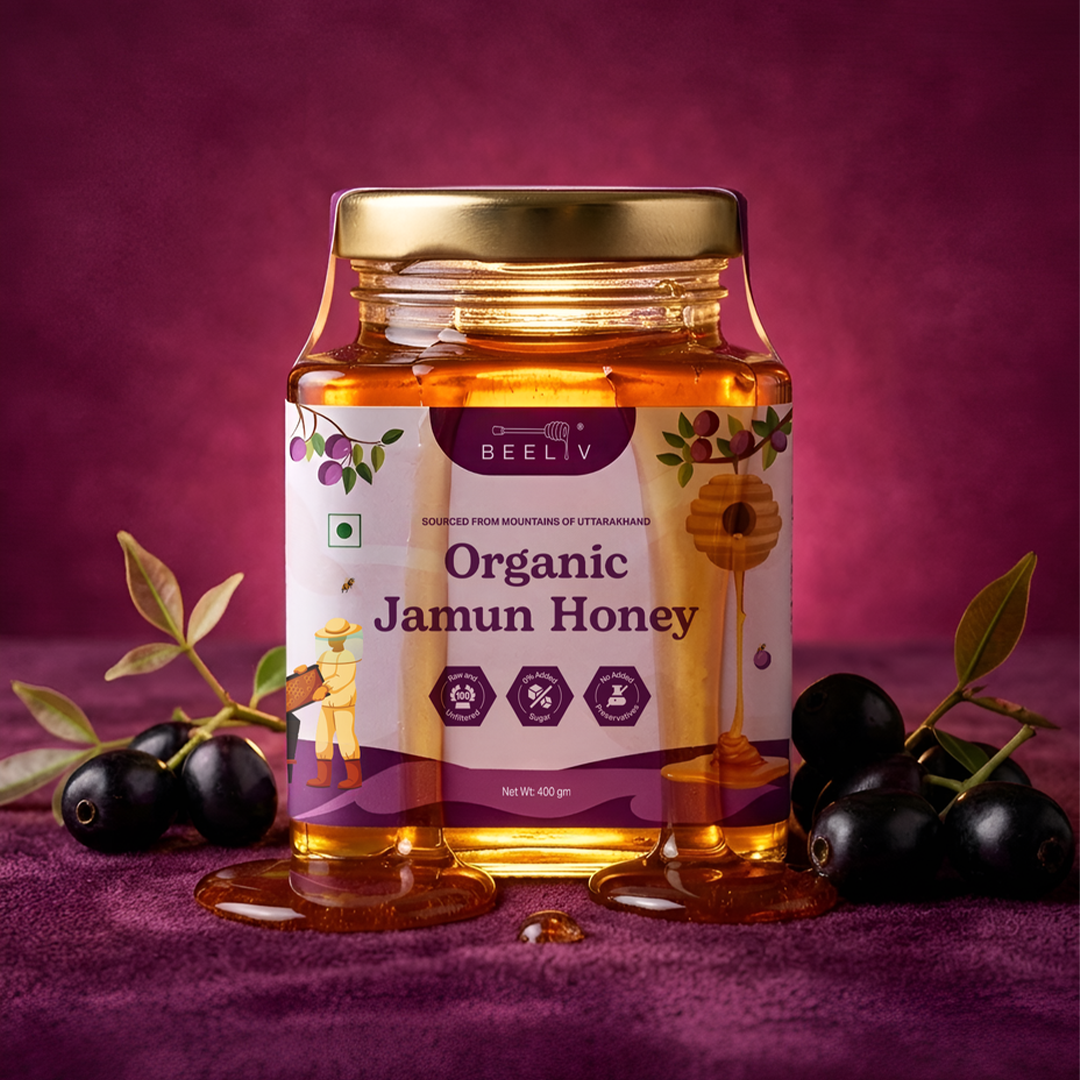
Beeliv is a premium Indian honey brand sourcing raw, unfiltered honey from the mountains of Uttarakhand. Available in two variants: Wildflower Organic Honey and Organic Jamun Honey. The brand is built on a simple belief: that India deserves honey that is pure, honest, and thoughtfully made. The entire visual identity is rooted in one question: What does the world look like through a bee’s eyes? Bees don’t perceive the world in sharp focus. Their vision is fluid, glowing, and full of motion. Rather than defaulting to the typical honey brand visual language, we built a world that feels alive, emotional, and distinctly modern.
SOLUTION
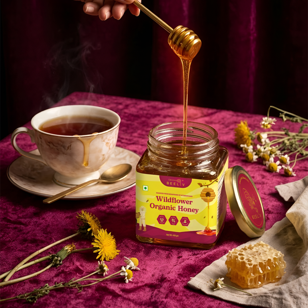
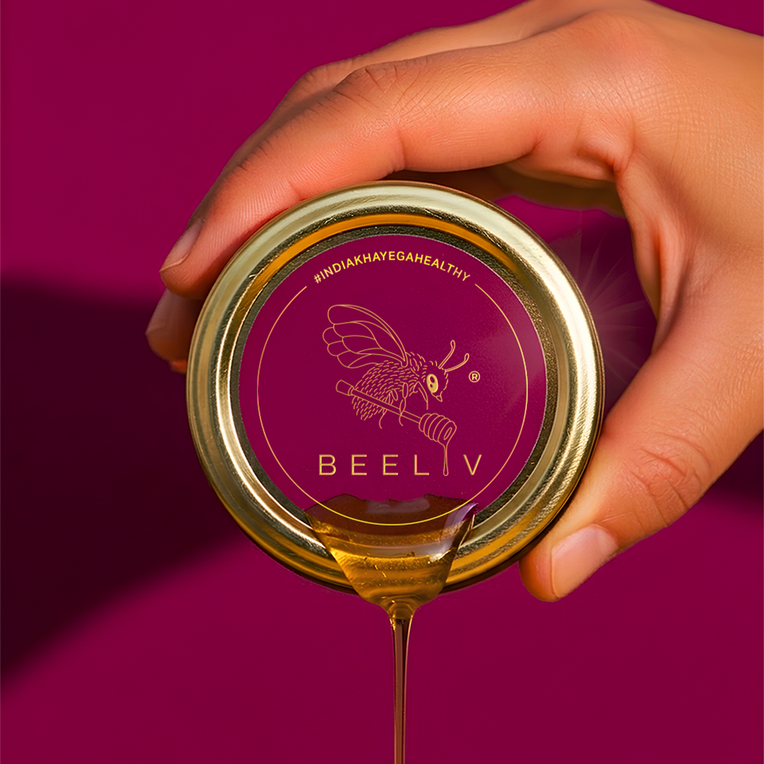
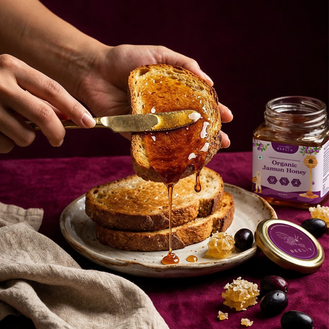
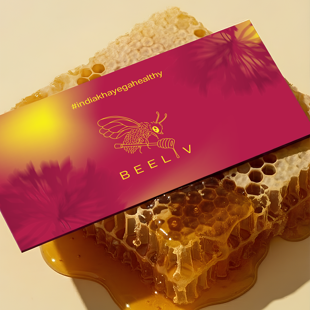
We developed a complete brand system anchored in the bee’s-eye concept. The color palette breaks convention – deep magenta and canary yellow replace the expected amber and brown, creating a bold, ownable identity that stands out on shelf. The two packaging variants are visually distinct, yet both feel unmistakably Beeliv. Every element connects back to the same central concept, giving the brand a rare coherence that feels considered at every level.
RESULT
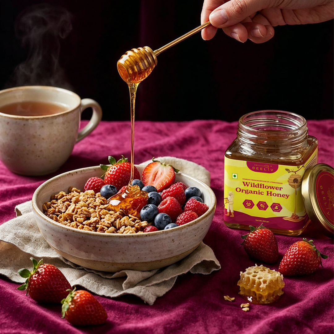
A complete brand system covering logo, color palette, typography, patterns, motifs, iconography, packaging for both variants, social media layout system, advertising, retail display unit, and brand photography direction. A brand that is visually distinctive within the Indian honey market, conceptually rooted, and built to scale consistently across print, packaging, and digital touchpoints.
 Derrick Lin
 VincoStudio
 lisakaplina
 CreativeWise
 alchimistestudioParis
 Adriana Adamo
 tauqueer
 MAISON D'IDÉE Prague
 Pixels Studio
 Atchayaa
 DESIGN CONCEPTS
 hello ocean
 monther al omari
 the Labelmaker
 alamgirbrands
 kat bres
 Vantablack Studio
 GruppoSaida
 studiorevv
 grafisercreative
 Kate Reichel
 UPRISE