

A gourmet snack designed for the horeca sector that extends a traditional seafood brand beyond preserved products, using a radical, colour-reduced visual system to translate flavour into a sensory experience rather than a product display.
This project was developed to expand the brand’s portfolio beyond its traditional preserved seafood products, introducing it into a new consumption moment: the gourmet aperitivo within the horeca and hospitality sector. The anchovy-flavoured artisanal chips act as a bridge between heritage and contemporary food culture, allowing the brand to be experienced in a more informal yet refined context.
The main challenge was to avoid the visual language typically associated with mass-market snacks and large-scale retail. Instead of relying on appetite-driven imagery or descriptive product representation, the project adopts a more conceptual approach, designed to resonate with professional environments where atmosphere, gesture and experience play a central role.
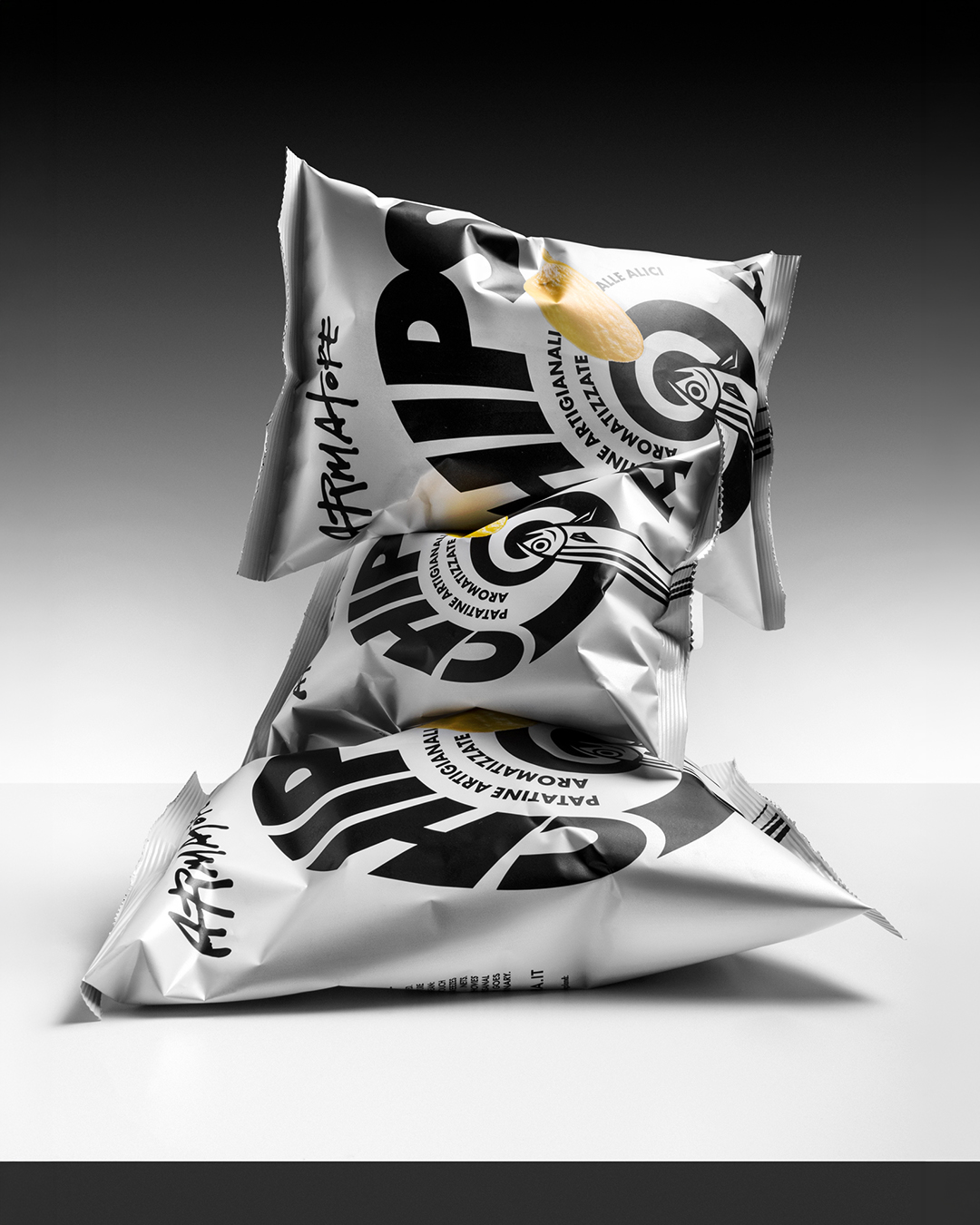
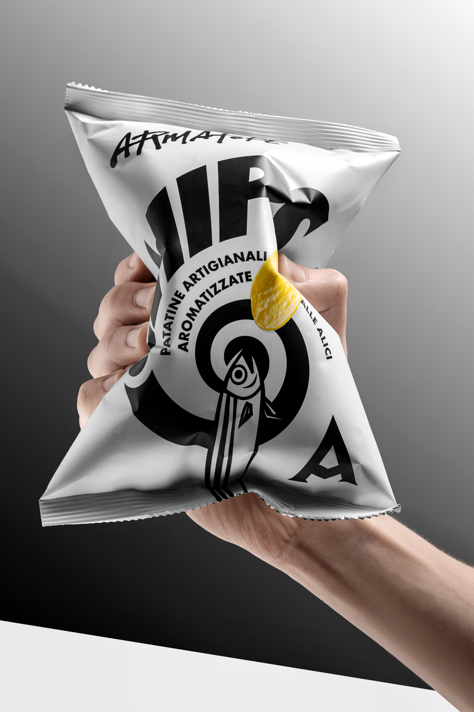
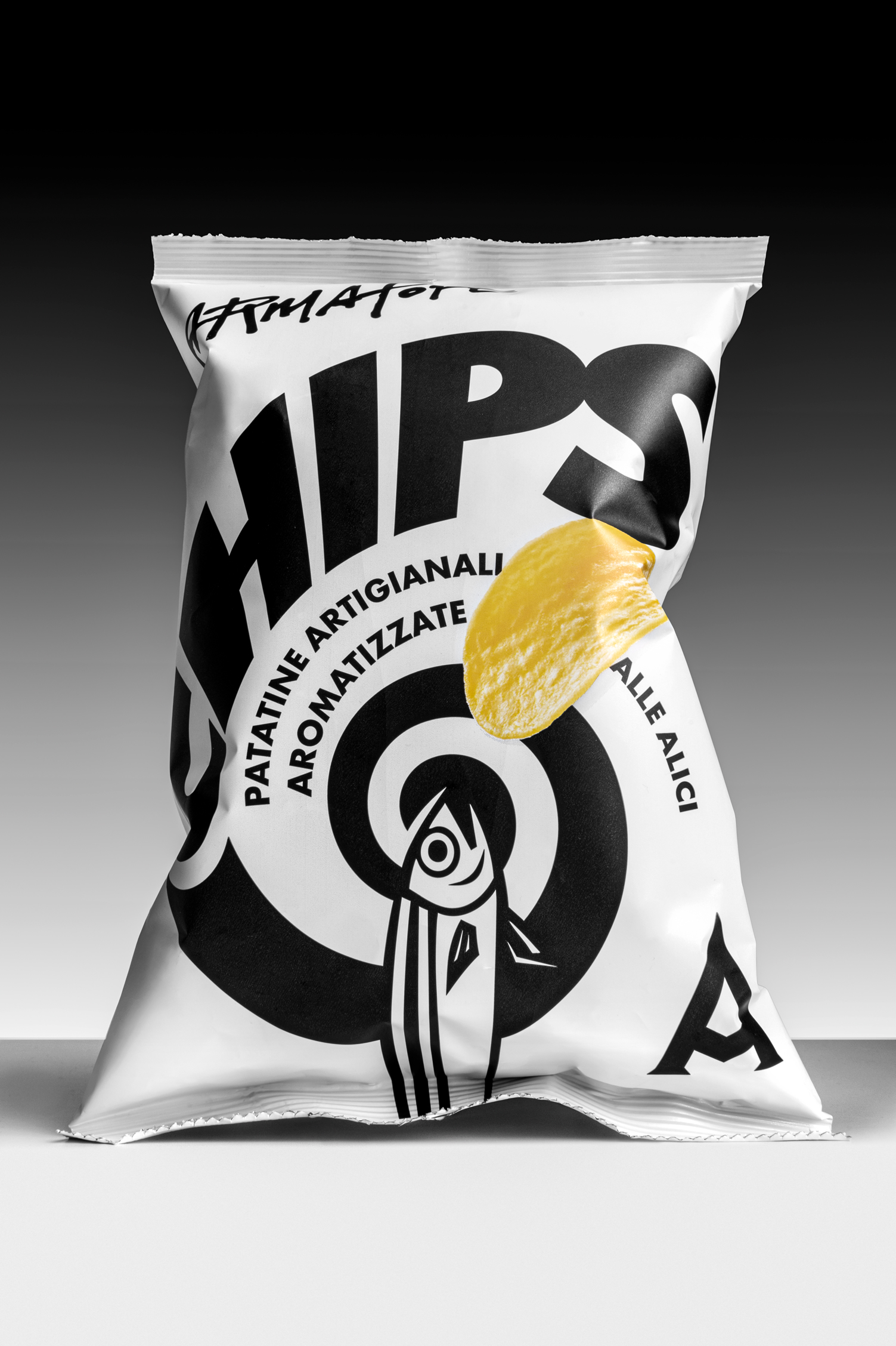
The core idea is built around the concept of a “vortex of flavour”: a dynamic visual composition that conveys intensity, depth and movement, transforming taste into a visual sensation. This vortex becomes the true protagonist of the packaging, while the product itself remains visible but deliberately secondary, reinforcing the idea of the snack as a gastronomic gesture rather than a conventional consumer good.
The near-total absence of colour is a conscious and radical design decision. It represents a clear, elegant and essential stance, distancing the product from the visual noise and rhetorical excess typical of the snack category. This reduction allows the design to communicate restraint, confidence and distinction, positioning the product within a more refined and curated context.
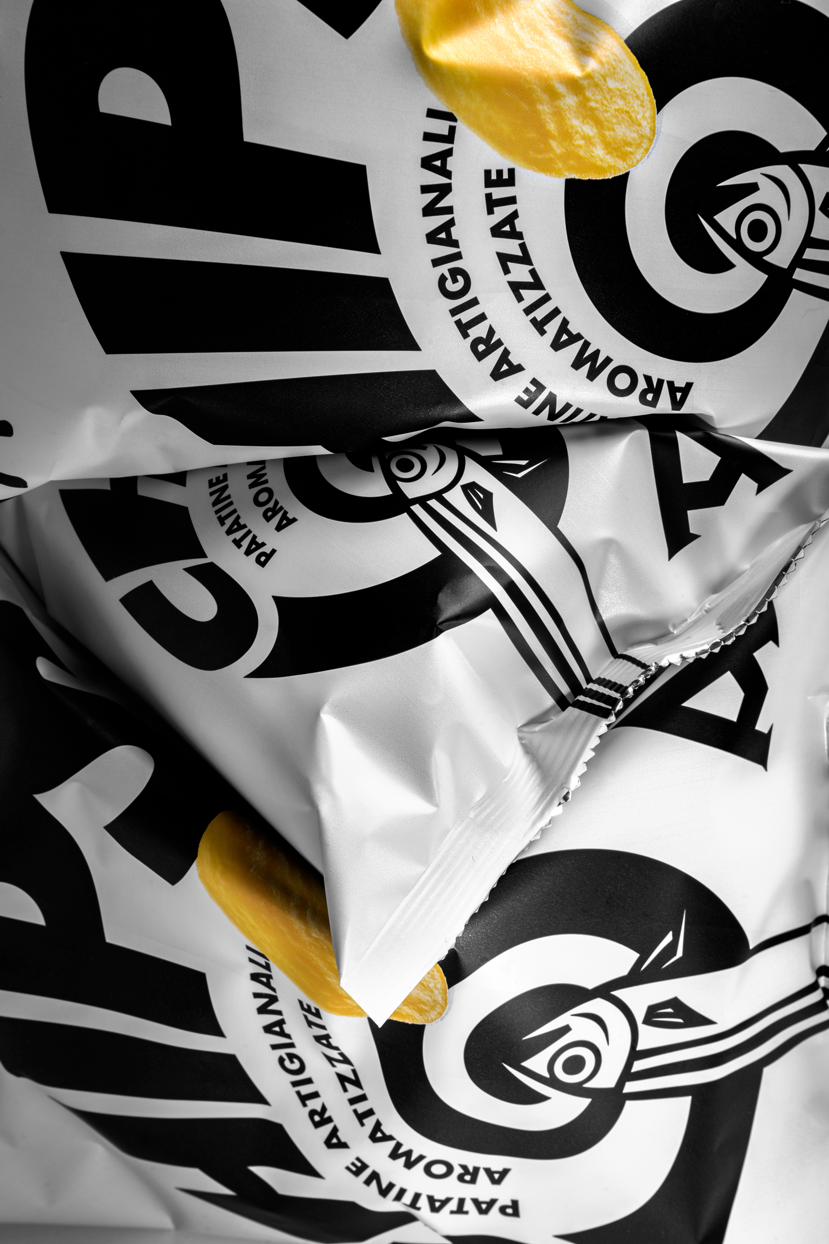
The graphic language draws inspiration from traditional artisanal printing techniques, particularly linocut and woodcut, reinterpreted through a contemporary lens. Bold contrasts, strong typography and a controlled visual system create a recognisable identity that is expressive without being decorative.
The project ultimately provides the brand with a coherent tool to enter new channels and usage occasions, maintaining a strong connection to its cultural and territorial roots while expressing them through a modern, essential and unconventional packaging language.


 Anna Kachaeva
 vrai studio
 Studio Pistache
 Slice Design
 David Byerlee
 宏洛图品牌设计HONGLT
 The Creative Method
 Fond
 DS1 branding agency
 Ashwini D
 Dozen Agency
 We Craft Studio
 Likit
 Asprey Creative
 Firstrein
 Nouna design
 JavierGarduno
 Daria Kolesnikova
 HerCreativeSide
 lbeck