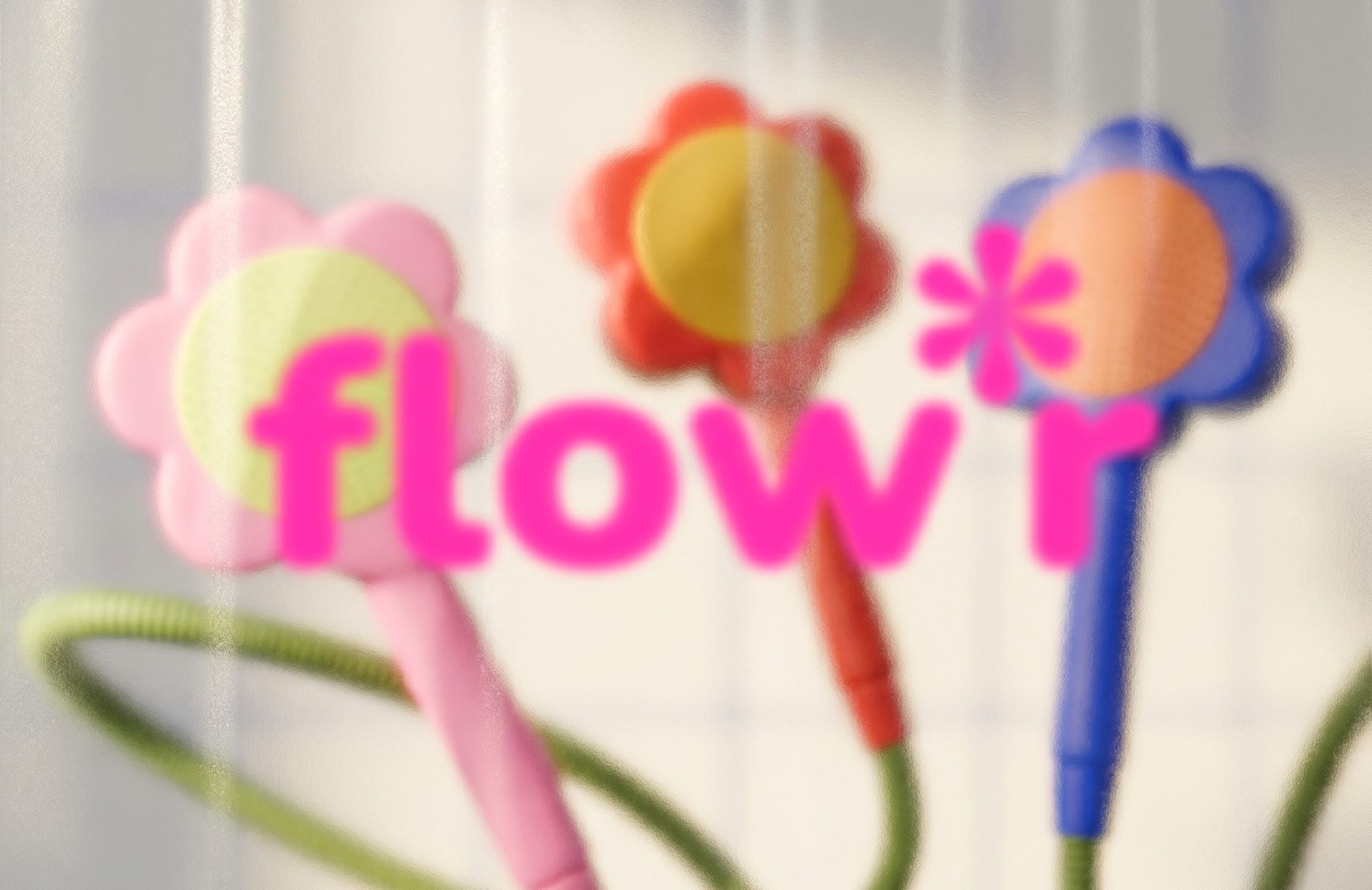

Every day, we pay more and more attention to the things around us. We’re used to having beautiful textiles, interesting furniture, rugs, dishes…
But what about the bathroom? It seems like all plumbing fixtures are complicated, serious, rectangular, and, of course, black and white.
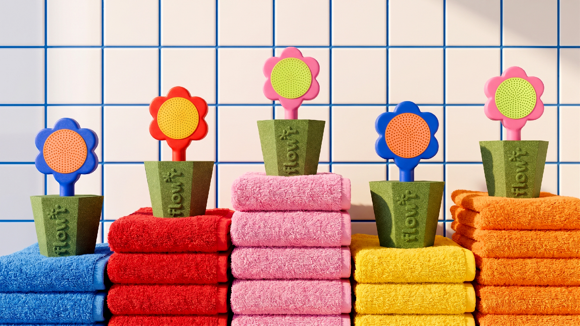
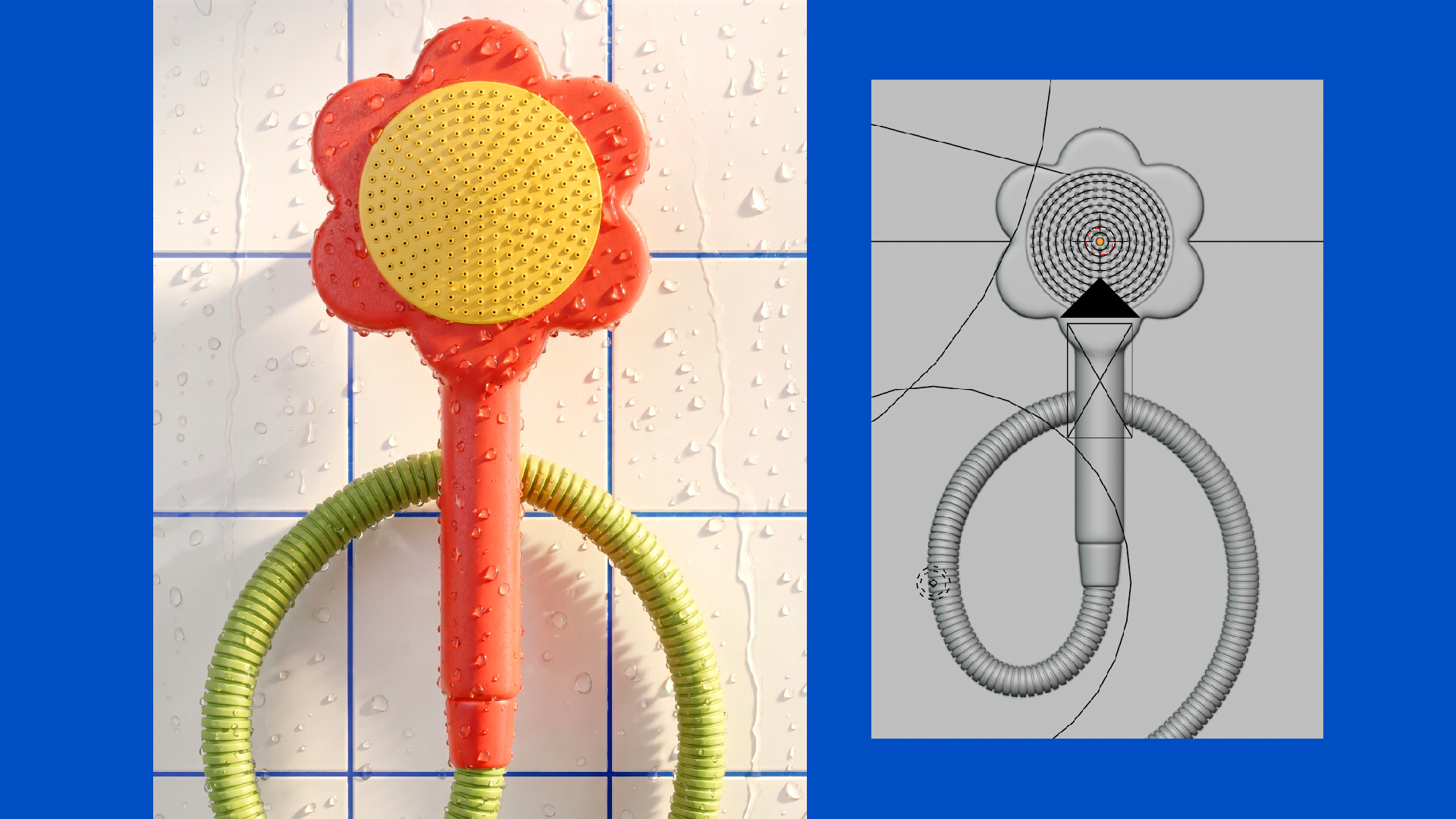
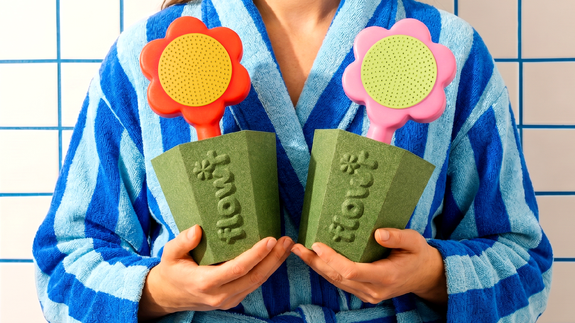
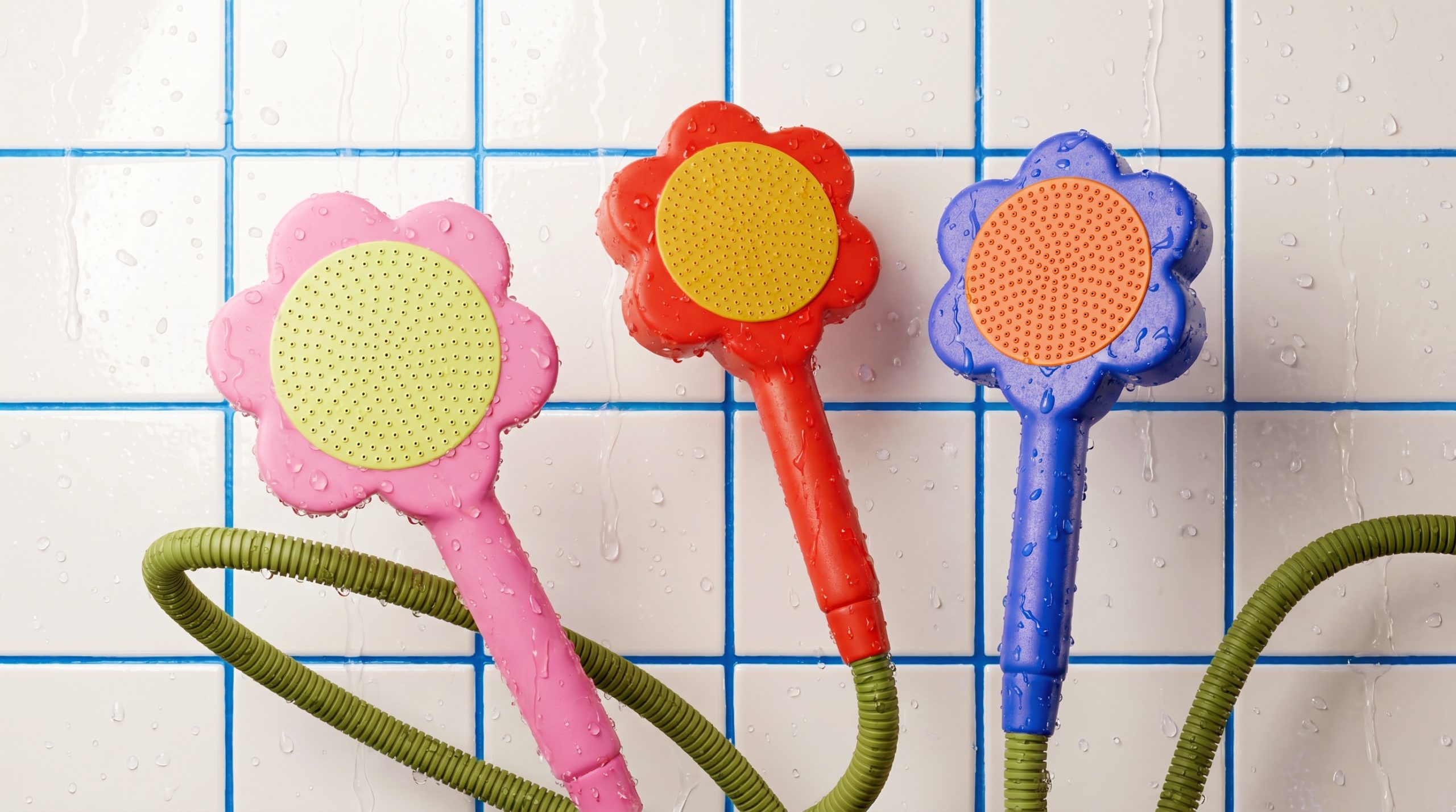
No way! In this project, flowers have grown in a recycled packaging pot, filling the bathroom with joy.
P.S. Yes, i’ve got something special with flower forms.
Curator’s Insight
What makes Flout genuinely interesting is not just the flower motif but the structural tension it creates between material and mood. The pot-form base is deliberately rough and utilitarian, its embossed logotype pressed into what reads unmistakably as recycled pulp or compressed fiber. It is the visual language of ecological responsibility, the kind of material honesty more common to a seed packet than a bathroom product. Placed against that, the glossy, cartoon-bright showerhead blooms feel almost subversive.
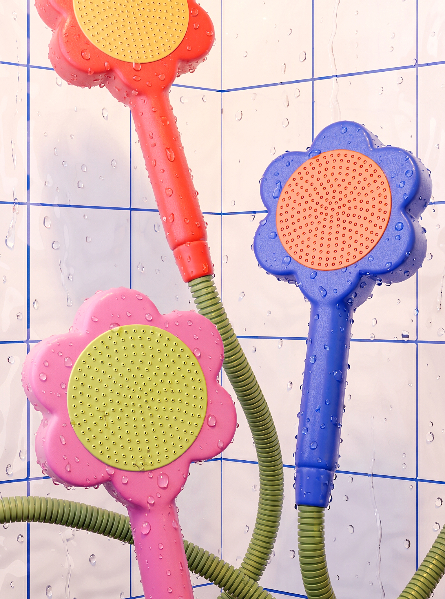
That contrast is doing real design work. Most sustainable bathroom products signal their virtue through restraint: muted tones, minimal form, quiet messaging. Flout takes the opposite bet, using joy as the communicative strategy. The flower shape is not decorative in the traditional sense; it is the product’s core argument, reframing a mundane fixture as something worth choosing, displaying, and keeping. The form earns its own shelf presence.
There is also something worth noting about the dual-product presentation. Two colorways held symmetrically evoke the logic of a bouquet rather than a product line, reinforcing the idea that these are objects you collect and arrange, not simply utilities you replace.
 Derrick Lin
 monther al omari
 43oz
43oz lilyz design23
 Modern Theory
 Eighteen Brand Studio
 Bhumika Singh
 MohamedMashaly
 Pixels Studio
 Gulya
Gulya UPRISE
 Lizaveta Kharitonyuk
 Bonsanco Creative Studio
 DesignRepublic
 GIRAFA STUDIO
 PiotrWisniewski
 Sophiagdotcom
 CreativeWise
 SoreThumbStudio®
 Modern World Studio
 Palashcc
 Valérie Colace