
Zenoffé Premium Coffee
Building on the philosophy of “Zen” and the pursuit of ultimate coffee perfection, we developed the brand identity and packaging for Zenoffé – a premium coffee line designed for those who value ritual and refinement.
The primary task was to create a visual language that balances “Quiet Luxury” with functional clarity. The challenge lay in differentiating five distinct blends while maintaining a cohesive brand DNA that feels both ancient and modern. We achieved this by merging minimalist Scandic aesthetics with symbolic Eastern patterns, creating a “Zen” experience through pure visual storytelling.
Strategic Design Solution
We developed a design code based on “The Path of Harmony.” Each blend is characterized by a specific color palette and a unique geometric pattern that reflects its name and flavor profile. The design relies on the high-contrast interaction between a deep, monochromatic black base and vibrant, culturally-inspired graphics, ensuring a bold shelf presence and immediate recognition of the blend’s character.
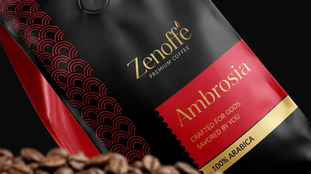
Ambrosia (100% Arabica): Dressed in a royal crimson, it features the Seigaiha (wave) pattern, symbolizing the “divine” flow of flavor.
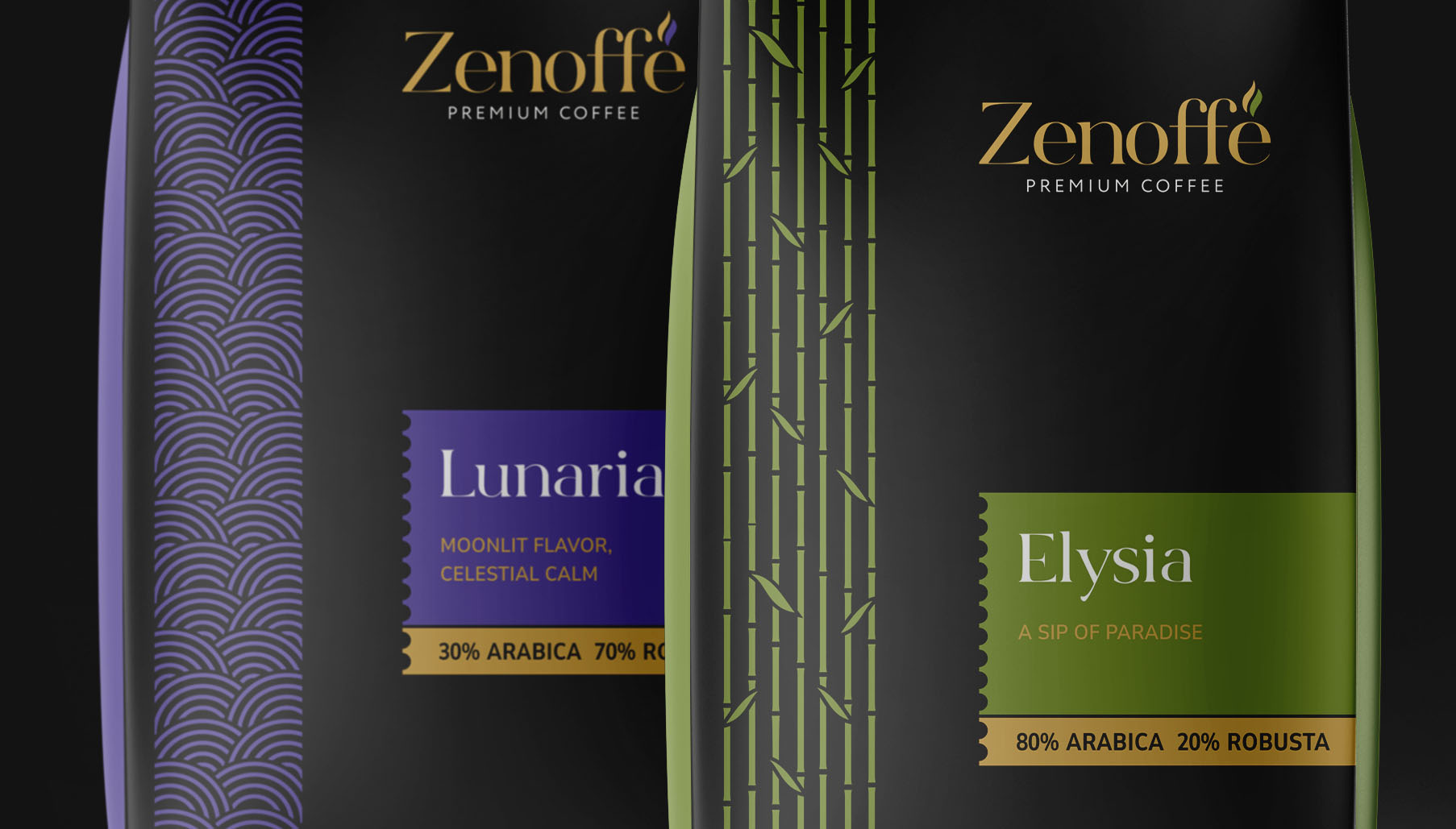
Elysia (80/20 Blend): A lush green accented with a bamboo motif, evoking the serenity of a “Sip of Paradise” and natural growth.
Aurelia (70/30 Blend): Represented by deep orange and stacked Zen stones (Cairns), this design communicates the “Golden Harmony” and the stability found in a perfect roast.
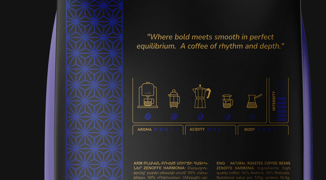
Harmonia (50/50 Blend): Utilizes a striking cobalt blue and the Asanoha (star/hemp) pattern, representing the intersection where bold strength and smooth texture meet in perfect equilibrium.
Lunaria (30/70 Blend): A celestial purple with crescent wave motifs, reflecting “Moonlit Flavor” and a calm, deep intensity intended for late-day contemplation.



 Alessandro Ammaturo
 Amblr Studio
 vladlenalevit
 Sis Tsarukyan
 monther al omari
 alchimistestudioParis
 designsbysukaina
 About House of Ta
 Amjad Battal
 UPRISE
 Maruf Nishat
 Dozen Agency
 neo creative studio
 Muhammad Tawfeeq
 Stefano Bracci
 Widakk Design
 Studio Garces
 宏洛图品牌设计HONGLT
 DN Designs
 BoldCrest
 Oksana