

| Lumera Skincare |
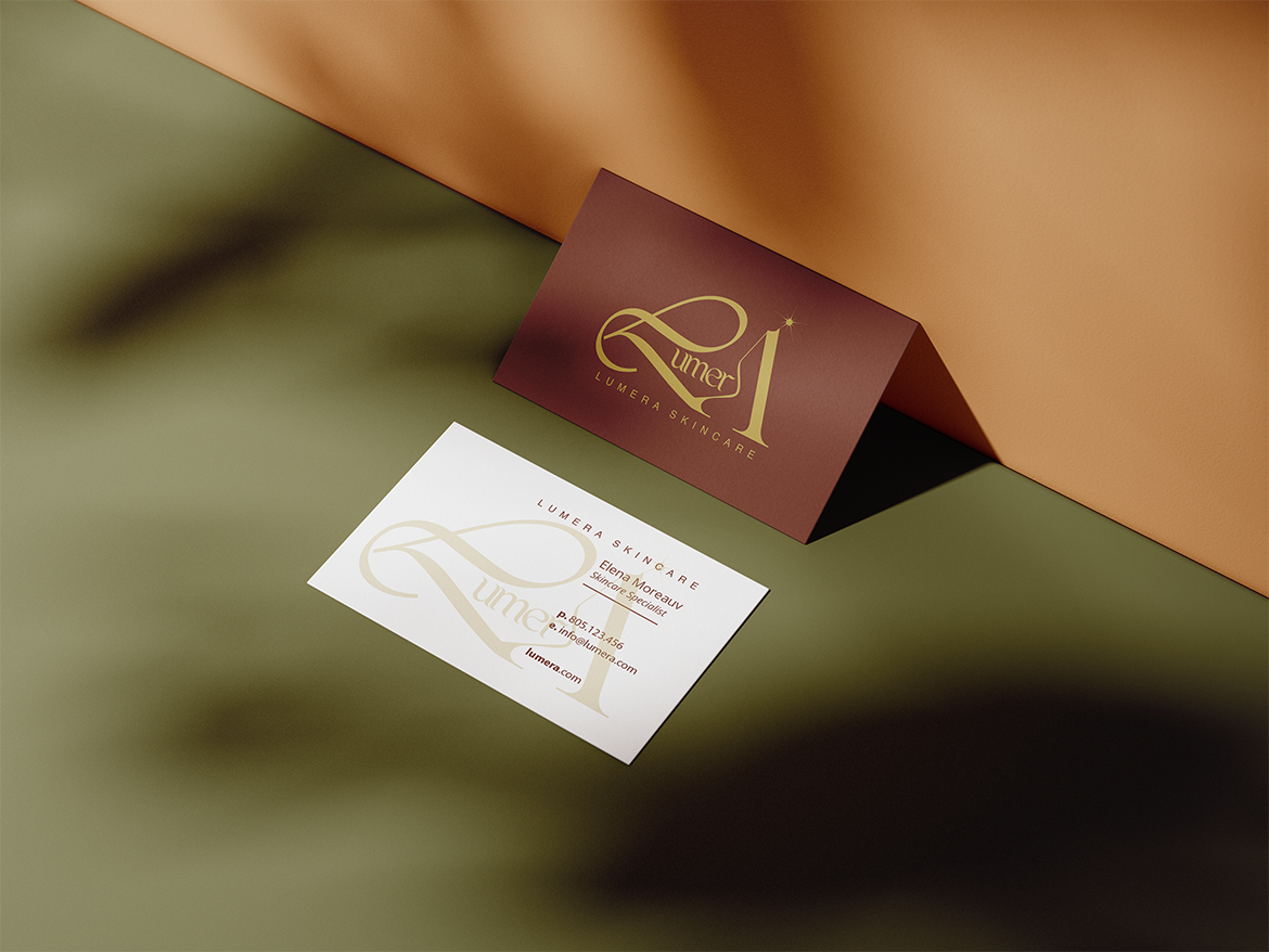
Lumera is a branding and packaging concept for an organic skincare line designed by YDesignStudio, crafted in Los Angeles, CA, USA. The identity was designed to express purity, balance, and calm—reflecting the brand’s botanical origins and minimal approach to beauty.
Lumera speaks through natural tones, clean forms, and tactile surfaces that feel as honest and grounded as the ingredients themselves.
The logotype was developed from a customized typeface, with particular emphasis on the opening letters L and A, a subtle nod to Lumera’s Los Angeles roots. Letterforms were redrawn and refined for balance and flow, transforming the wordmark into a visual anchor that feels both natural and distinct.
The packaging extends this philosophy into a sensory experience: architectural silhouettes and subtle finishes that capture the interplay of light and minimalism, while soft, warm, autumn-inspired color palettes and detailing create a sense of calm and glow. Each detail—from the weight of the materials to the quiet shimmer of accents—is designed to elevate the moment of use, making skincare feel less like a routine and more like an intimate ritual.
Together, the design positions Lumera as an organic skincare brand defined by restraint, honesty, and refinement—turning daily care into a quiet and grounding ceremony of self-care.






 Andrea Del Prete
 Le Studio G
 Julia M.
 eliza
eliza B&WGraphicLab
 Opime Studio
 monther al omari
 Akim Melnik Design Studio
 Oksana
 vitoramockup
 Studio Wrapd.
 CJMartins
 Carreto Concepts Design Studio
 LogoSayLove
 Koolbrand
 Jeremiah Haastrup
 Creative Branding Agency
 Expand Buzz
 estudioe
 Heramb Arora