
ABOUT
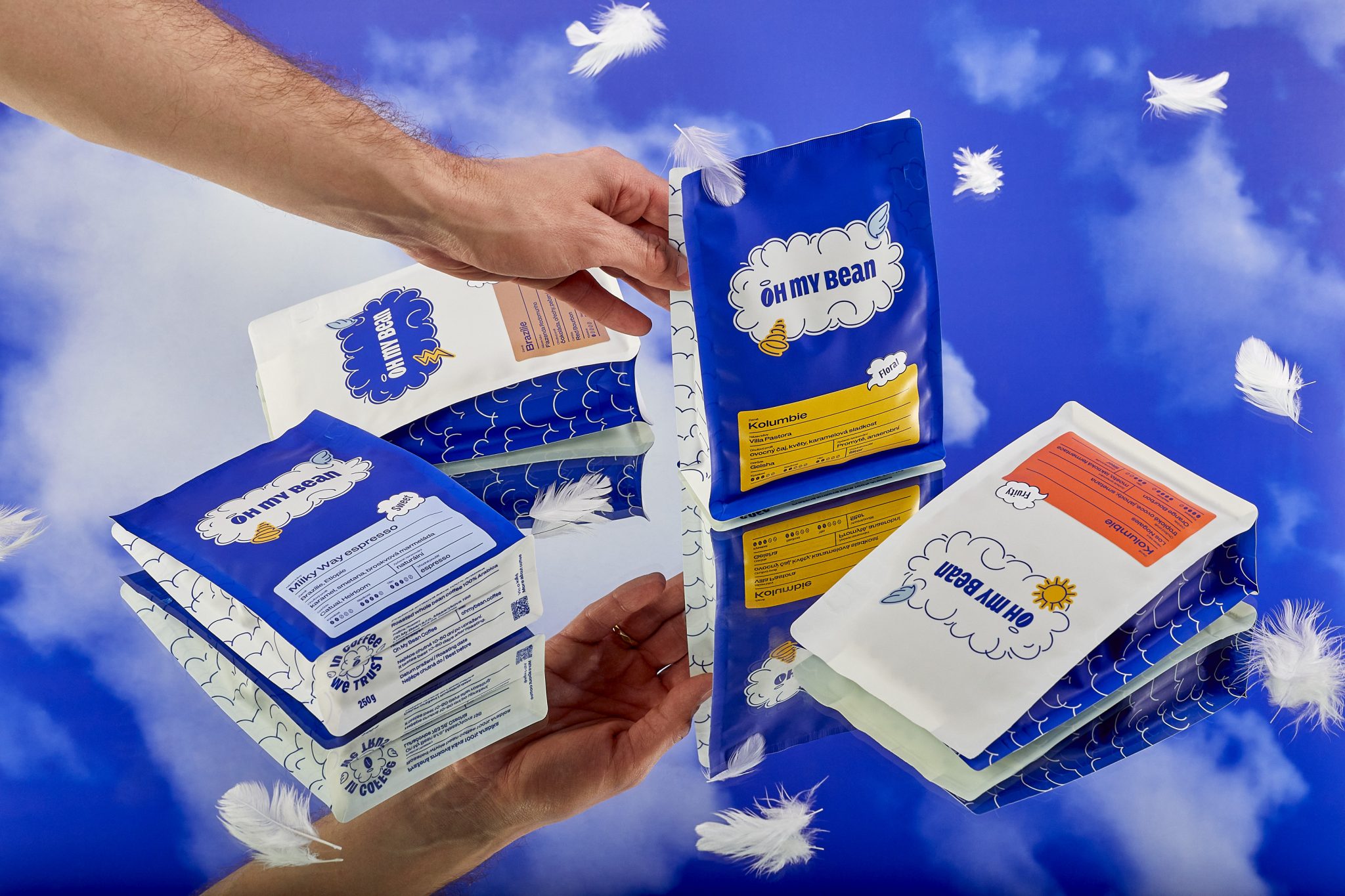
Oh My Bean is a Czech specialty coffee roastery that launched into a market dominated by established brands with strong visual identities. The founders needed packaging that could hold its own on a shelf — not just locally, but in specialty shops across Europe.
CONCEPT
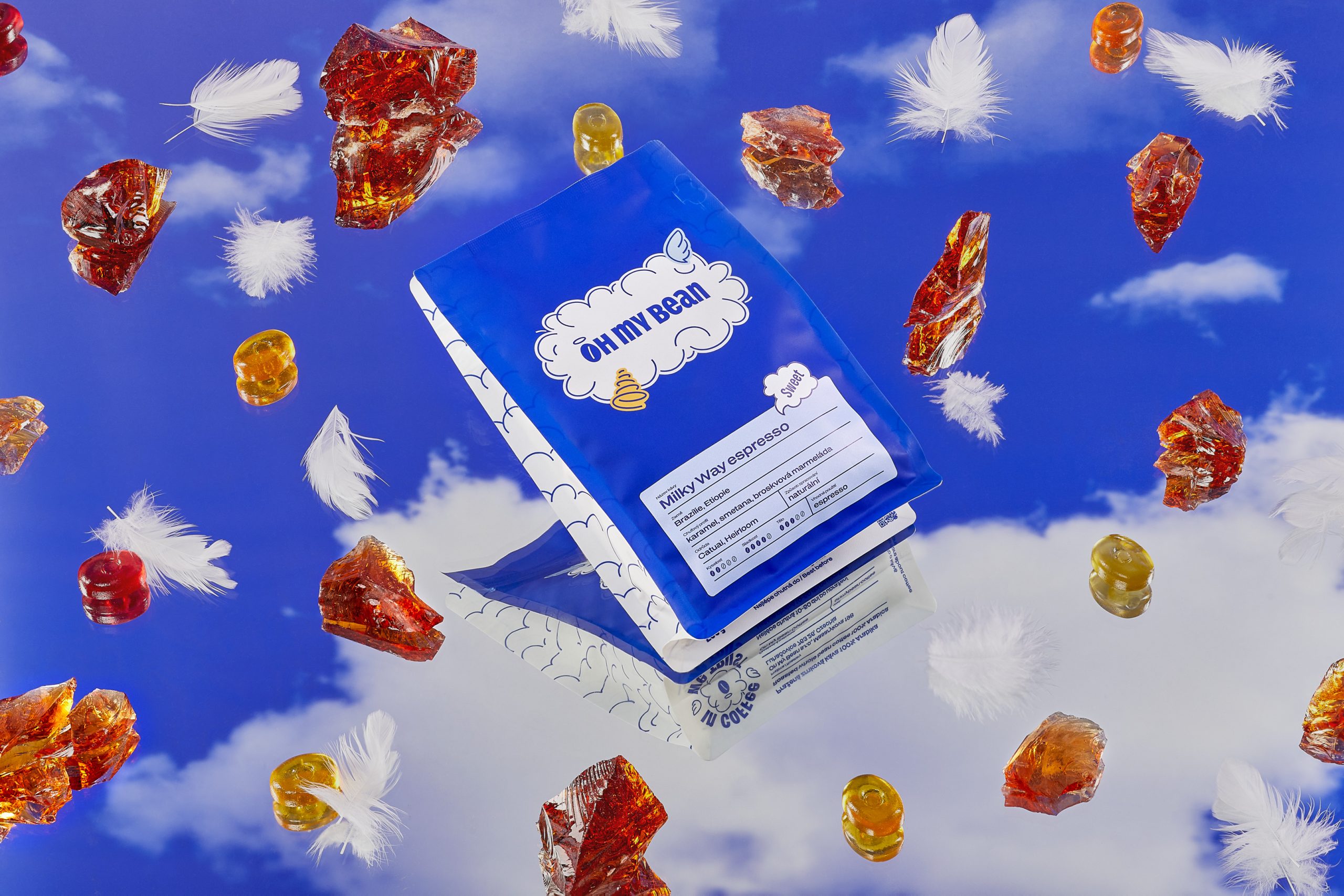
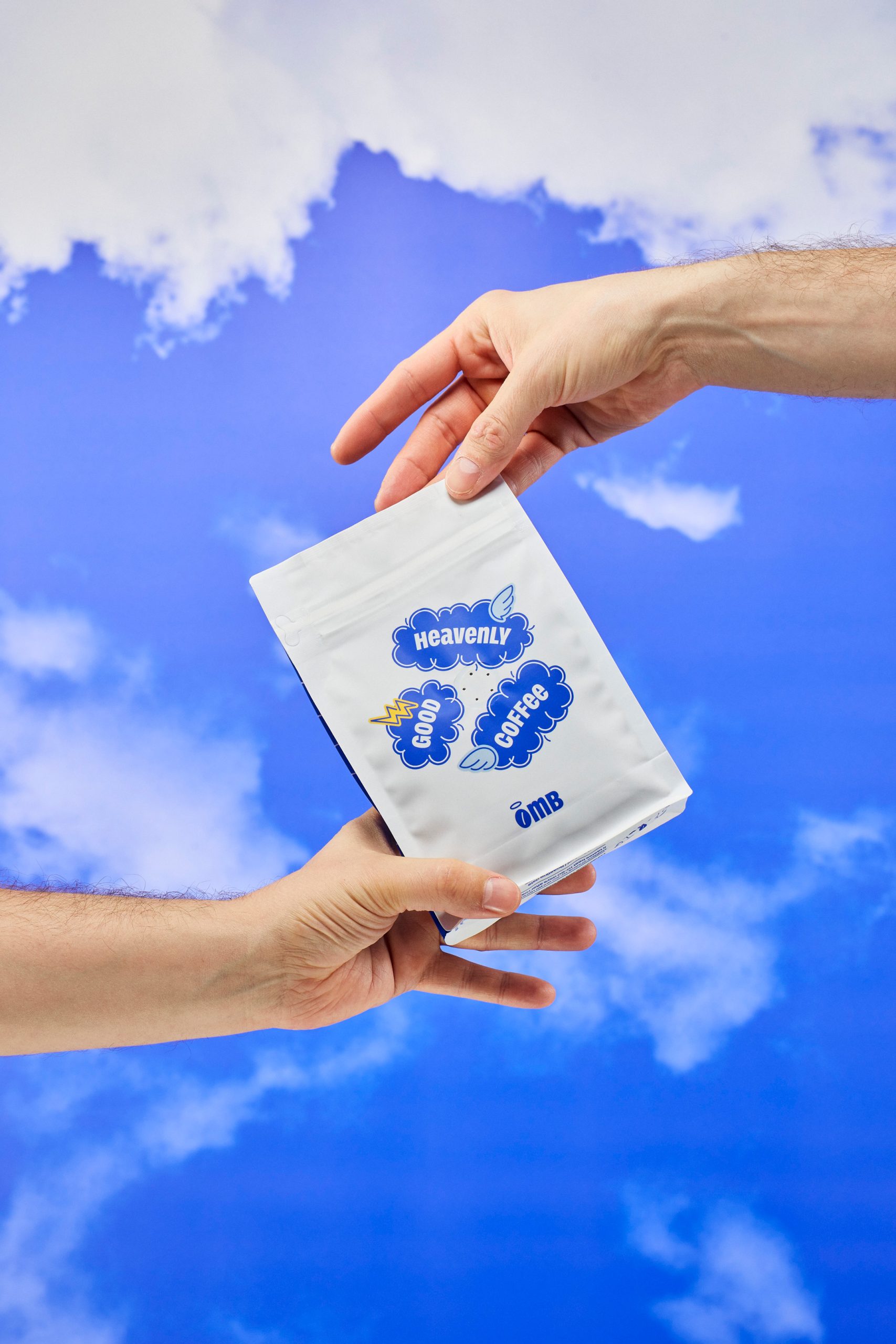
The brand concept centres on what we call a “heavenly” identity. The name Oh My Bean naturally lends itself to a sense of wonder and delight. We leaned into that — the haloed holy bean became the heart of the visual system. Cloud-like linear shapes, bold typography combining small and all caps, and a cosy colour palette create a brand world that feels uplifting, approachable, and premium.
SOLUTION
The packaging was designed as part of a complete brand identity – not as a standalone gig. Logo, typography, colour system, and packaging were developed simultaneously as one integrated system.
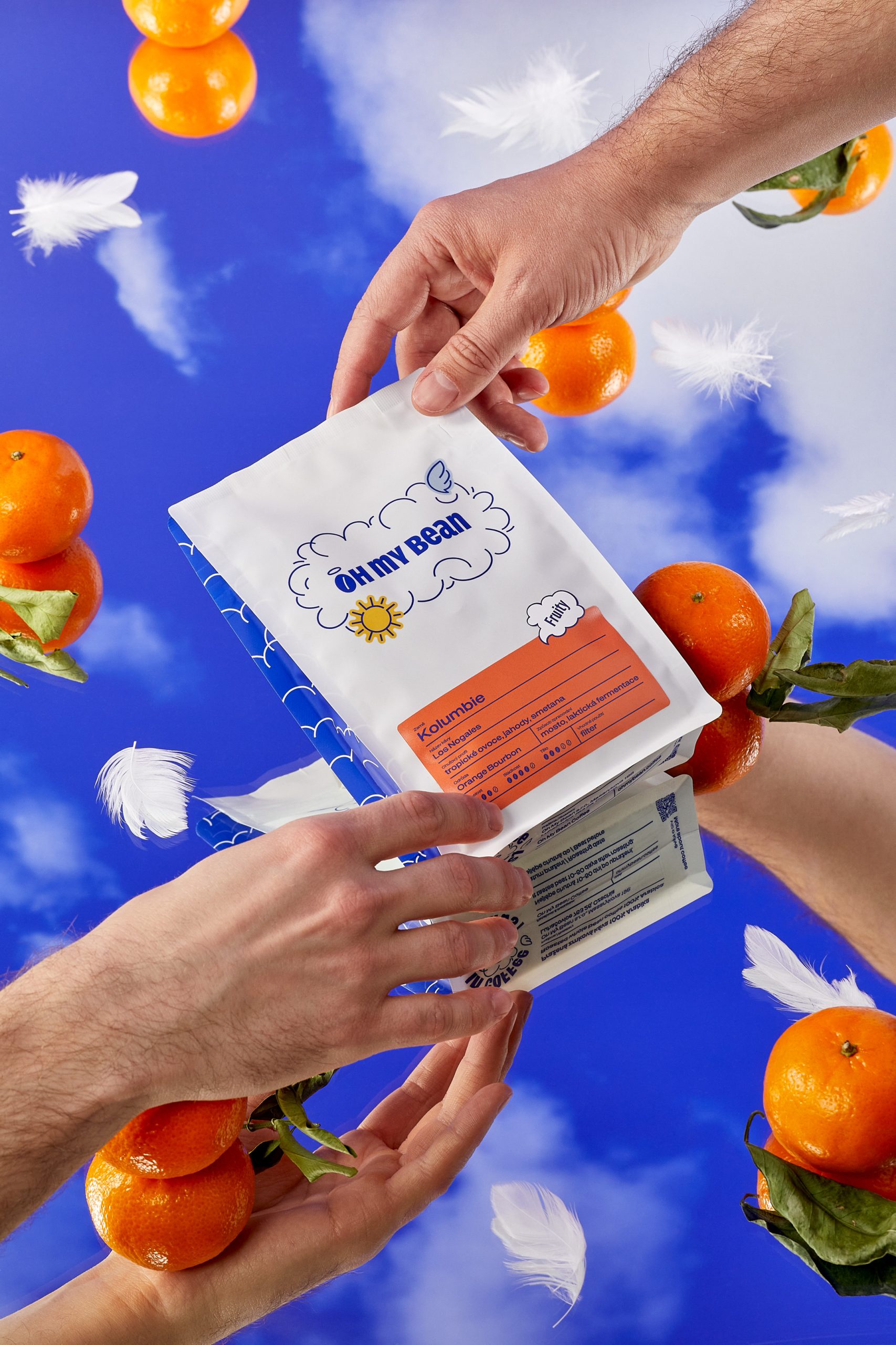
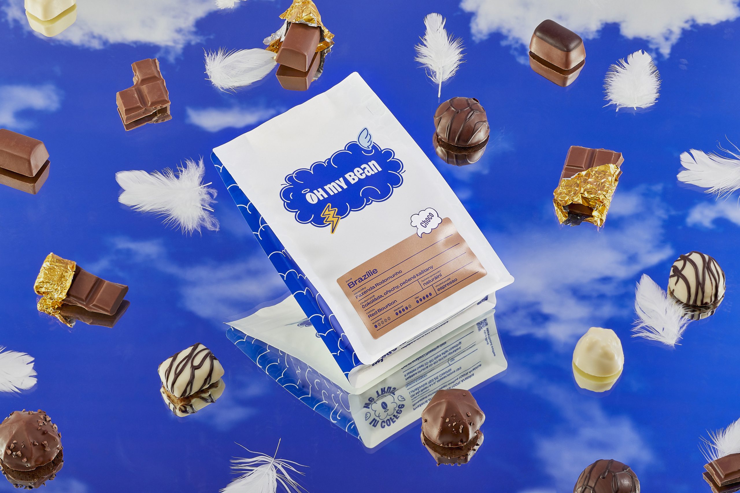
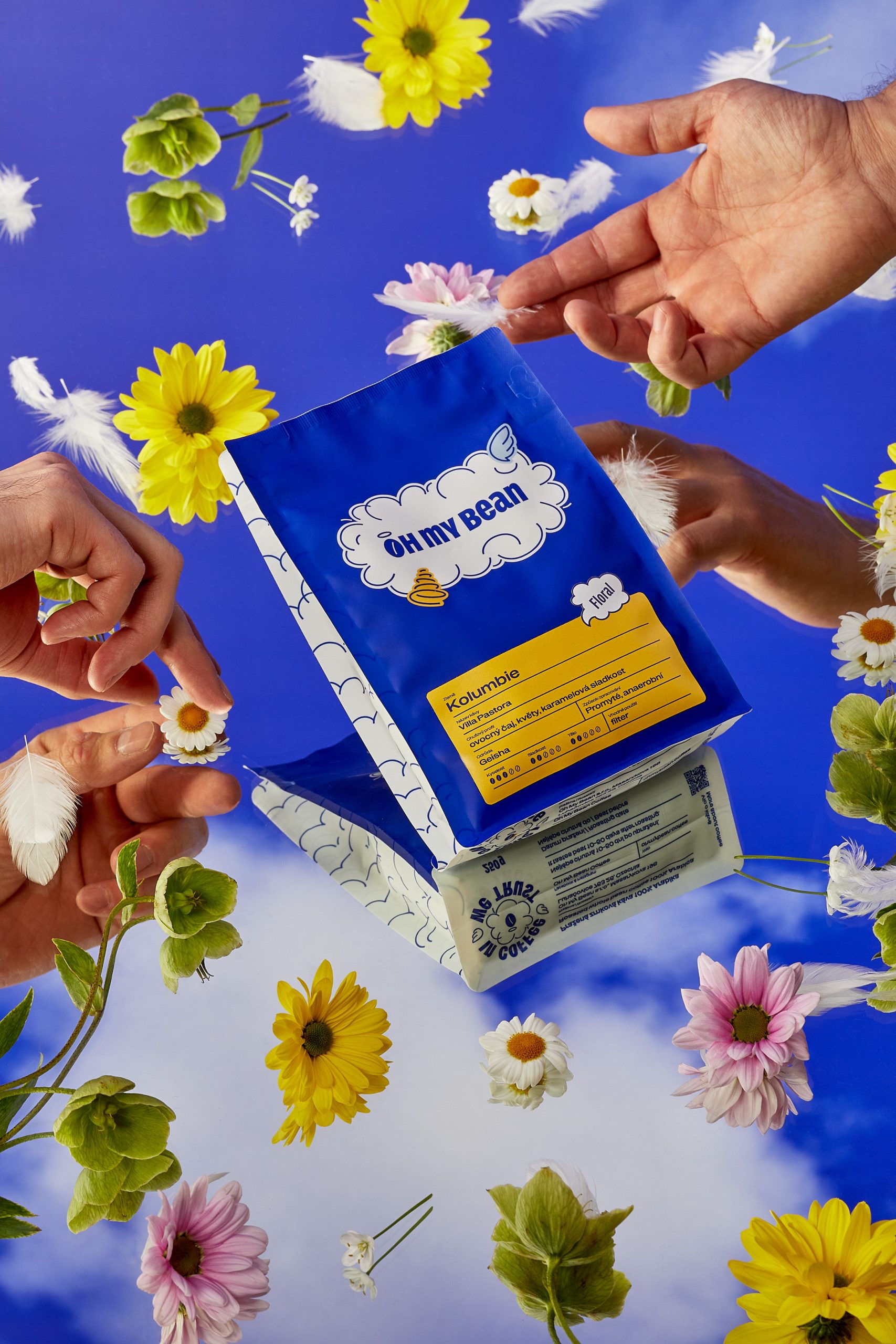
Each bag features a cloud carrying the Oh My Bean logo as its central element. The cloud works as a modular base – sticker-like illustrations are added on top to indicate the brewing method. A lightning bolt on a dark, stormy cloud means espresso beans. A sun on a light cloud means filter. A tornado marks house blends. The system is designed to expand: seasonal editions get festive motifs layered onto the same cloud, keeping the family cohesive while staying fresh.
A second layer – a label on the lower part of the bag – carries the specific coffee information. Four flavour categories define the colour of this label: Choco, Sweet, Fruity, and Floral. Each has its own distinct background colour, making it easy for returning customers to find their preferred flavour profile even as the coffee selection constantly rotates.
RESULT
Oh My Bean went from a nameless newcomer to a brand with real shelf presence. The identity system proved flexible enough to grow across products and markets. Within a year of the rebrand, the company saw an 80% increase in revenue — proof that packaging isn’t decoration but business infrastructure.
Curator’s Insight:
What stands out here is the restraint in the system’s logic … by keeping the base illustration constant and only swapping the “sticker” on top, the studio built a format that can absorb new SKUs, seasonal drops, and even market-specific flavour notes without ever needing a redesign. It’s a quiet rebuttal to the idea that specialty coffee branding has to lean on muted, artisanal cues to feel premium — here, a punchy, almost toy-like palette and playful iconography do the heavy lifting instead, and clearly resonate on shelf against more austere competitors.
 Derrick Lin
 monther al omari
 43oz
43oz lilyz design23
 Modern Theory
 Eighteen Brand Studio
 Bhumika Singh
 MohamedMashaly
 Pixels Studio
 Gulya
Gulya UPRISE
 Lizaveta Kharitonyuk
 Bonsanco Creative Studio
 DesignRepublic
 GIRAFA STUDIO
 PiotrWisniewski
 Sophiagdotcom
 CreativeWise
 SoreThumbStudio®
 Modern World Studio
 Palashcc
 Valérie Colace