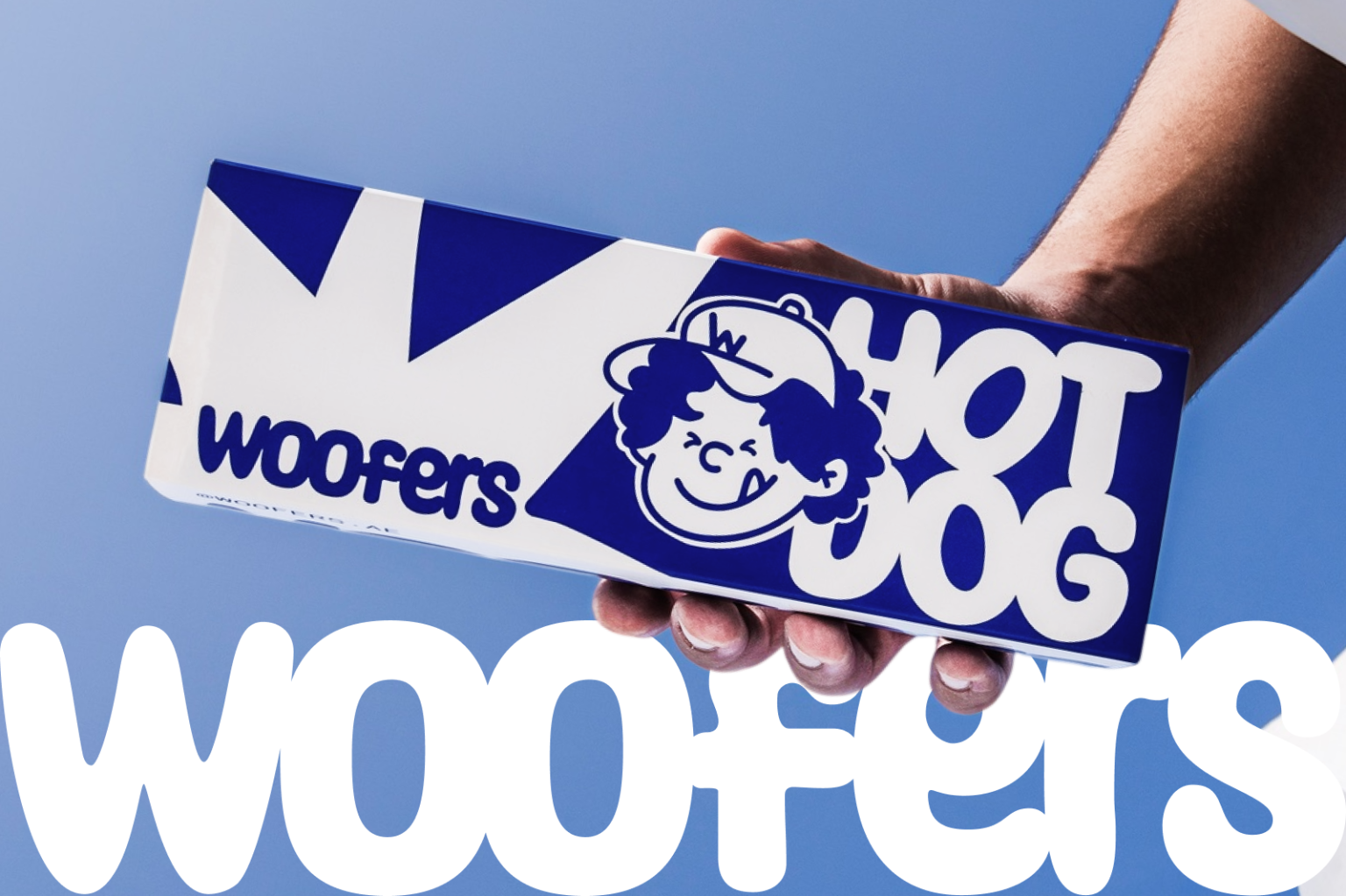

BEWARE: THIS PROJECT CAN CAUSE CRAVINGS!
WOOFERS is an independent fast-casual brand specializing in hot dogs and contemporary street food. Its physical location is a compact quick-service pavilion situated at Al Qana Drive Thru in Abu Dhabi.
CHALLENGE Since the format allows only a brief interaction with the guest, the brand needed to be visible from the road, instantly recognizable, and compelling enough to make people stop before even seeing the menu. It was important to stand out from competitors by moving beyond the category’s familiar visual codes. The compact location had to become a distinctive, visually rich brand environment in its own right.
GOAL The identity needed to make WOOFERS immediately stand out among neighboring concepts, create an emotional response, and turn a casual visitor into part of the brand’s world.
- Instant recognition
- High visibility from a distance
- Emotional openness
- A scalable visual system
SOLUTION
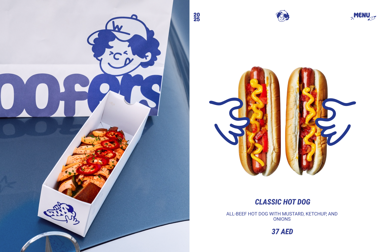
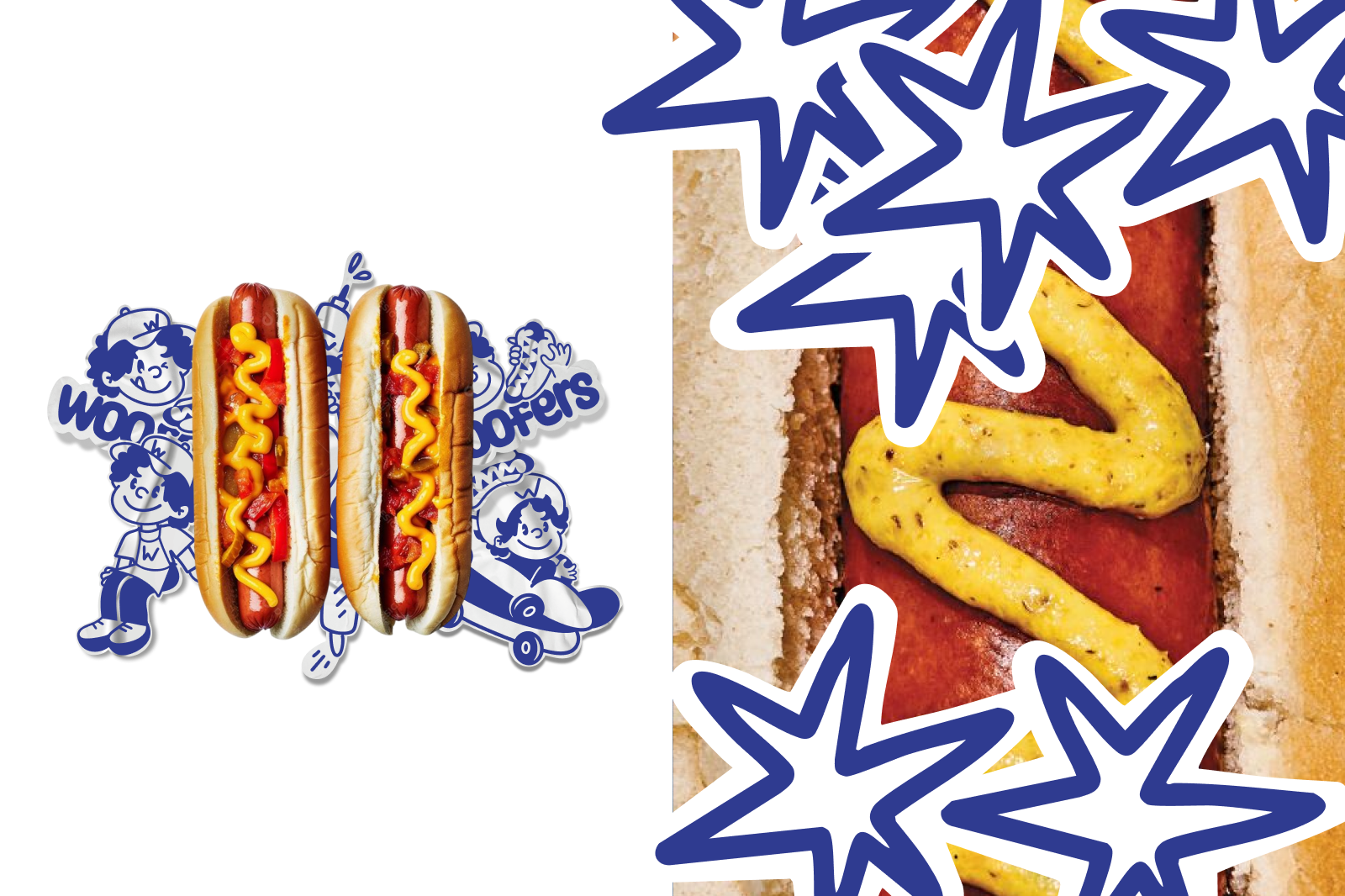
Instead of the red-and-yellow palette traditionally associated with fast food, I chose a monochromatic blue-and-white color system. Blue acts as a tool for branding the entire environment, connecting the façade, signage, packaging, staff uniforms, and communication materials. White functions as active negative space, amplifying the scale and impact of the graphics. Oversized, expressive typography became the second key element of the identity. The enlarged logo, dynamic cropping, and dense compositions allow the brand to work confidently across both small packaging formats and the architecture of the pavilion. I also developed a mascot and a series of illustrations. The character acts as an emotional link between the brand and its guests, bringing warmth, humor, and a more human tone to the communication. It gives WOOFERS not only a recognizable personality, but also the potential to build its own visual narrative over time. ✷✷✷ The graphic system is built on the contrast between clean color fields, bold typography, and expressive hand-drawn lines. This combination allows the brand to feel contemporary, energetic, and effortless at the same time.
RESULT
The result is a cohesive visual system brought to life in the real environment of Al Qana Drive Thru. The identity remains recognizable across different scales: it stands out on the pavilion façade, works confidently across the packaging system, and adapts easily to menus, signage, uniforms, and social media. WOOFERS gained a distinctive visual territory in which architecture, graphic design, illustration, photography, and tone of voice all speak the same language. As a result, a compact quick-service location becomes a memorable brand experience — a place that catches attention from the road, is recognized after the first interaction, and becomes associated with the simple pleasure of enjoying the moment.





 Alessandro Ammaturo
 Amblr Studio
 vladlenalevit
 Sis Tsarukyan
 monther al omari
 alchimistestudioParis
 designsbysukaina
 About House of Ta
 Amjad Battal
 UPRISE
 Maruf Nishat
 Dozen Agency
 neo creative studio
 Muhammad Tawfeeq
 Stefano Bracci
 Widakk Design
 Studio Garces
 宏洛图品牌设计HONGLT
 DN Designs
 BoldCrest
 Oksana