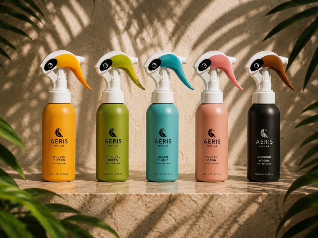

AERIS — Where Function Meets Emotion
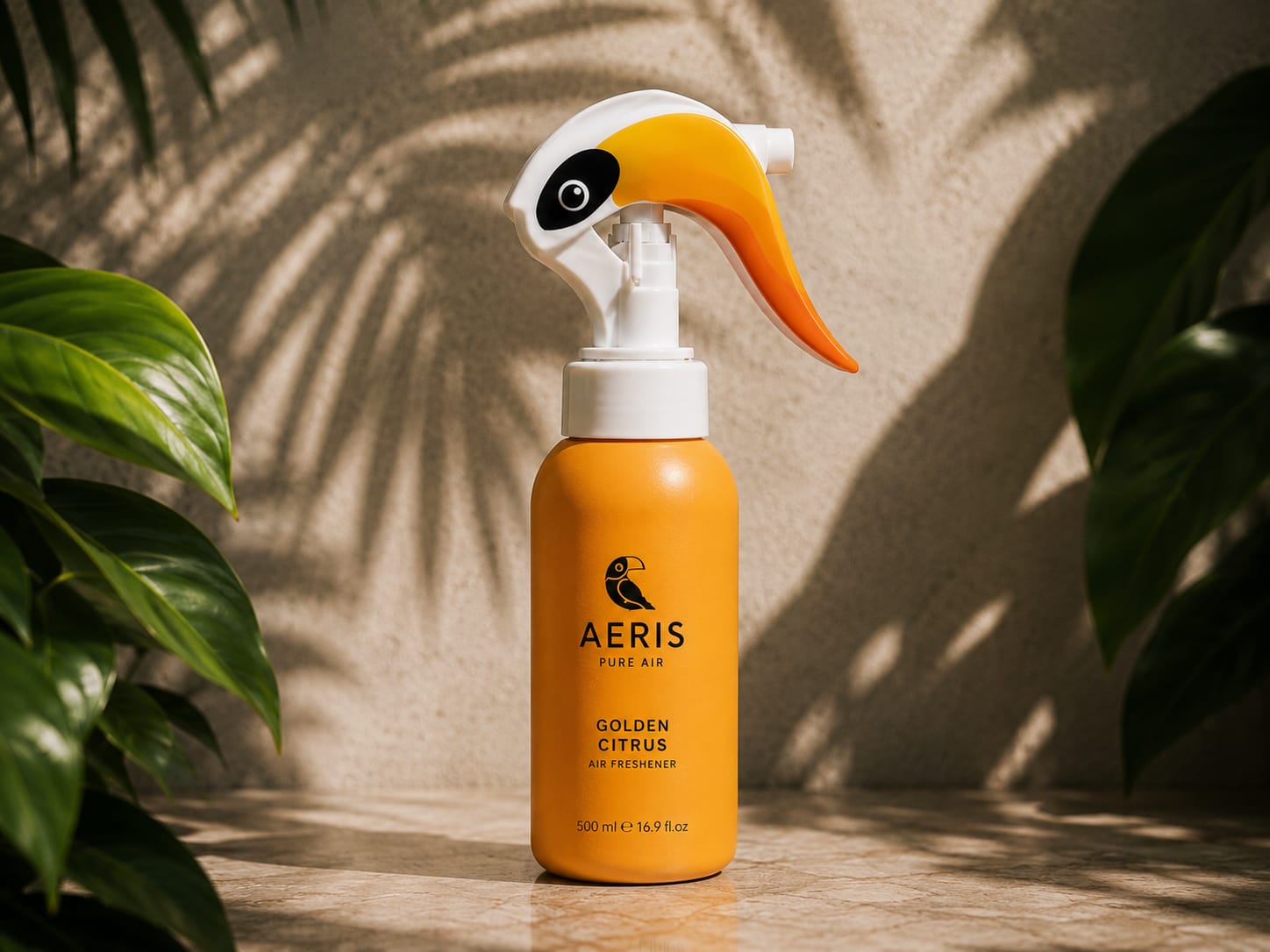
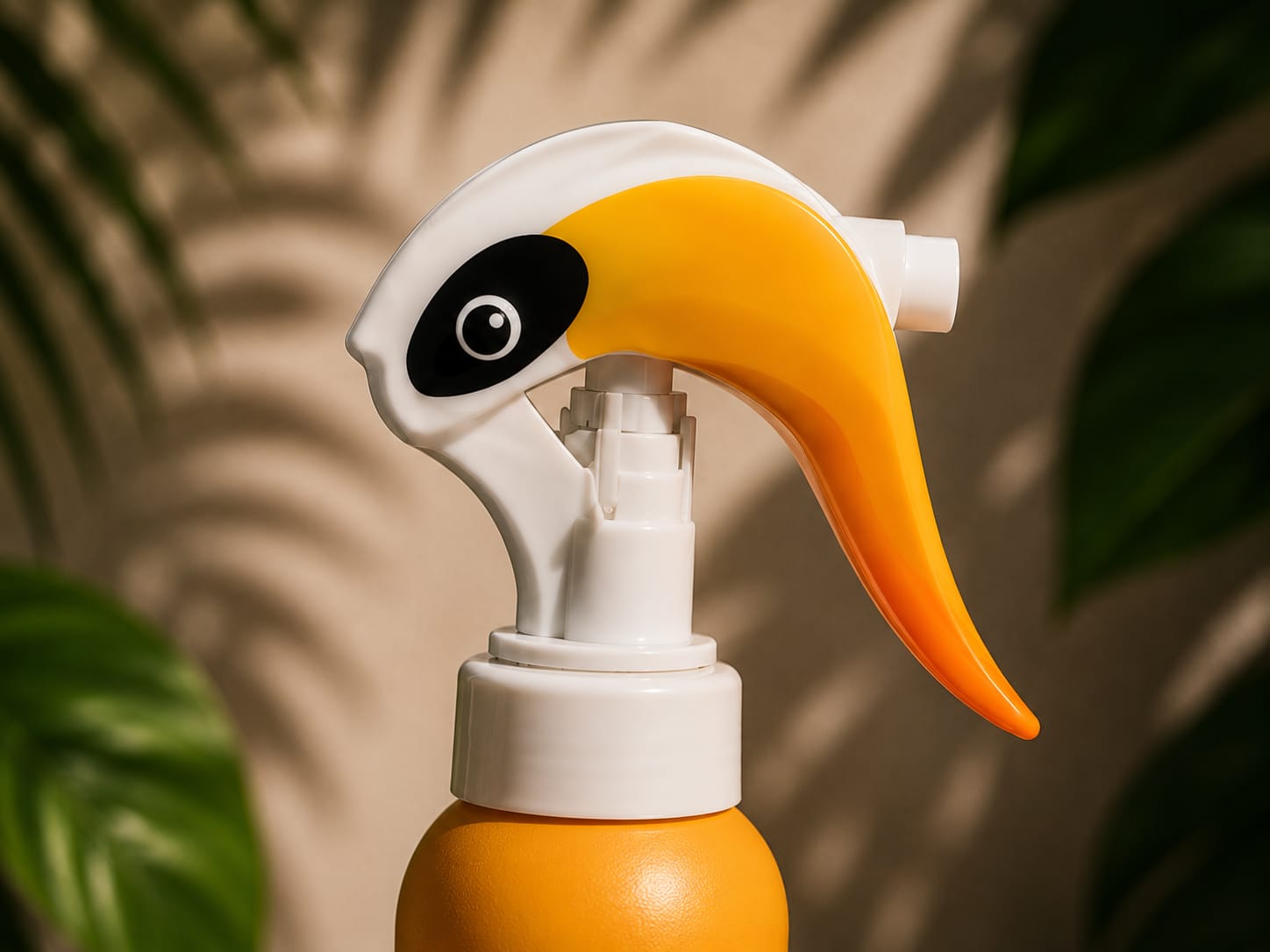
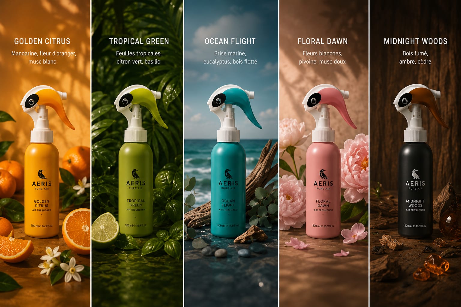
AERIS reimagines the everyday air freshener by transforming a familiar household object into a memorable brand experience. Inspired by the silhouette of a tropical bird, the trigger becomes more than a functional component—it becomes the emotional signature of the product. A simple cleaning gesture is elevated into a small moment of delight, creating an immediate visual connection between freshness, nature and design.
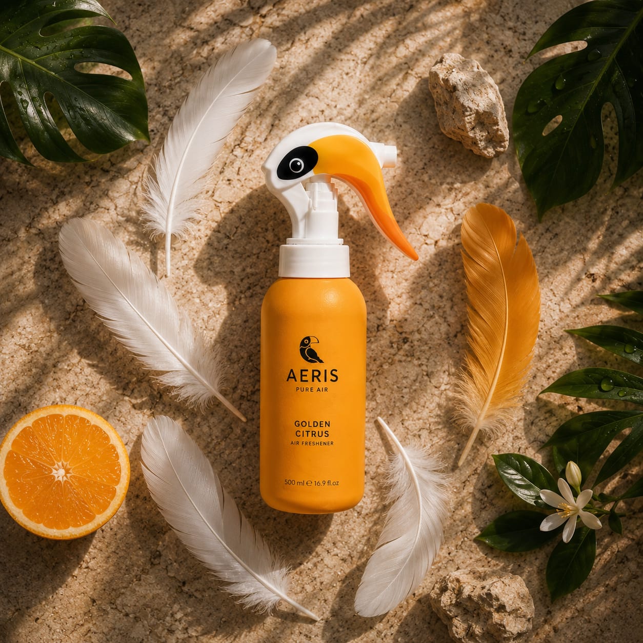
The identity is built around the idea that every fragrance is a destination. Rather than relying on decorative graphics, each variant is expressed through a restrained monochromatic palette and a carefully curated atmosphere. Golden Citrus radiates warmth and sunlight, Tropical Green evokes lush vegetation, Ocean Flight captures the freedom of sea breezes, Floral Dawn celebrates delicate blooms, while Midnight Woods explores deeper, more sophisticated notes. Each color becomes an intuitive code, making the range instantly recognizable while preserving a strong family identity.
The packaging embraces minimalism to let the iconic trigger shape become the hero of the product. Soft matte finishes, clean typography and generous negative space communicate purity, calm and premium quality. The toucan symbol reinforces the brand narrative while remaining subtle enough to support, rather than dominate, the overall design language.
Beyond aesthetics, AERIS demonstrates how industrial design, branding and packaging can work together as one coherent system. The product itself becomes the primary communication tool, reducing the need for excessive visual elements and allowing the packaging to express personality through form, proportion and color.
Designed to stand proudly in contemporary interiors rather than be hidden away, AERIS transforms an everyday air freshener into an object people are happy to display. It is a project that celebrates emotional design, proving that even the most ordinary household products can create lasting memories when functionality, storytelling and visual identity are conceived as a single, unified experience.
Curator’s Insight
What’s notable here isn’t the toucan reference itself, it’s where that reference lives. Most novelty-shaped packaging puts the character on the label as decoration. AERIS puts it in the mechanism. The trigger sprayer, a part every user has to touch to operate the product, is the part that carries the entire brand identity. That’s a harder design problem to solve than surface graphics, because the form has to work ergonomically first and read as a bird second, without either function suffering.
The five-color system solves a separate problem: how do you differentiate a fragrance range without relying on illustrated scenes or scent-note iconography, which tend to date quickly and crowd the bottle. Assigning one flat, saturated hue per variant means the differentiation lives in the industrial design itself rather than in printed graphics. It’s a system that could expand to ten scents or contract to three without needing new artwork, only new tooling colors.
The broader principle: when a product’s shape can carry the brand’s personality, the packaging’s job shifts from decorating the object to protecting the clarity of that shape. Restraint isn’t a stylistic choice here, it’s the mechanism that makes the concept legible.
 Natasha Spitsyna
 babyage
 GruppoSaida
 ahmedraoudgfx
 Hi estudio
 Nadezhda Gorelikova
 Studio Garces
 Brandsbylufo
 Rewot
Rewot Asprey Creative
 kat bres
 Valérie Colace
 Atiq Alam
 Sara Communications
 David Hakobyan
 monther al omari
 Innovāt - Empowering Creative Innovation
 mmdesign
 Amjad Battal
 Hollóka Grafikai Műhely / Graphic Design Studio
 Palashcc
 ABC Design Communication
 ChrisSkarlatos
 Hedayat Hadavi
 Tia Nguyen
 étiquette