
Background
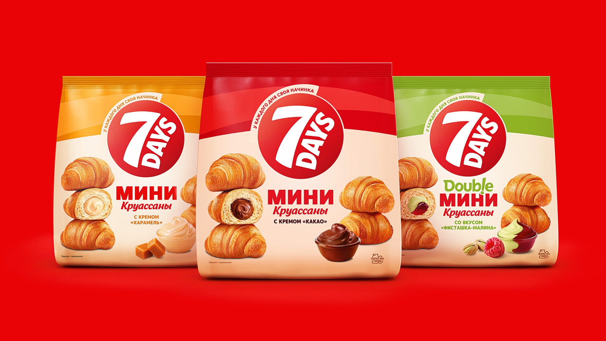
7Days croissants have long been a part of the daily lives of active city dwellers who value convenience, taste, and the ability to snack on the go. For 26 years, the brand’s packaging has remained virtually unchanged, maintaining high consumer recognition. However, visual trends, shopping habits, and shelf presentation requirements have changed. Therefore, it became necessary to update the packaging design while maintaining its recognizable character and adapting the brand to a modern perception.
Challenge
VIEWPOINT was tasked with a discreet packaging redesign, enhancing its appeal and visibility in retail spaces. It was important to maintain key elements of the brand’s identity, including the logo and color differentiation of flavors. A key aspect of the design was to make the food zone as delicious and appetizing as possible. Particular attention needed to be paid to the “double” line, ensuring more pronounced visual differentiation of flavors.
Solution
Together with the Russian team of the Mondelez Group, which owns the 7Days brand, the VIEWPOINT agency developed an updated packaging concept that maintained brand continuity while simultaneously making it visually more modern.
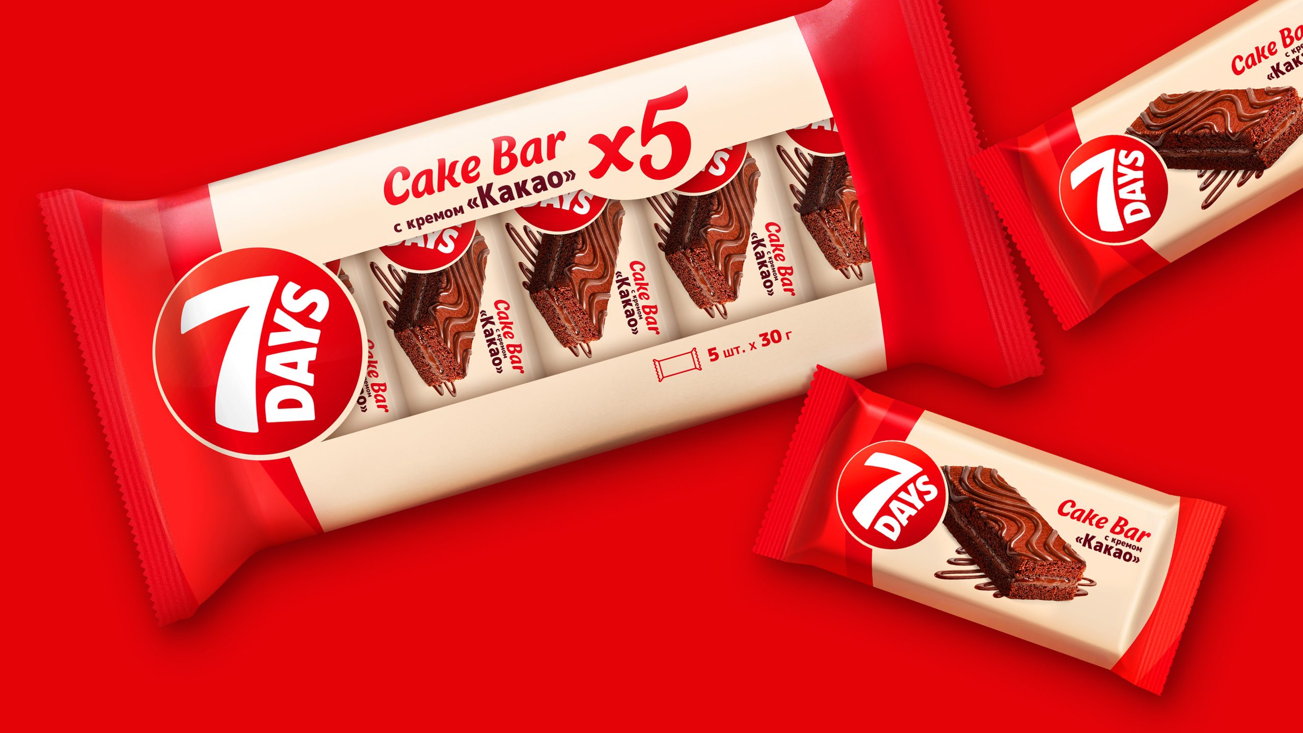
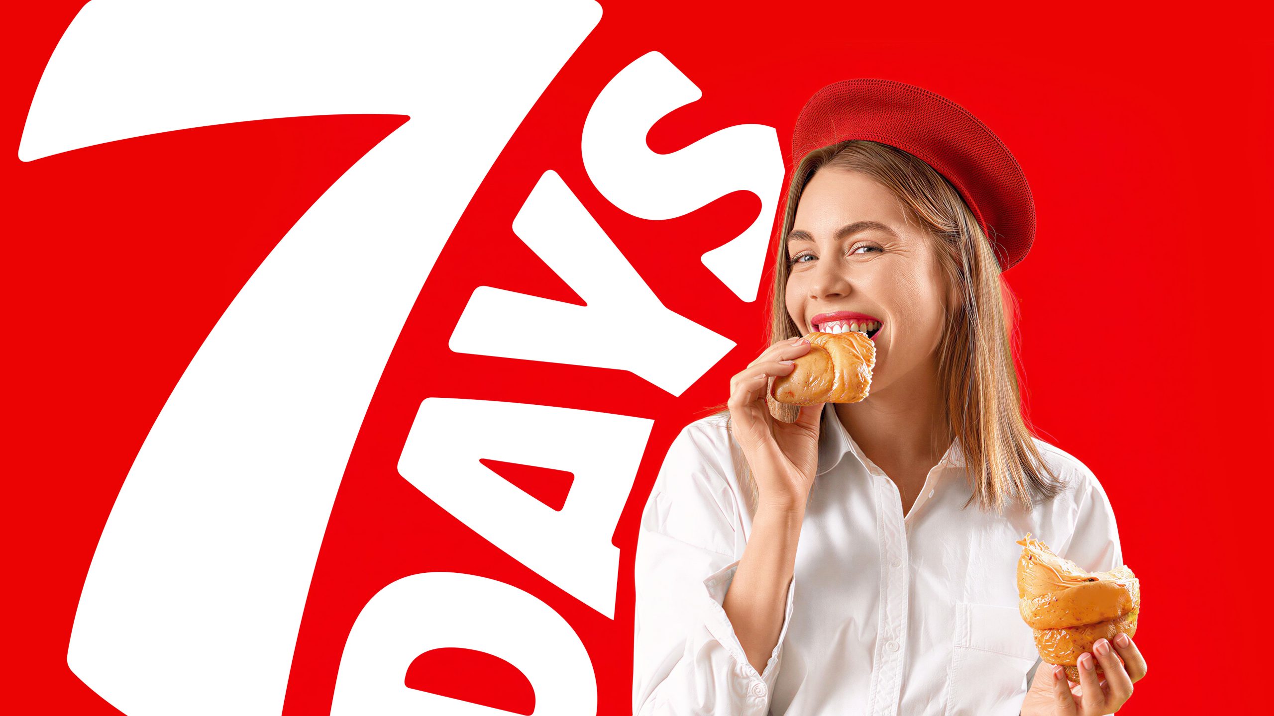
The logo was not only enlarged but also given a brighter design, while the updated 7Days typeface became more relevant, noticeable, and dynamic. Thanks to the new logo and red accents in the design, the 7Days brand block became more prominent on the shelf.
To create a sense of dynamism, smooth, curved elements were integrated into the design, visually emphasizing the brand’s active nature.
Particular attention was paid to the product area. The croissants on the package now taste more delicious; they also convey a light and airy texture and a variety of fillings. The appetizing croissant images have been presented more vividly, and the unique composition now appears more three-dimensional and appealing.
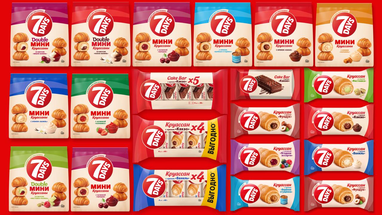
Thanks to the updated color navigation system, each flavor now has its own vibrant character, and the “Double” line has received additional visual differentiation, making it easier to navigate the product range and find the desired product.
As a result, the packaging has acquired a modern and more premium look while maintaining brand recognition. The updated design has strengthened 7Days’s presence on the shelf, made the product visually tastier, and provided a clearer perception of the flavor line for a wider consumer audience.



 softmachine
 monther al omari
 alchimistestudioParis
 airobtq
 Buzz & Co.
 Ruby
Ruby themythographer
 IDNB Inc.
 viktorflr
 Zenpack
 Wessam Hussien
 samarabdelmonem
 StudioMordius
 Polaris Designs
 Atiq Alam
 duha mohamed
 HassanEtman22
 agarcia studio
 Wynand88
 Eva Chistyakova
 Maria Bukhtilova