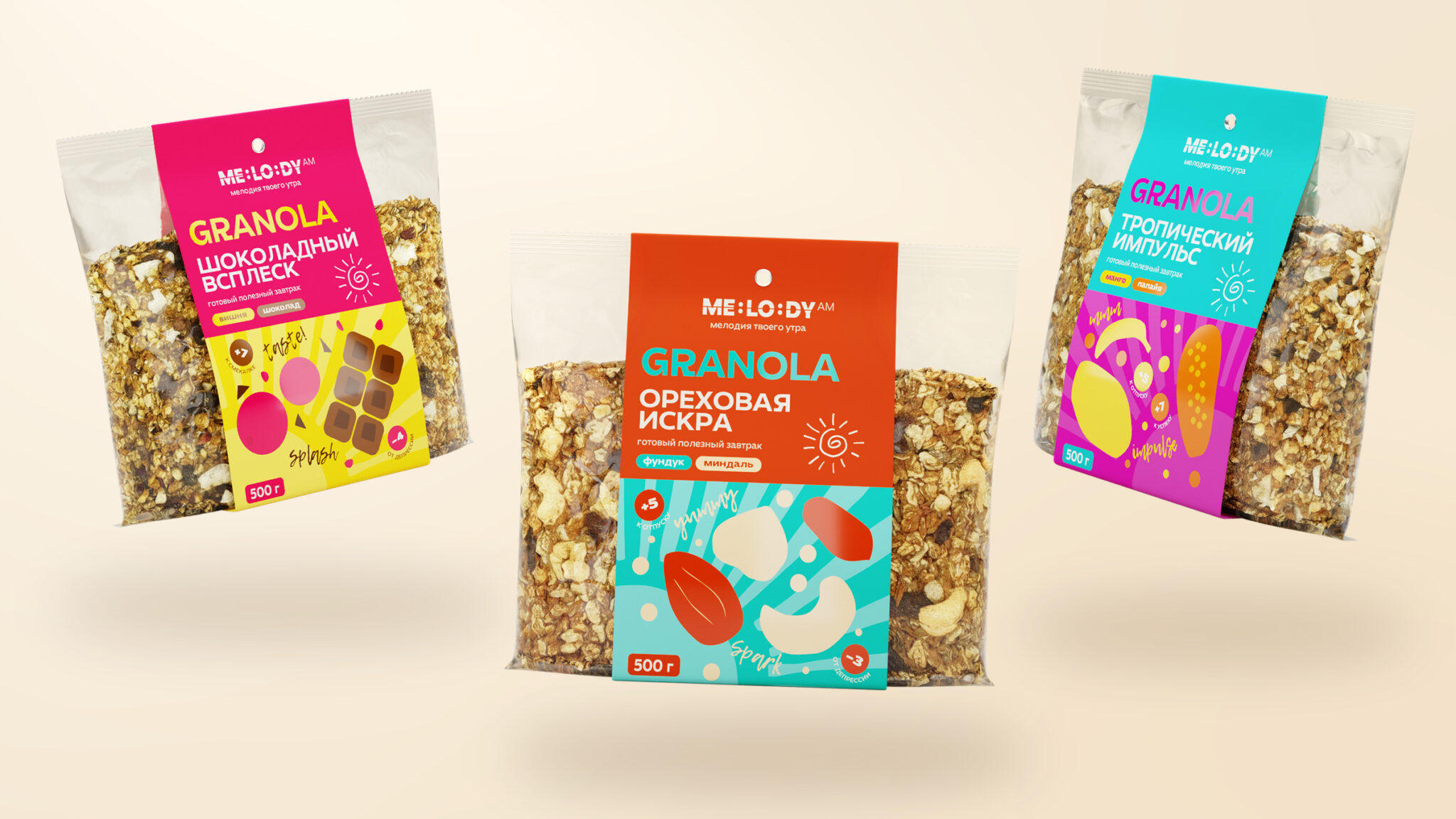

Granola with character. Three flavours to wake up to.
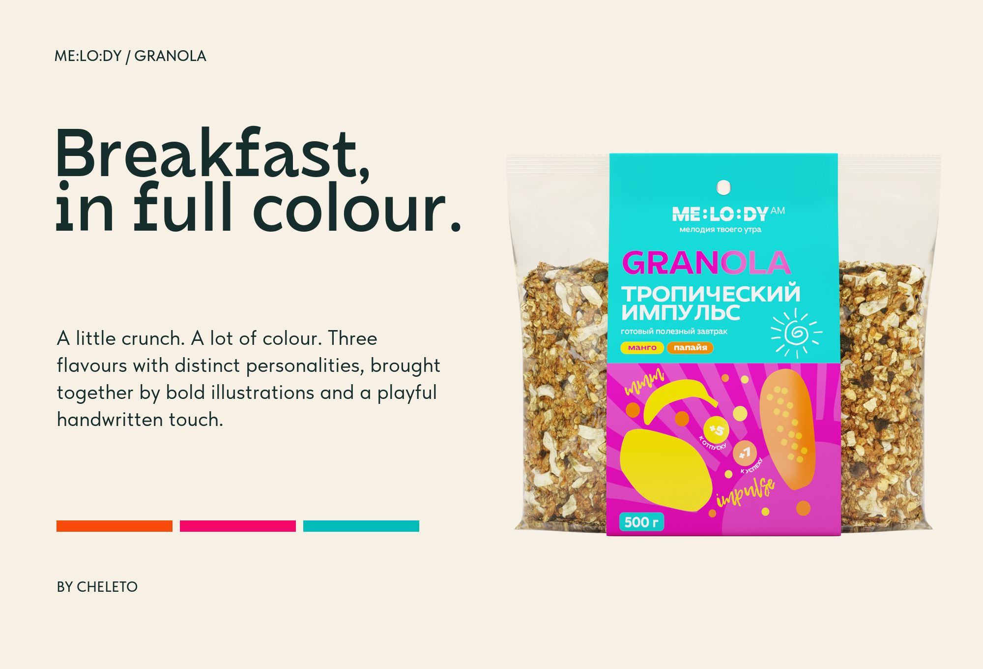
A little crunch. A lot of colour. ME:LO:DY brings hazelnut and almond, cherry and chocolate, and mango and papaya to the breakfast table. Bold colour pairs, oversized ingredient illustrations and a playful handwritten touch give each flavour its own personality.
The Idea
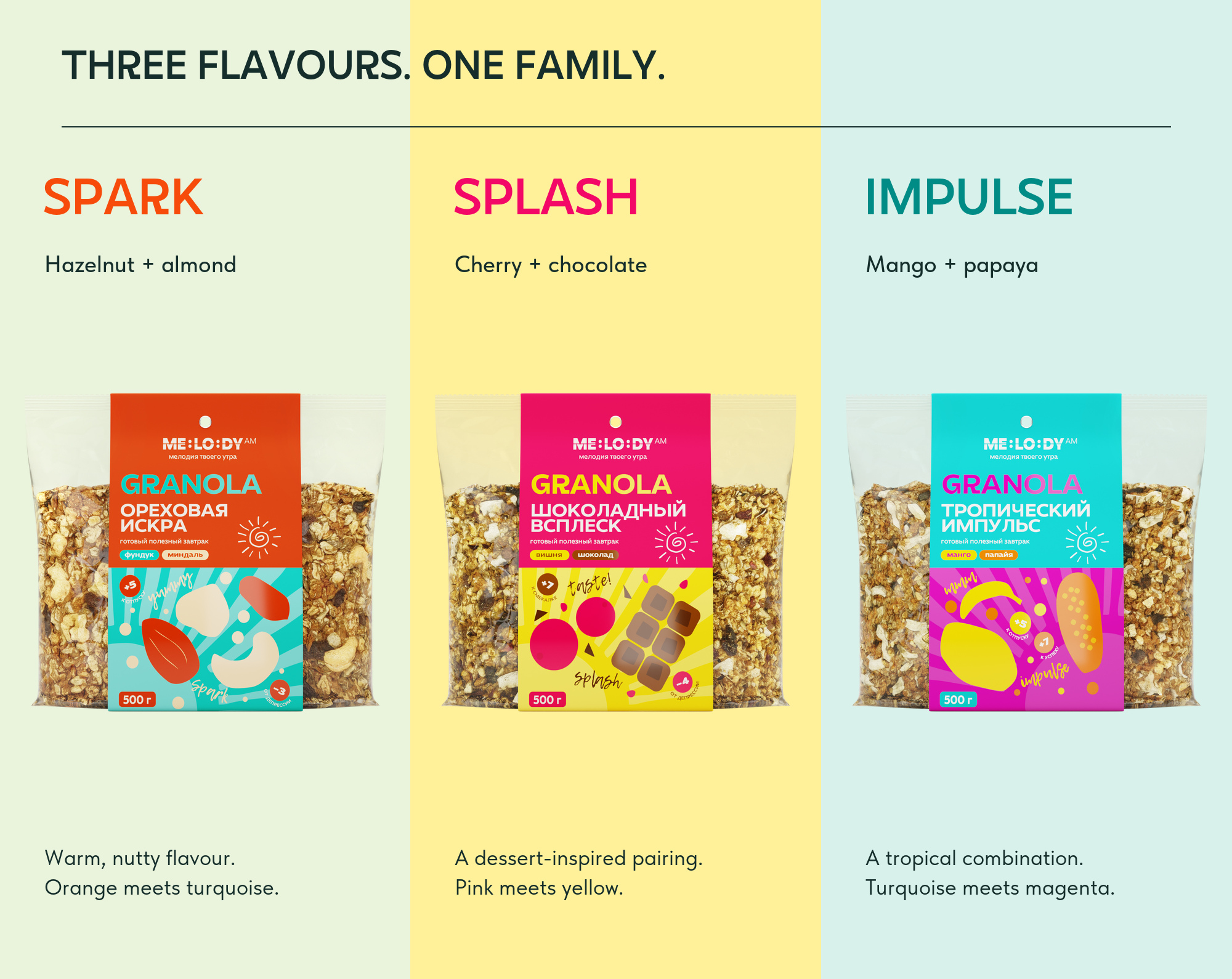
ME:LO:DY gives a familiar breakfast an expressive voice. SPARK, SPLASH and IMPULSE turn three ingredient pairings into three distinct moods. The names set the rhythm; the flavours bring it to the table.
From Product to Packaging
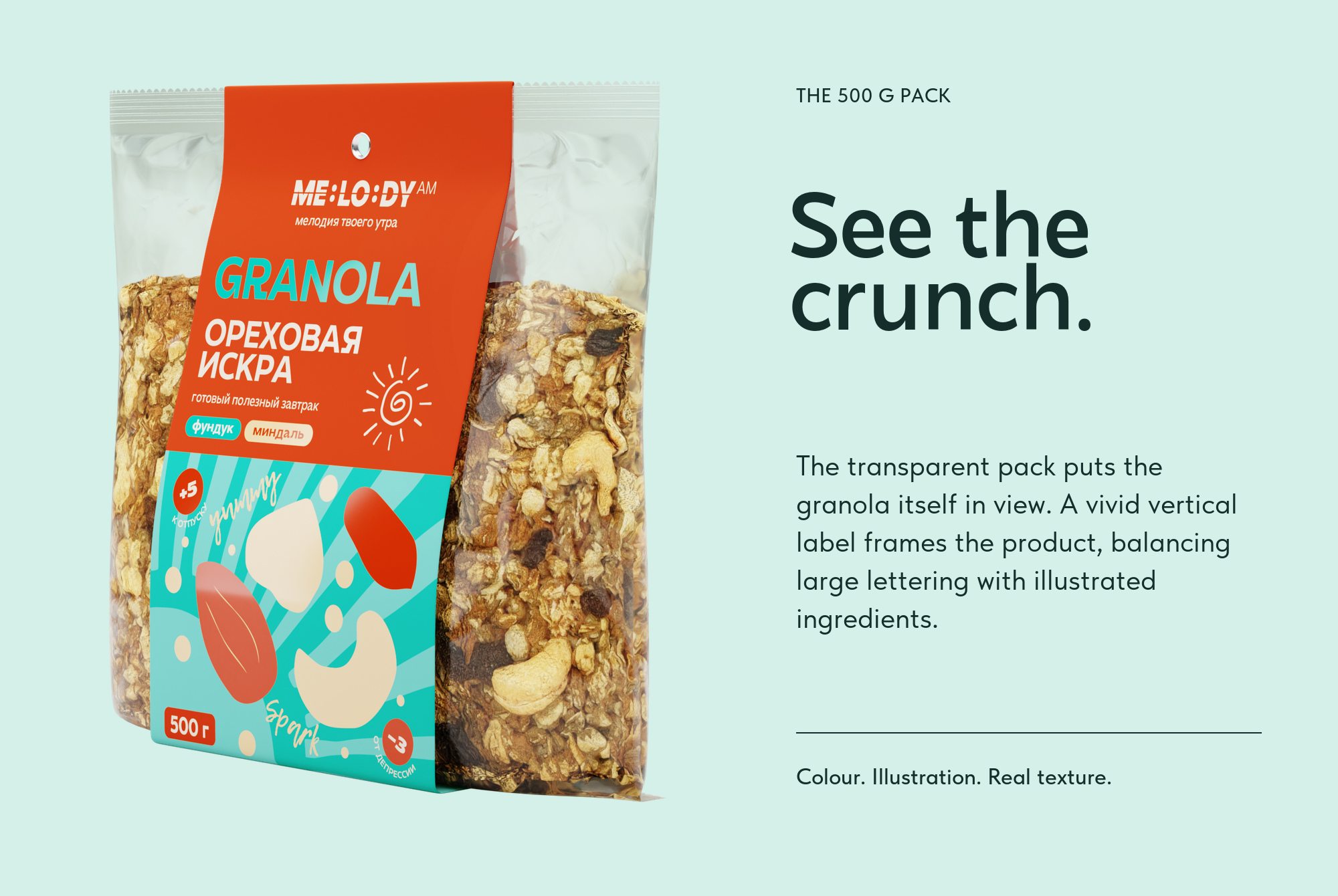
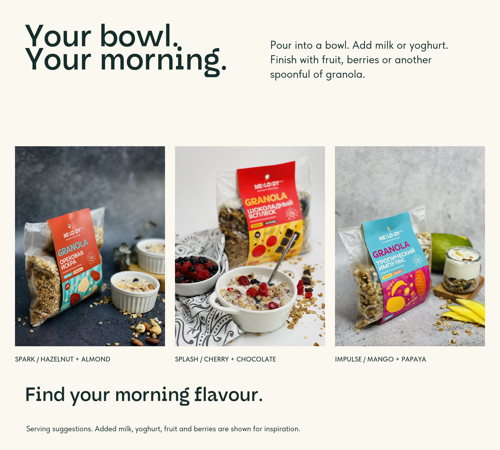
The transparent pack brings the texture of baked cereal into the composition. A wide colour band carries the name and ingredient illustrations, framing the granola while keeping it in view. One pack format holds three distinct flavour identities.
The Design Language
Orange meets turquoise for SPARK. Pink meets yellow for SPLASH. Turquoise meets magenta for IMPULSE. A shared layout, a small drawn sun and the ME:LO:DY wordmark connect hazelnut and almond, cherry and chocolate, and mango and papaya.
ME:LO:DY is a granola brand by CHELETO. This project presents the 500 g packaging family across three flavours: SPARK with hazelnut and almond, SPLASH with cherry and chocolate, and IMPULSE with mango and papaya. Vivid colour pairs, illustrated ingredients and transparent packs give the range its identity. The presentation brings original product mockups and serving photography into a bright editorial composition.
Brand — ME:LO:DY
Company/client — CHELETO
Packaging design — Anton Zolotykh
 cheleto
 habiba hatem
 Up-Brands
 sayadworks
 Kingdom & Sparrow
 furtgoods
 Si me preguntas
 Narrow House Packaging Branding & Design
 Clever Branding
 About House of Ta
 Hossam khalifa
 Valentyna Hradova
 Backbar Studios
 Holy Studio
 Prime
Prime Naeema Raashid
 Buddy Creative
 ezgidesignstudio
 Minim Brand Design
 Nenad Došen Studio
 Atyan
Atyan Massimo Lo Cascio
 Carreto Concepts Design Studio
 Charles Mason
 Pinot Agency