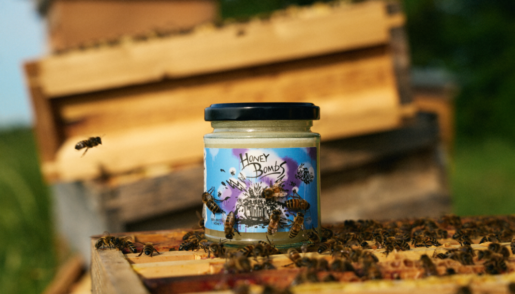

HONEYBOMBS — RAW HONEY PACKAGING
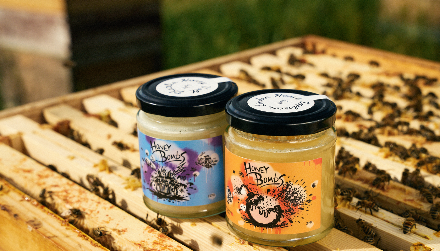
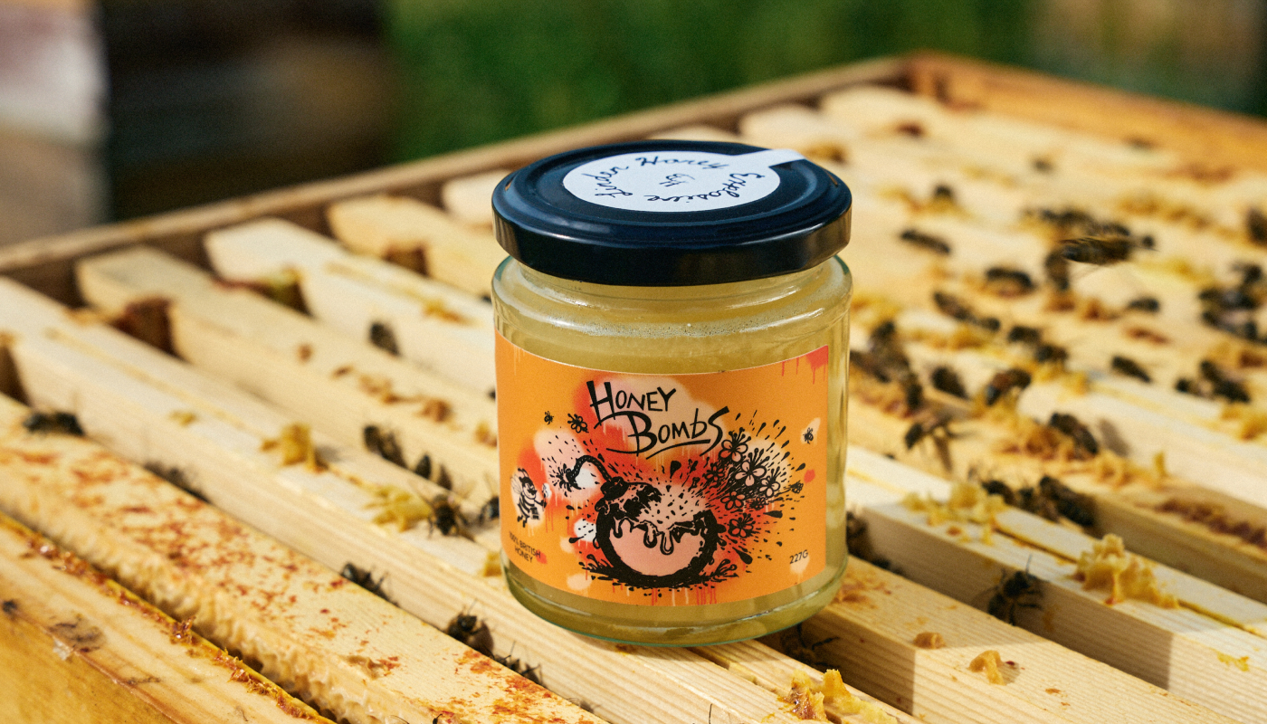
HoneyBombs brings a bold, playful character to British honey from the Cotswolds. The identity translates the natural energy of the product into expressive lettering, illustrated bee characters, and vivid colour contrasts, giving a traditional pantry staple an unexpected personality.
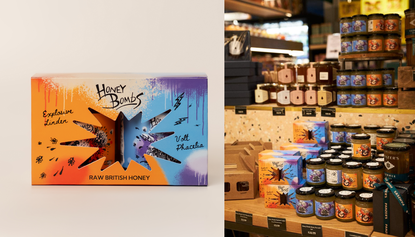
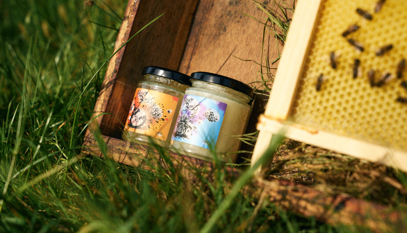
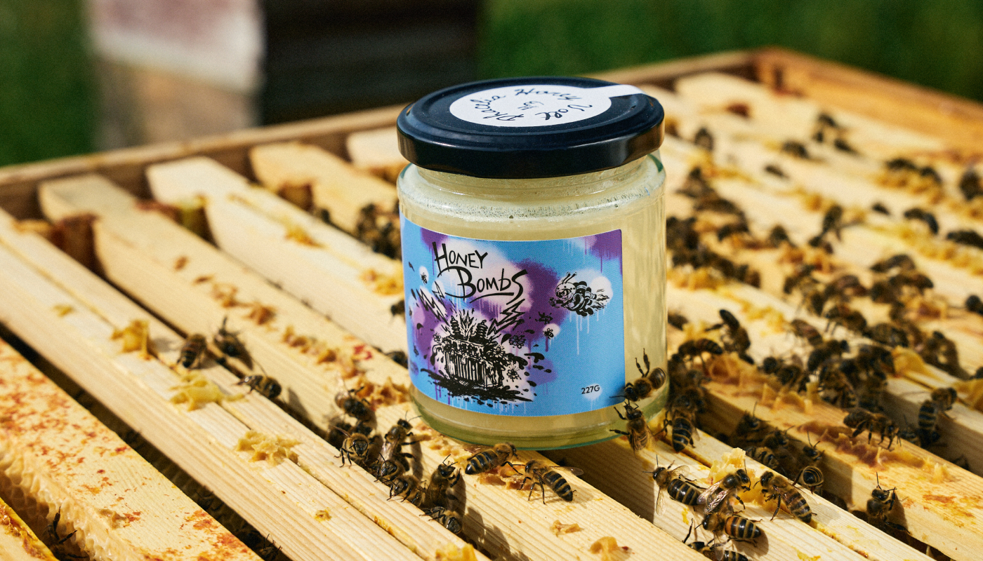
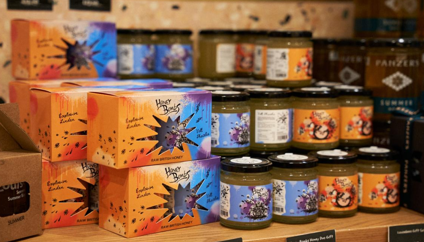
The packaging revolves around two distinct varieties: Explosive Linden and Volt Phacelia. Warm orange and golden yellow give Explosive Linden a sun-filled character, while electric blue and purple bring a contrasting charge to Volt Phacelia. Shared graphic elements and label layouts connect the two, creating a recognisable family while giving each variety its own voice.
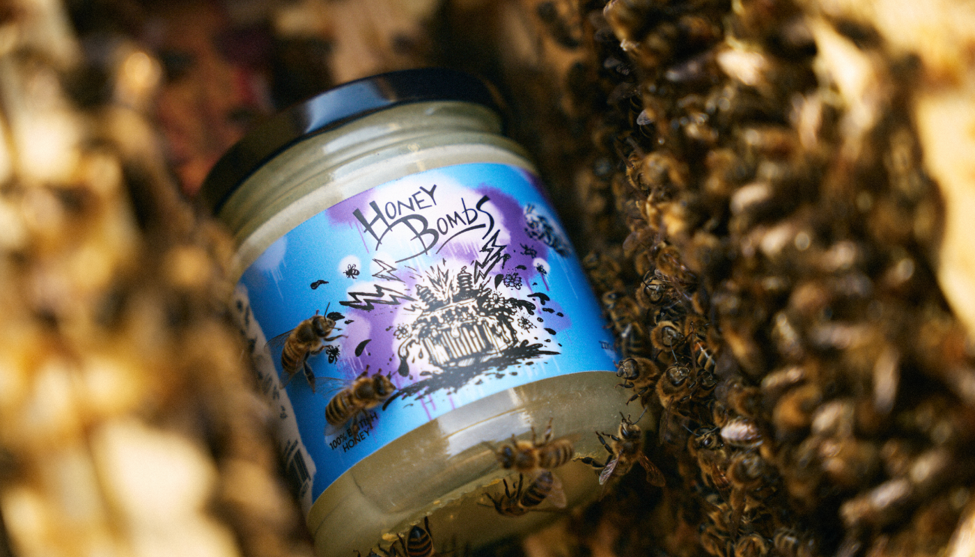
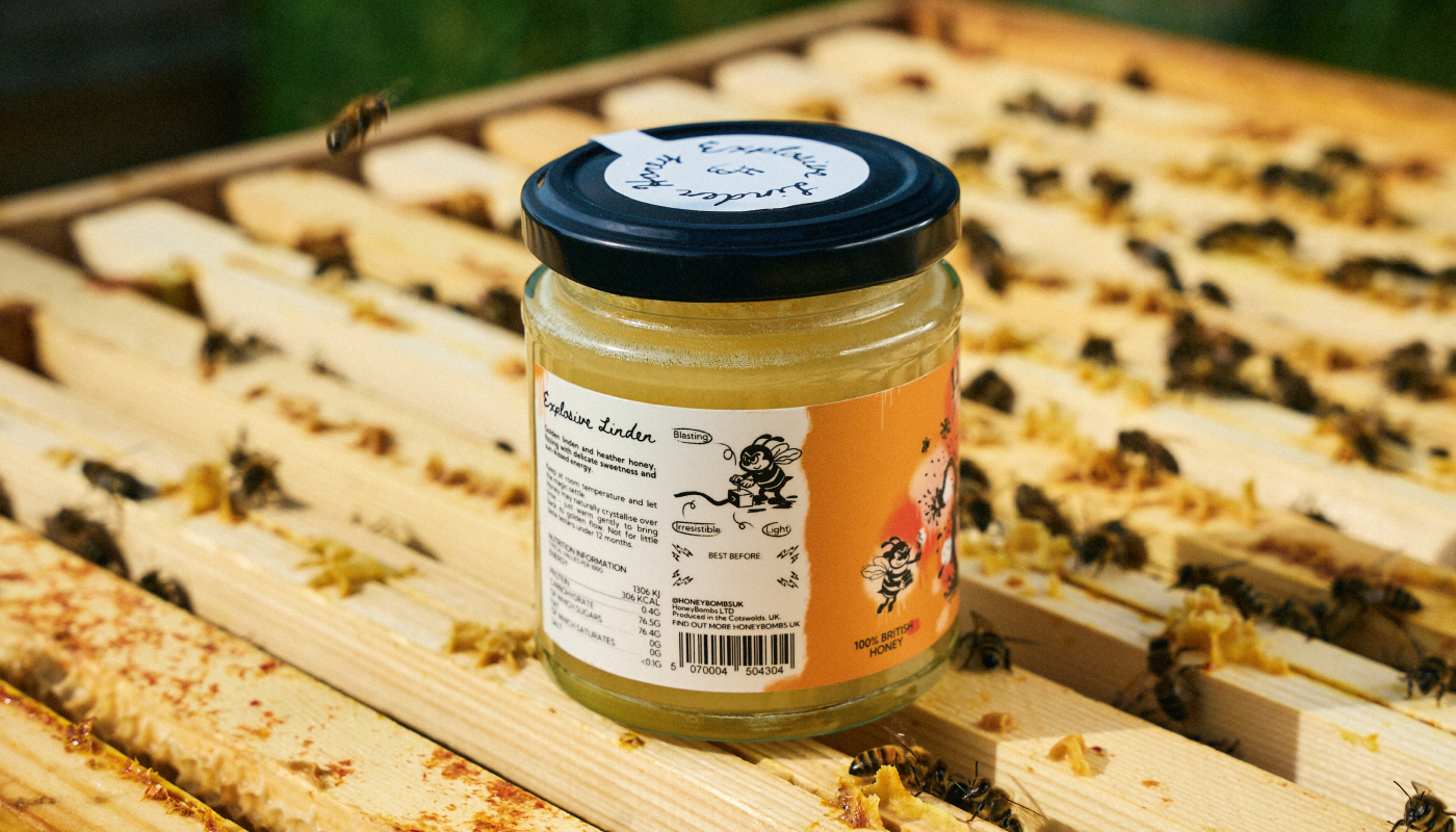
Hand-drawn bees sit at the heart of the visual identity. Playful, restless, and slightly mischievous, they turn familiar symbols of honey into characters with a story to tell. Bursts, lightning bolts, and energetic marks extend their movement across the labels, echoing the HoneyBombs name. A custom hand-lettered logo carries the same spontaneous rhythm.
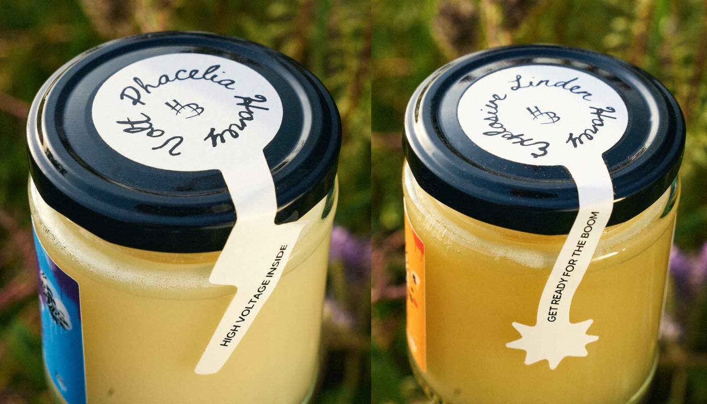
The attention to character continues into the functional details. Custom tamper-evident seals run from the lid down the side of each jar: a lightning bolt for Volt Phacelia and a lit bomb fuse with a spark for Explosive Linden. Each seal extends the personality of its variety, making first-opening protection part of the brand’s visual language.
The HoneyBombs Duo Box concept brings both varieties together in a single gift set. Its contrasting colours and expressive cut-out window carry the energy of the labels onto the outer packaging, revealing the jars through a shape inspired by an explosion.
Graphic Designer: Valentyna Hradova
 Derrick Lin
 VincoStudio
 lisakaplina
 CreativeWise
 alchimistestudioParis
 Adriana Adamo
 tauqueer
 MAISON D'IDÉE Prague
 Pixels Studio
 Atchayaa
 DESIGN CONCEPTS
 hello ocean
 monther al omari
 the Labelmaker
 alamgirbrands
 kat bres
 Vantablack Studio
 GruppoSaida
 studiorevv
 grafisercreative
 Kate Reichel
 UPRISE