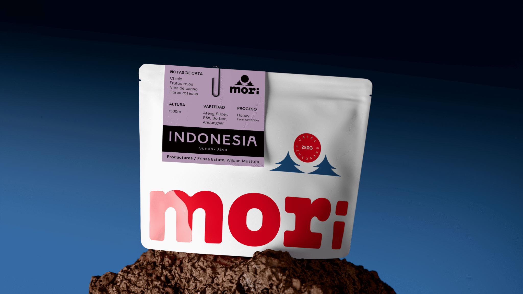

Mori is an established coffee brand based in Santiago de Compostela, Spain. The project involved a complete rebranding of the brand and its entire packaging system, with the aim of refreshing its image, strengthening its personality, and creating a more distinctive and recognizable visual identity.
The story of Hacienda Mori, where the coffee originates and whose heritage is Japanese, became the starting point for the new visual universe. The symbol is inspired by the meaning of Mori (“forest” in Japanese) and merges it with the rising sun, creating a simple and memorable icon directly connected to the brand’s history.
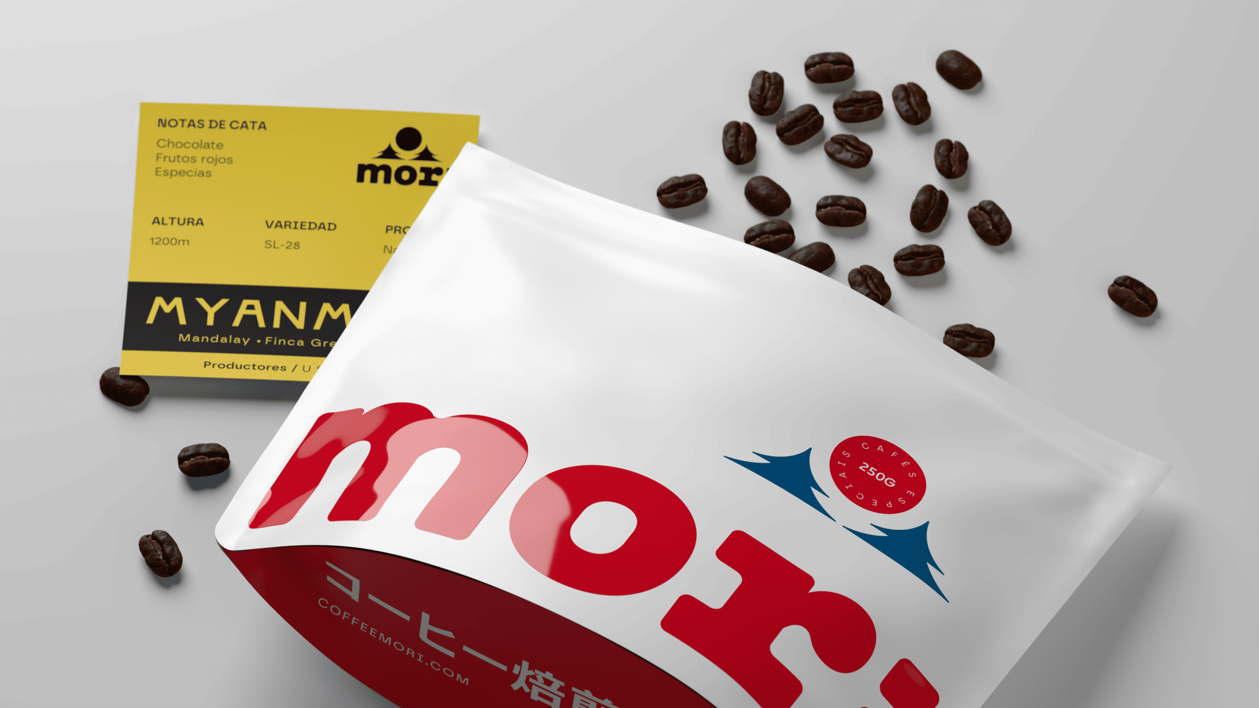
From this concept, the packaging develops a clean, geometric and direct aesthetic inspired by Japanese graphic sensibility. The coffee plant is also reinterpreted through single-color graphic forms, creating a distinctive visual language that moves away from the more predictable codes of specialty coffee.
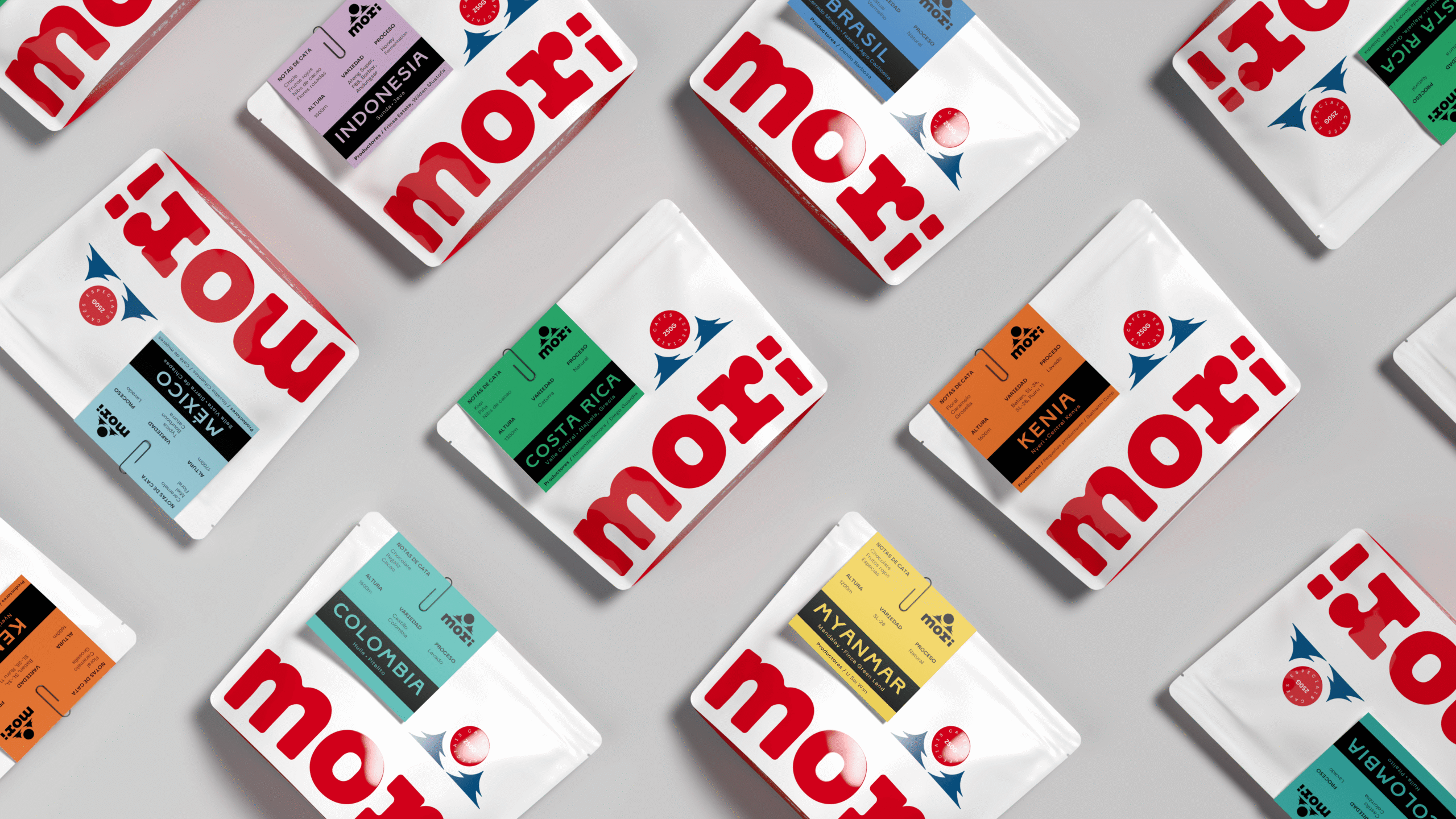
Each coffee origin is differentiated through a colored card that works as both a visual and informational device, bringing together the key details of each coffee while creating a flexible system that can expand with new varieties without losing consistency.
The result is a new identity that preserves the essence of Mori while transforming it into a more contemporary, recognizable brand, ready for its next chapter.
CREDITS:
Creative Direction and Design: Alvaro García
Visuals: Miquel Nadal
Curator’s Insight
A single-origin range has a familiar tension: every bag needs its own identity, but the shelf still has to read as one brand. Mori settles this by locking the pouch and moving all variation onto one clipped card. The white bag, red wordmark and navy accents never change, so the colored card is the only thing the eye has to sort. The fixed black band keeps the origin name legible whatever the hue, from lilac to yellow. The paperclip makes the card feel like a tag attached to the bag, which suggests it can be swapped. The other panel is where the illustration takes over, so the front stays loud and the reverse becomes a poster. When a range keeps growing, keep the container constant and let one detachable-feeling element carry the variation.





 Wynand88
 Eva Chistyakova
 Maria Bukhtilova
 estudiomarciano
 monther al omari
 Thirst
 Maruf Nishat
 Gray Matter Studio
 Julia Jay
 Modern Theory
 Furt Goods
 Fluid
Fluid alchimistestudioParis
 Ancora
 Mostafa Abdelmawla
 MewKittyDraw
 Studio Shala
 43oz
43oz Lucid mk2
 Atiq Alam
 IDEOLOGO
 Open Strategy & Design
 cem kutlu