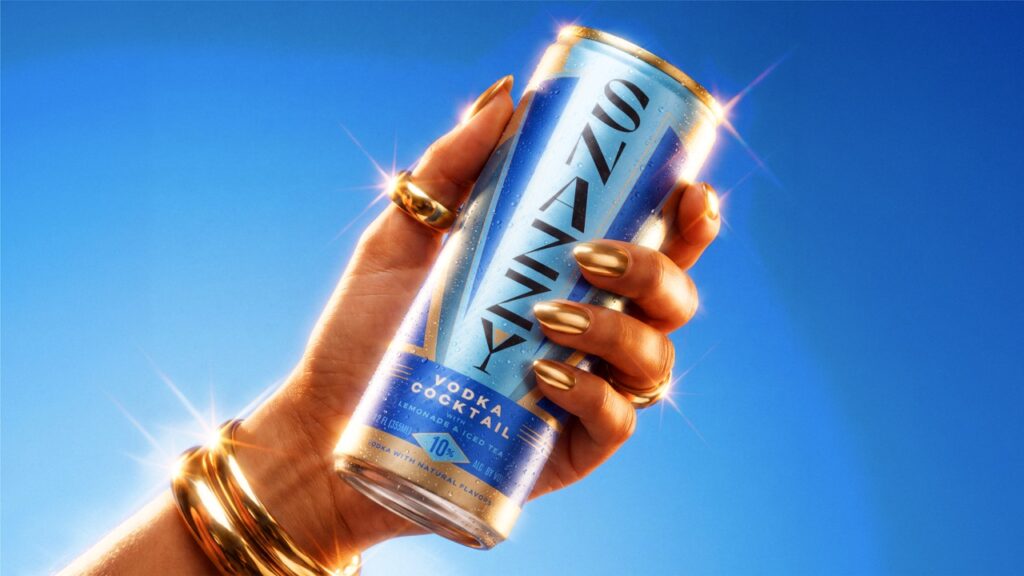

Thirst gives award-winning canned cocktail Snazzy an identity to match
Independent brand design and innovation studio Thirst reimagines the San Francisco RTD brand with a new identity built around ‘Dazzling Decadence’, designed to match its award-winning liquid and support its next stage of growth.
Inspired by the classic American Arnold Palmer, Snazzy takes the familiar combination of iced tea and lemonade and brings spirits into the mix, with whiskey, vodka, tequila and rum expressions.
Founded by David Peterson, the idea has its roots in Peterson’s childhood summers in Napa, where he would make lemonade from lemons picked in his grandmother’s garden. Years later, after developing a love for half iced tea and half lemonade, he began experimenting with adding different spirits to the drink. That personal recipe eventually became the starting point for Snazzy.
The liquid was already earning attention. Snazzy has been recognised by the San Francisco Ready-to-Drink Competition, SIP Awards and RTD Magazine, with honours including Best of Class, Double Gold and Editor’s Choice. Its Whiskey Half & Half Cocktail was also named Best Whisk(e)y-Based RTD at the 2025 Top Shelf Awards.
The challenge was to create an identity that could match the quality of the product and give a young, ambitious brand greater presence in a crowded RTD market.
Working closely with Peterson, Thirst rebuilt the identity around a clearer, more confident idea, giving Snazzy greater shelf presence and a system designed to support the brand as it grows.
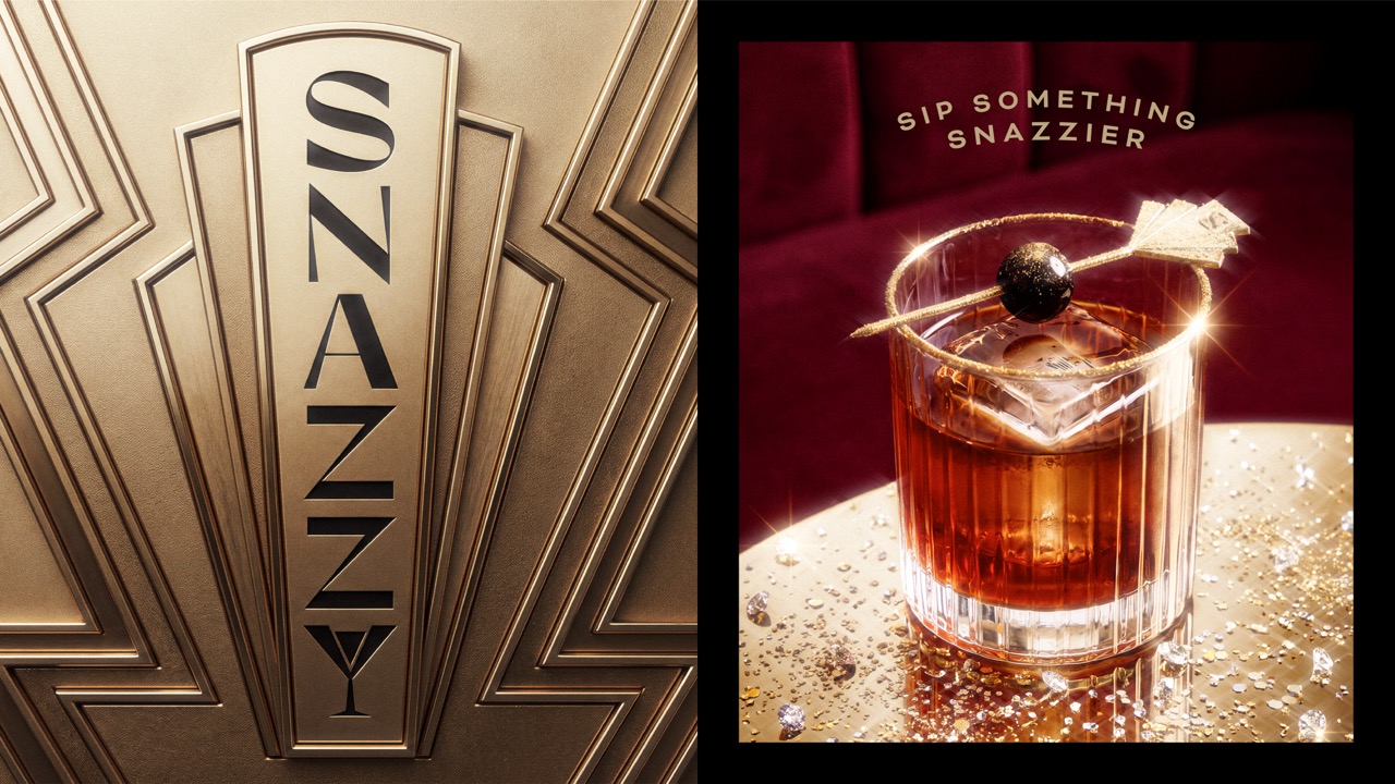
At the heart of the new identity is Dazzling Decadence, a creative idea inspired by a modern Gatsby world. Drawing on the glamour, celebration and indulgence of the Roaring Twenties, Thirst created a visual language that embraces theatre and excess without taking itself too seriously.
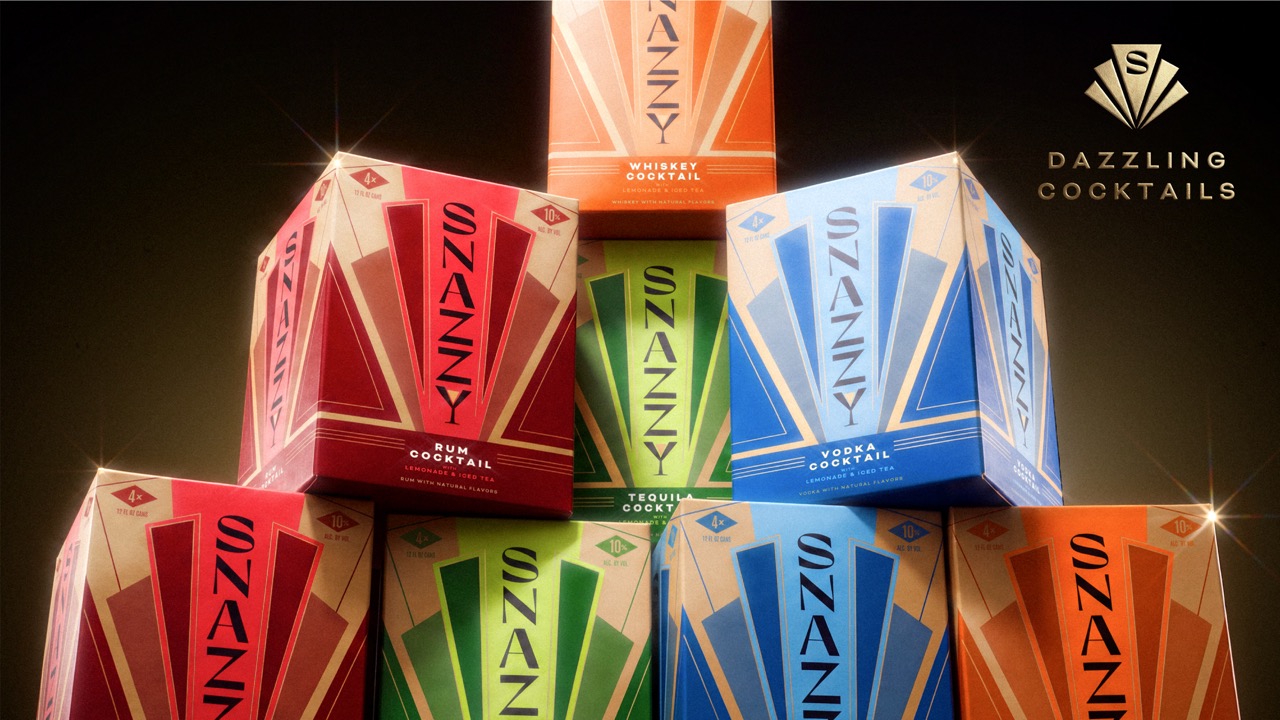
Art Deco-inspired geometry gives the identity its structure, while expressive typography, gold in abundance and bright colour bring the decadence to life. A new Snazzy wordmark sits at the centre of the system, giving the brand a confident signature across the range.
Across the packaging, colour helps signal the different spirit bases while keeping the range cohesive on shelf. Each expression has its own character, but the system holds whiskey, vodka, tequila and rum together as one family and gives Snazzy room to expand as the business grows.
The result marks a major departure from Snazzy’s previous packaging. The liquid was already working hard for the brand; the new identity now works just as hard, bringing the quality of the product, the personality of Snazzy and the ambition of the business into the same world.
David Peterson, Founder and CEO of Snazzy, said:
“Over the last year, the response to the liquid has given us real confidence in what we’ve created. People love the product and the choice of whiskey, vodka, tequila or rum, but we knew the identity needed to do a better job of communicating the quality and personality of Snazzy. Working with Thirst gave us the chance to build a brand that feels much closer to our ambition for the business and where we want to take it next.”
Glenn Thorpe, Design Director at Thirst, said:
“We wanted Snazzy to feel like a modern Gatsby: full of Roaring Twenties decadence and theatre, but never too serious. Art Deco gave us a strong visual world to build from, and our creative idea, ‘Dazzling Decadence’, gave it the Snazzy spin. Gold in abundance and bright colour help the brand stand out while keeping the range feeling cohesive. It gives Snazzy more presence and personality, while keeping the fun at the heart of the brand.”
The new identity gives Snazzy a brand built to match the quality of its cocktails and the ambition of the business behind them.

 Derrick Lin
 Biaa
Biaa Petitmoulin Studio
 White Bear Studio
 Eva Chistyakova
 monther al omari
 Atipus
 alchimistestudioParis
 oneandother
 bloomburo
 helocrene
 Shapers Studio
 Denver Design
 Aidearte
 andrew.huerta
 softmachine
 airobtq
 Buzz & Co.
 Ruby
Ruby themythographer
 IDNB Inc.
 viktorflr
 Zenpack