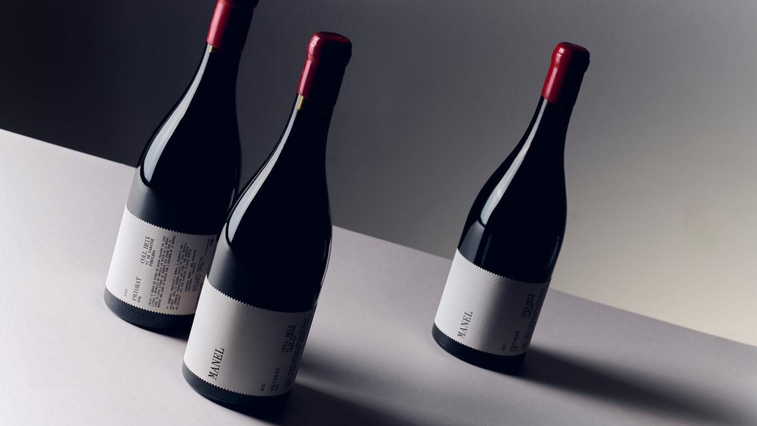

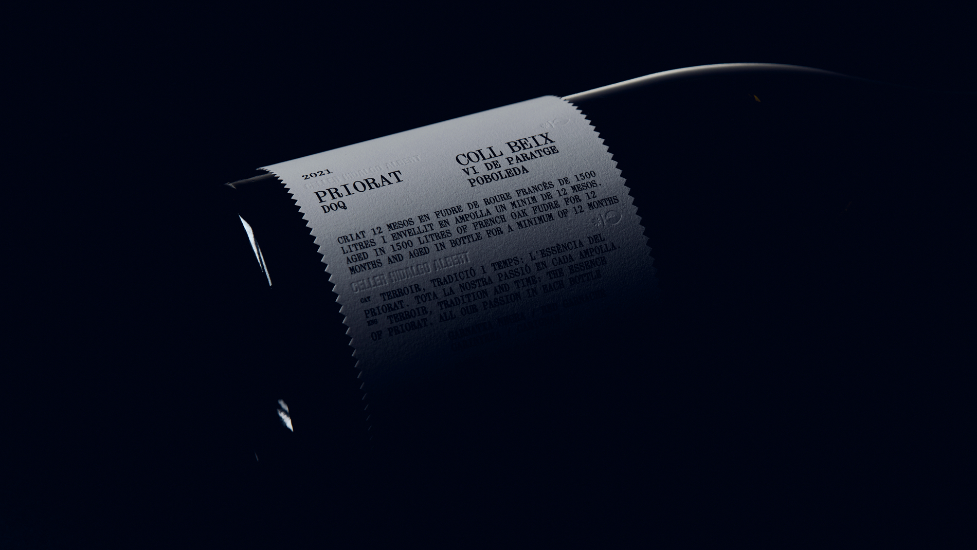
A new label for Manel, building on the graphic foundations that have defined Celler Hidalgo Albert from the beginning.
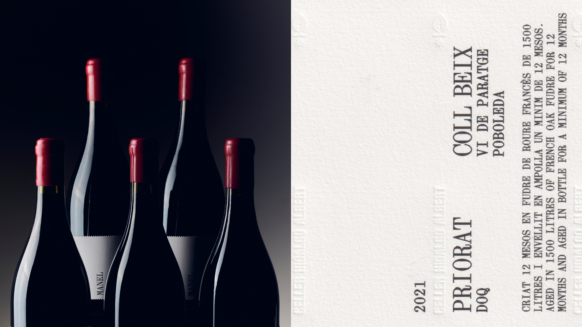
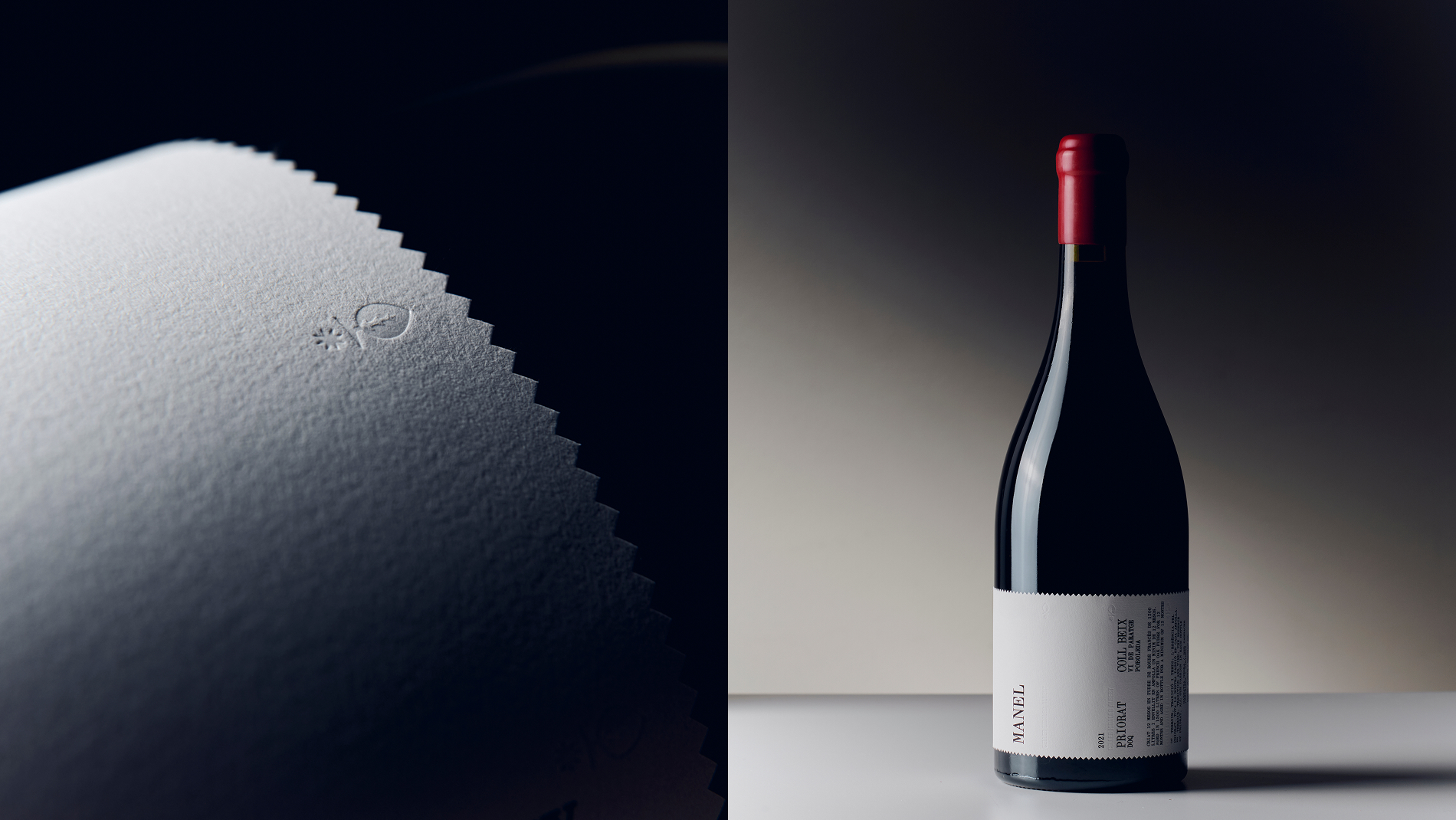
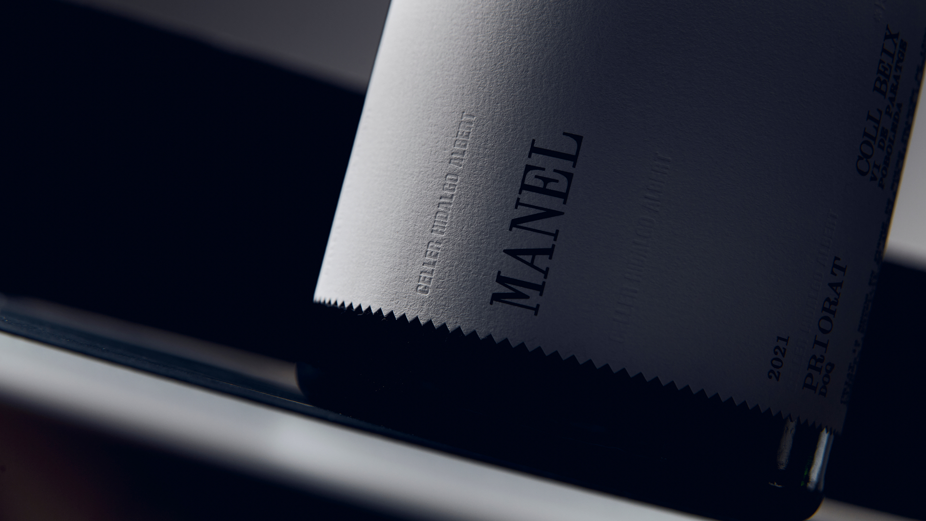
We took their original visual language as our starting point, keeping its essence while giving it a more contemporary expression. The winery’s symbol acts as a link to its origins, while typography, nomenclature and a stripped-back composition give the wine a distinctive presence.
Photography: Marc G. Camps
 Derrick Lin
 Biaa
Biaa Petitmoulin Studio
 White Bear Studio
 Eva Chistyakova
 monther al omari
 alchimistestudioParis
 oneandother
 bloomburo
 helocrene
 Shapers Studio
 Denver Design
 Aidearte
 andrew.huerta
 softmachine
 airobtq
 Buzz & Co.
 Ruby
Ruby themythographer
 IDNB Inc.
 viktorflr
 Zenpack
 Wessam Hussien