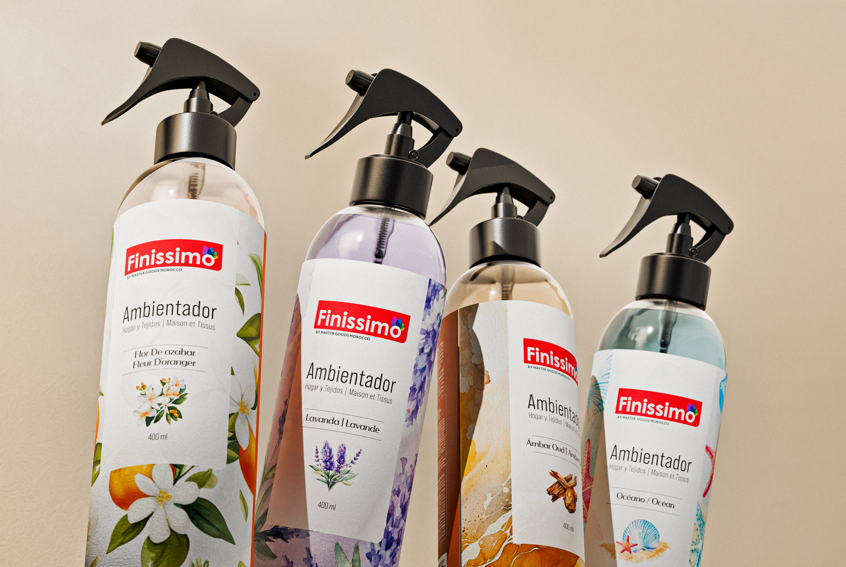

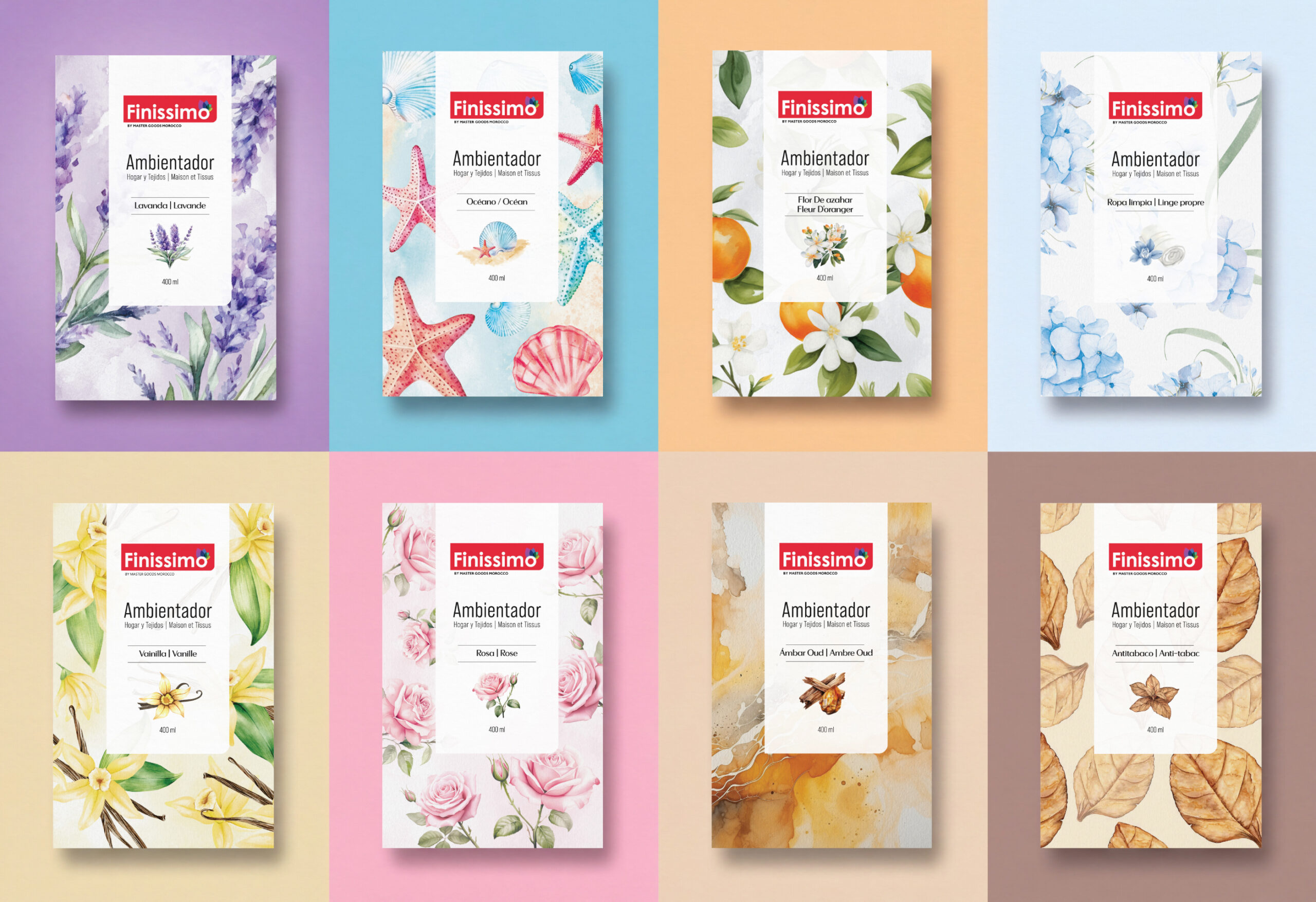
Finissimo Home Fragrance is a collection of eight room and fabric sprays. The design challenge was to make each fragrance easy to distinguish without losing the sense of one range. Brandegree’s work centred on packaging design, label architecture and illustration: a repeatable framework that could hold eight individual visual worlds.
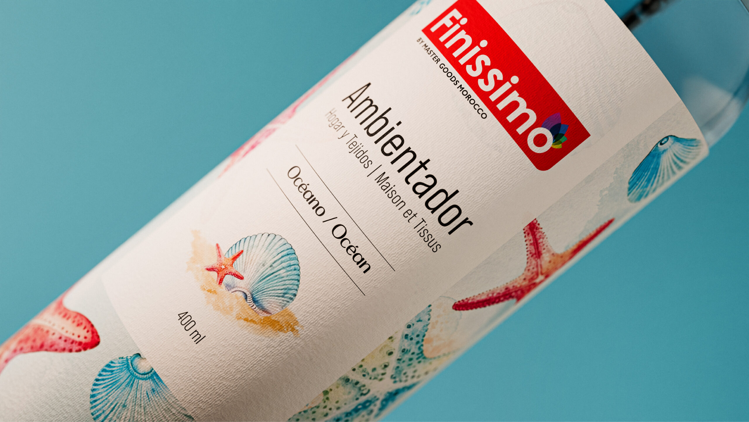
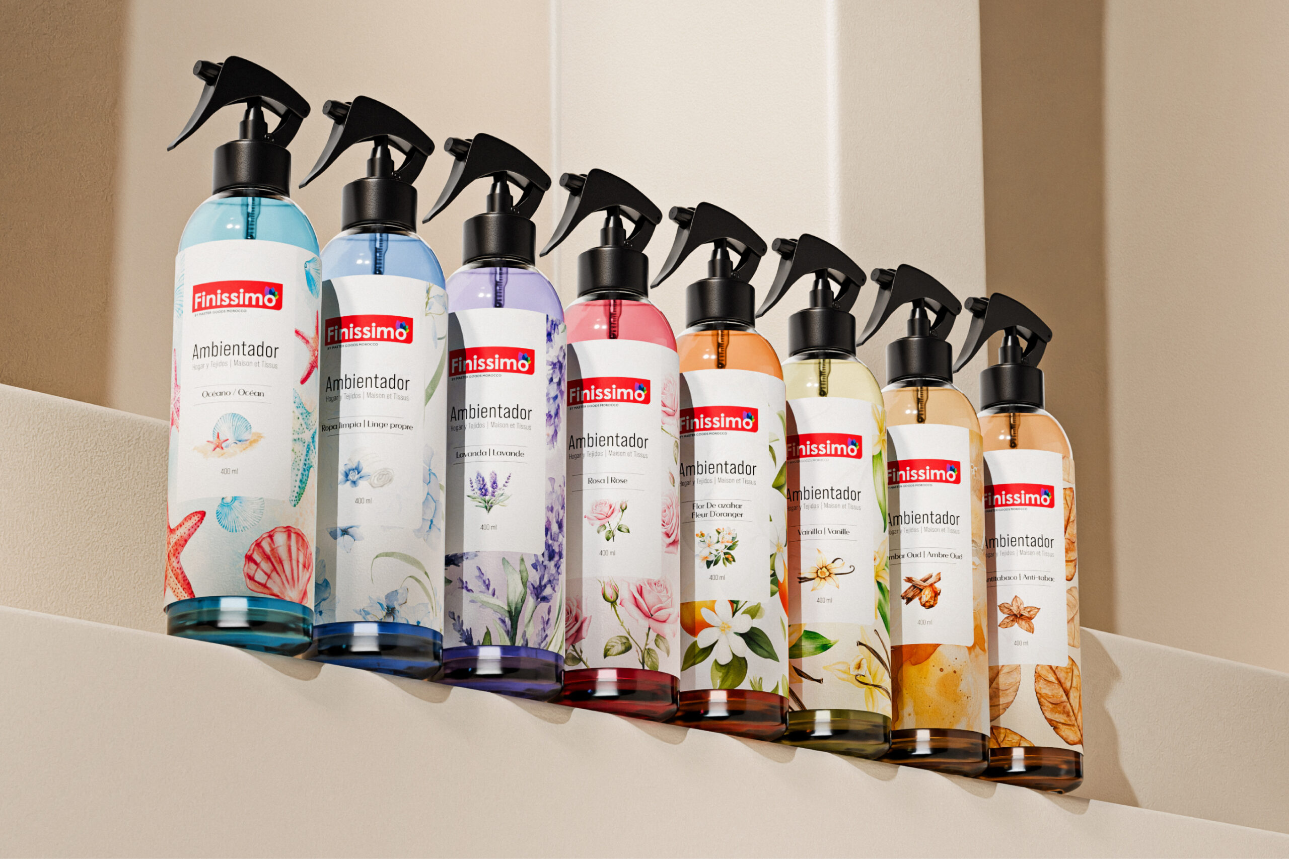
The front labels share a clear structure. Finissimo remains the constant brand cue, while the product descriptor and fragrance name sit in an organised hierarchy. This consistent reading order helps the collection work as a group; the illustrations, colours and surface patterns then carry the personality of each scent. Rather than giving every reference a separate identity, the system creates variation within a recognisable family.
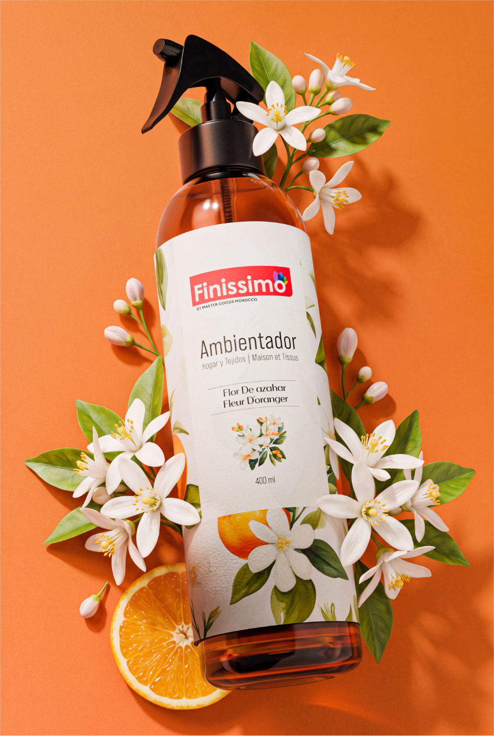
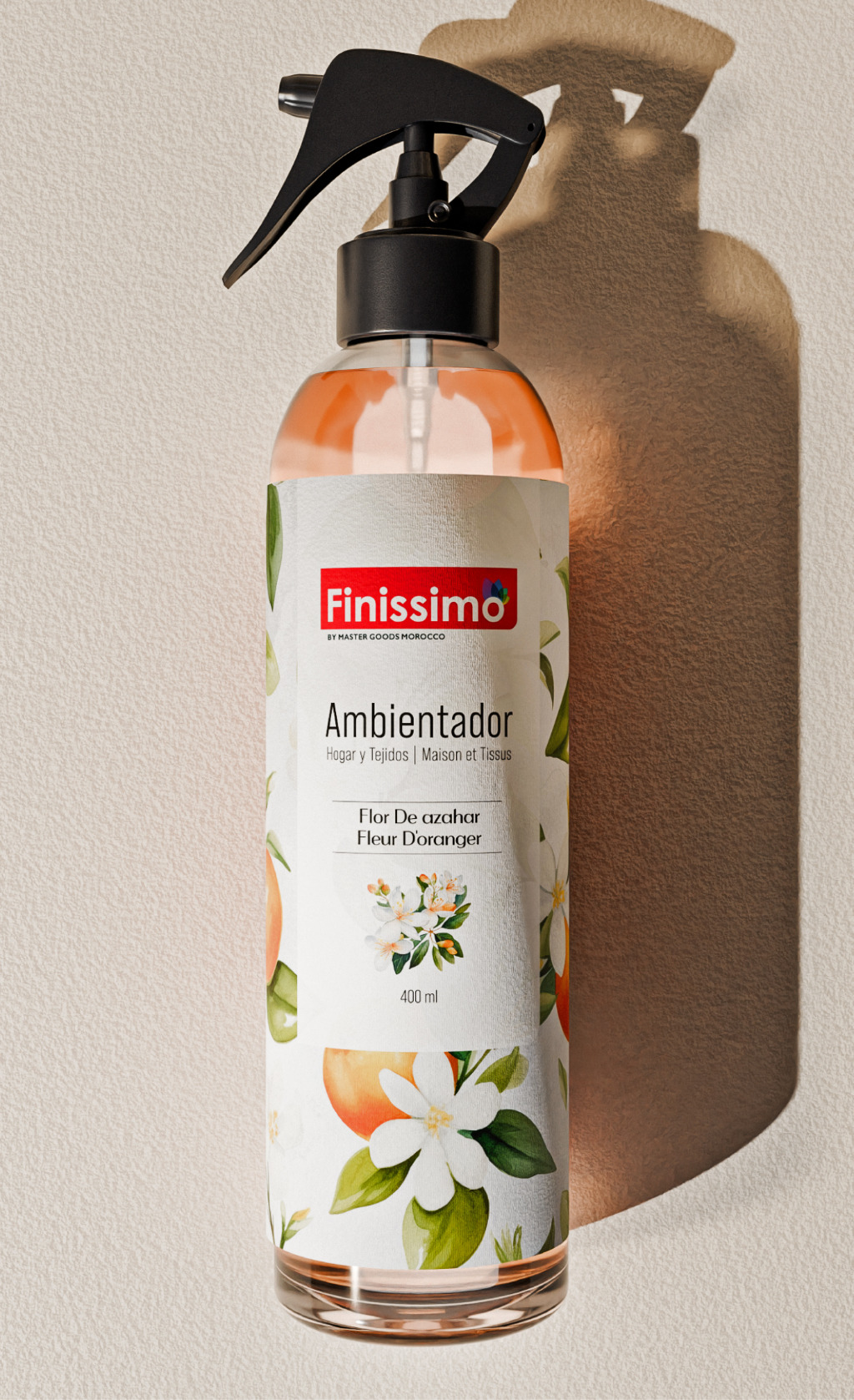
The range demonstrates this principle across contrasting atmospheres. Orange Blossom uses citrus and white floral imagery; Ocean draws on shells and marine forms. Lavender, Vanilla and Amber Oud use different palettes and illustrations to signal their place in the collection. These visual cues are more than backgrounds. They give each label a point of recognition at a glance and make the range legible when several bottles are shown together.
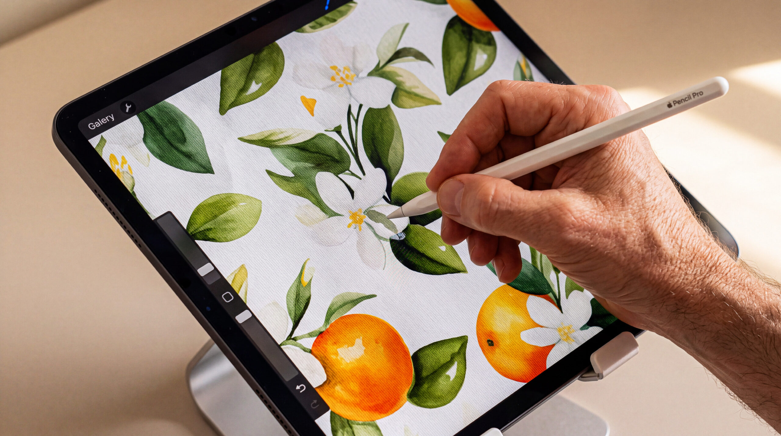
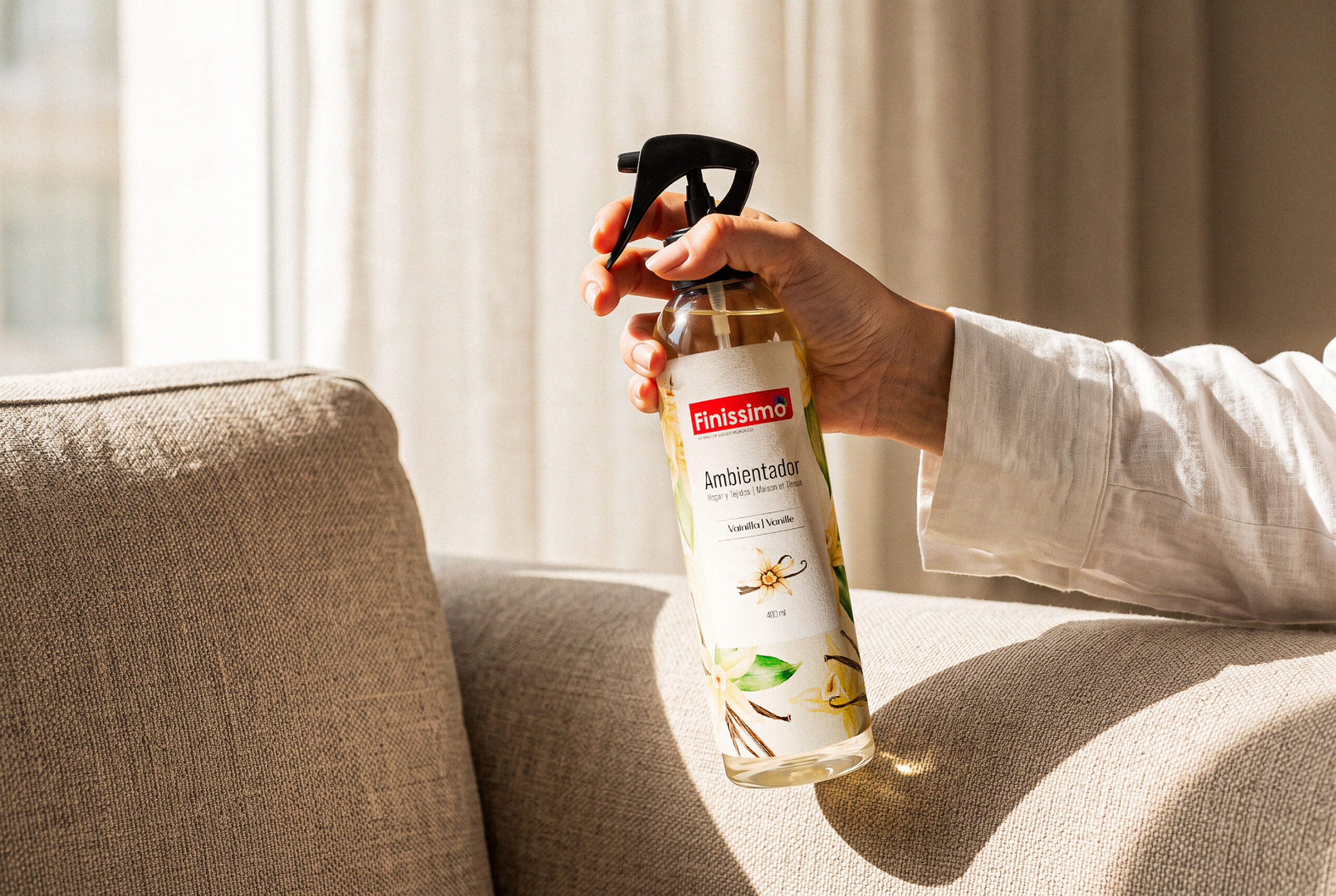
The project also considers how the design behaves beyond a single front-facing view. The submitted images show Orange Blossom from the front and back, close-ups of the Ocean label, the eight-label system, and bottles shown together or in domestic settings. An illustration-process image shows how the artwork is developed before it is applied to the packaging. The same graphic structure remains visible as the scale shifts from a tight label detail to a full line-up. Colour and texture bring variety, while the type and placement keep the information grounded.
This balance matters for a multi-scent product. A customer should be able to recognise Finissimo first, then find the fragrance that suits them. The packaging system gives those two tasks a shared visual language instead of making them compete. It creates room for expressive scent-specific imagery without weakening the family resemblance.
The outcome is a coherent label and illustration system for eight home-fragrance sprays. Seen together, the bottles reveal a single visual grammar; seen individually, each fragrance retains its own colour and character.

 VERONIKA KISELEVA
 al margen
 Jasgul
 Abhijith Madhu
 mariee
 Modern Theory
 Tancybox
 WINK®DESIGN
 impprintz
 Chainhouse
 rufydesign
 White Candy Design
 Just Design
 alchimistestudioParis
 bmd group
 Laurie Offer
 medok4r
 Nouna design
 CreativeWise
 ANNA ONISHCHENKO
 Denomination
 VANESA GARCÍA ESTUDIO
 Julia Persuk