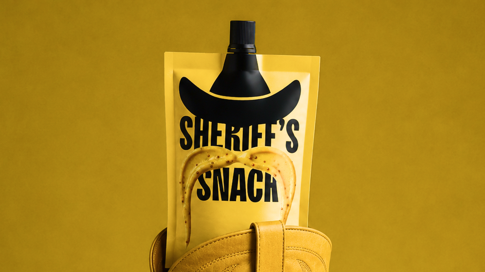

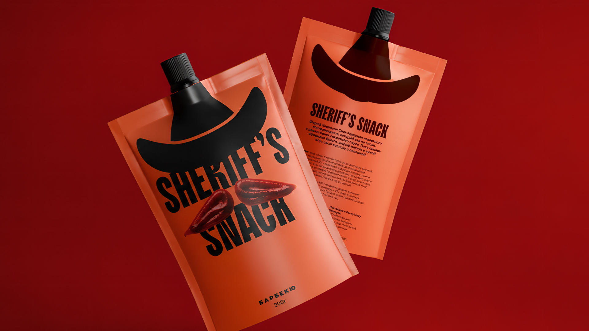
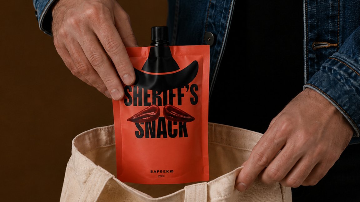
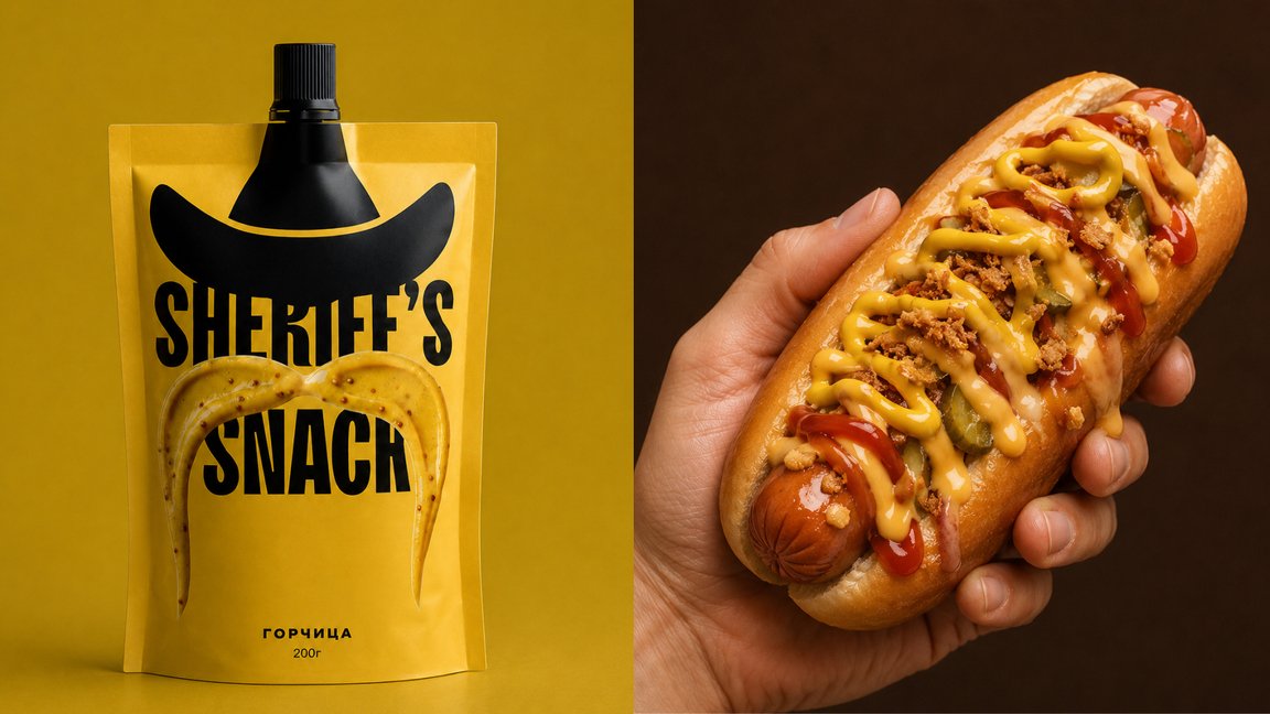
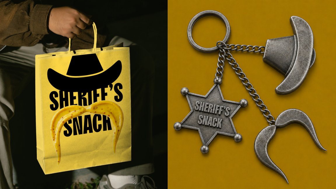
Sheriff’s Snack a classic line of sauces, where the image of the sheriff symbolizes the traditions of true great taste, combining quality, integrity, and a recognizable classic in every bottle.
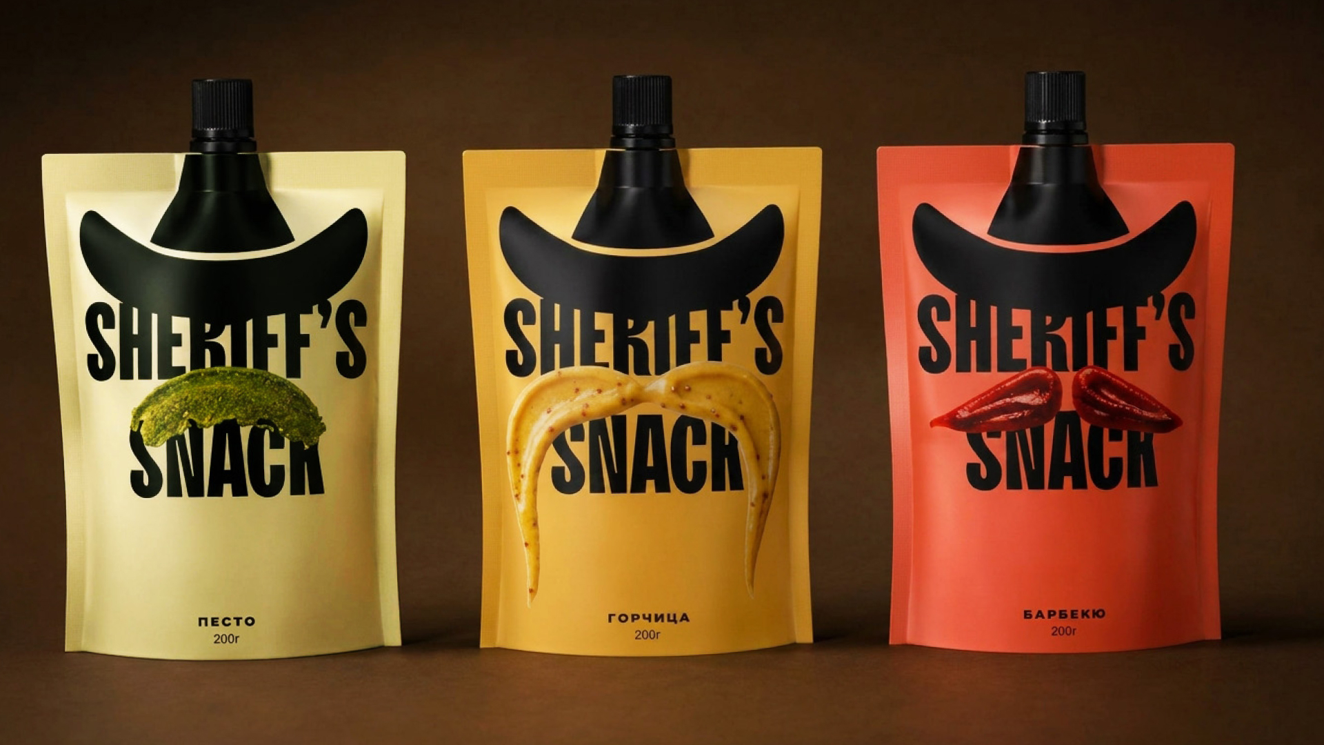
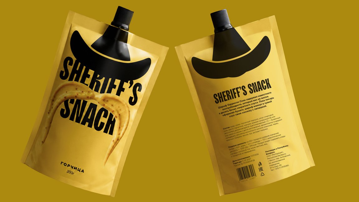
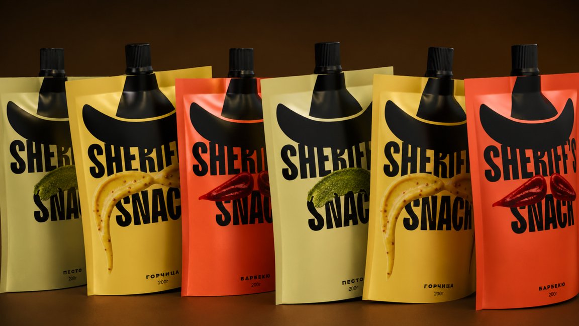
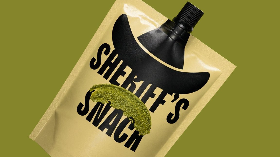
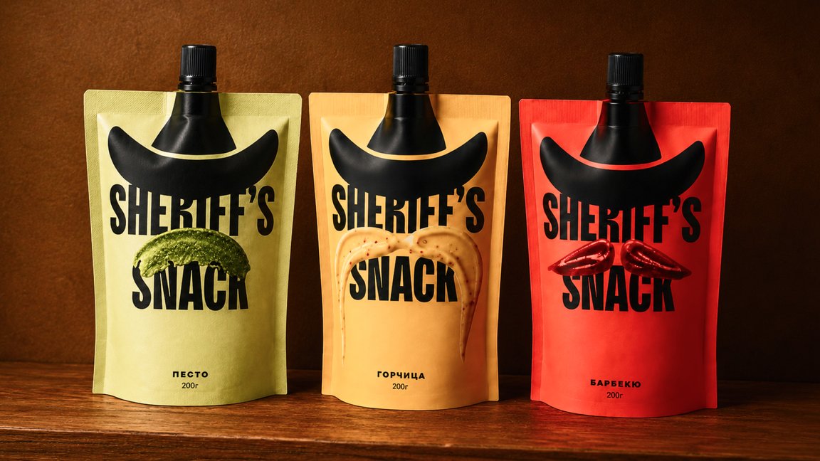
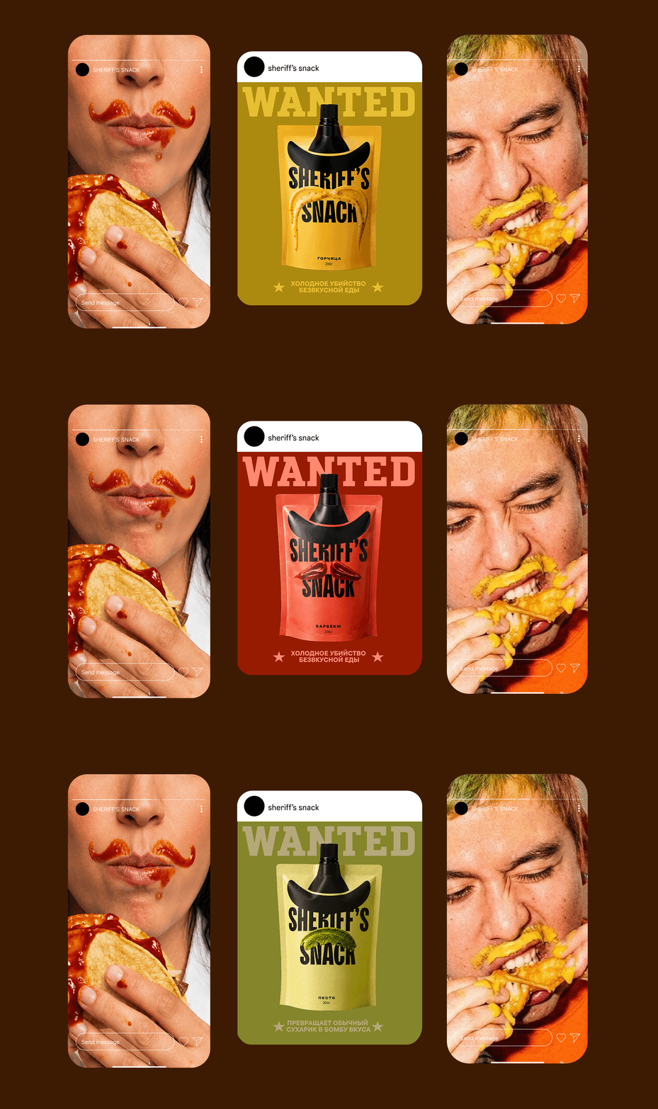
The “Sheriff’s mustache” becomes the brand’s main visual anchor. It’s more than just an image element, it’s a tool for communicating flavor. The mustache functions as a code: its shape, curve, and character directly convey the sauce’s character. A classic, neat mustache conveys a restrained, time-tested flavor. A dashing, curled one conveys bold, rich, and peppery flavor. A thick, wide one conveys substantial, smoky, and meaty flavor. The consumer doesn’t need to read the description: they sense the flavor at a glance, just by looking at the silhouette.
Thus, the brand speaks a language understood without words—the language of form and character. The Sheriff doesn’t decorate the packaging; he directs it: he maintains the order of flavors, sets the standard of quality, and remains recognizable in every bottle of the classic line.
 VERONIKA KISELEVA
 al margen
 Jasgul
 Abhijith Madhu
 mariee
 Modern Theory
 Tancybox
 WINK®DESIGN
 impprintz
 Chainhouse
 rufydesign
 White Candy Design
 Just Design
 alchimistestudioParis
 bmd group
 Laurie Offer
 medok4r
 Nouna design
 CreativeWise
 ANNA ONISHCHENKO
 Denomination
 VANESA GARCÍA ESTUDIO
 Julia Persuk