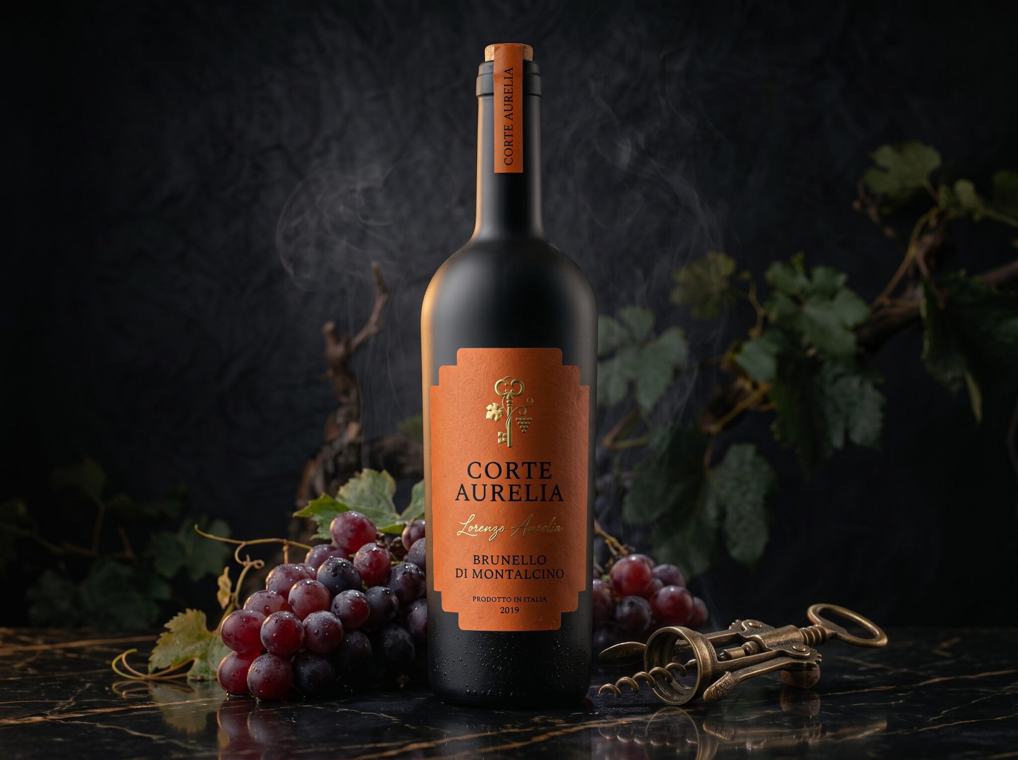

What if the most precious things in life were never meant to be discovered, but unlocked?
Some stories are written in words. Others are preserved in places, traditions, and the quiet passage of time.
CORTE AURELIA was born from the idea that true luxury is not about revealing everything. It is about leaving something to the imagination.
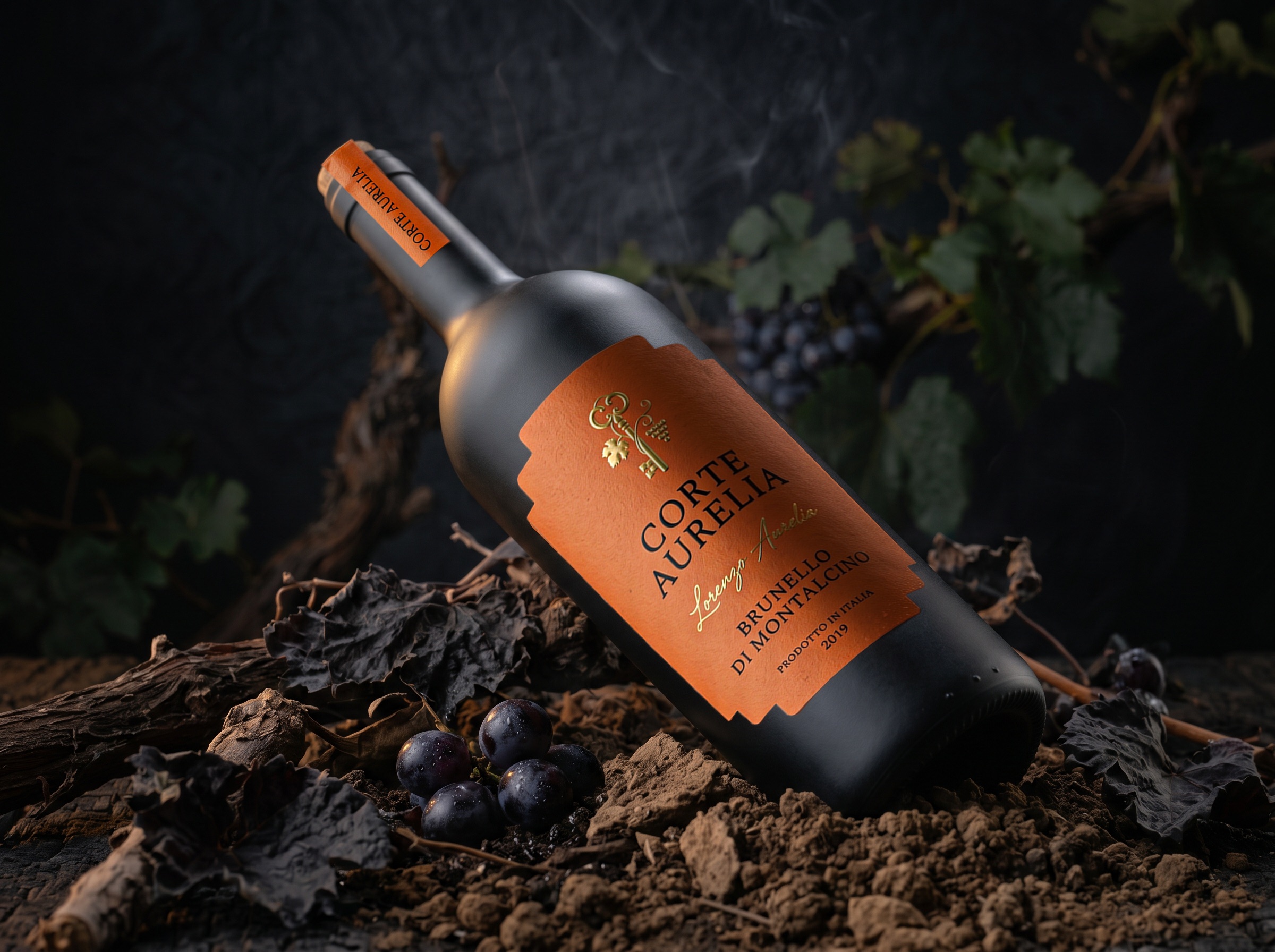
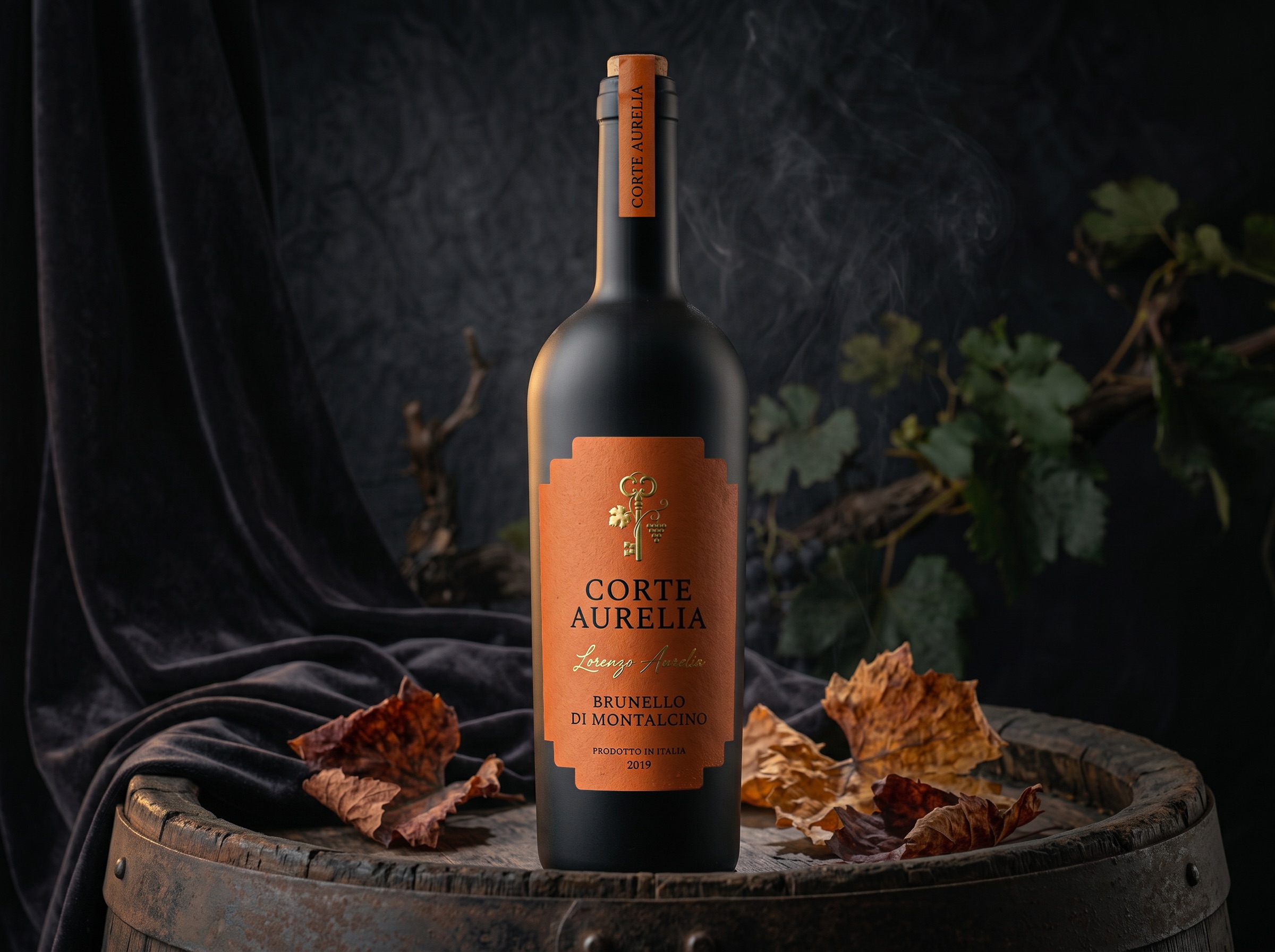
Inspired by the timeless elegance of Italian heritage, this packaging concept transforms a classic wine bottle into a visual story of mystery, craftsmanship, and exclusivity.
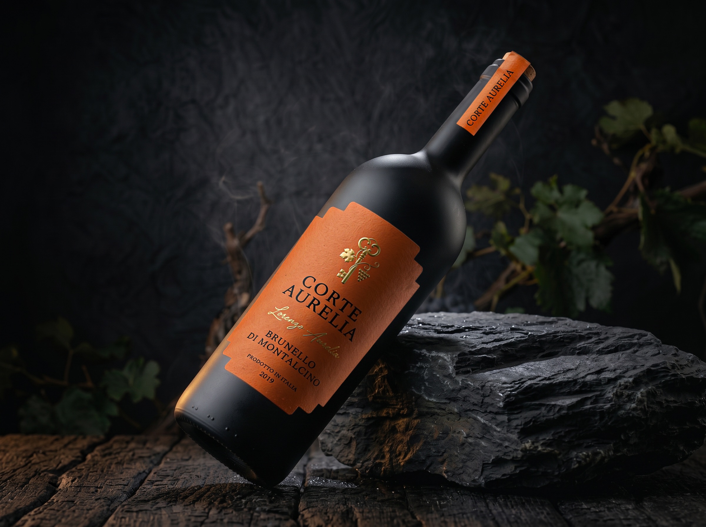
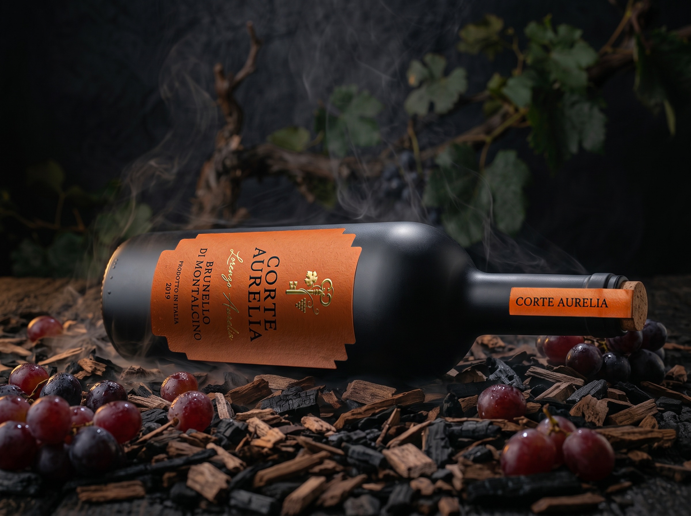
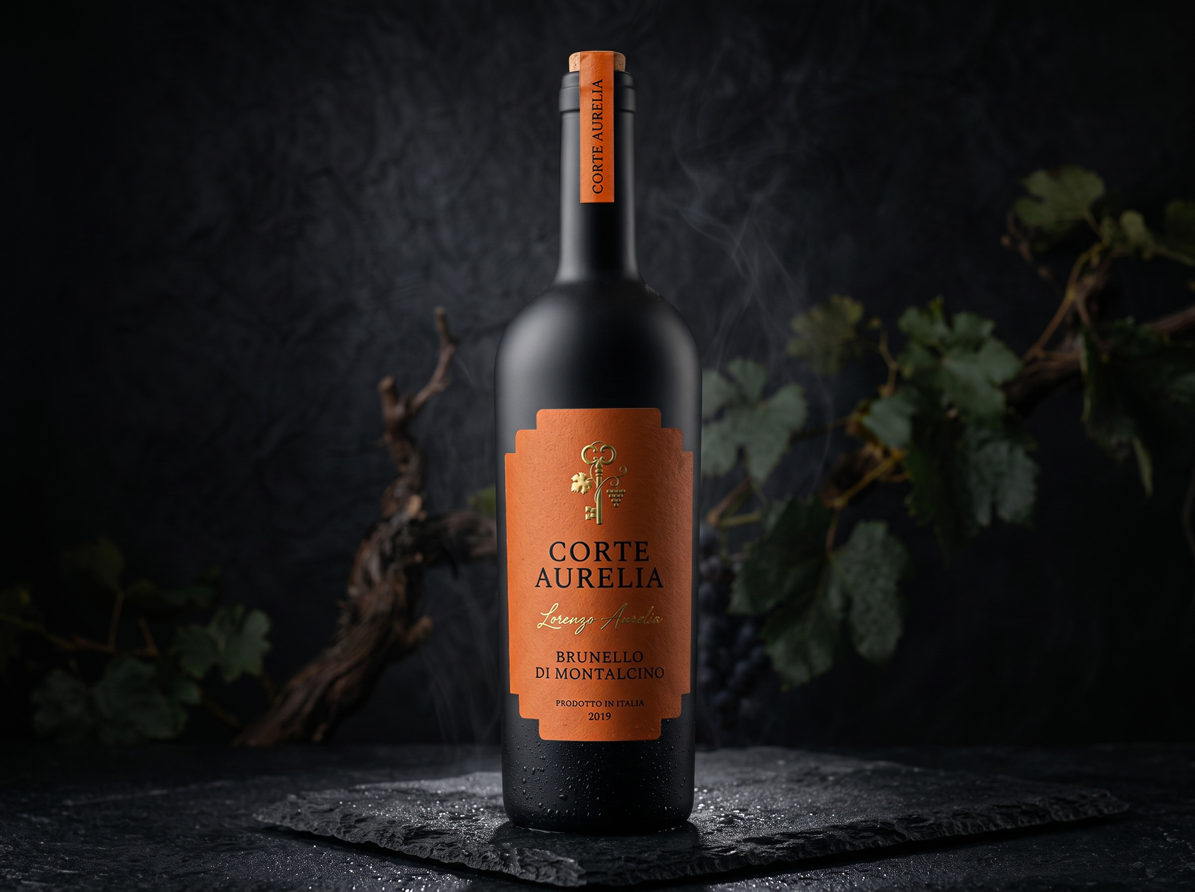
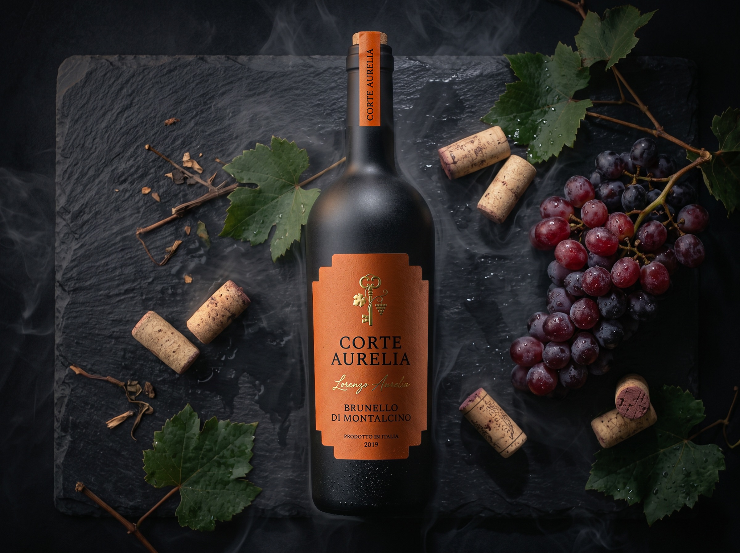
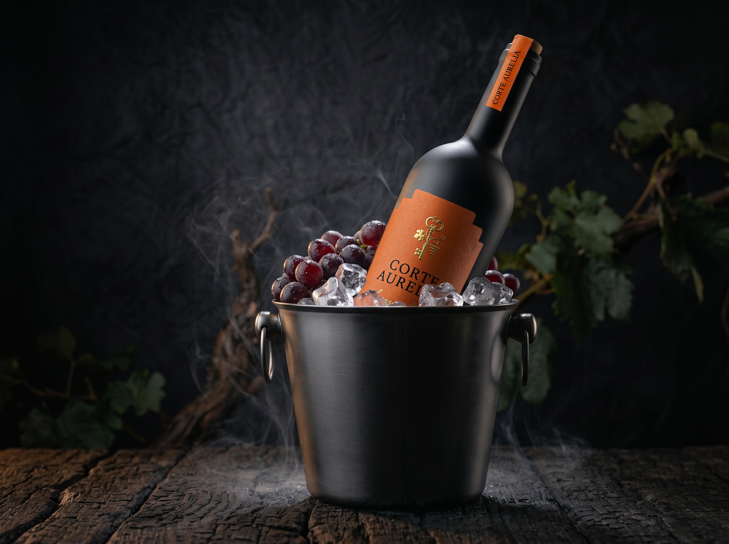
At the heart of the identity lies a golden key, an emblem of discovery and a symbol of the stories waiting behind closed doors. More than a decorative detail, it becomes the signature of the brand, inviting the viewer to imagine the heritage and character concealed within.
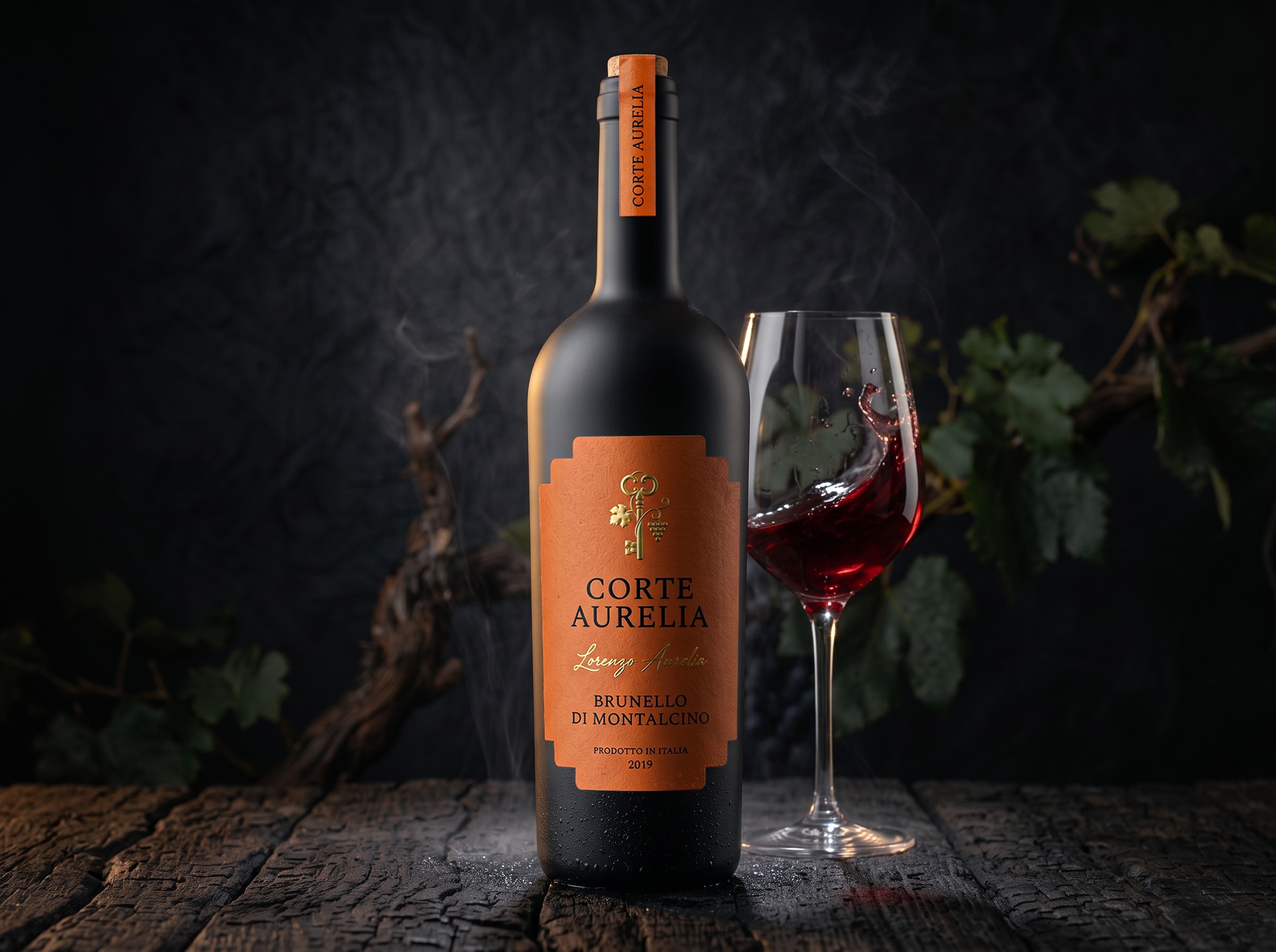
The label is dressed in a warm terracotta tone, recalling the sun-kissed architecture, aged stone, and earthy landscapes of Tuscany. Its subtly textured surface introduces an authentic, tactile quality, beautifully contrasted against the deep matte-black bottle.
Delicate gold detailing adds a restrained touch of sophistication, while the elegant serif typography and handwritten signature create a dialogue between tradition and individuality.
Every design decision was carefully considered. The architectural silhouette of the label establishes a distinctive identity without overwhelming the bottle. The vertical neck seal extends the storytelling beyond the main label, creating a visual connection from the cork to the golden emblem.
The result is a packaging identity that feels both historic and contemporary — confident in its simplicity, rich in its details, and memorable without demanding attention.
Because true elegance doesn’t need to reveal its secrets. It only needs to offer the key.
 ANONIMA/
 Armoder Arte y Diseño
 eimanbeh
 Biaa
 Hartson Creative
 Karen Danielyan
 AUN BRANDS
 Studio Zak
 Hey Joe Studio
 Blue.labs
 Jasmine Tsan
 Atiq Alam
 Modern Theory
 Tancybox
 Artrime Graphic Design
 WhiteWarblerCo
 Simple Studio
 M&A CREATIVE AGENCY
 Husain Studio
 JDO
 INTSIGN
 Agence des Coteaux
 Yaniv Vaknin