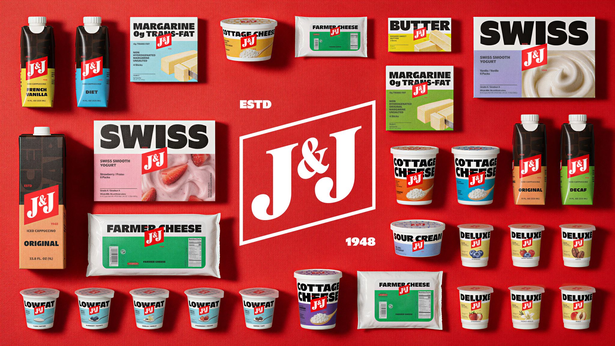

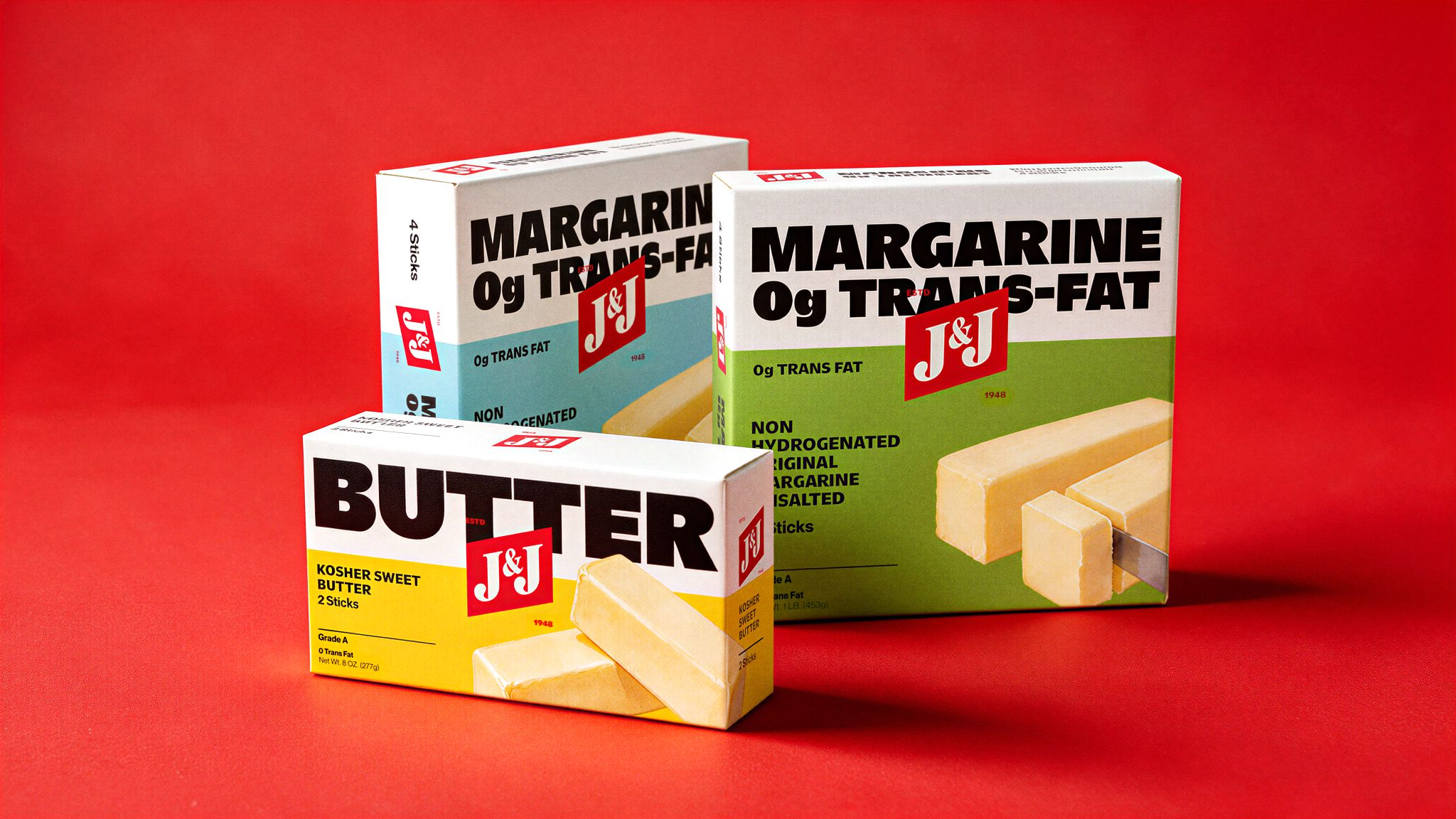
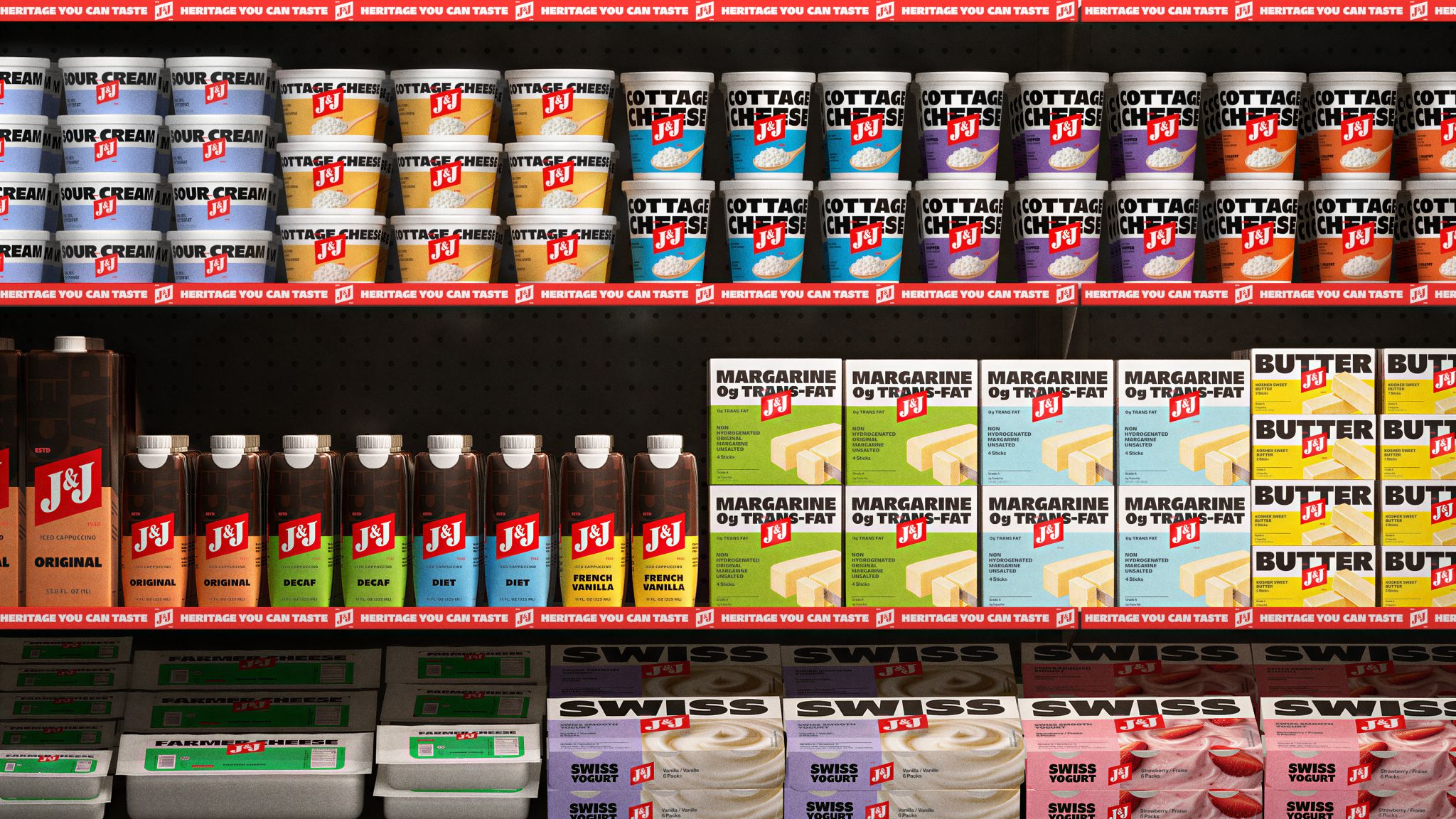
J&J Dairy came to M/OTG to reclaim its presence on the shelf. Familiar to generations of Jewish families, the kosher dairy brand needed packaging that would make it recognizable at a glance.
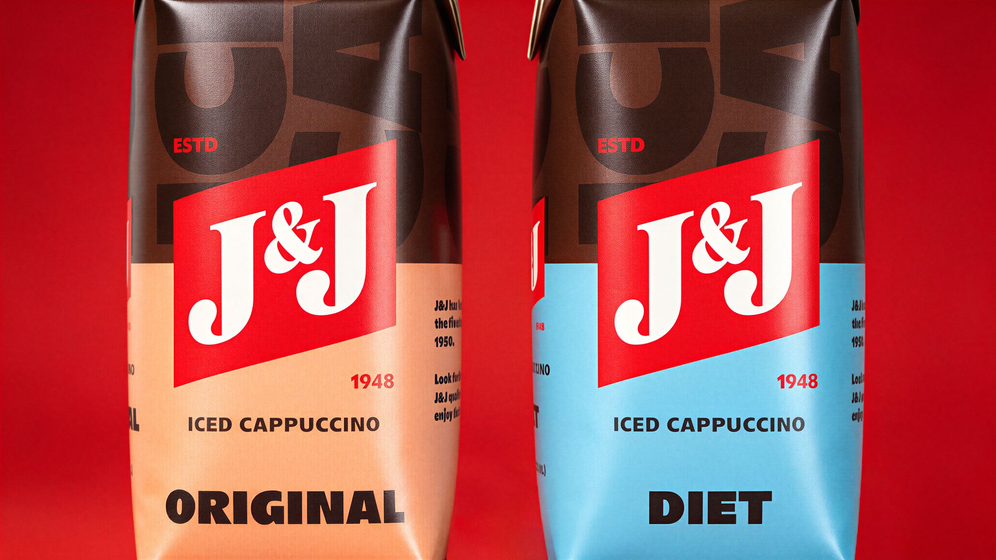
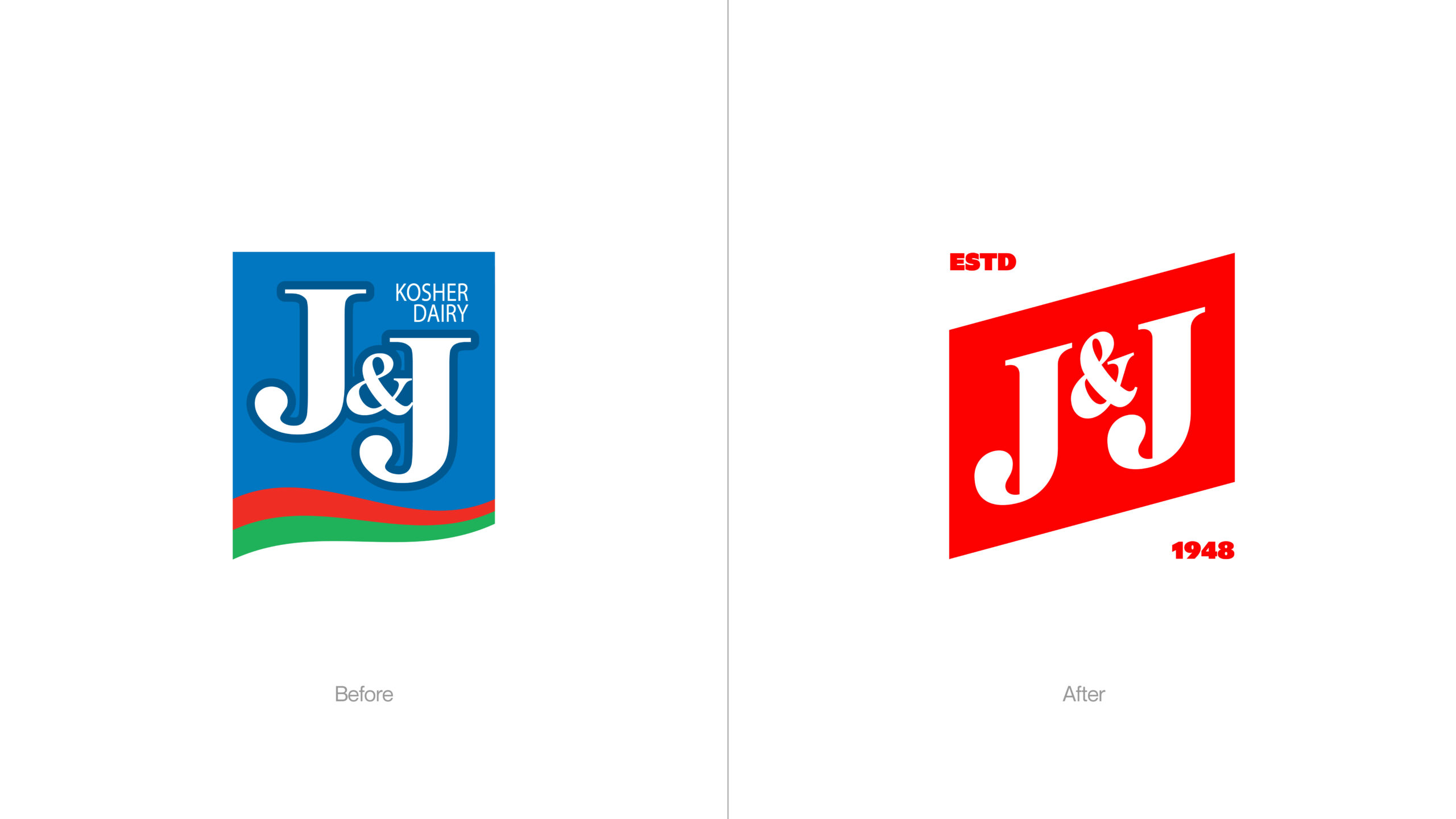
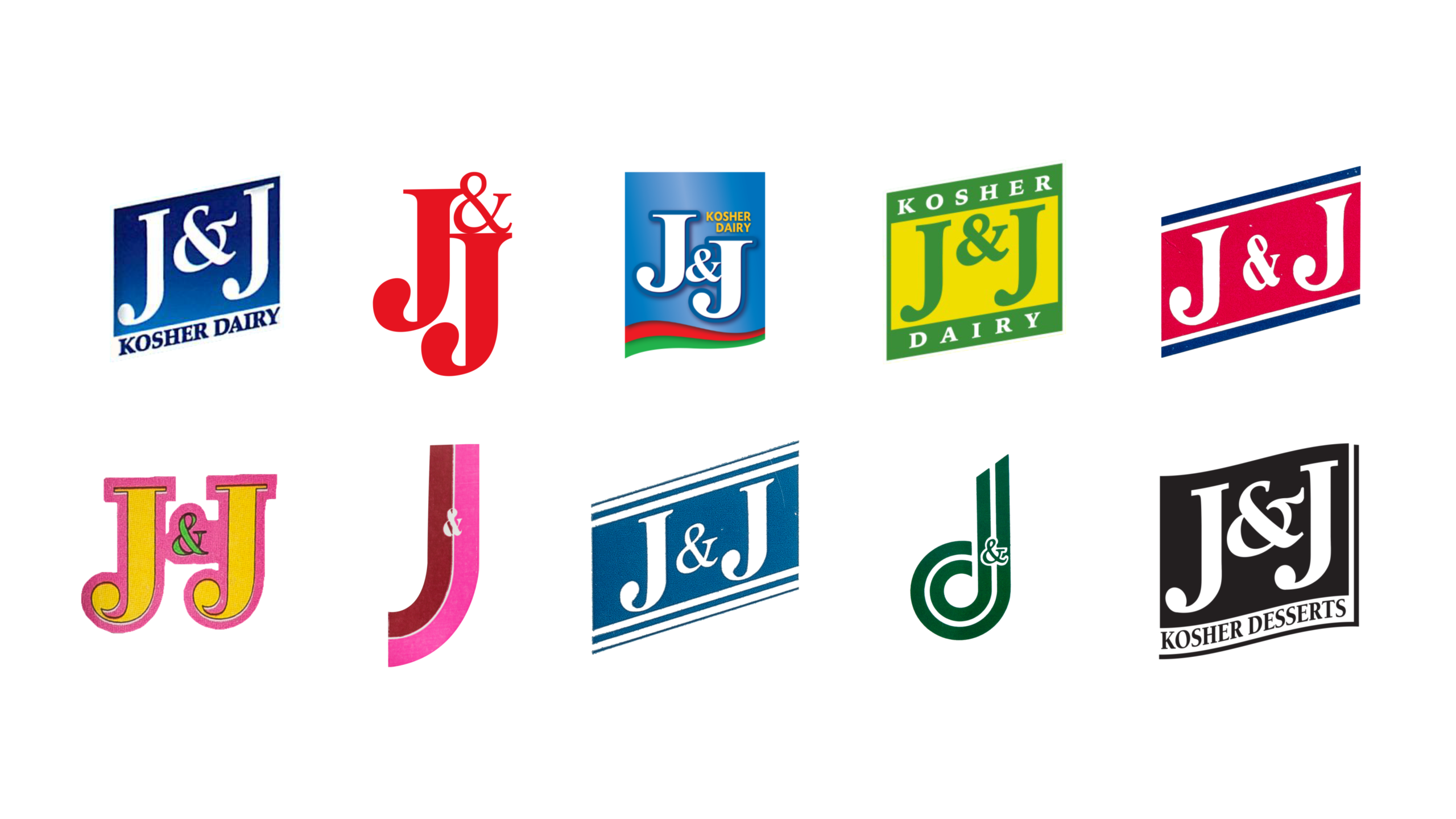
The starting point was J&J’s original flag. A flag marks a place and declares a presence, giving the rebrand a visual idea grounded in the company’s own history.
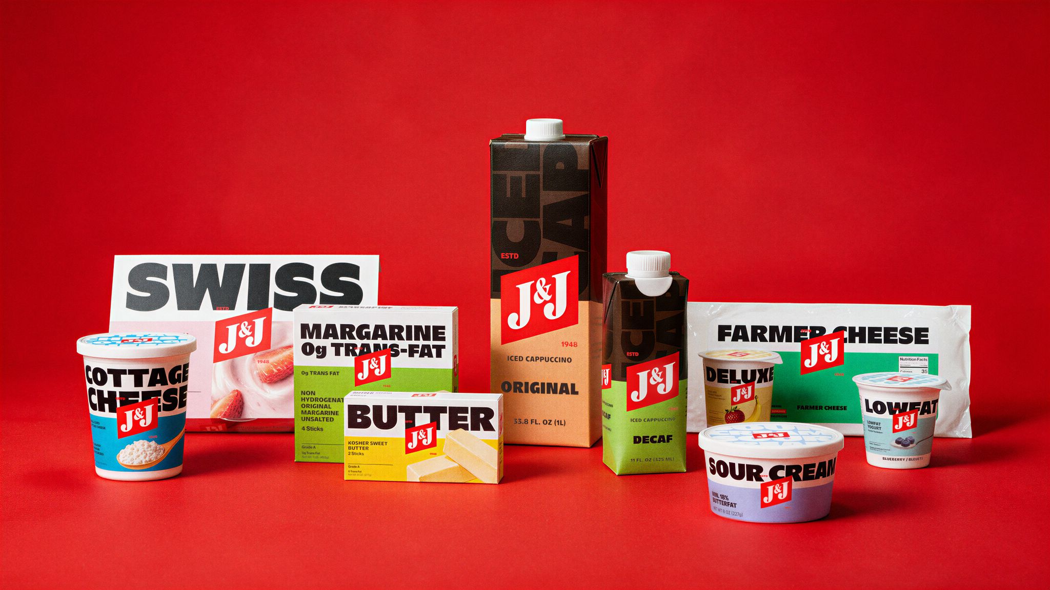
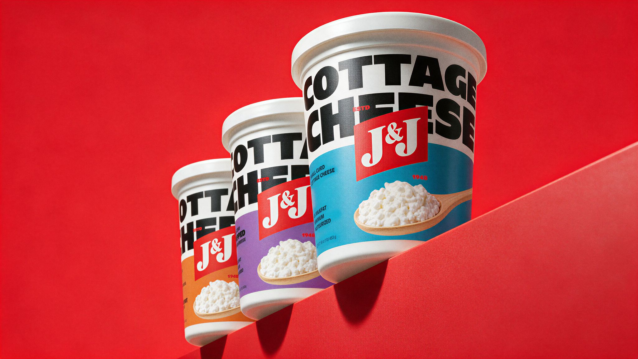
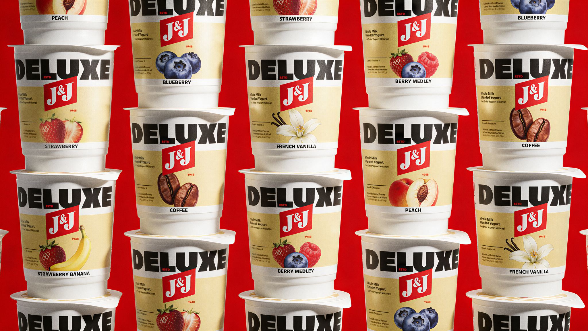
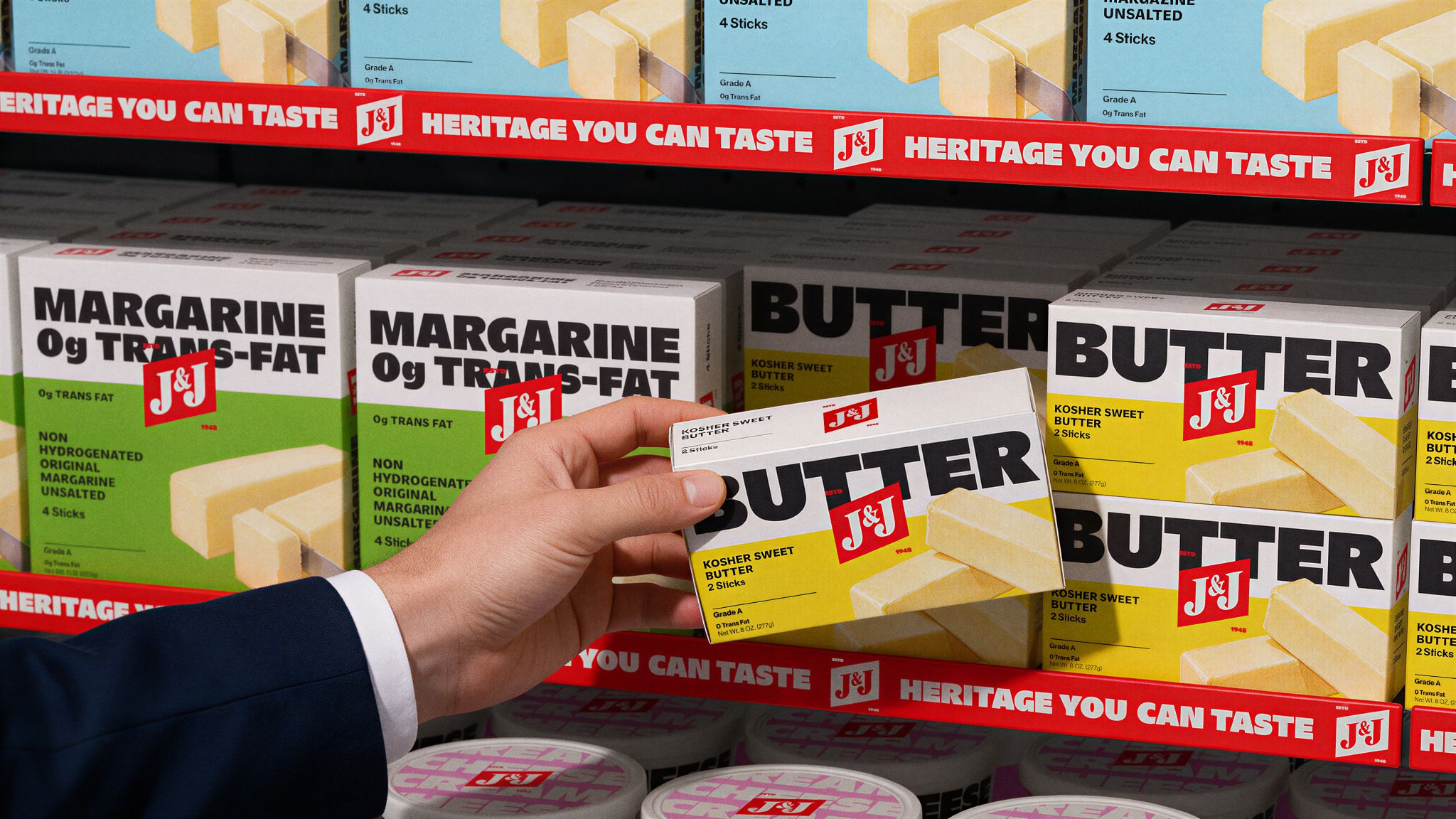
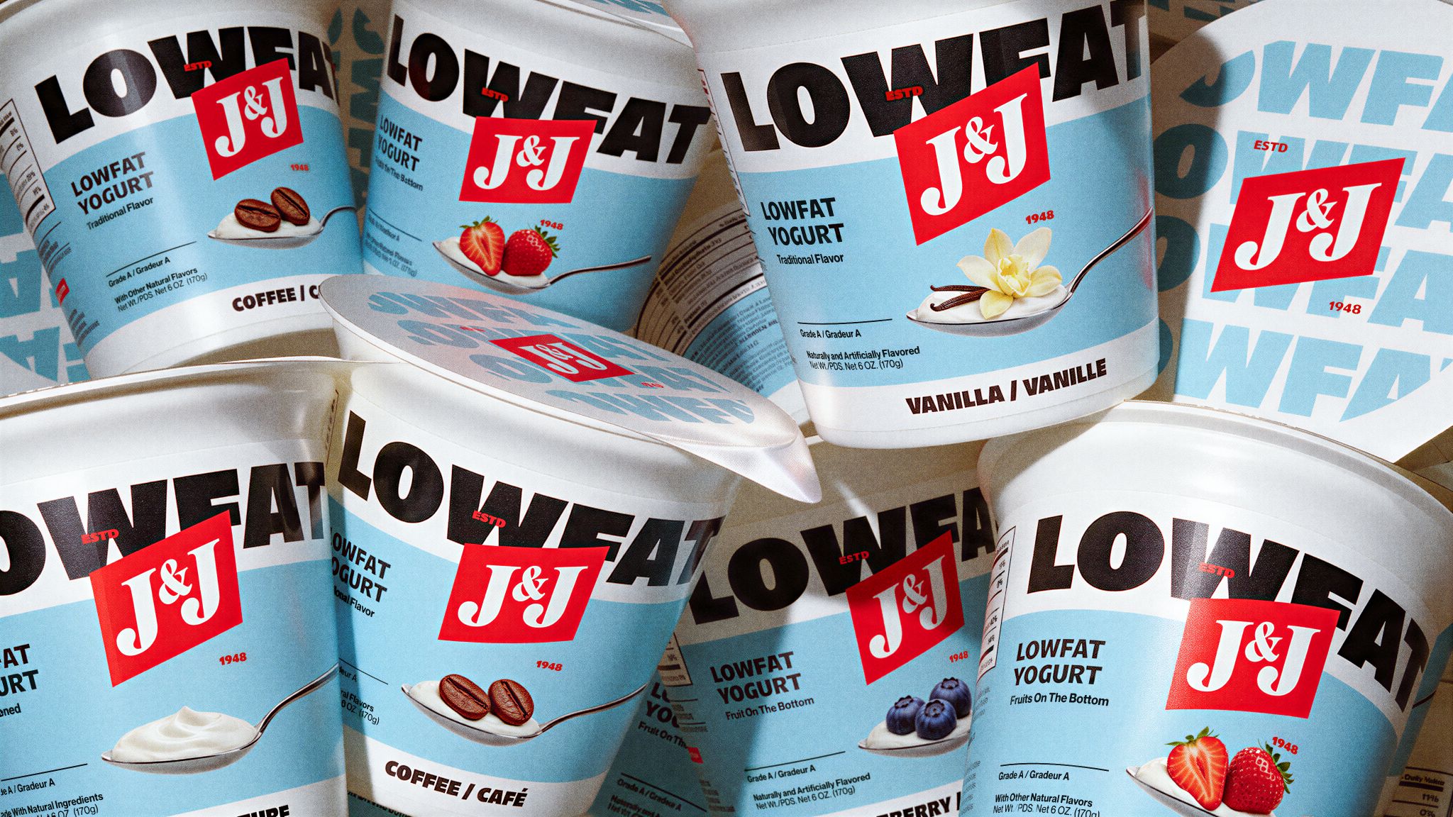
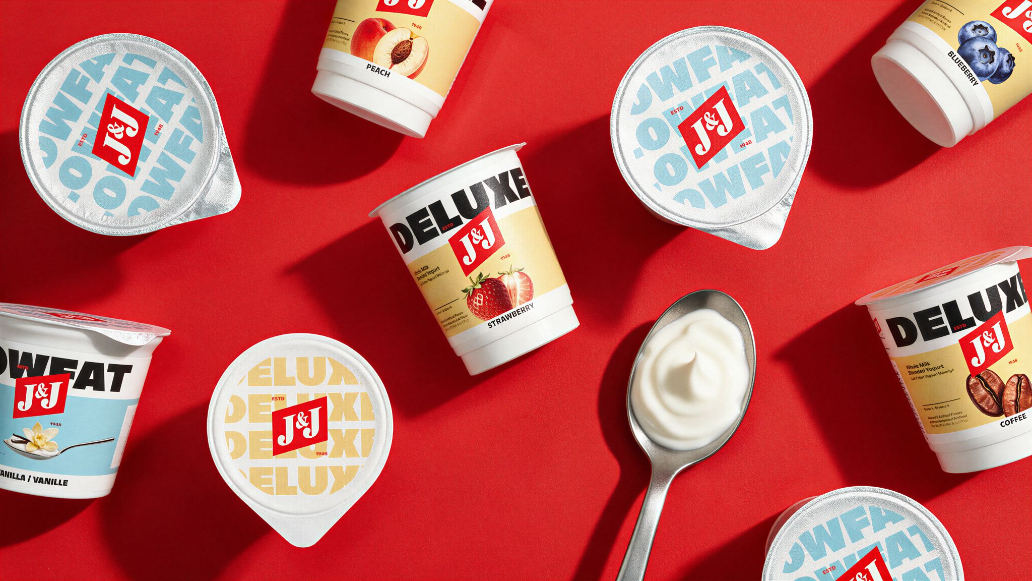
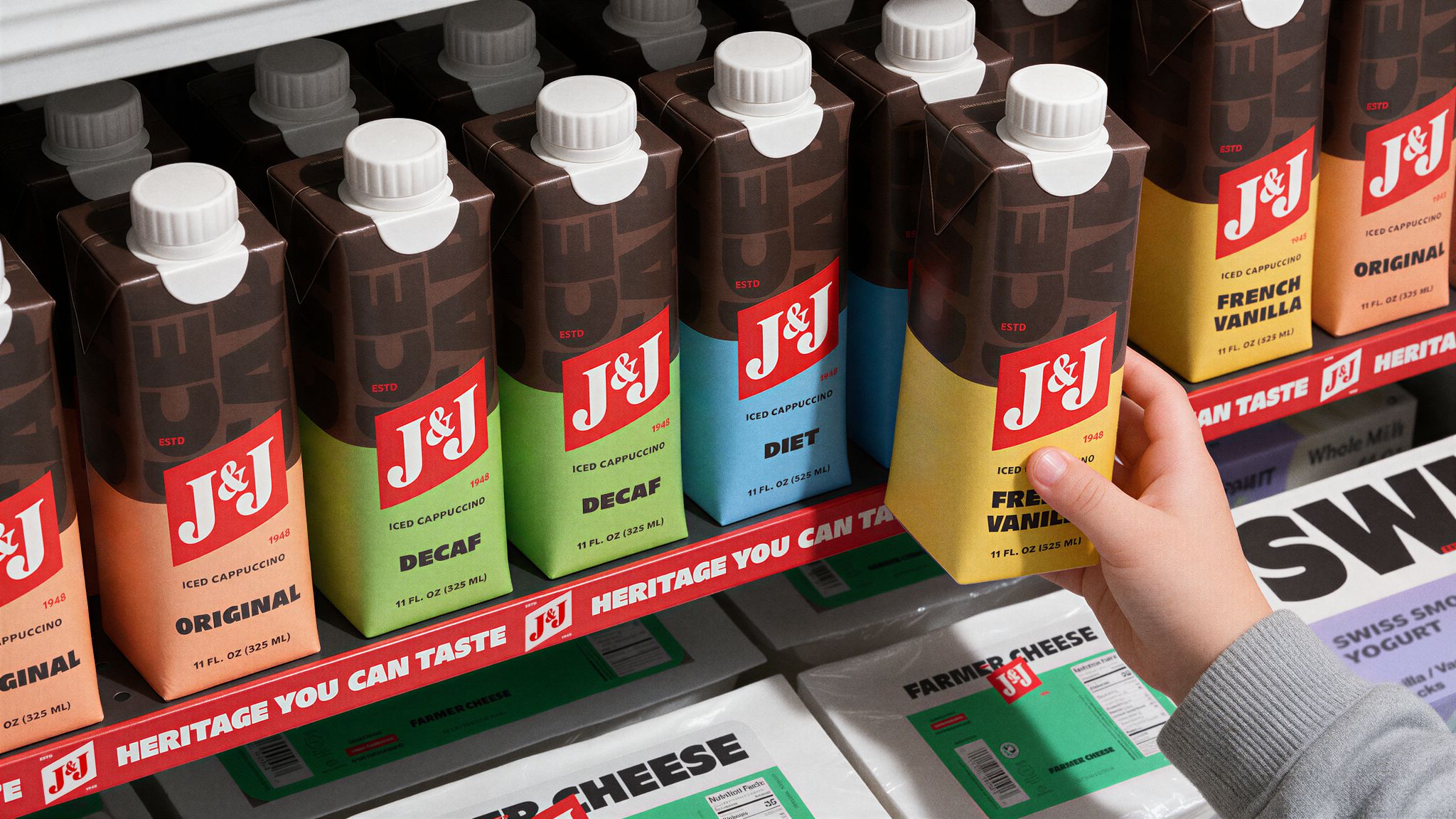
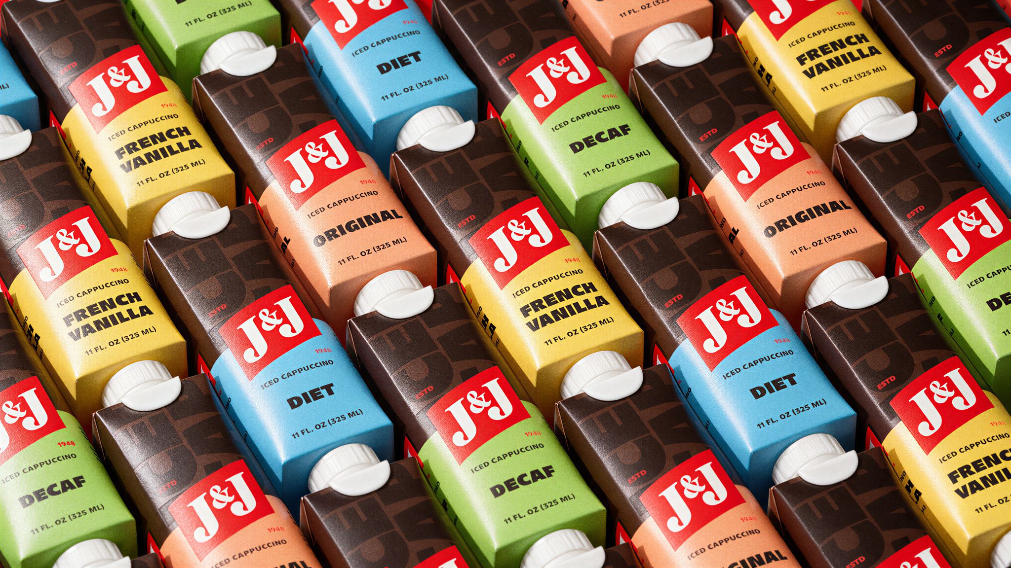
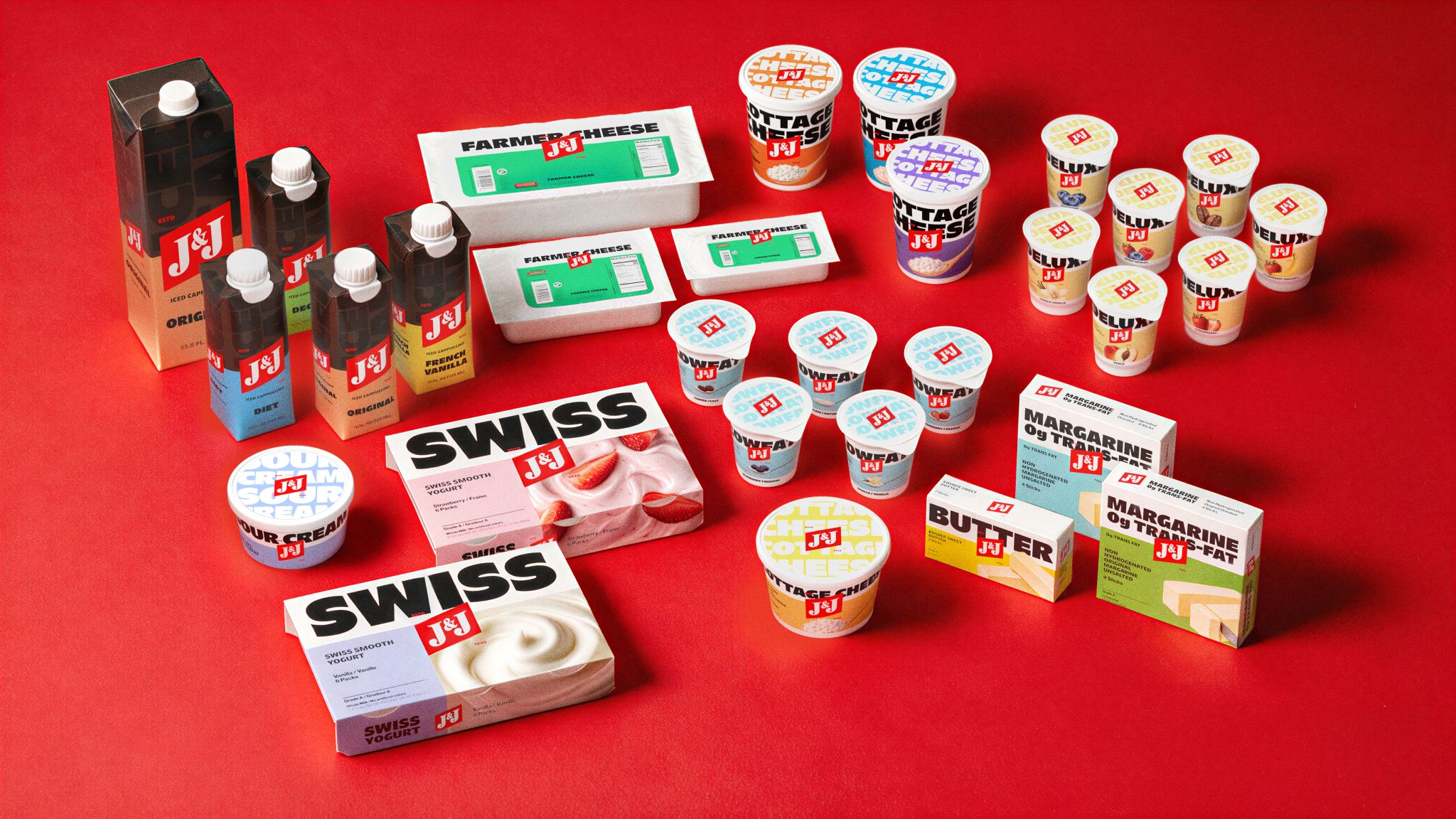
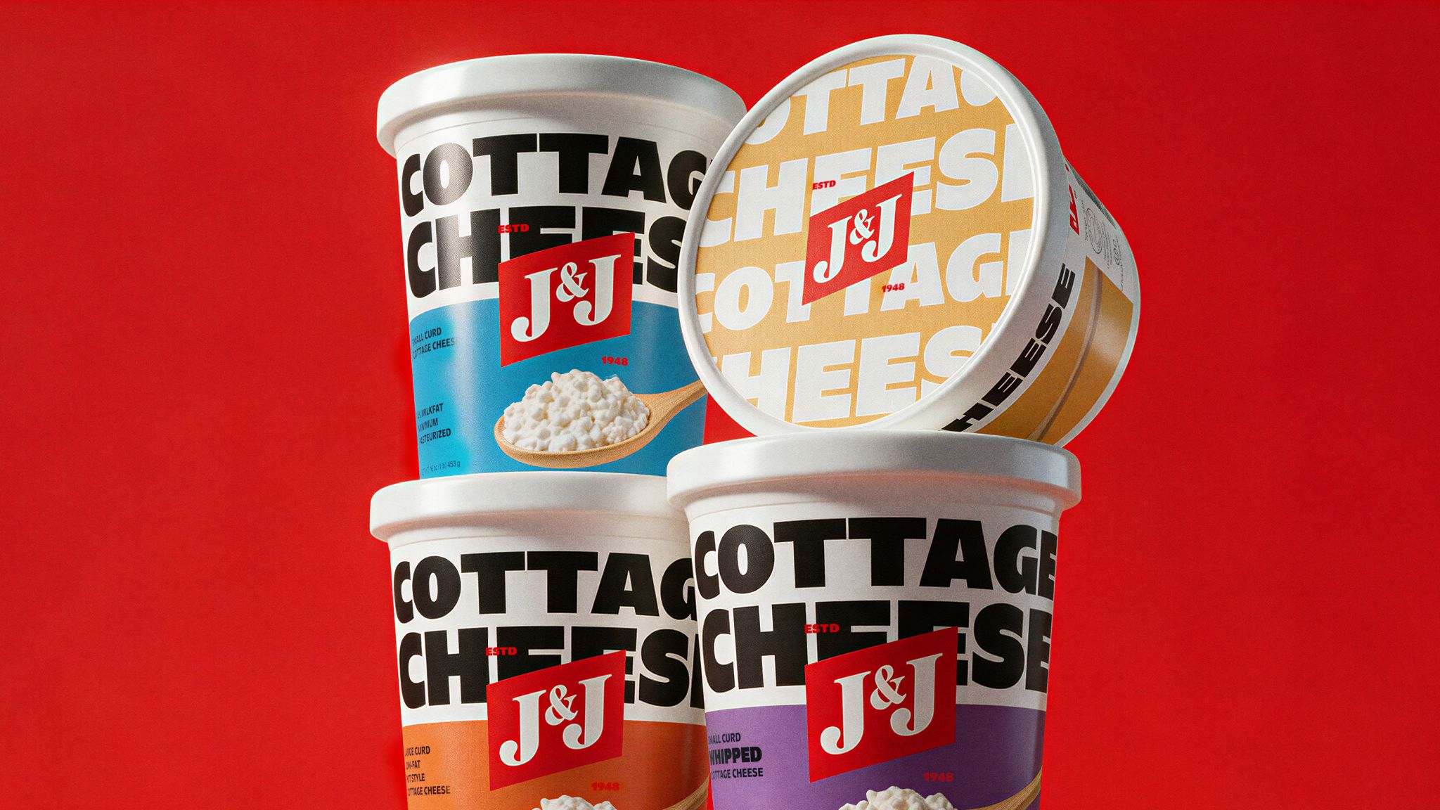
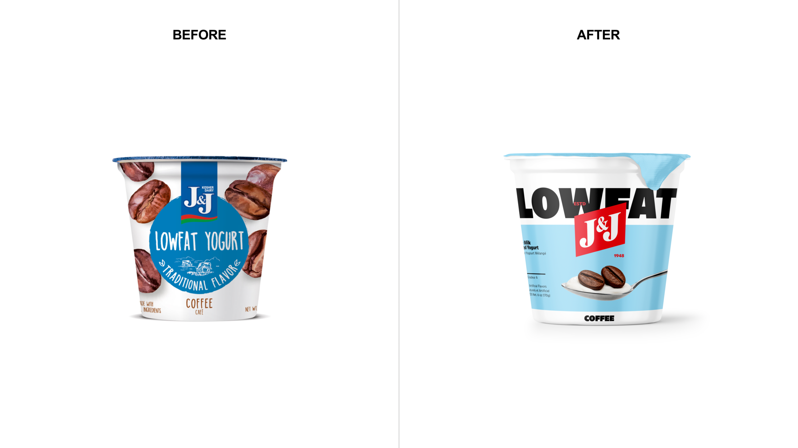
M/OTG revived the flag in bold red and placed it at the center of the packaging, layered over oversized black product names. The typography identifies the product, while the white J&J lettering on red identifies the brand. Supporting colors and imagery distinguish flavors and varieties.
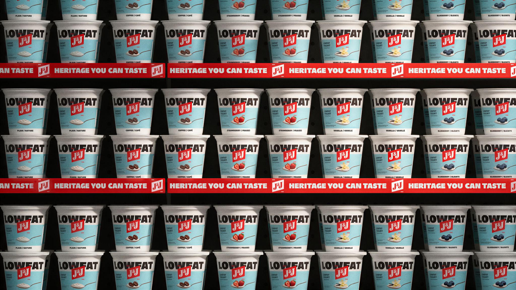
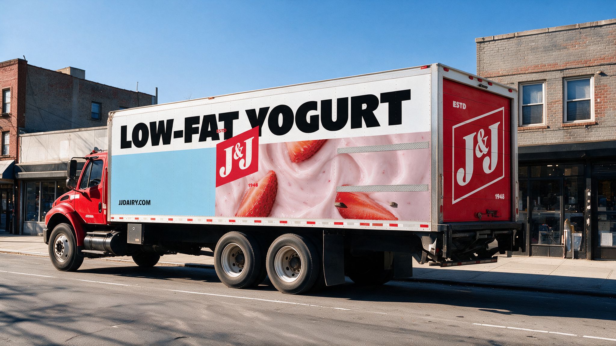
The system adapts across tubs, cartons and boxes, keeping the relationship between flag and typography consistent. It also extends to delivery trucks, bringing the same visual identity beyond the supermarket.
Built around “Heritage You Can Taste,” the rebrand gives an existing symbol a prominent new role, with packaging designed to make the products easy to identify and the brand easy to remember.


 VERONIKA KISELEVA
 al margen
 Jasgul
 Abhijith Madhu
 mariee
 Modern Theory
 Tancybox
 WINK®DESIGN
 impprintz
 Chainhouse
 rufydesign
 White Candy Design
 Just Design
 alchimistestudioParis
 bmd group
 Laurie Offer
 medok4r
 Nouna design
 CreativeWise
 ANNA ONISHCHENKO
 Denomination
 VANESA GARCÍA ESTUDIO
 Julia Persuk