
Dorita — Tradition Reimagined
A contemporary packaging identity for 13 seafood products, rooted in over a century of Galician canning heritage.
The Brand
For more than a century, Ignacio González Montes has been part of Galicia’s seafood canning tradition in northwestern Spain. Among its established brands, Dorita represents a premium range of canned fish and seafood products.
Brandesign, an independent branding and packaging design studio based in Madrid, was commissioned to rethink Dorita’s visual identity and packaging system, creating a contemporary expression of the brand while preserving its heritage and recognition.
The Challenge: Evolving Without Losing Identity
The canned seafood category is highly competitive, with many brands sharing similar packaging formats, visual conventions and product presentations.
Dorita needed more than a cosmetic redesign. Its existing packaging lacked consistency across the range, while differences in formats, proportions and product information made it difficult to establish a unified visual identity.
The challenge was to develop a recognizable, flexible packaging system that could elevate the brand’s premium positioning, improve shelf readability and distinguish individual products without losing the visual equity built over decades.
The Creative Solution
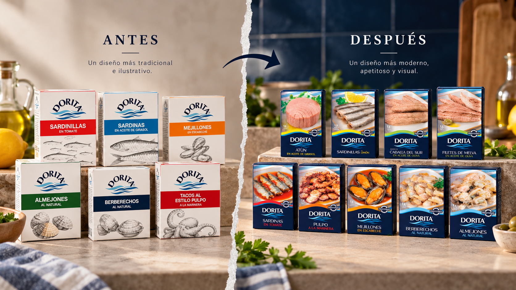
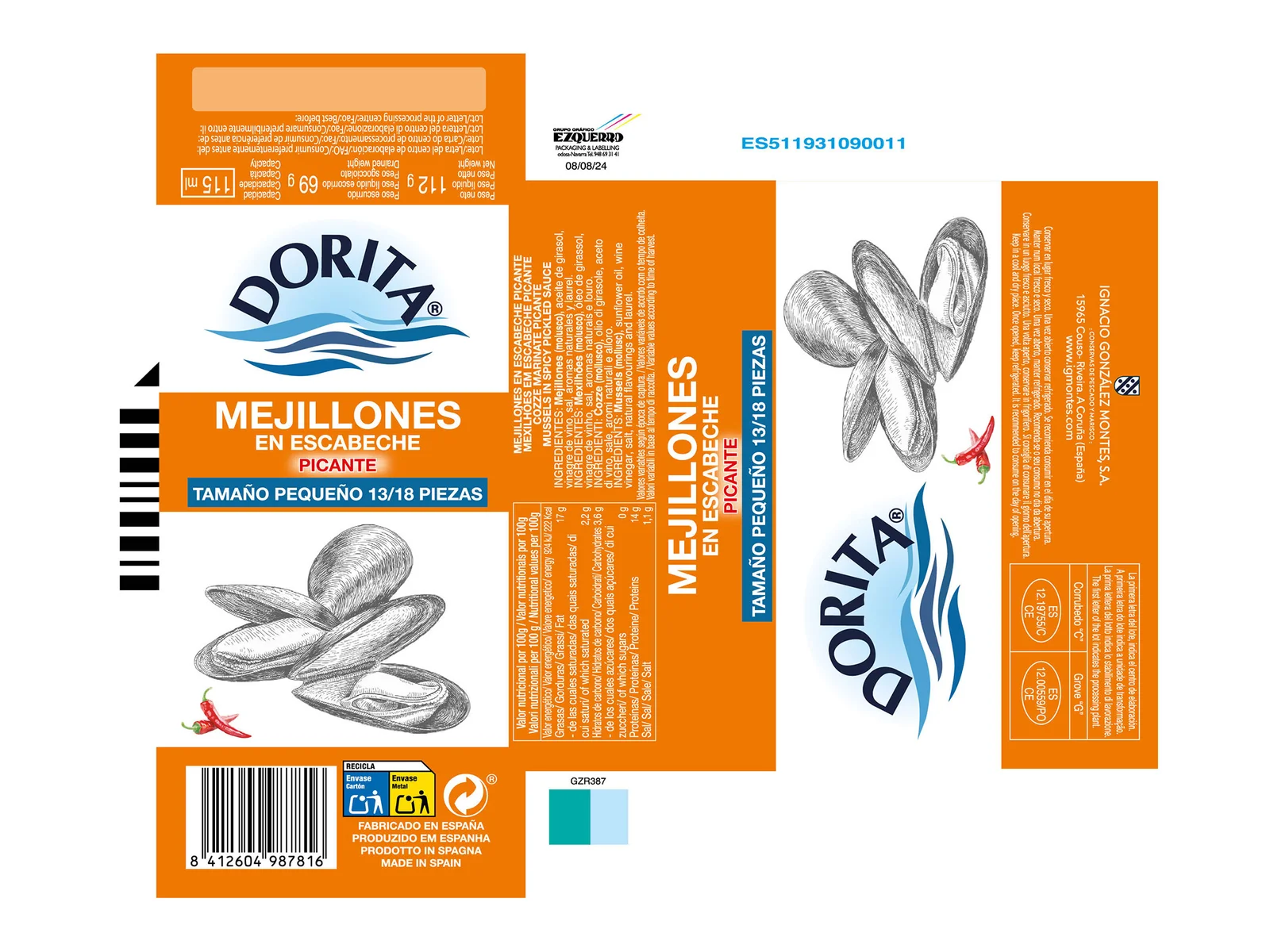
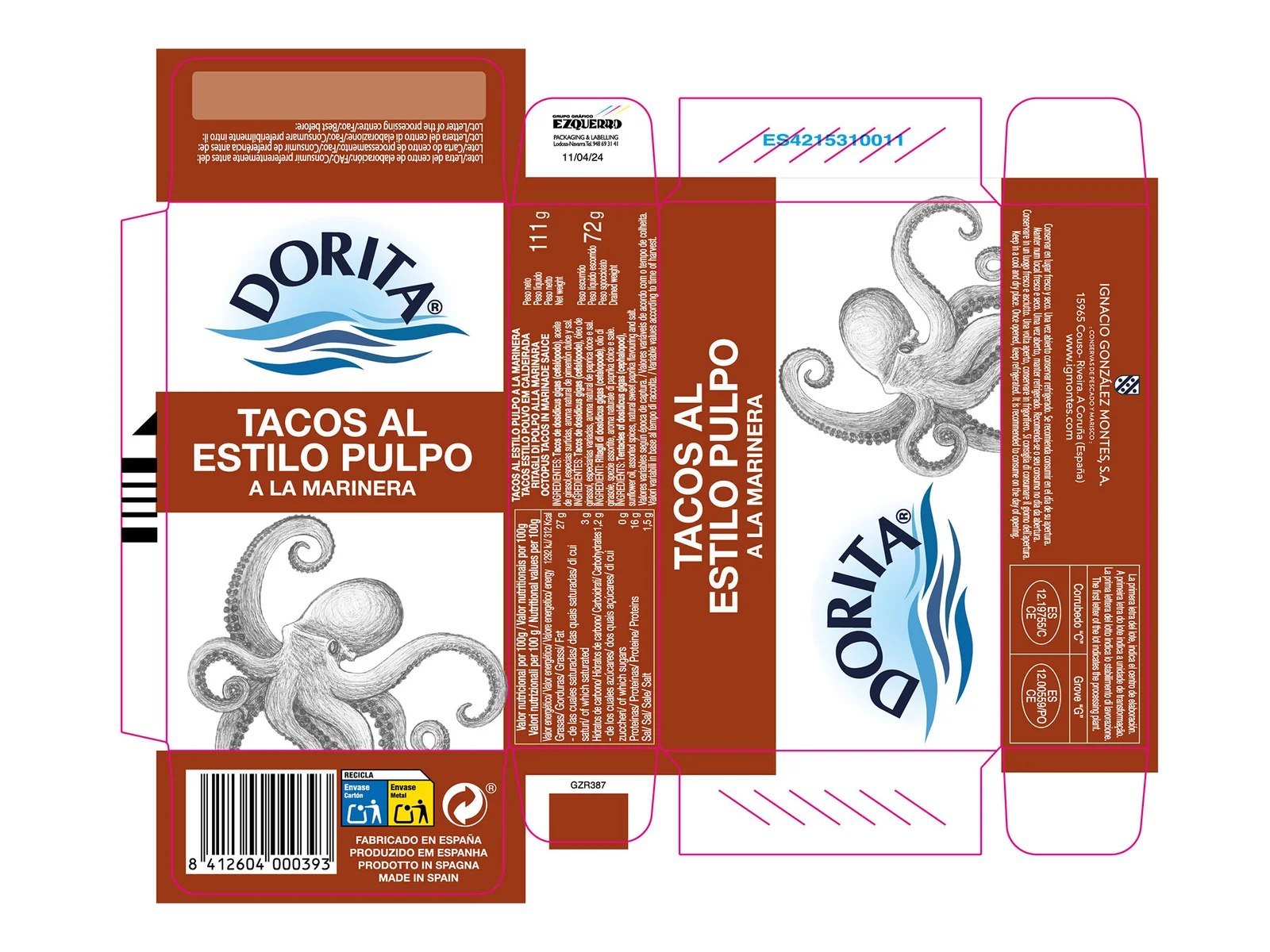
Brandesign developed a comprehensive visual system built around six key design elements.
- A refined brand identity
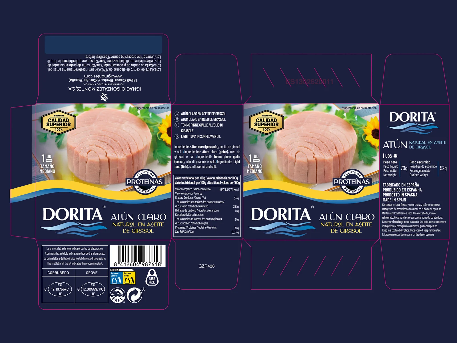
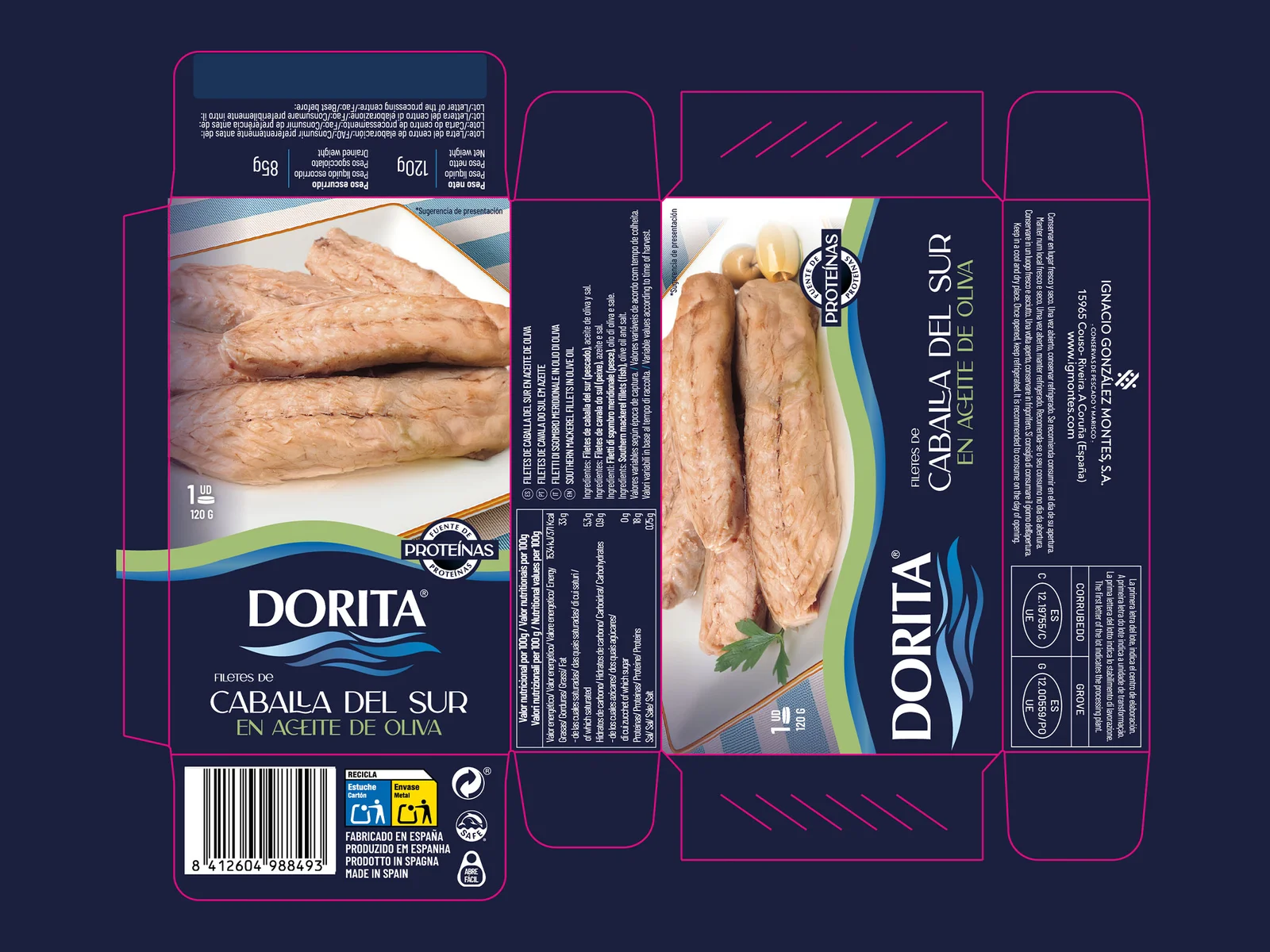
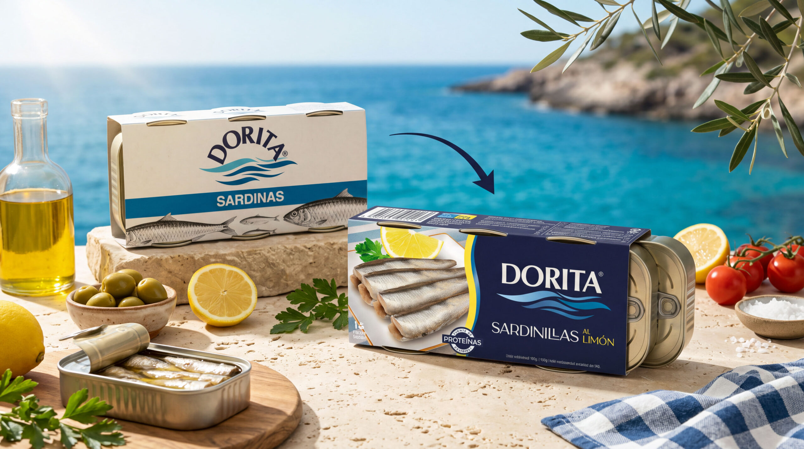
The Dorita logo was carefully restyled, replacing its previous curved composition with a cleaner, more stable horizontal structure. The result preserves brand recognition while improving legibility and visual impact.
- A distinctive maritime graphic language
A new wave-inspired graphic element connects the identity to Dorita’s maritime origins, introducing movement and continuity throughout the packaging family.
- A consistent colour-coding system
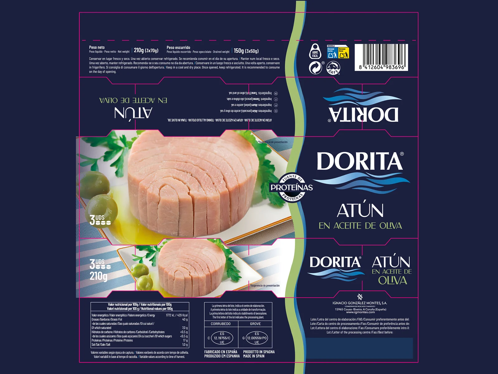
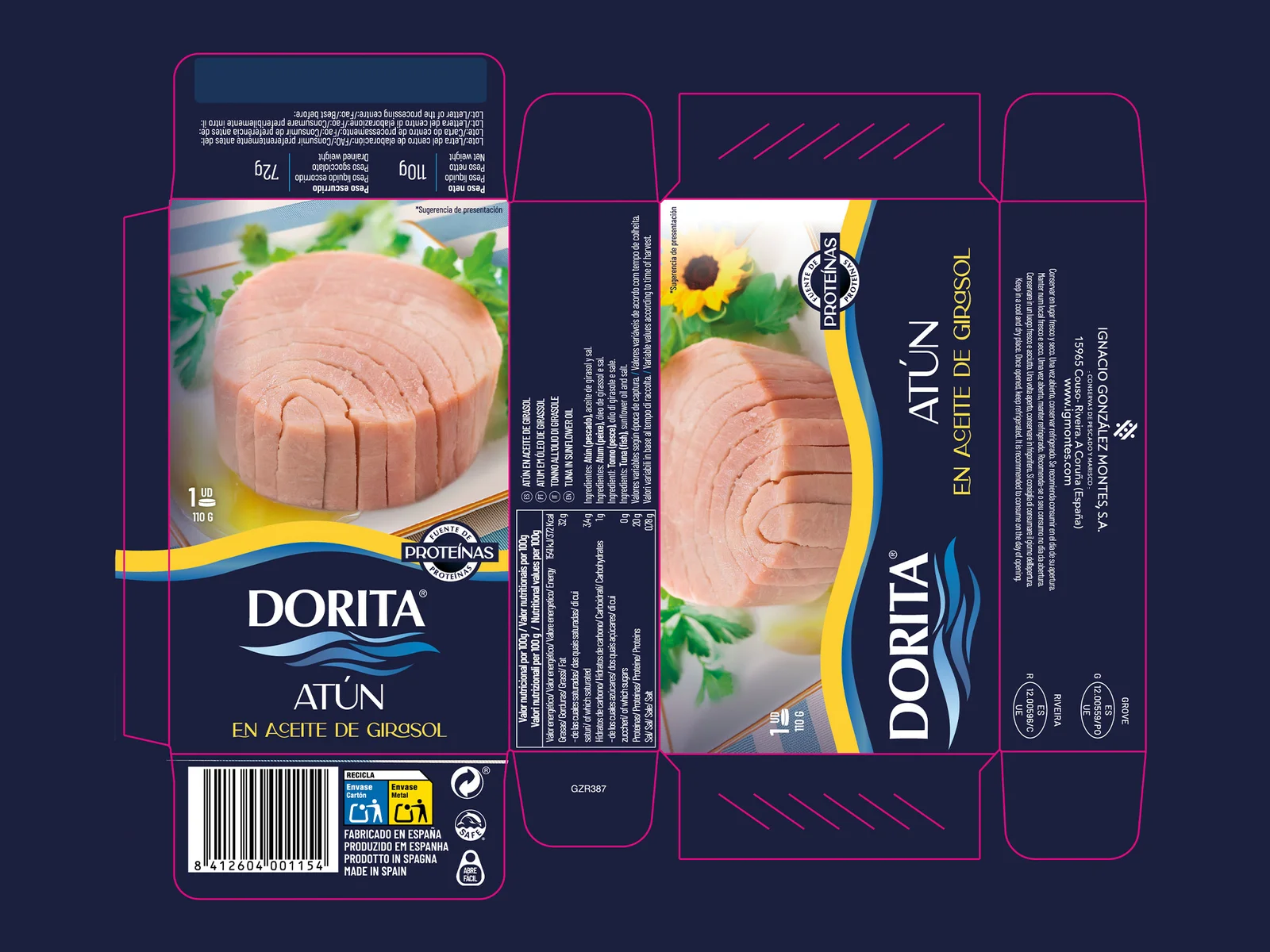
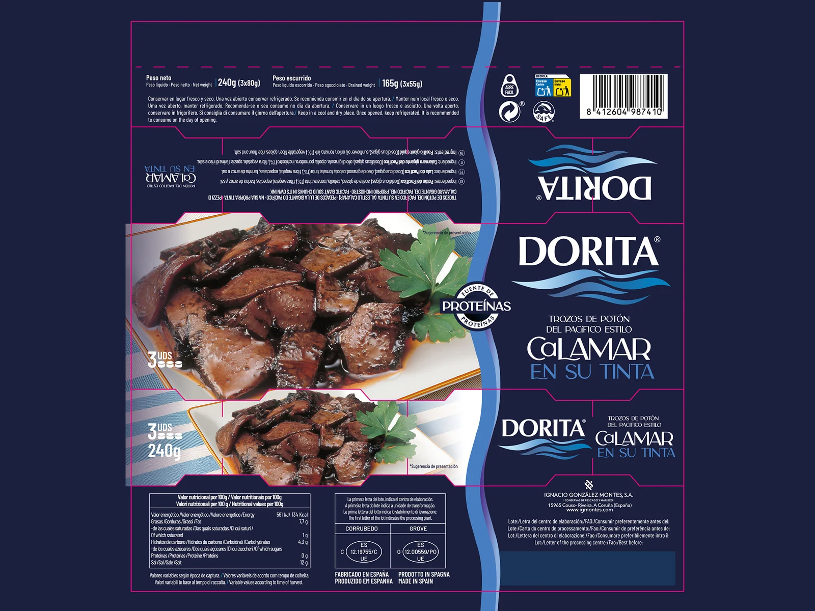
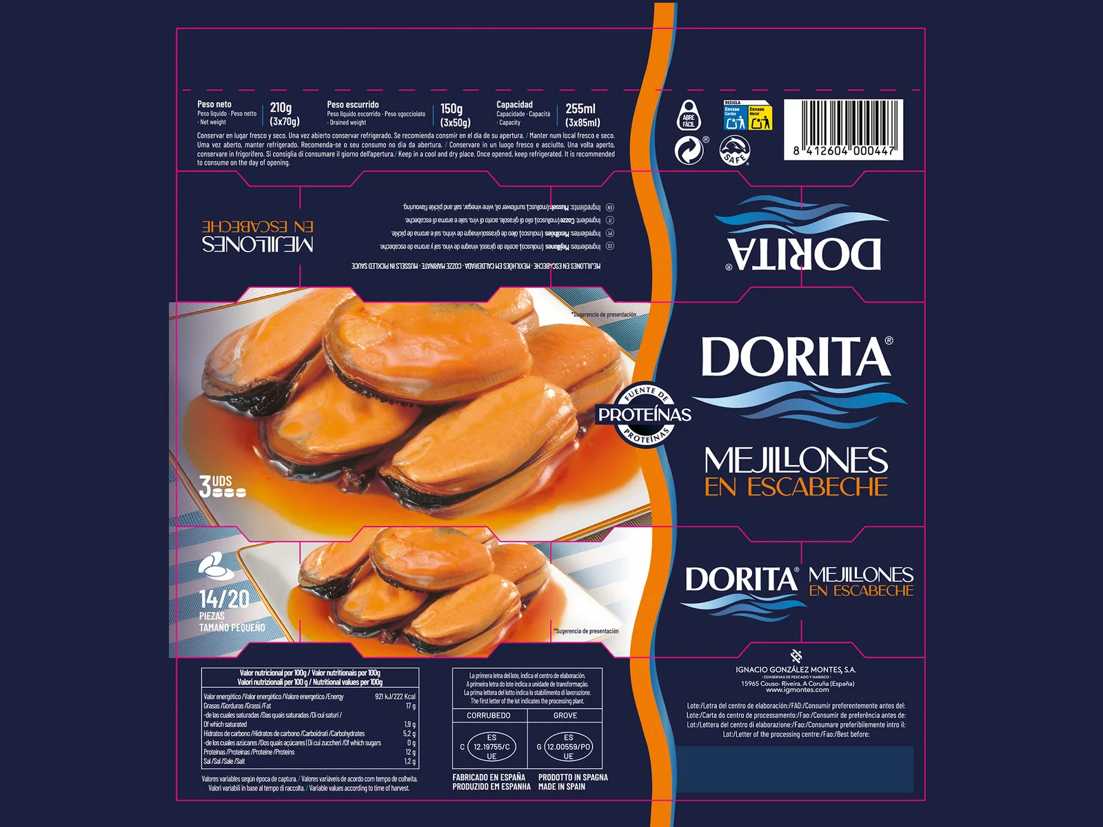
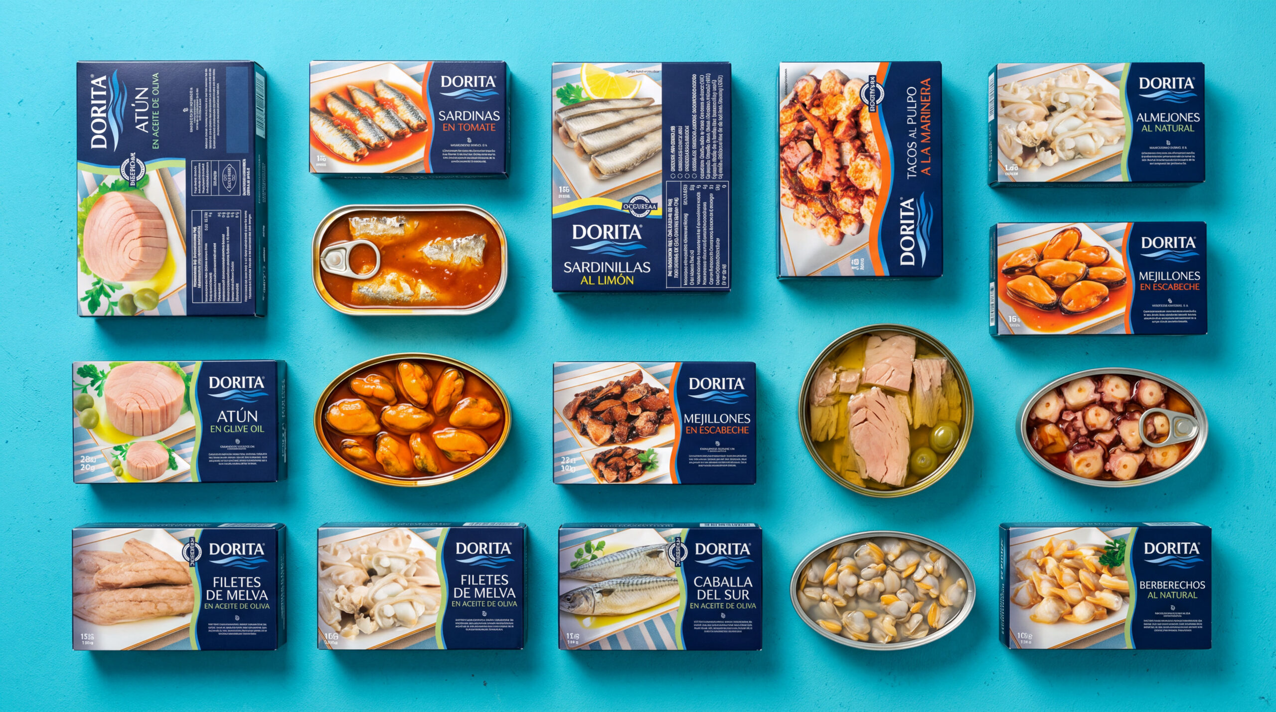
Navy blue became the unifying colour of the range, complemented by distinctive secondary colours to help consumers identify different seafood varieties at a glance.
- Clearer information hierarchy
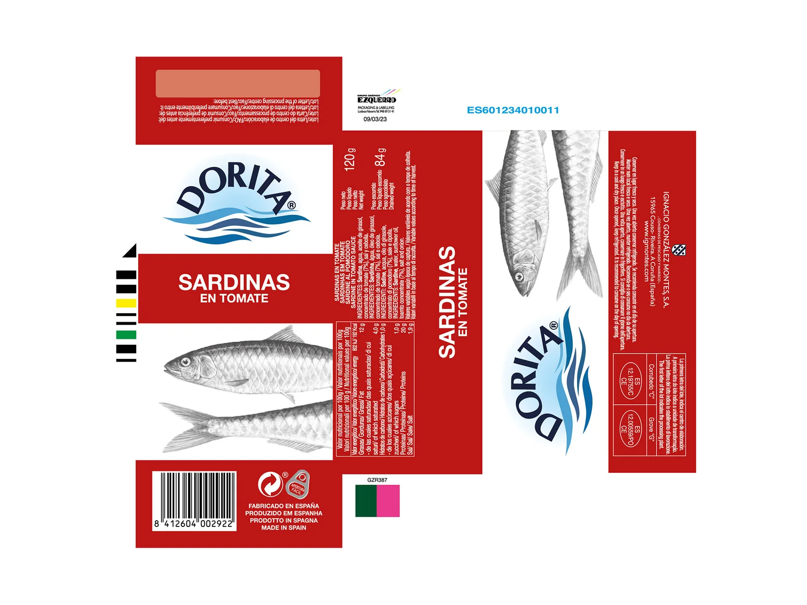
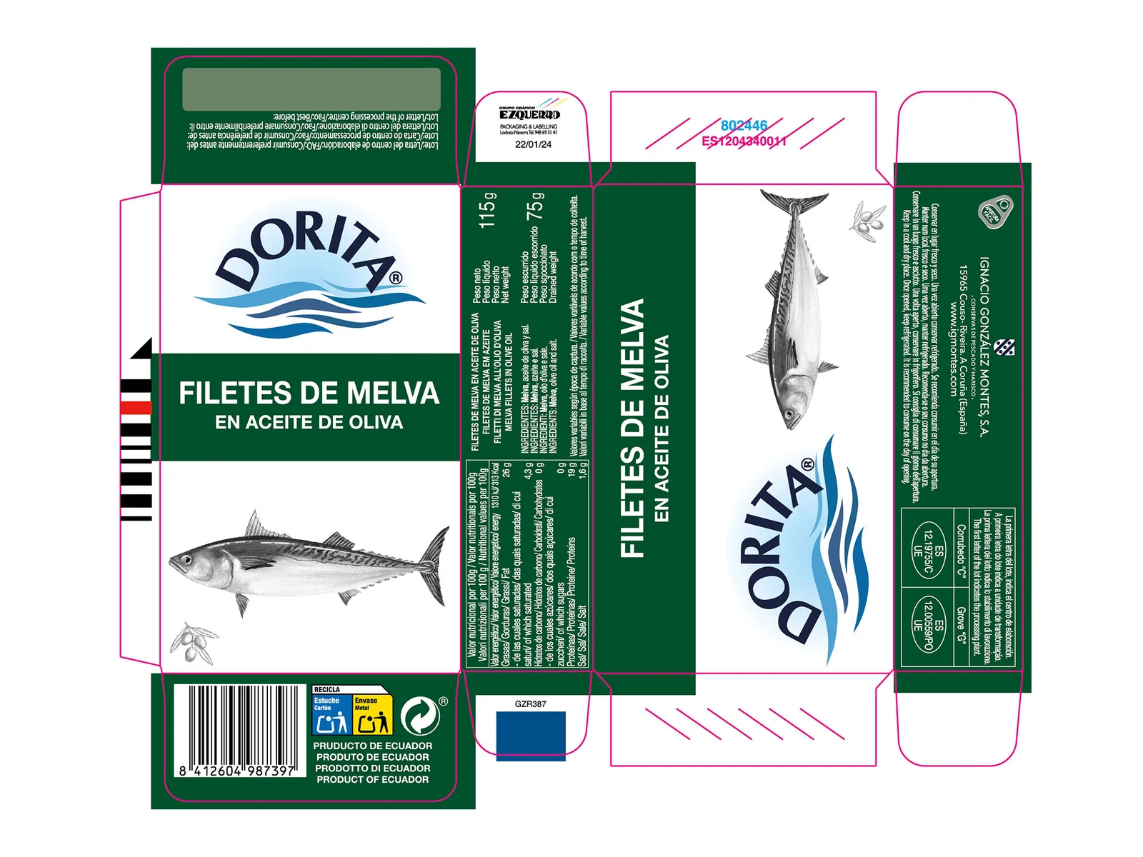
Product names, varieties, weights, multilingual information and supporting details were reorganized to create a more intuitive reading experience across different packaging formats.
- A unified iconographic system
A consistent set of icons was developed to communicate relevant product information, including nutritional attributes and quality-related features.
- A scalable packaging architecture
Rather than designing thirteen isolated packs, the studio created a coherent design system capable of adapting to different product categories, sizes and structural formats.
The Art Direction Challenge
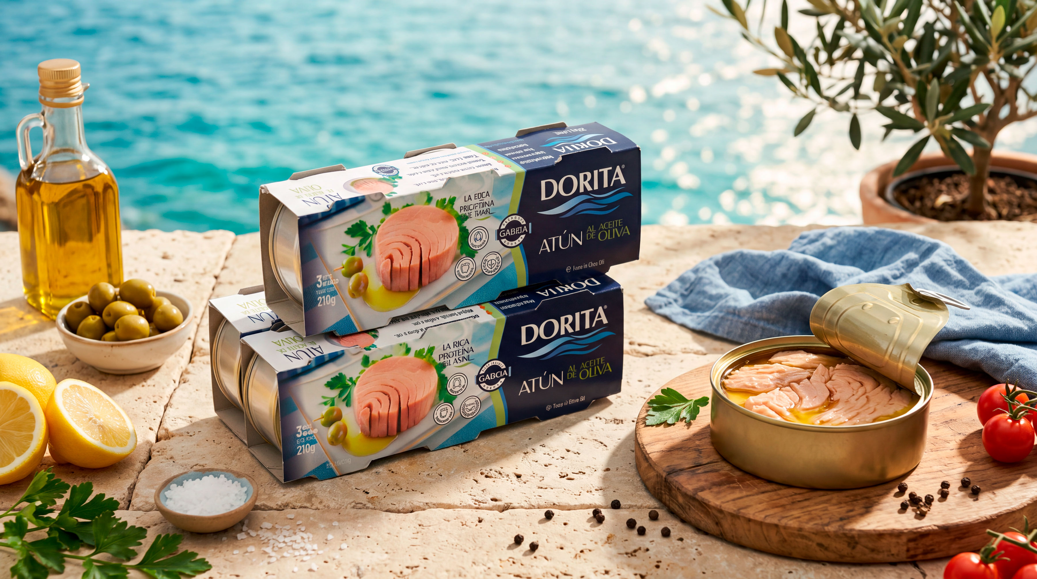
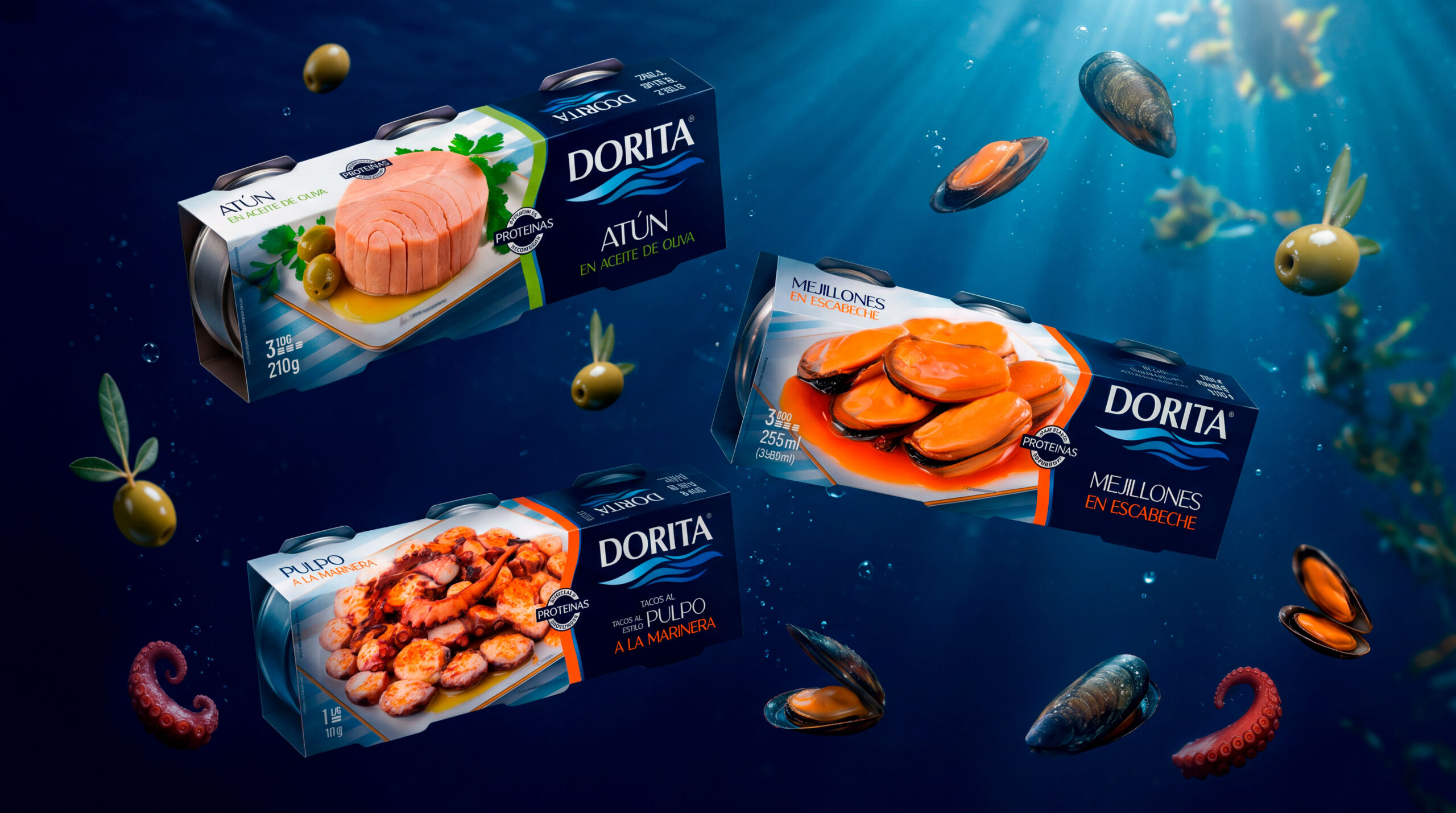
One of the project’s most distinctive aspects was the creation of its food imagery.
With no physical product samples available for a studio photoshoot, Brandesign digitally reconstructed the product presentations through advanced image compositing and retouching.
Ingredients, liquids, reflections, lighting and photographic perspectives were carefully adjusted to establish a consistent visual language across the range.
This process allowed the team to create appealing food imagery tailored to each packaging format while maintaining the same visual standards throughout the collection.
Thirteen Products. One Recognizable Brand.
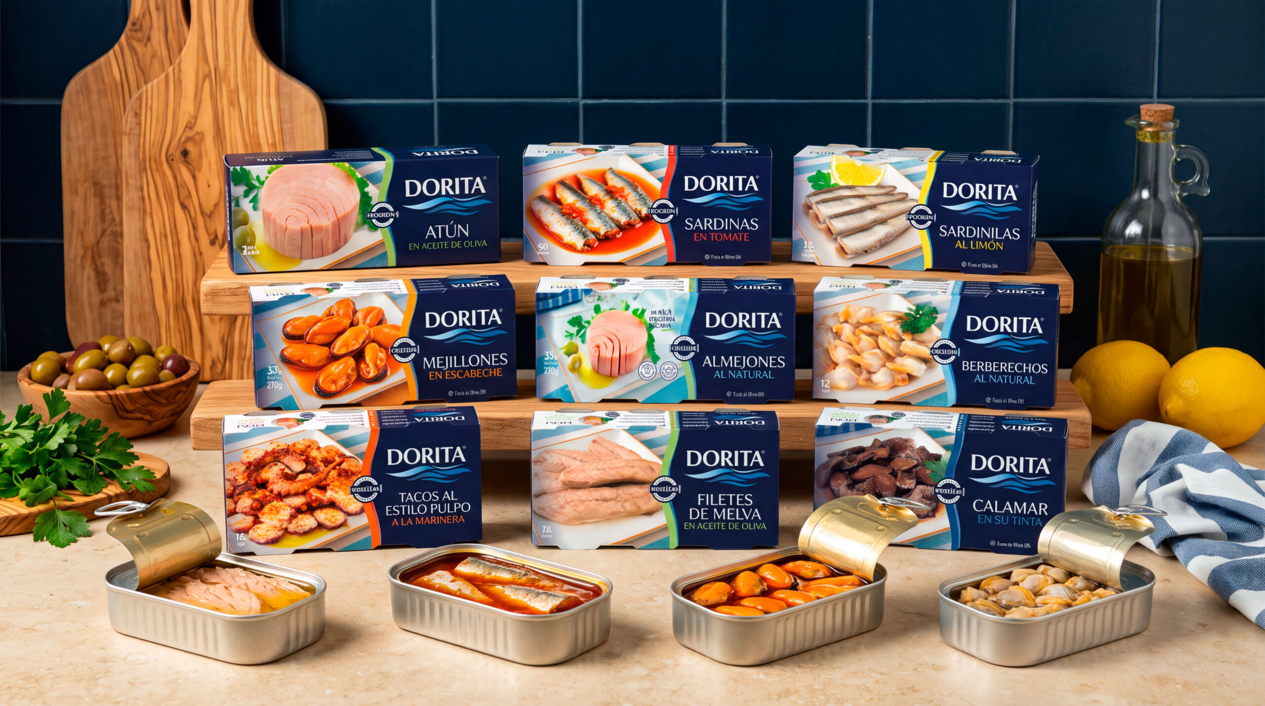
The new identity was implemented across thirteen canned fish and seafood references, including tuna, sardines, mackerel, frigate tuna, mussels, cockles and other seafood specialties.
The packaging system was adapted to individual cans, multipacks, horizontal and vertical cartons, and different sleeve and box formats.
Each adaptation required balancing brand consistency, production constraints, multilingual labelling, legal information and the individual character of the product.
The Result
The redesign gives Dorita a more contemporary, cohesive and recognizable packaging identity while retaining its connection to Galician seafood heritage.
A refined logo, maritime-inspired graphics, carefully structured typography, colour differentiation and digitally crafted food imagery now work together as a unified system.
The result is a flexible visual identity designed to communicate quality, improve product recognition and support future extensions of the range.
Dorita demonstrates how thoughtful packaging design can bring new relevance to an established brand without erasing the heritage that makes it distinctive.
Project credits
Project: Dorita Packaging Redesign
Client: Ignacio González Montes S.A.
Brand: Dorita
Creative Agency: Brandesign
Location: Madrid, Spain
Industry: Food & Beverage / Canned Seafood
Services: Brand Identity Restyling, Packaging Design, Art Direction, Digital Image Compositing, Label Design, Packaging Architecture and Print-Ready Artwork
Year: 2026
Full project: https://brandesign.es/portafolio/diseno-packaging-alimentacion-conservas-dorita/
Studio: https://brandesign.es
 CreativeWise
 ANNA ONISHCHENKO
 Denomination
 VANESA GARCÍA ESTUDIO
 Julia Persuk
 Kingdom & Sparrow
 Agustina Bo
 Matcha DNA
 Atelier 9AM
 Jie Yee
 43oz
 monther al omari
 Rajat Chaple
 timaddington
 Nouna design
 Rabia zouina
 Derrick Lin
 Sophiagdotcom
 Sofia Nikishina
 studionerius