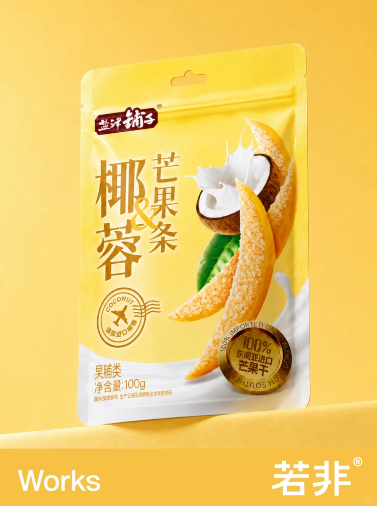

Recently, we designed packaging for a new coconut-coated mango strip product for Yanjinpuzi (盐津铺子) in the 很忙量贩 snack retail channel.
The biggest challenge was not making the mango larger. It was helping shoppers understand at first glance that these are mango strips with a coconut coating.
Many products that combine flavors face the same question: mango is the main component, while the other flavor makes the product distinctive. Giving both equal visual weight can make the design feel crowded; emphasizing only mango can obscure what sets the product apart.
So we built the visual hierarchy in two layers.
① First glance: mango.
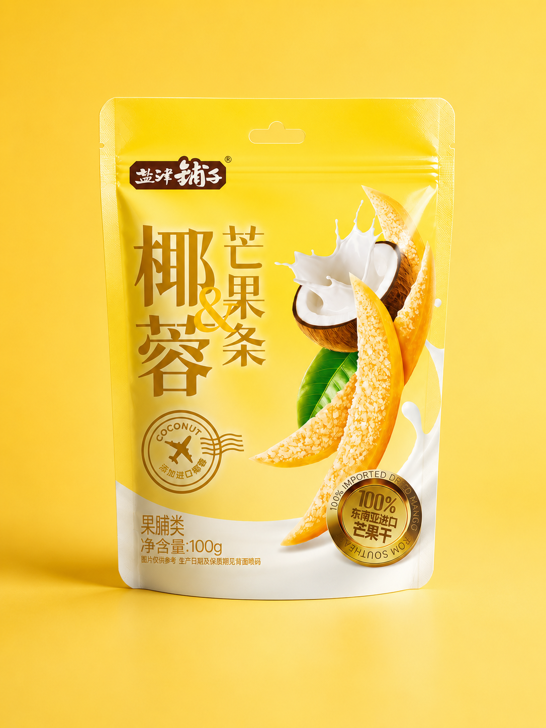
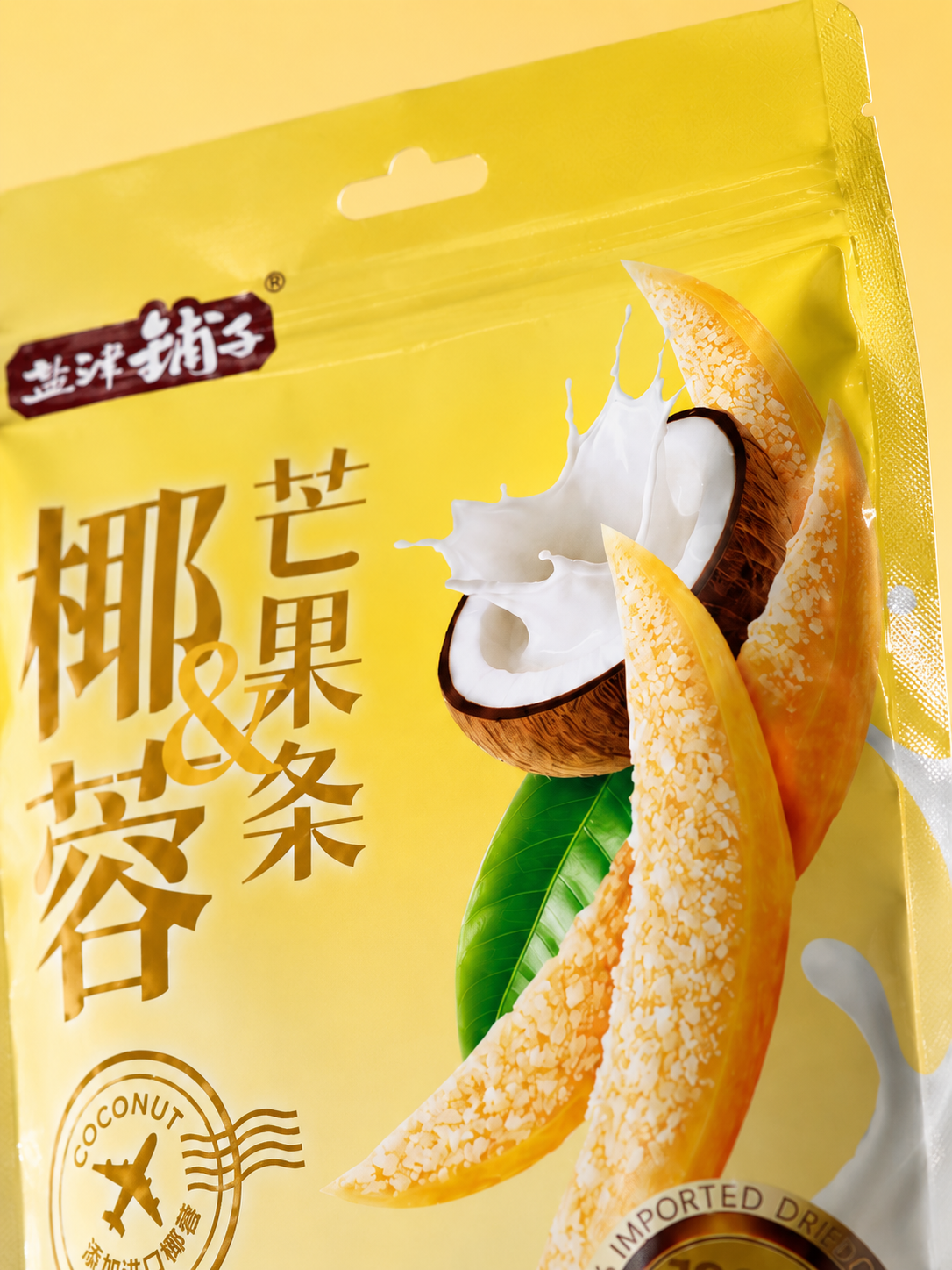
We used large, full mango strips as the main visual. They show the product’s form, help shoppers quickly recognize it as a mango-strip snack, and give the food a fresh, appetizing appearance.
② Second glance: coconut.
Rather than filling the pack with coconut imagery, we wanted to suggest the experience of its texture and flavor.
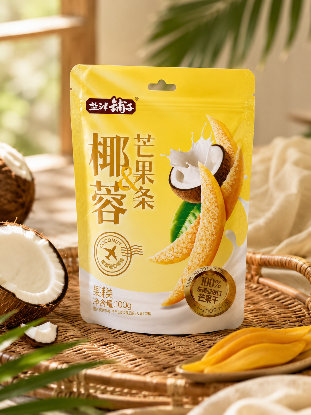
A splash of coconut milk, a cut coconut, and the coconut flakes covering the mango strips work together to evoke a richer, smoother coconut flavor.
Before opening the package, shoppers can already begin to imagine the taste.
We also chose a bright yellow as the overall color. It follows the familiar visual cue of mango and helps the package stand out from a distance on crowded snack shelves.
We have always believed that food packaging does more than tell people what is being sold. It can also shape their expectations of the taste experience.
Good packaging makes people look forward to the first bite the moment they see it.
 VERONIKA KISELEVA
 al margen
 Jasgul
 Abhijith Madhu
 mariee
 Modern Theory
 Tancybox
 WINK®DESIGN
 impprintz
 Chainhouse
 whitecandydesign
 Just Design
 alchimistestudioParis
 bmd group
 Laurie Offer
 medok4r
 Nouna design
 CreativeWise
 ANNA ONISHCHENKO
 Denomination
 VANESA GARCÍA ESTUDIO
 Julia Persuk
 Kingdom & Sparrow