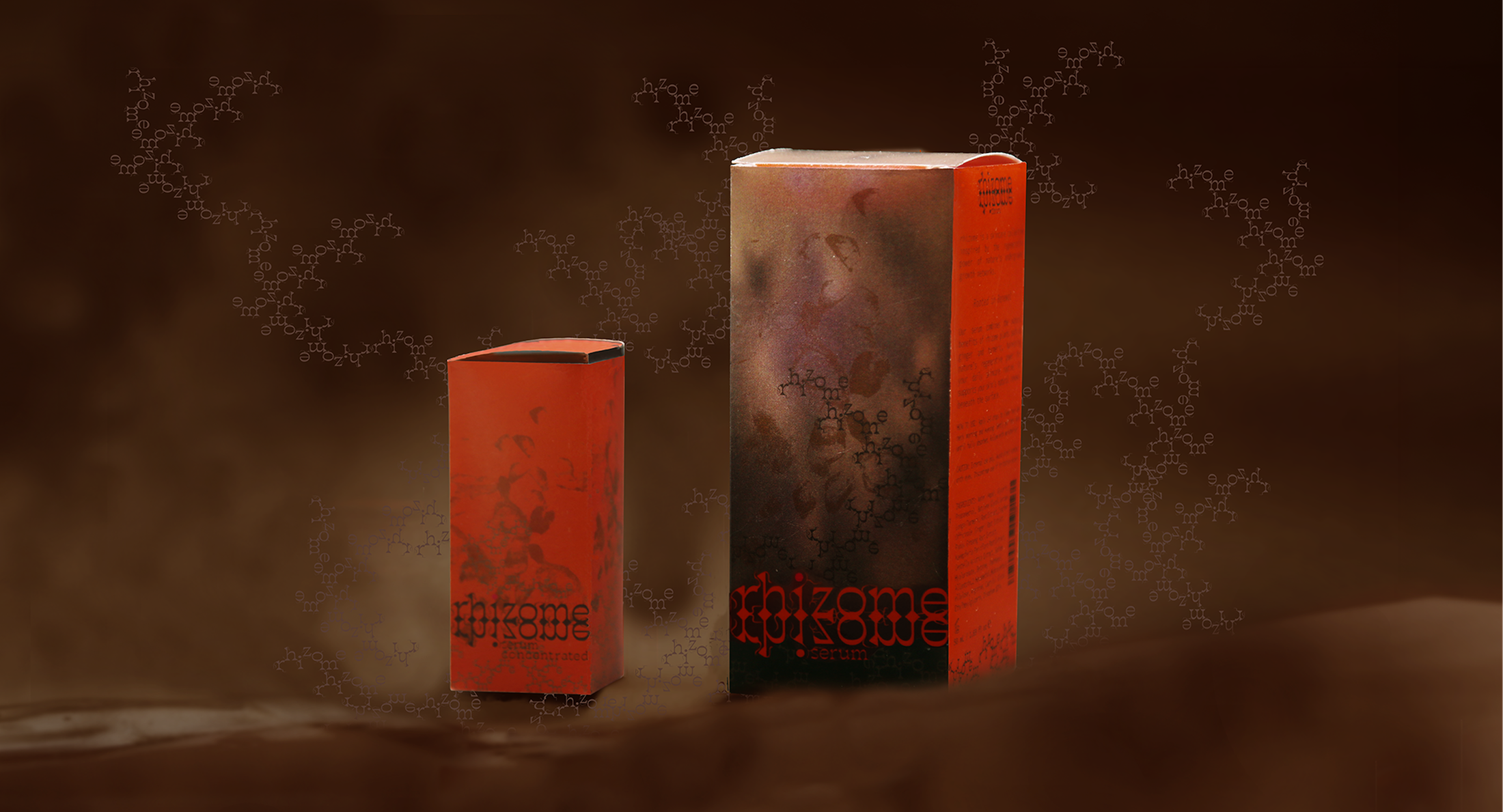

rhizome is a skincare serum collection featuring ingredients made from rhizome plants, such as ginseng, ginger, and turmeric, known for their revitalising properties.
The project began with a question: What would beauty packaging look like if it were truly inspired by the essence of its ingredients?
Inspired by the hidden growth structures of rhizome plants, the concept explores the vitality beneath the soil: their ability to spread, branch, and continuously generate new growth.
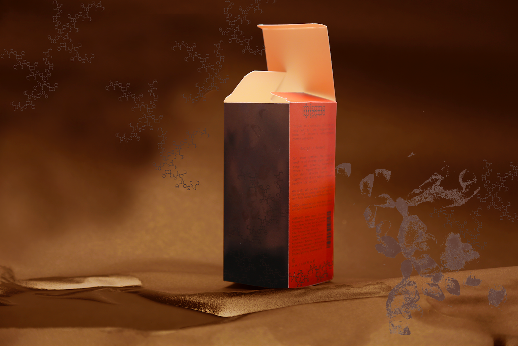
The visual identity draws from the organic growth patterns and interconnected structures of rhizome plants. Rather than using botanical imagery as decoration, their underlying growth system becomes the foundation of the visual language. The result is an identity that expresses the hidden vitality of these plants through an evolving and interconnected graphic system.
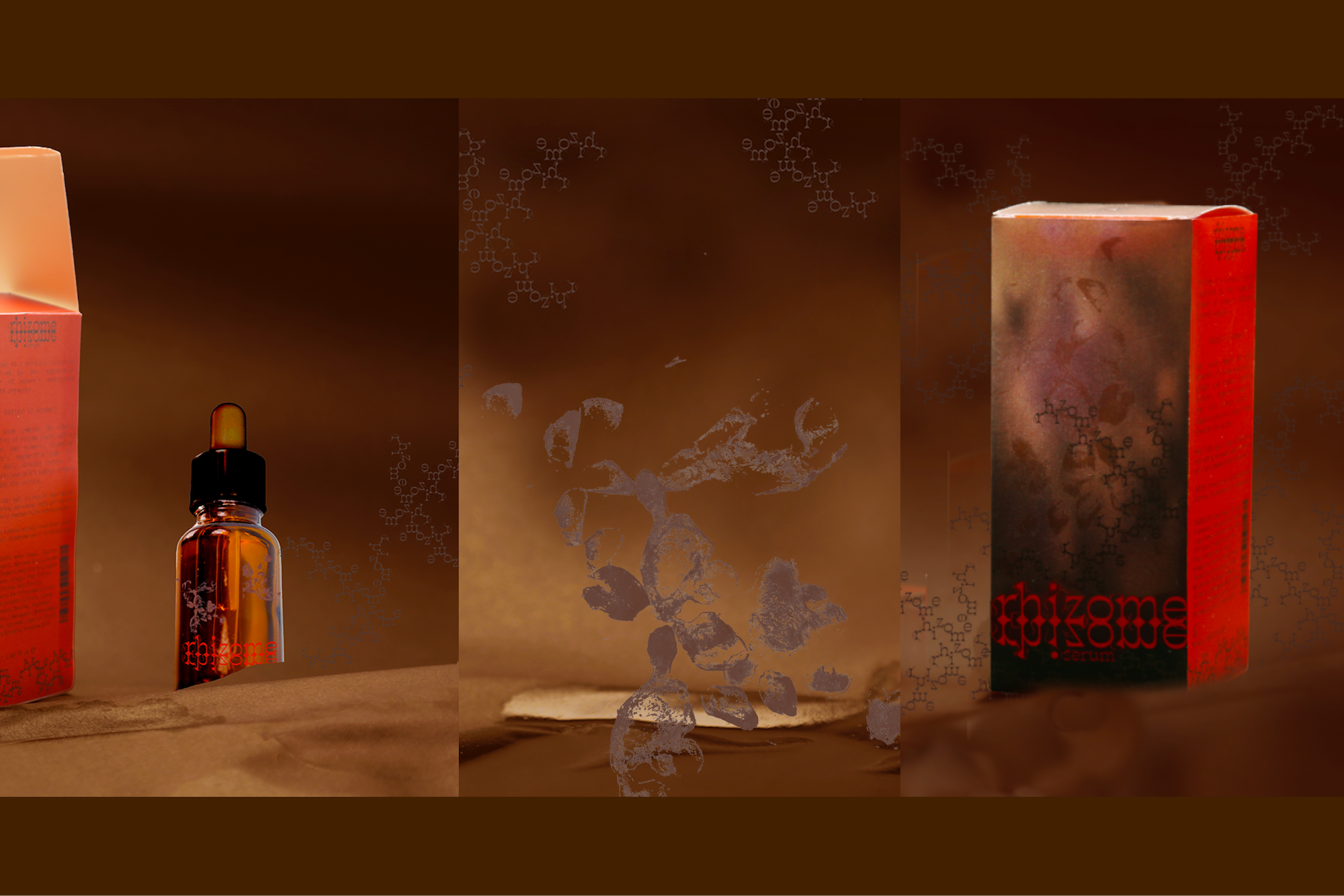
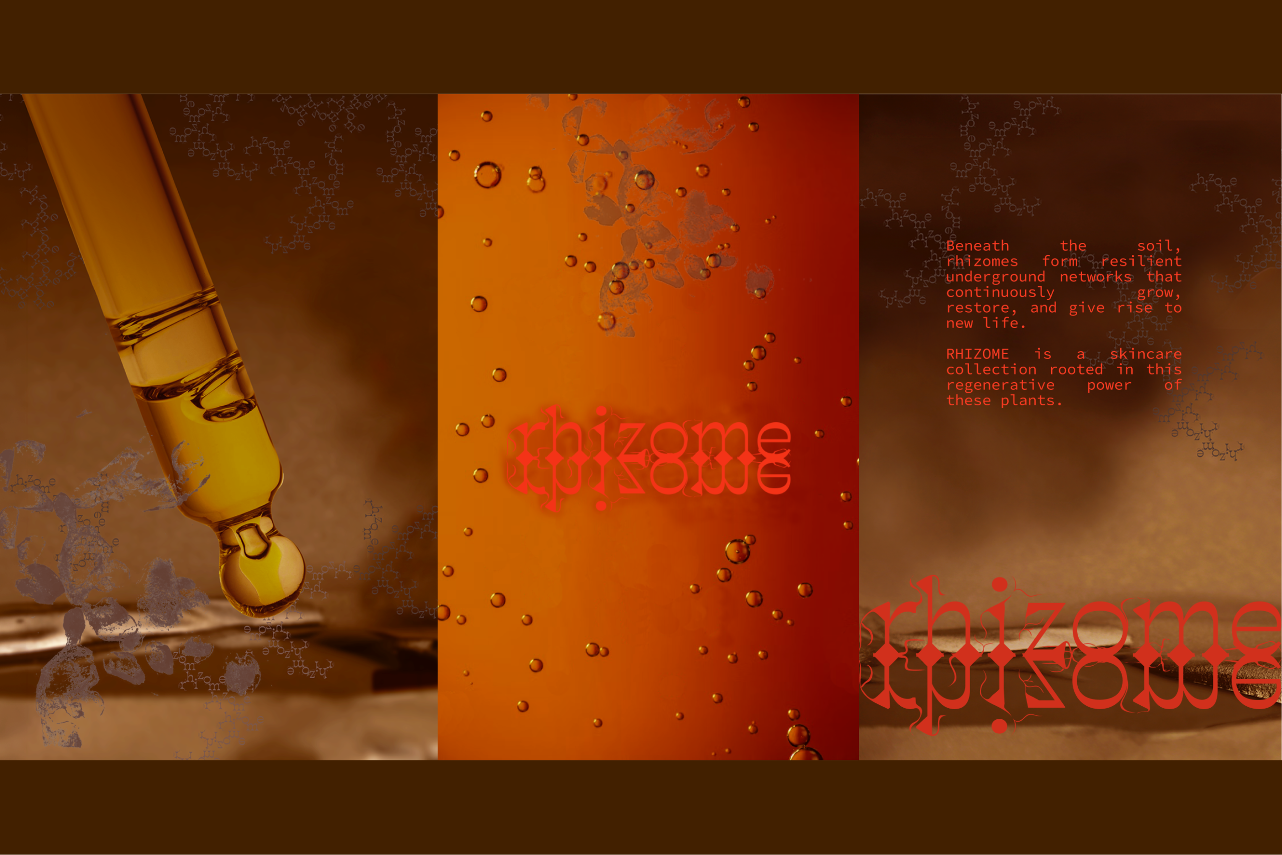
To bring the tactile qualities of rhizome plants into the packaging, textures were created through hand-stamping with fresh ginger, translating the natural irregularities of its surface into a distinctive texture. Typography forms another layer of the visual language, with letterforms and graphic elements that branch and extend like growing rhizomes.
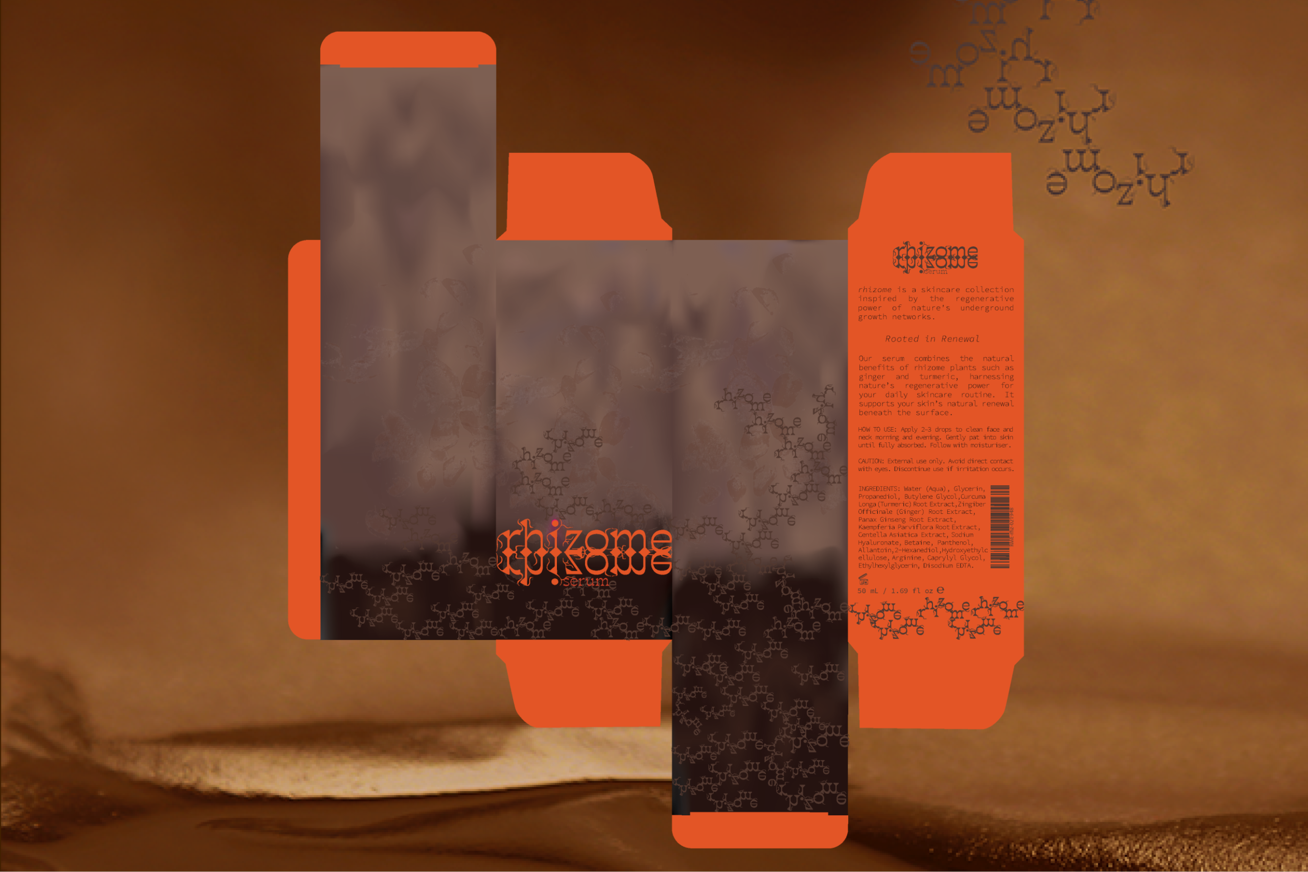
By combining hand-stamped botanical textures with an organically evolving typographic system, the packaging reflects the growth logic of its ingredients. Each element is conceived as part of a larger system, allowing the visual identity to extend and adapt across different packaging formats and brand touchpoints.
Through the layering of tactile textures, organic typography, and interconnected graphic elements, the packaging captures the vitality and complexity of rhizome plants in a cohesive visual identity.
 VERONIKA KISELEVA
 al margen
 Jasgul
 Abhijith Madhu
 Modern Theory
 Tancybox
 WINK®DESIGN
 impprintz
 Chainhouse
 rufydesign
 whitecandydesign
 Just Design
 alchimistestudioParis
 bmd group
 Laurie Offer
 medok4r
 Nouna design
 CreativeWise
 ANNA ONISHCHENKO
 Denomination
 VANESA GARCÍA ESTUDIO
 Julia Persuk
 Kingdom & Sparrow