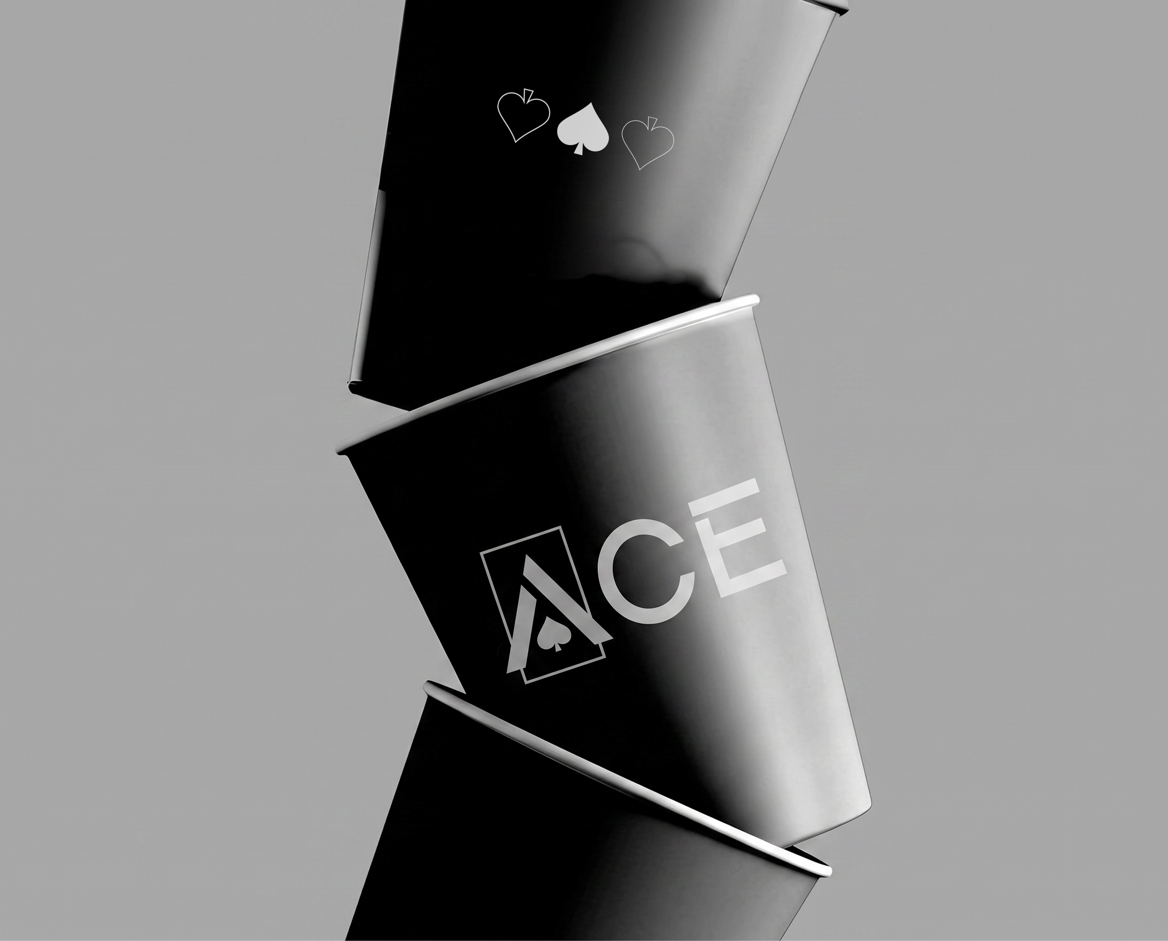

In a coffee market saturated with vibrant colors, elaborate illustrations, and increasingly complex visual identities, ACE Coffee Roastery takes a different approach. Rather than competing for attention through visual noise, ACE embraces simplicity as its defining strength, creating a bold yet refined identity that communicates confidence, authenticity, and a premium coffee experience.
The creative direction is built around a central philosophy: Great ideas begin in silence. This concept inspired a minimalist visual language where every element serves a purpose, and where restraint becomes a powerful form of expression.
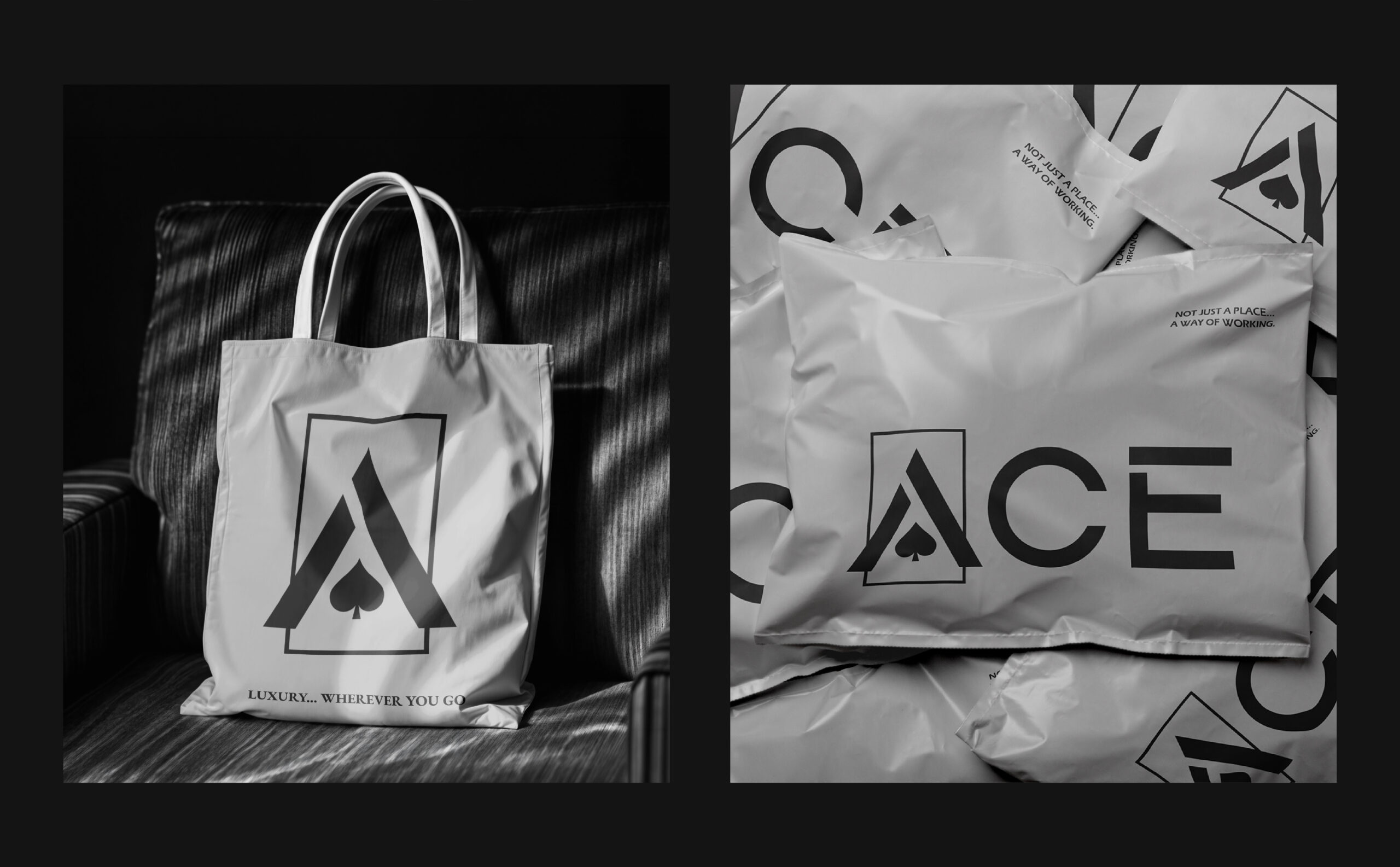
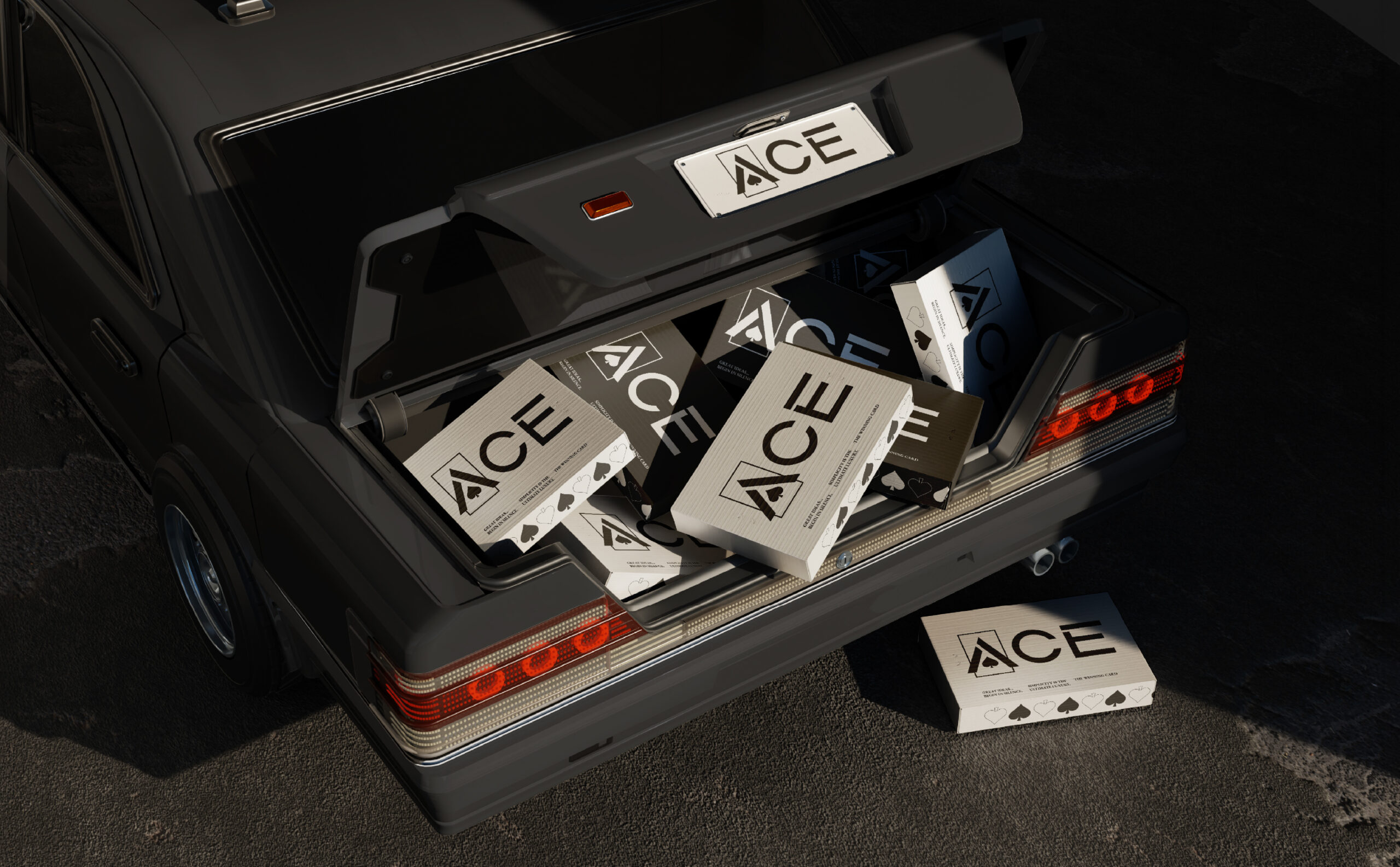
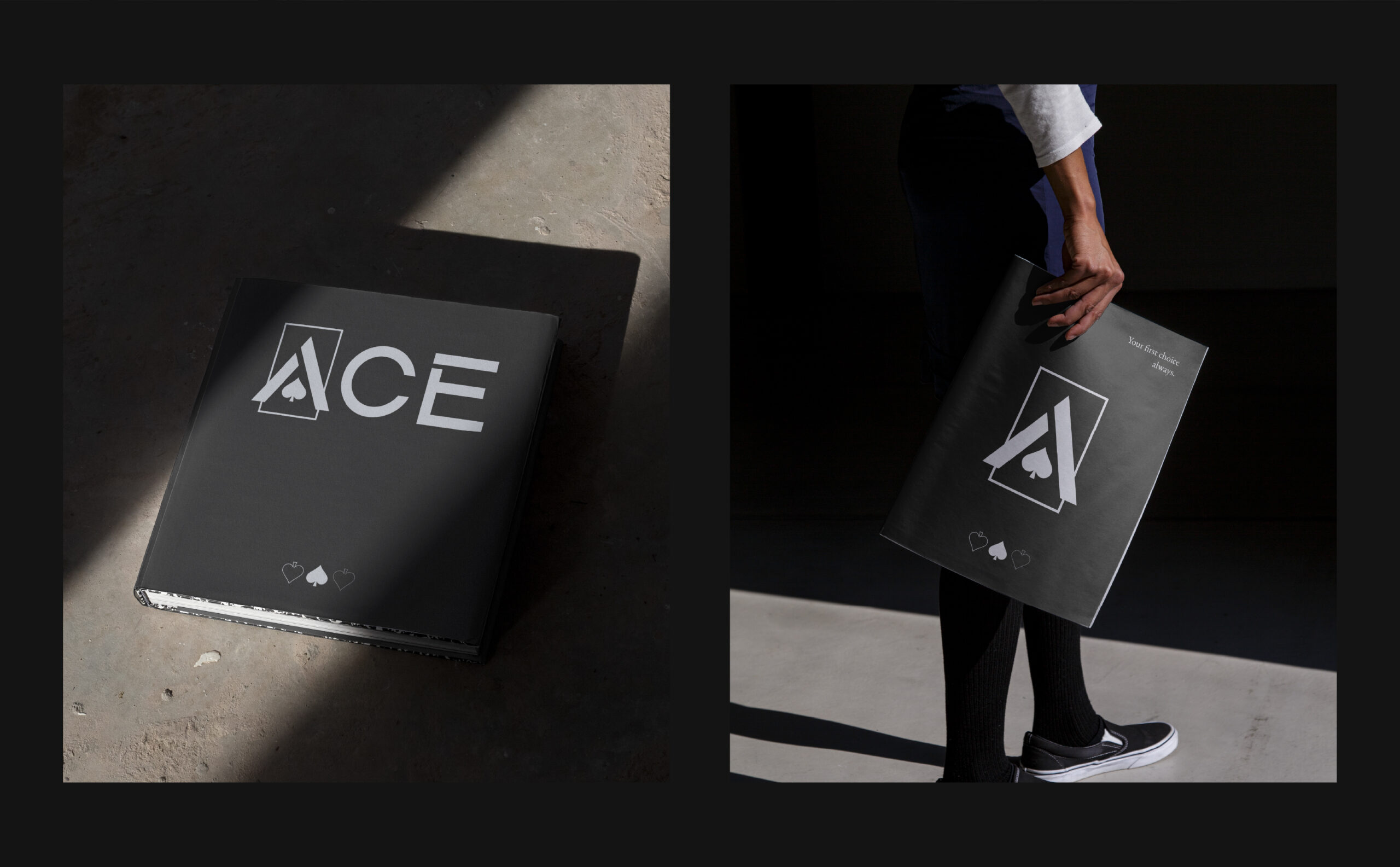
At the heart of the identity is a distinctive geometric logo that seamlessly integrates the letter “A” with the iconic spade symbol from playing cards. Constructed through a precise grid system, the mark reflects the brand’s connection to the idea of the winning card, balancing geometric clarity with a timeless visual character.
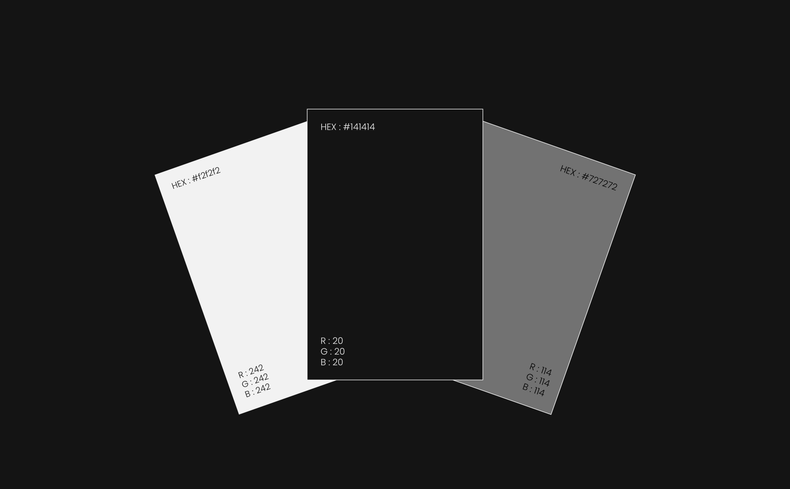
A carefully selected monochromatic palette of deep black, white, and neutral gray reinforces the brand’s sophisticated personality. The absence of vibrant colors allows typography, composition, and material textures to take center stage, creating a visual identity that feels both contemporary and enduring.
Typography plays an essential role in defining ACE’s character. The combination of EB Garamond and Eras Demi ITC brings together classical elegance and modern precision, establishing a distinctive contrast that remains consistent across the identity.
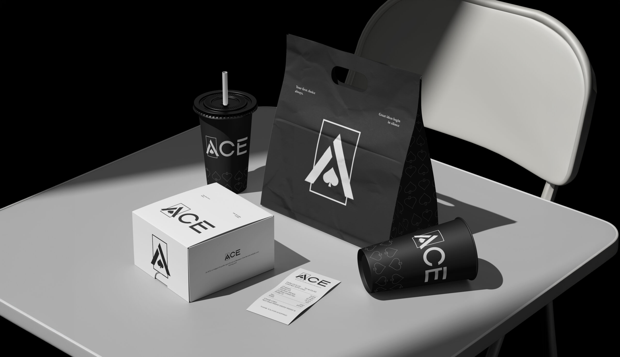
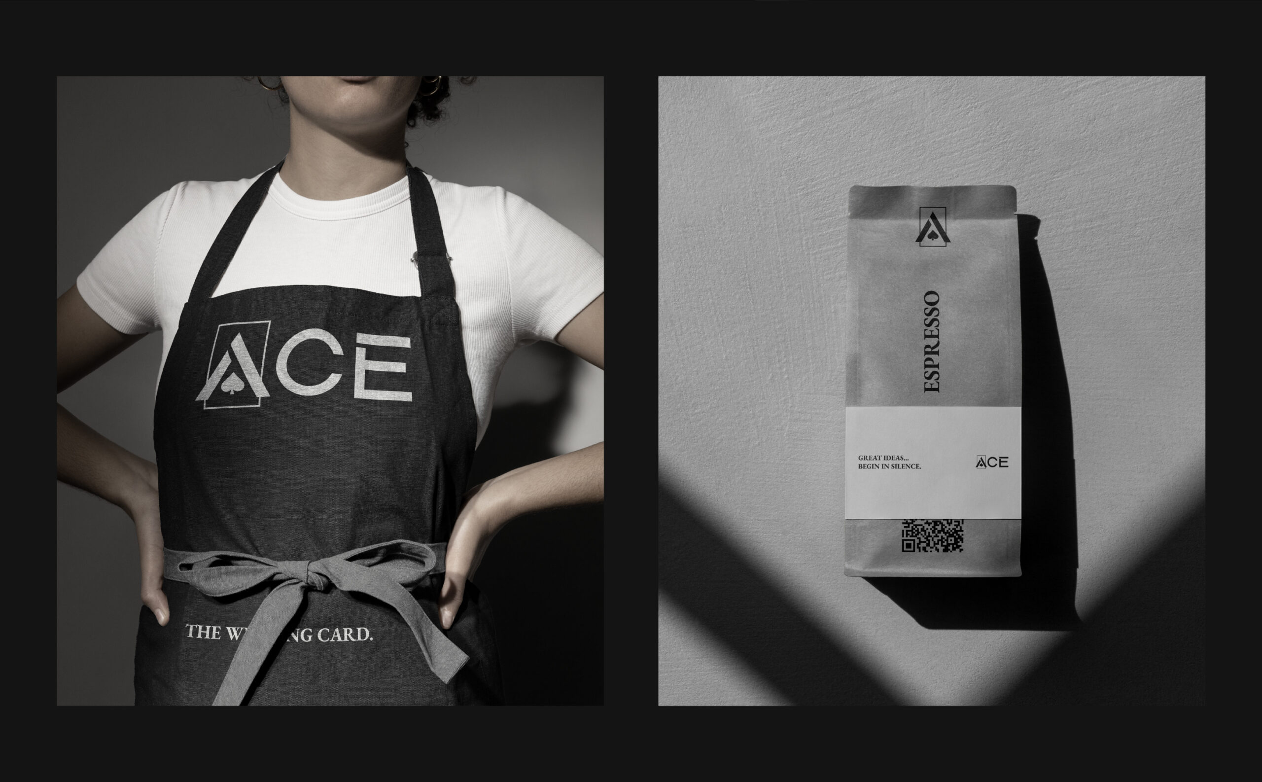
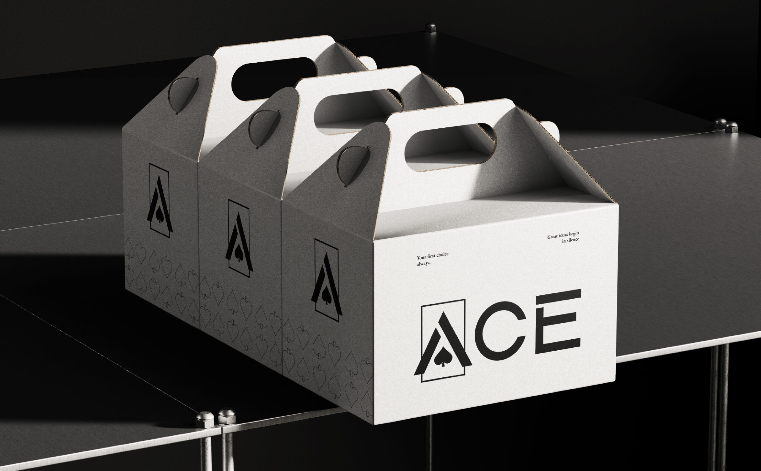
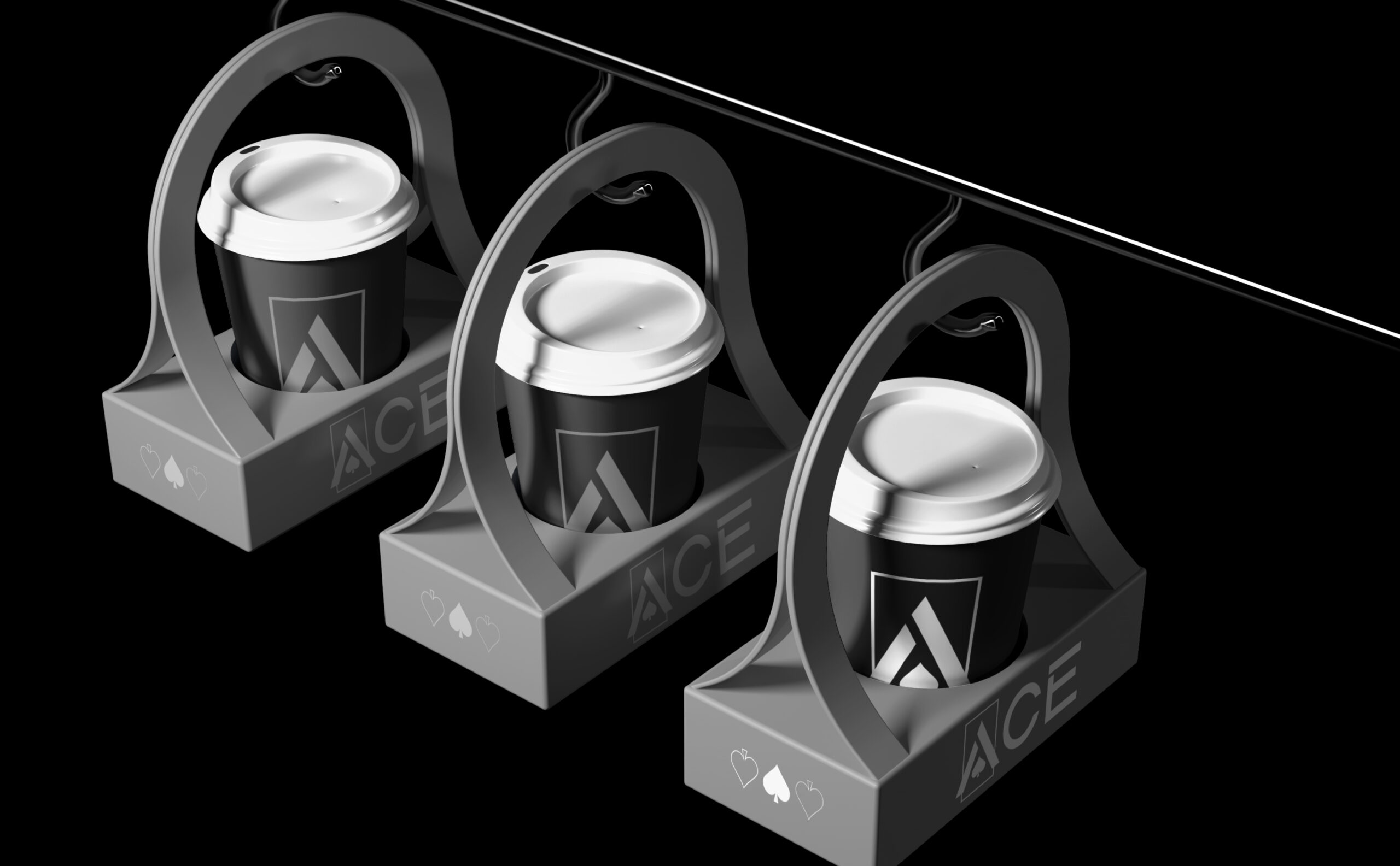
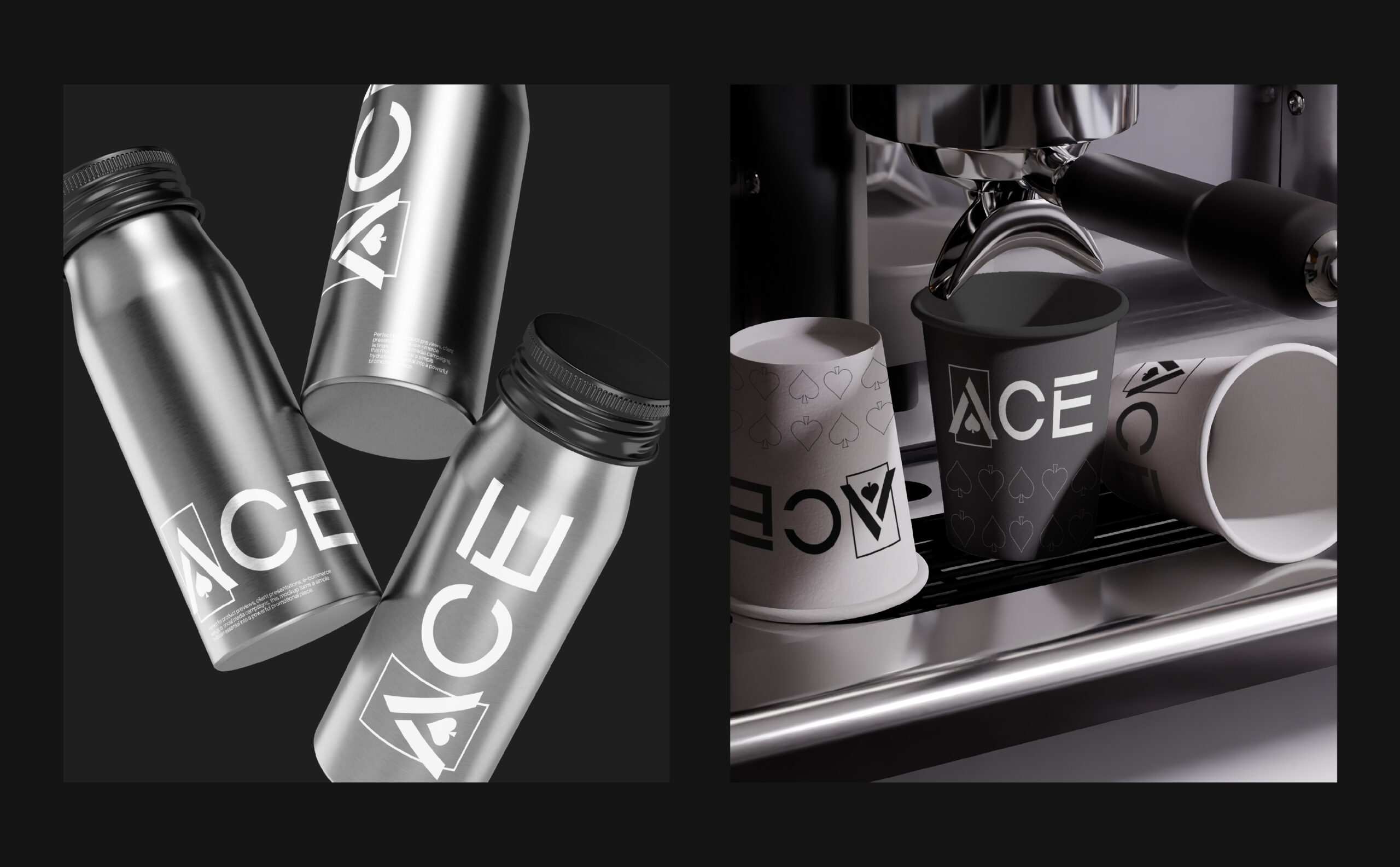
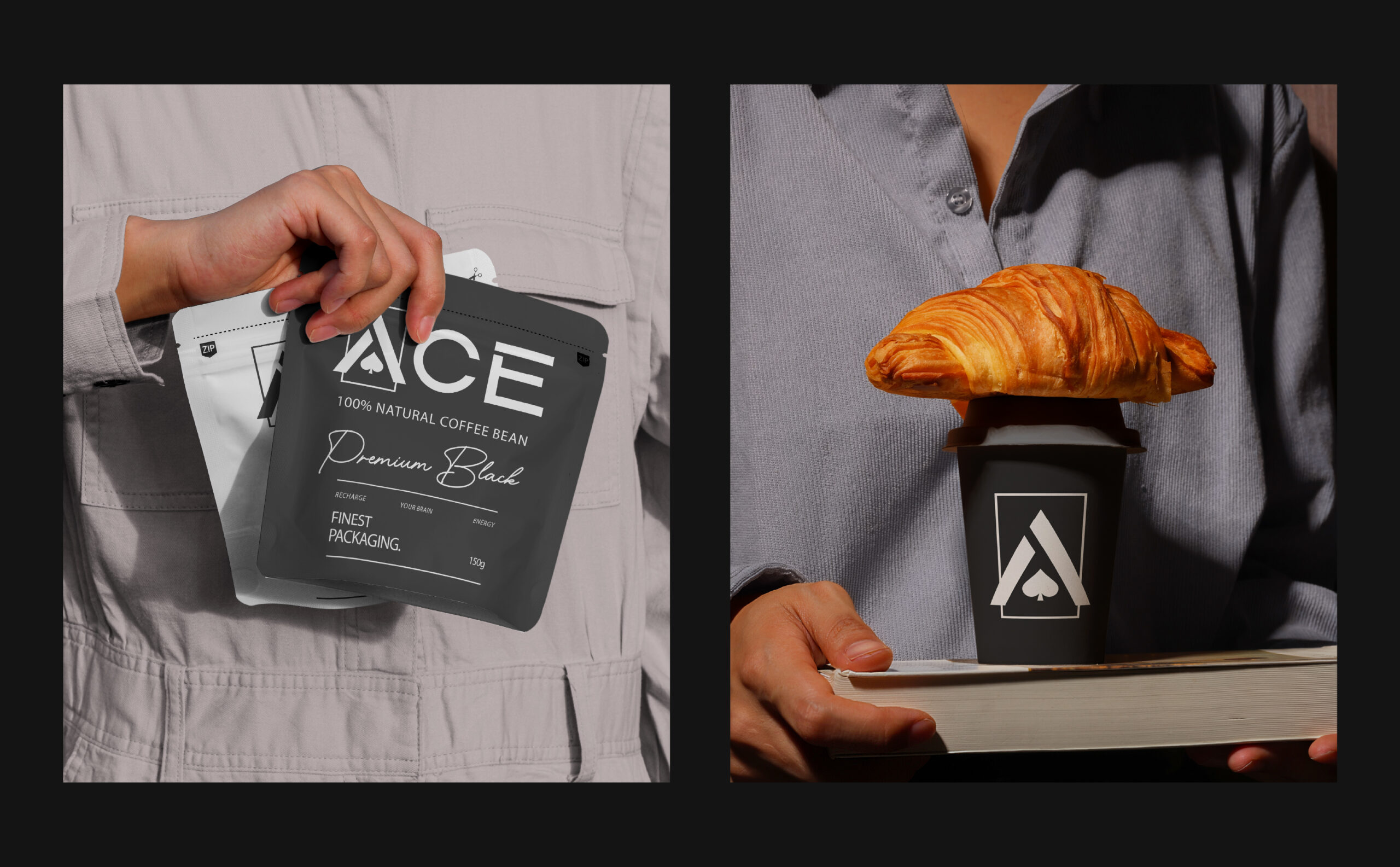
The visual system extends across coffee packaging, takeaway cups, shopping bags, branded merchandise, stationery, staff apparel, digital applications, and environmental signage. Each touchpoint reinforces the same design philosophy, demonstrating how a restrained graphic language can create a recognizable and cohesive brand experience.
ACE Coffee Roastery is an exploration of how simplicity can become a powerful competitive advantage. By stripping away unnecessary visual elements and focusing on clarity, consistency, and distinctive design, the identity proves that a brand does not need to be loud to make a lasting impression.
ACE — The Winning Card.

 VERONIKA KISELEVA
 al margen
 Jasgul
 Abhijith Madhu
 mariee
 Modern Theory
 Tancybox
 WINK®DESIGN
 impprintz
 Chainhouse
 rufydesign
 White Candy Design
 Just Design
 alchimistestudioParis
 bmd group
 Laurie Offer
 Nouna design
 CreativeWise
 ANNA ONISHCHENKO
 Denomination
 VANESA GARCÍA ESTUDIO
 Julia Persuk
 Kingdom & Sparrow