WillCUT
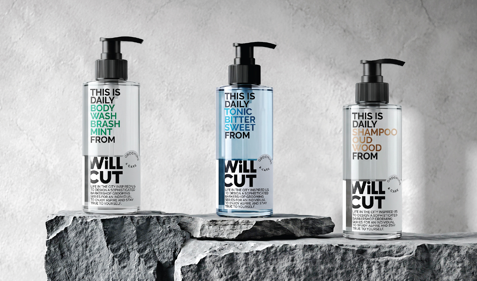
Packaging Design for Men’s Daily Grooming
ABOUT
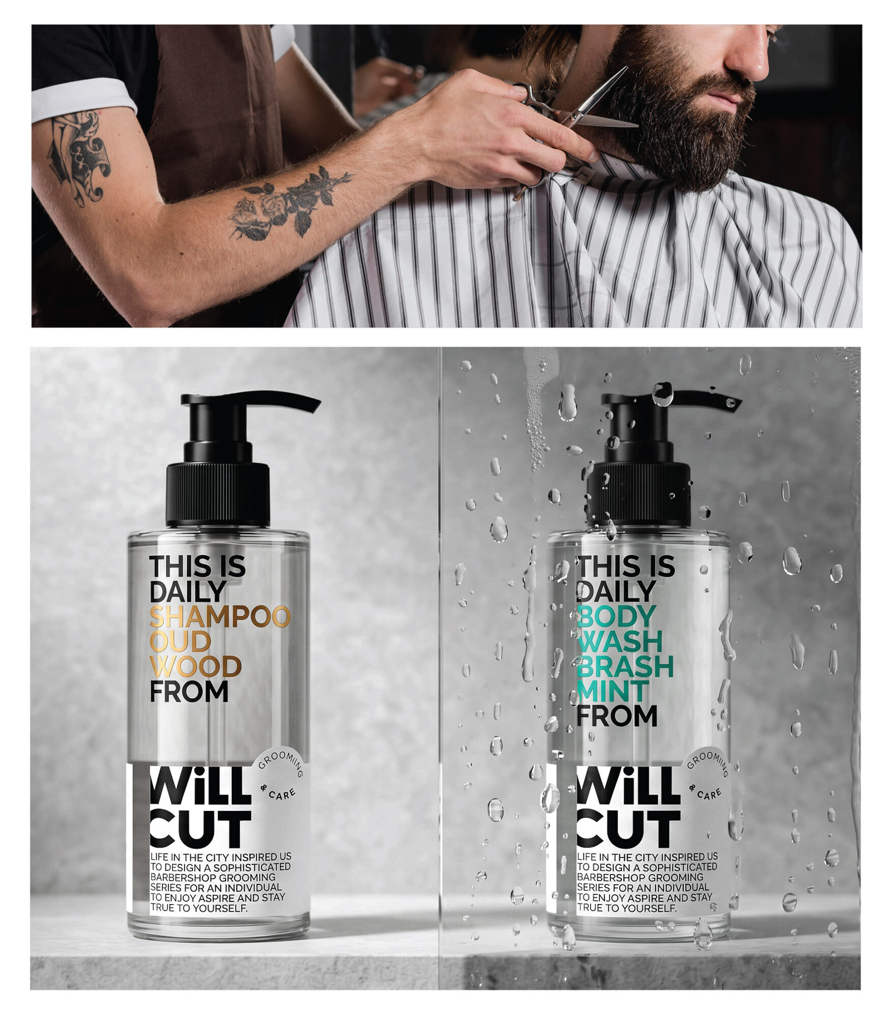
WILLCUT is a men’s daily grooming range created by a barber, bringing the character of contemporary barbershop culture into everyday personal care.
The challenge was to develop a distinctive packaging identity that combines confident masculinity with a sense of humour — sophisticated without being overly serious, playful without becoming childish.
SOLUTION
The creative direction follows the idea of “Sophisticated Mischief”, where bold typography and witty copywriting become the main visual elements.
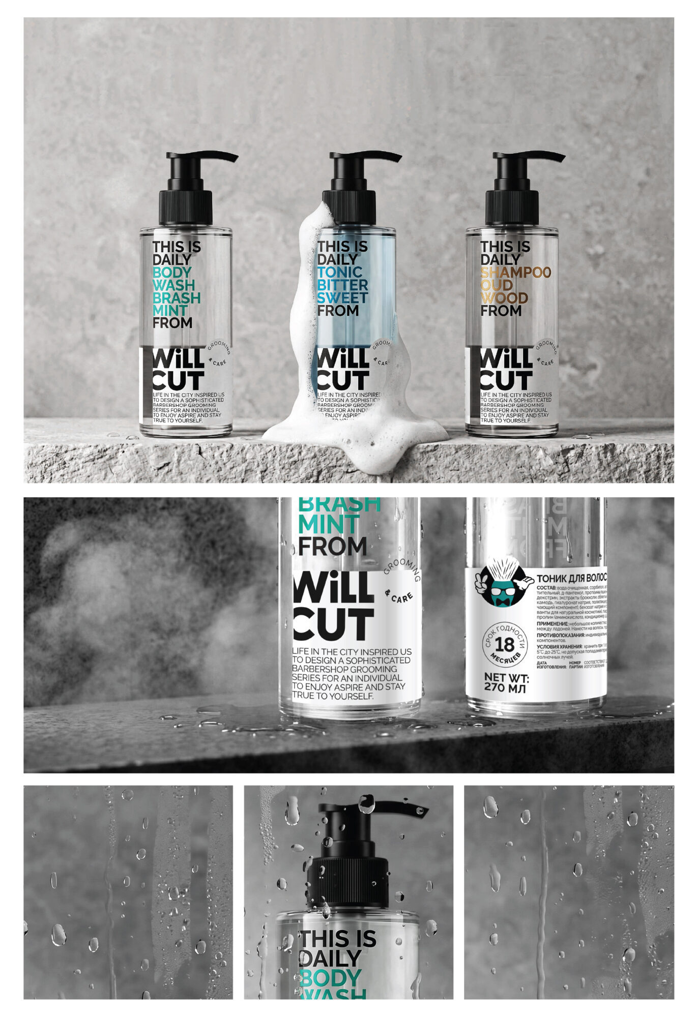
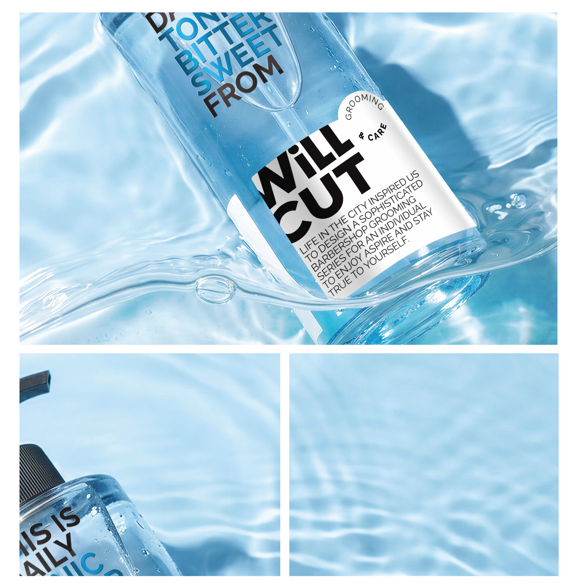
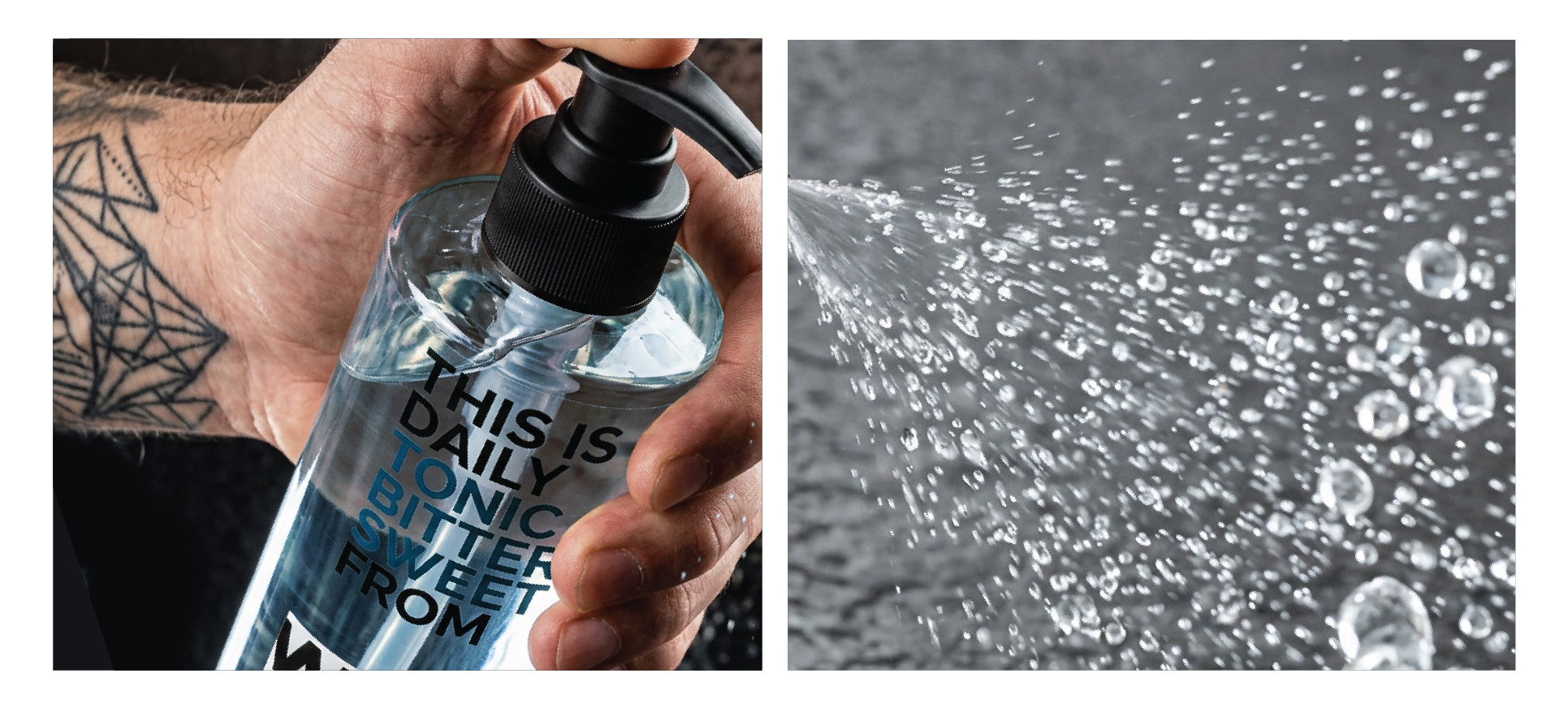
Oversized product descriptions turn into graphic statements, connected to the WILLCUT logo through the word “FROM”: THIS IS DAILY BODY WASH BRASH MINT FROM WILLCUT. The transparent upper section reveals the product itself, while the white lower label creates a clear space for branding.
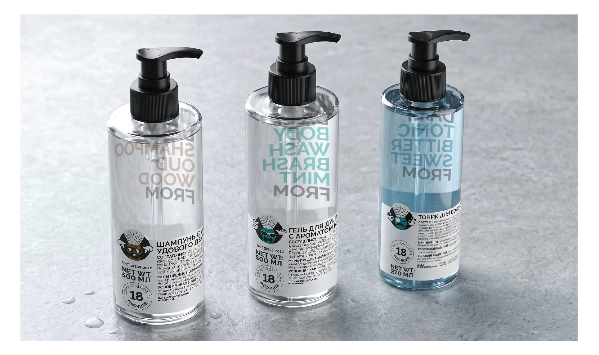
Restrained typography, minimal colour accents and transparent bottles give the front a clean, contemporary appearance. The playful side of the brand is revealed on the back, where a cheeky shaving-brush mascot references its barbershop origins.
RESULT
The result is a distinctive packaging system that balances typographic clarity with irreverent humour. Each product has its own colour and verbal character, while the consistent layout maintains a strong identity across the range.
The contrast between the disciplined front and the unexpected personality on the back makes WILLCUT recognisable, memorable and unmistakably its own.


Comments
0 commentsLog in to comment or submit projects