A New Product with a Sparkling Twist
Situation
Autumn is a season for small indulgences. Historically, sales for the “Danissimo” brand — owned by the company “Logika Moloka” (ex Danone Russia) — tend to rise during this time of year; seeking a remedy for the “autumn blues,” consumers often reach for dessert-style yogurts featuring unexpected and intriguing flavors.
Meanwhile, products infused with alcohol-inspired flavors — ranging from ice cream to croissants and even potato chips — are gaining traction in the market. This trend reflects a growing consumer interest in unconventional culinary pairings, a willingness to experiment with flavors, and a desire to try something new.
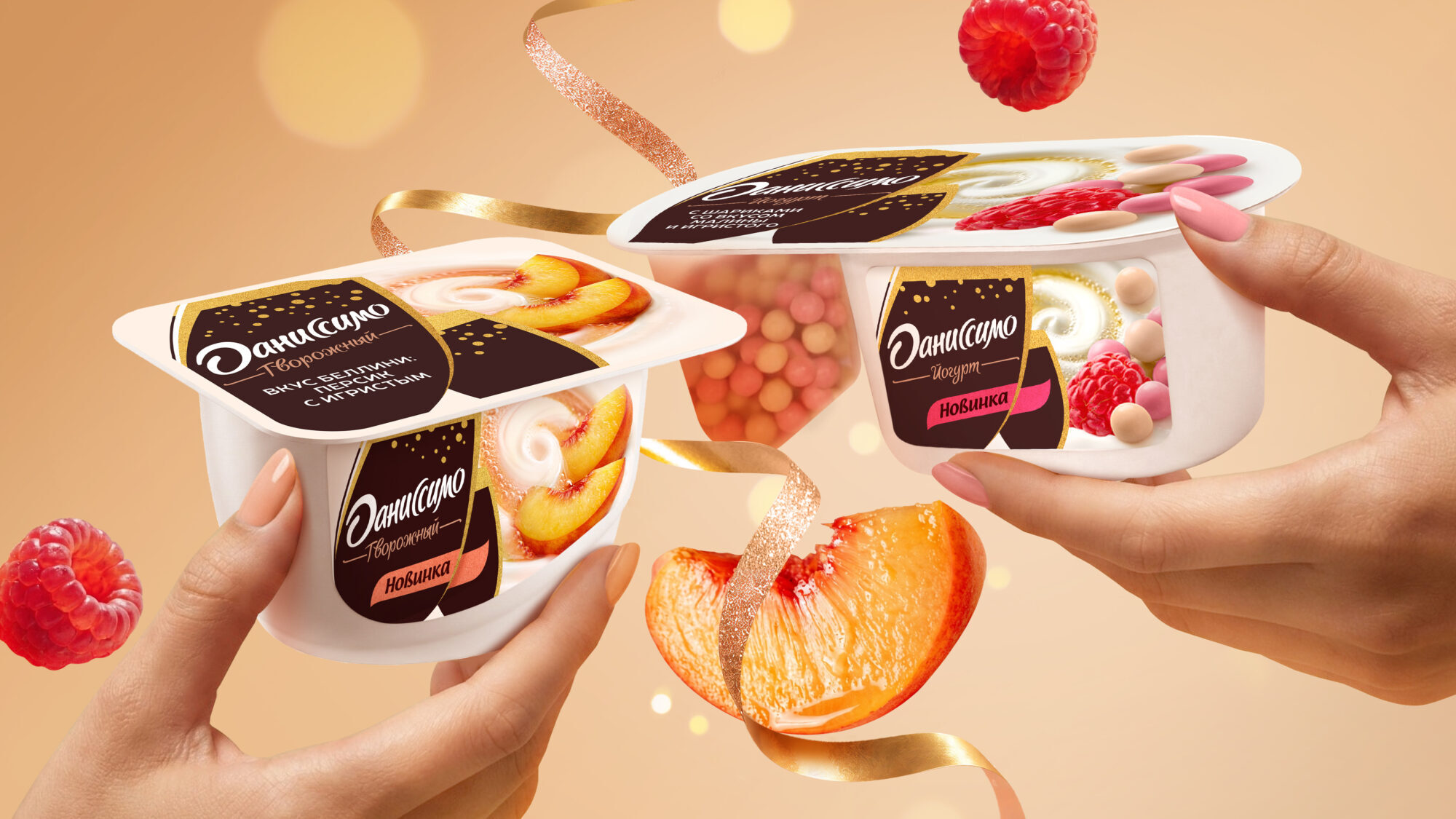
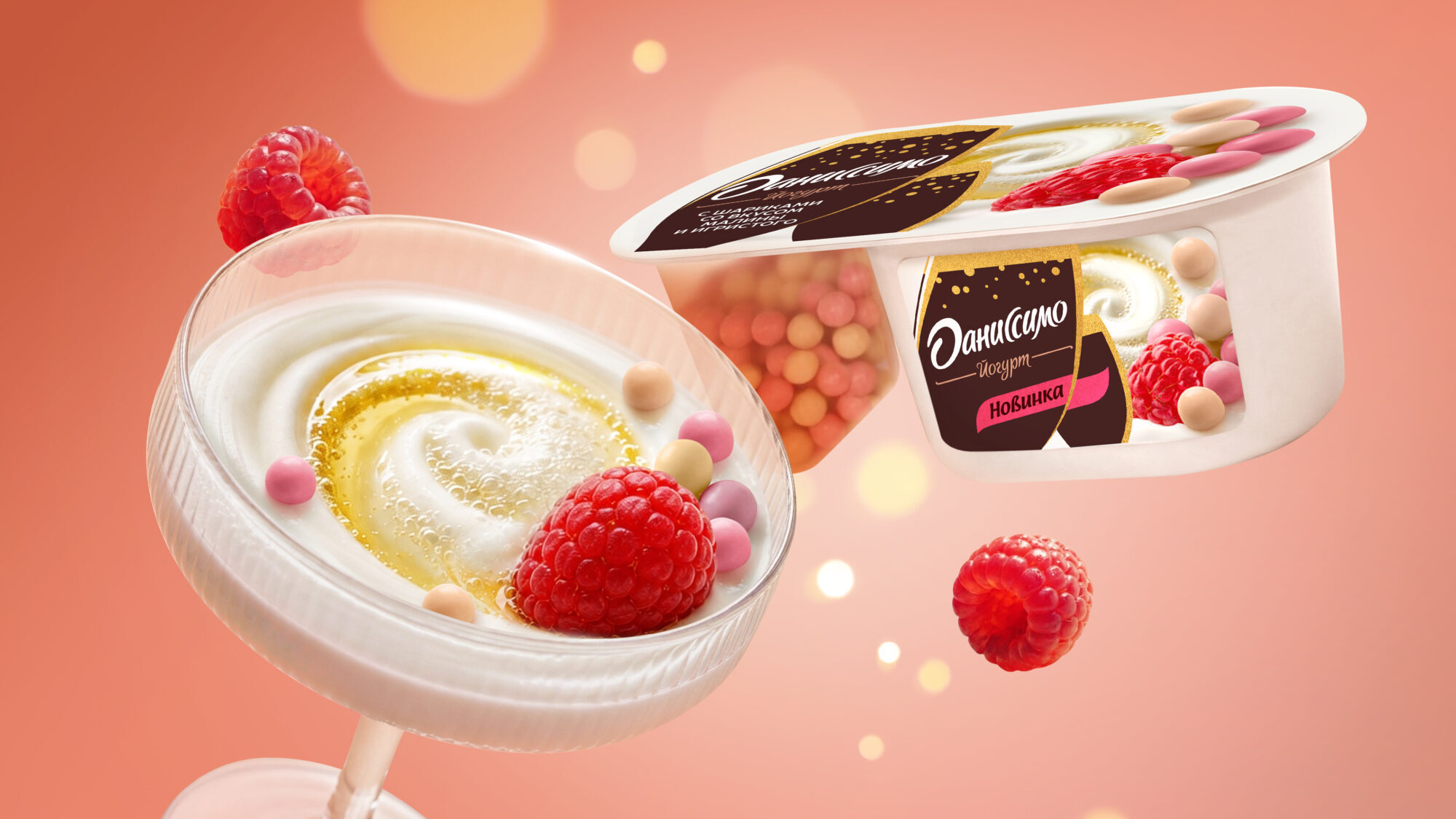
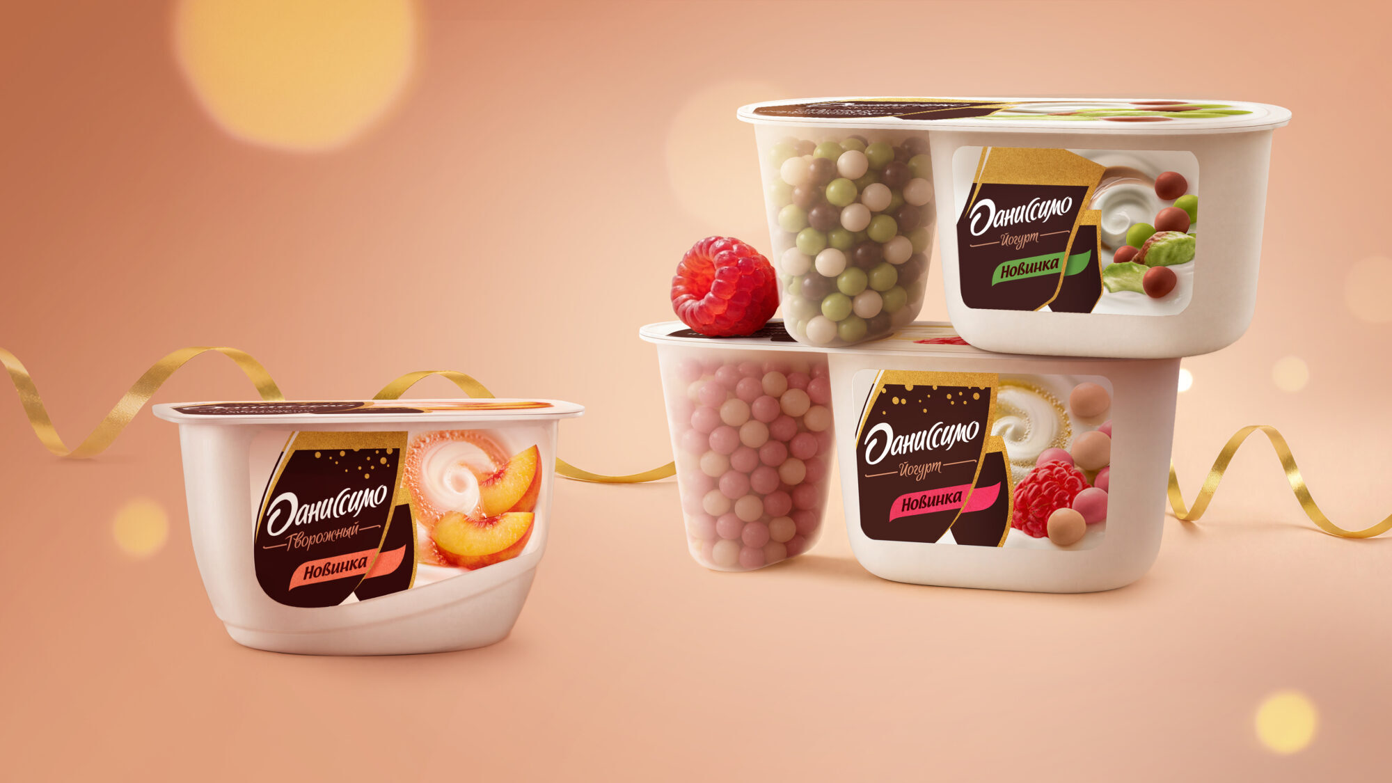
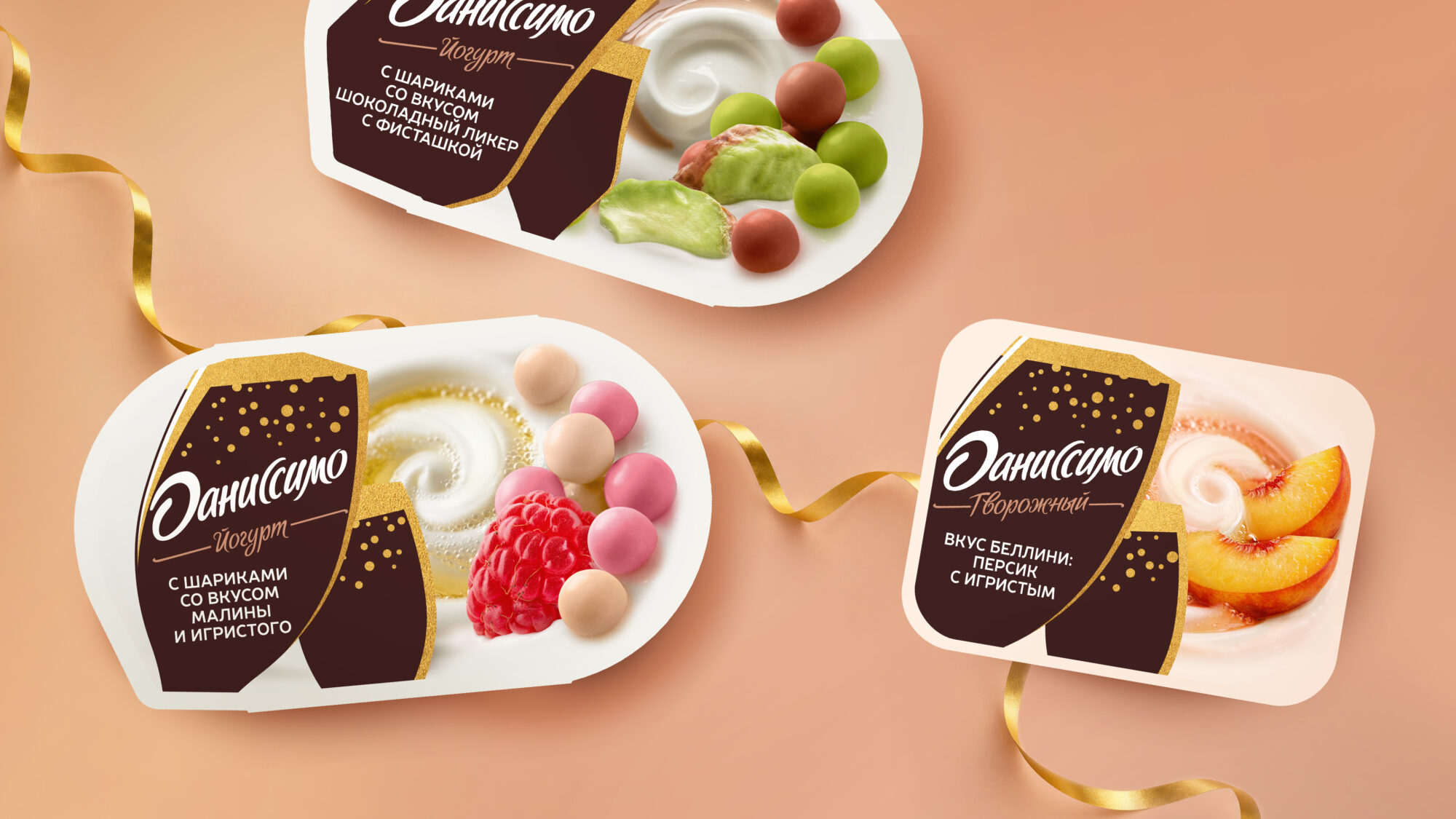
Embracing this direction, the “Danissimo” brand decided to launch a new line of products: a creamy dessert inspired by a Bellini cocktail (featuring peach and a hint of sparkling wine), a yogurt with raspberry- and sparkling-wine-flavored inclusions, and a yogurt with chocolate-liqueur- and pistachio-flavored inclusions.
Challenge
VIEWPOINT team was tasked with creating packaging designs that would highlight the unique nature of these new flavors while preserving the core attributes of the product: its creamy texture, complex, multi-layered flavor profile, and the multisensory experience provided by the distinctive mix-ins and combinations.
It was essential not only to make these new items stand out on the shelf but also to ensure they fit seamlessly into the broader “Danissimo” product range, maintaining the brand’s overall recognizability.
Solution
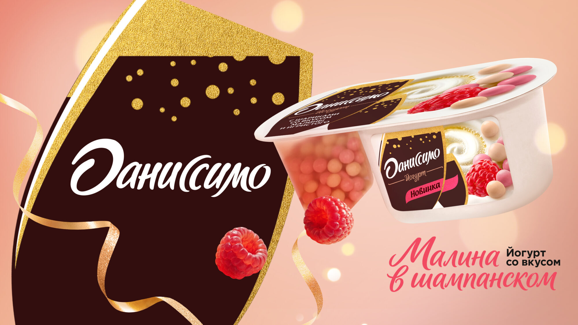
VIEWPOINT team explored various creative directions and design concepts to strike the right balance between the established brand identity and the expressive, bold nature of the new flavors — all while finding a visual way to bridge two seemingly disparate elements: yogurt and sparkling wine. The result was a design featuring a unique brand-block shape: the silhouettes of two glasses filled with the golden bubbles of a sparkling beverage. This helped the new products stand out, gave the packaging a distinct character, and underscored the unique nature of the new line. It is particularly noteworthy that the Danissimo brand team agreed to depart from their standard approach to the brand-block — an element that is always treated with the utmost care.
In this way, the packaging evolved from a mere source of information about flavor into a tool for visually positioning the new products within the brand’s broader portfolio.
The project later expanded: in addition to the packaging for three SKUs, the VIEWPOINT team developed a key visual that united the new products into a cohesive communication narrative.
These unconventional flavors were given their own visual language, while Danissimo gained a bold design solution that helped the new products make a strong statement on the shelf.



Comments
0 commentsLog in to comment or submit projects