

纪莲娜—美瞳包装
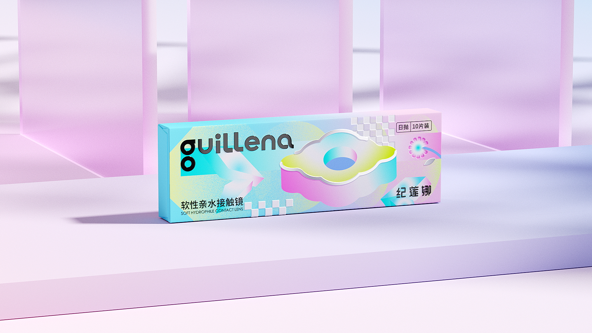
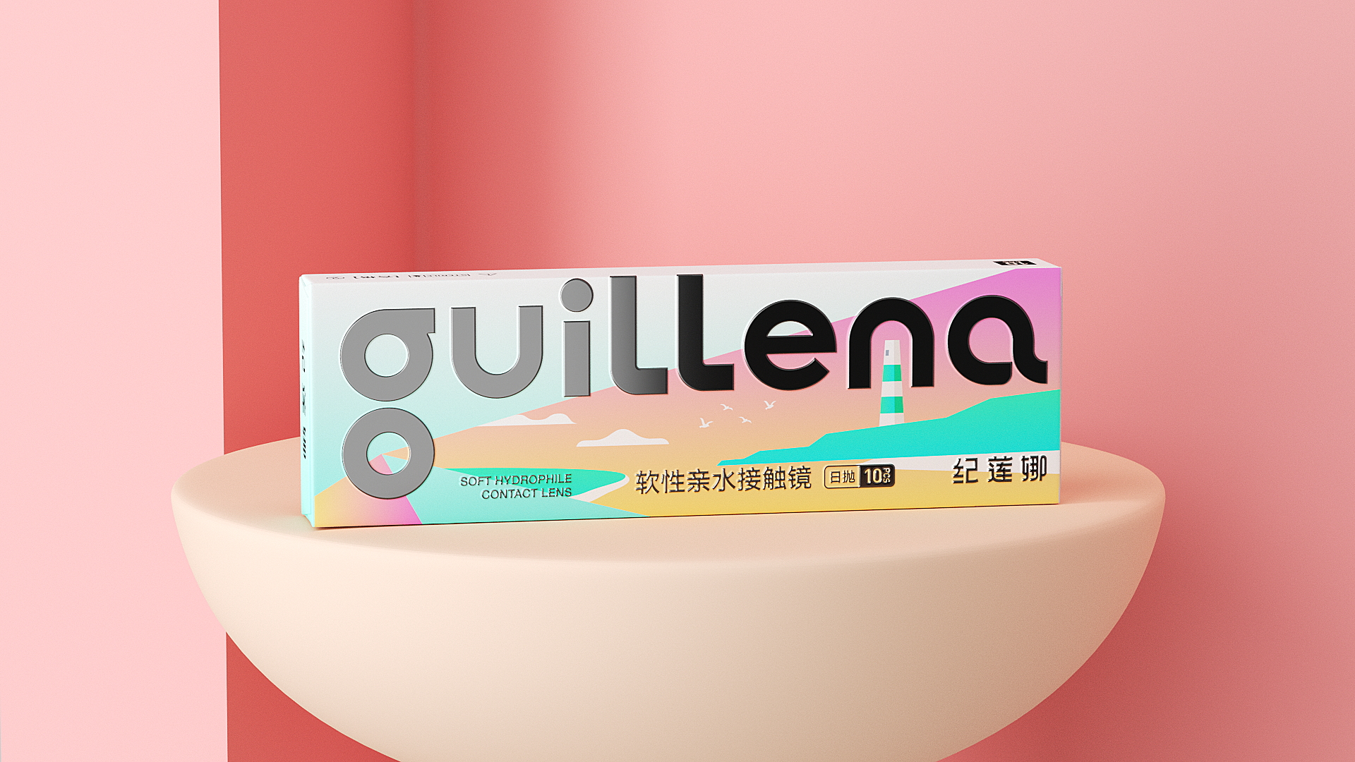
Guillena’s contact lens packaging takes a bold, youth-oriented approach to a category typically defined by clinical minimalism. The range spans several distinct colorways, a gradient cyan, vivid magenta, deep chocolate brown, and an iridescent multicolor variant, each housing the same confident lowercase wordmark that anchors the brand identity across every SKU.
The elongated slim box format feels deliberate, designed to sit as comfortably on a vanity as in a handbag. Typography is kept lean and modern, with technical specifications rendered in fine print that contrasts cleanly against the expressive backgrounds.
The multicolor editions lean into an almost psychedelic energy with swirling abstract forms, while the cyan and white variants favor a cooler, airy gradient aesthetic. Together, the lineup reads less like medical packaging and more like a beauty brand that happens to sell lenses, a positioning choice that feels very much intentional.




 butterflyhunters
 monther al omari
 Asprey Creative
 About House of Ta
 Up-Brands
 KJS CRAFT
 PG Branding
 CF Napa Brand Design
 booouuuche
 Hyejung Choi
 Abbydraw Designs Unique Conceptual Branding & Packaging Designing Ideas
 Hollóka Grafikai Műhely / Graphic Design Studio
 Minim Brand Design
 saerom81
 YNL
YNL bilel tkouri
 vitoramockup
 Lampra
 Sanavala
 www.branding.uz
 alchimistestudioParis
 Estudio Argo
 Modern Theory
 Ohmybrand