
ABOUT
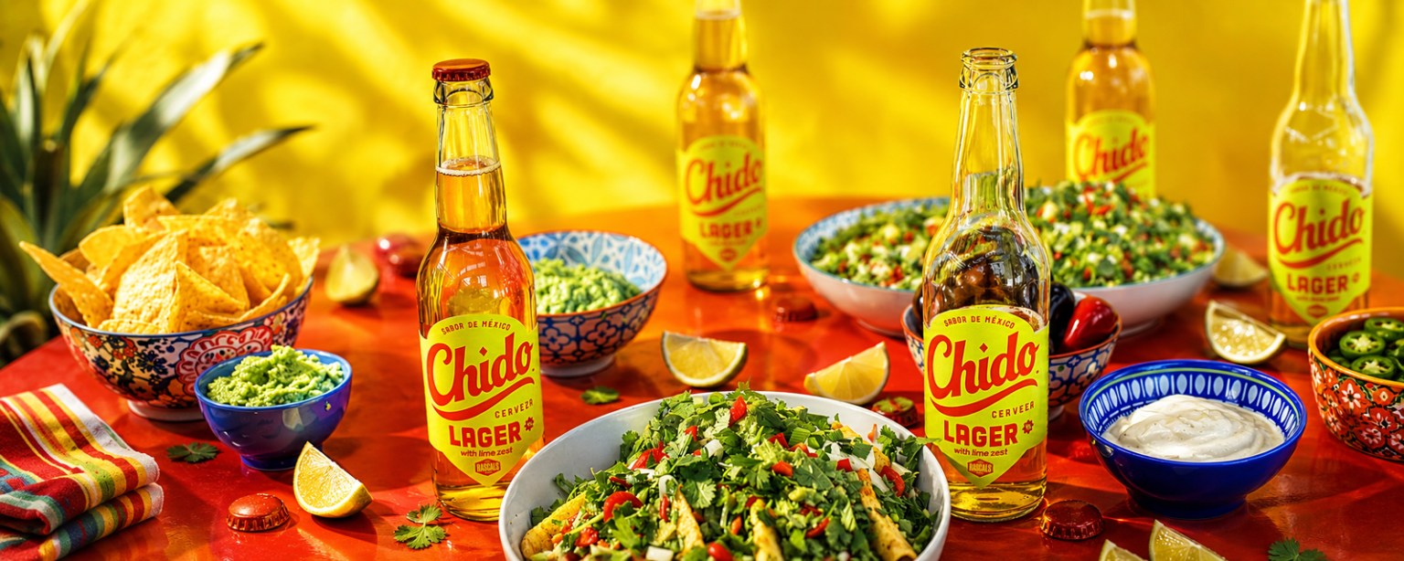
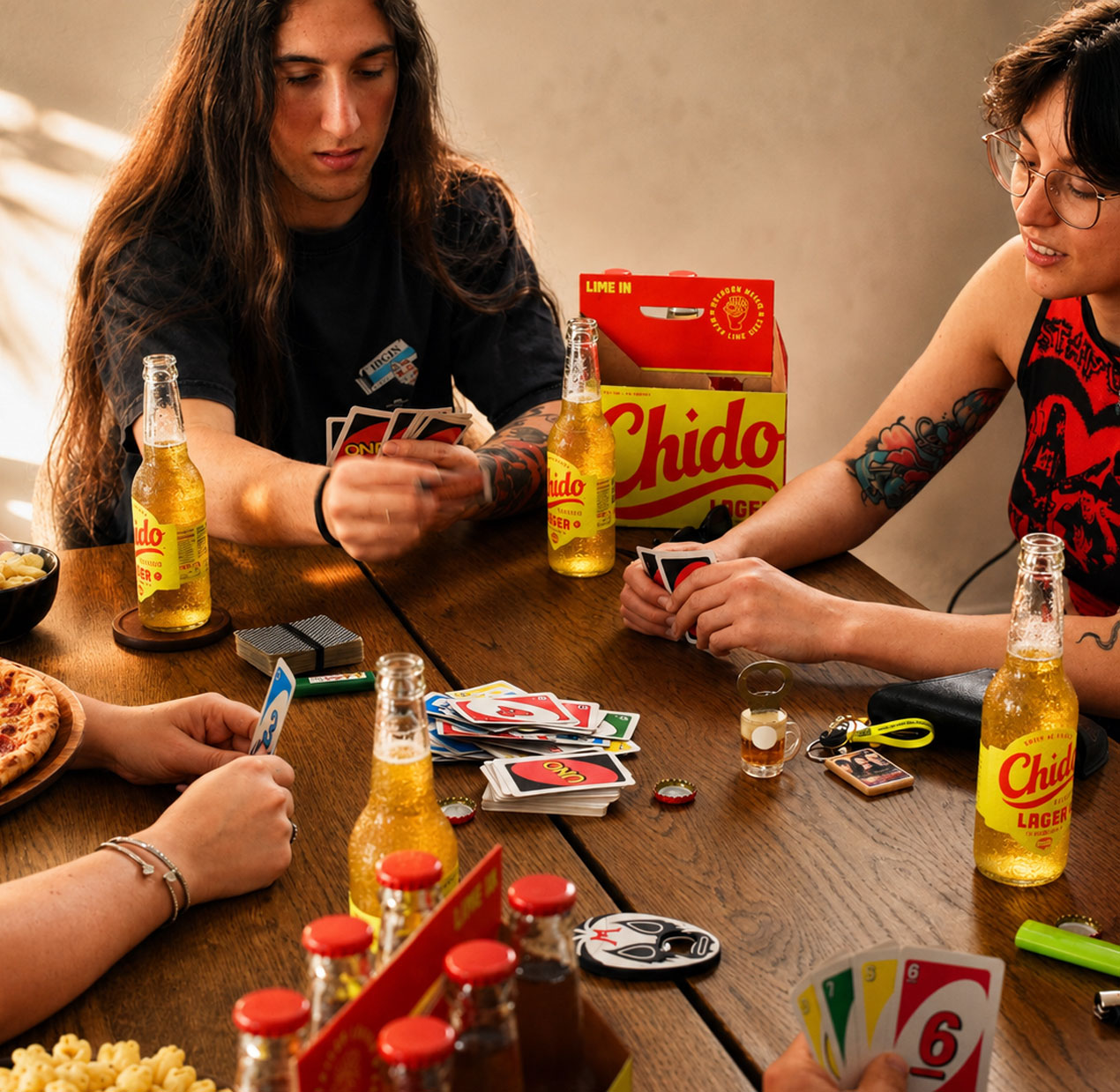
CHIDO is a modern Mexican lager with real lime zest, created for easy-going, social moments. Built around the idea “LIME IN”, the brand turns a simple product benefit into a clear point of difference: no lime wedge needed. The challenge was to create a lager brand that felt bold, joyful and culturally distinctive, while still being simple enough to live confidently in pubs, retail and everyday social occasions.
SOLUTION
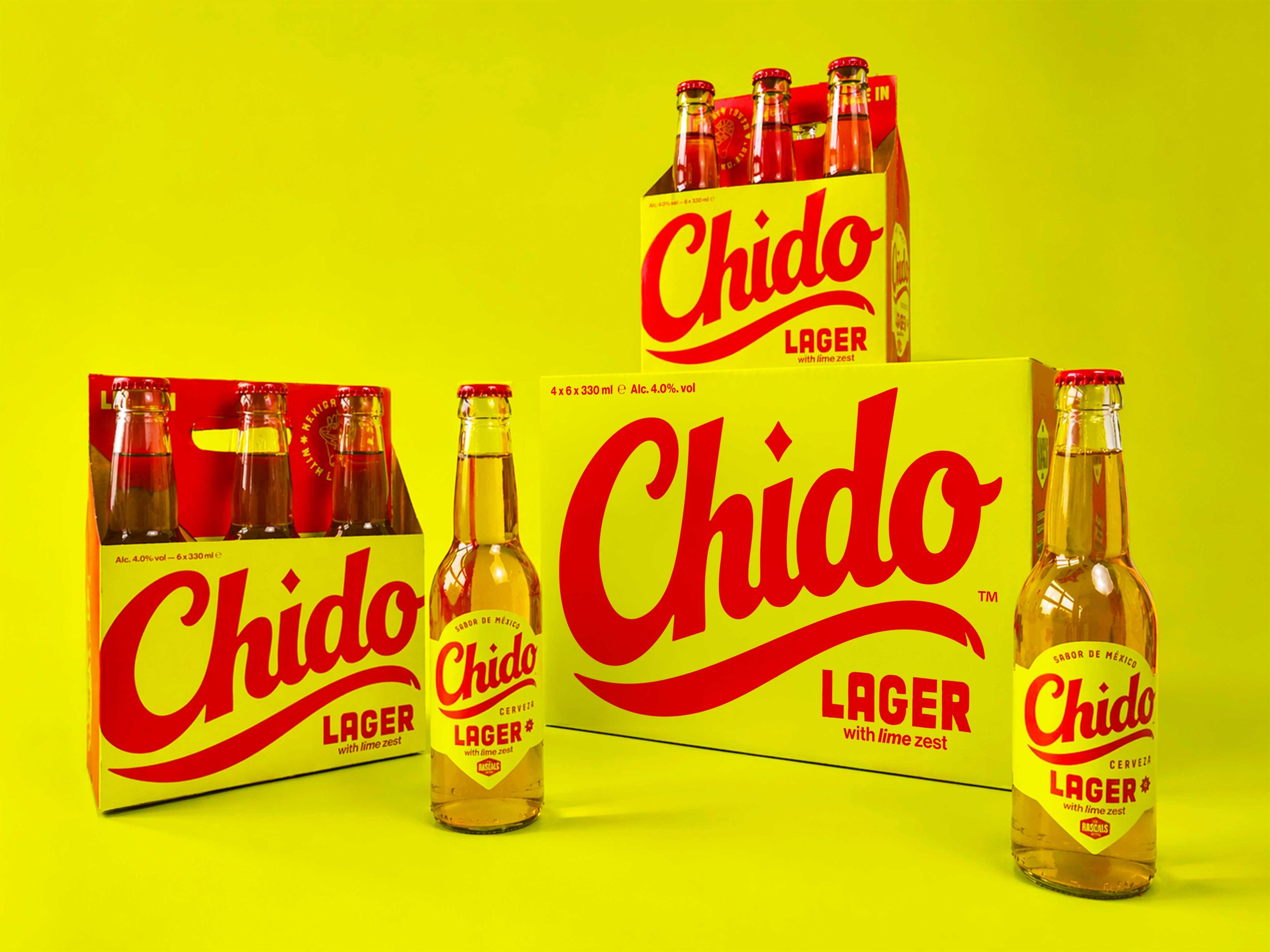
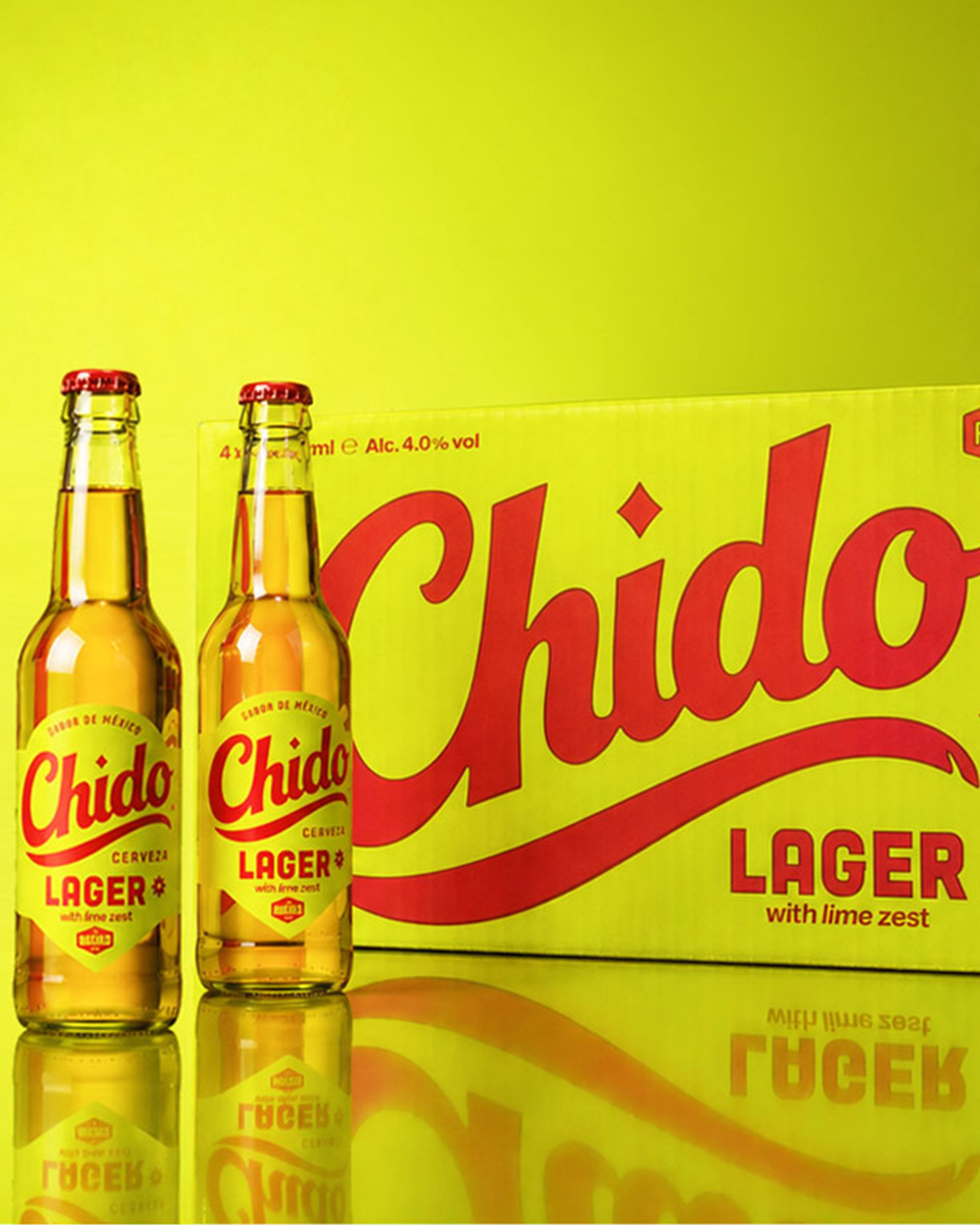
The identity draws from traditional Mexican hand-painted sign lettering found across storefronts, market stalls and cantina walls, translating that warmth and character into a contemporary beer brand. A flowing red script wordmark sits against a vivid lime-yellow background, creating immediate shelf impact and a strong connection to the product’s lime-led proposition. A small chip in the logo’s swoosh adds a subtle handmade imperfection, keeping the mark human rather than overly polished.
RESULT
The result is a distinctive brand world that brings colour, warmth and movement into a lager category often dominated by muted craft cues or minimal modernist design. Across packaging, point-of-sale, guidelines and launch assets, CHIDO feels bright, confident and instantly recognisable — a beer with the energy of a street party and the clarity to stand out in mainstream spaces.
Curator’s Insight:
The deliberate chip in the logo’s swoosh is a small decision that carries real weight. It’s the kind of detail that separates a brand identity with genuine craft instincts from one that simply references a visual tradition. Hand-painted lettering as inspiration is well-trodden territory in food and beverage, but the imperfection here isn’t decorative nostalgia. It functions as a credibility signal, suggesting the brand earned its visual language rather than borrowed it. Worth noting too is how the yellow-and-red palette sidesteps the obvious. Red and green would have been the predictable Mexican market shorthand. Swapping green for a saturated lime-yellow keeps the lime proposition literal without collapsing into cultural cliché, and it gives the bottle a distinctly warm, sun-bleached register that reads differently at retail than the cool-toned craft lagers surrounding it.







 monther al omari
 Alexander Skurihin
 Studio K95
 ARMBRAND
 Richa Rai
 houseoferas by Miti
 Agence des Coteaux
 Kushi Eaknath
 Ann Treasa
 Xiao Ning
 krrrrrllii
 babyage
 Deep
Deep Atiq Alam
 TUERCA Studio
 neo creative studio
 Pinot Agency
 Pixels Studio
 Anastasia Cherepanova | xtramez
 awaiskhadim
 Studio Be Design
 Belova Oksana