

Encore is a non-alcoholic aperitif made for people who still want the drink, the ritual, and the social experience, just without the alcohol. The idea behind the brand is that choosing not to drink shouldn’t feel like you’re missing out. Encore is meant to feel just as fun, exciting, and worth reaching for as any other drink. Nothing to Proof.
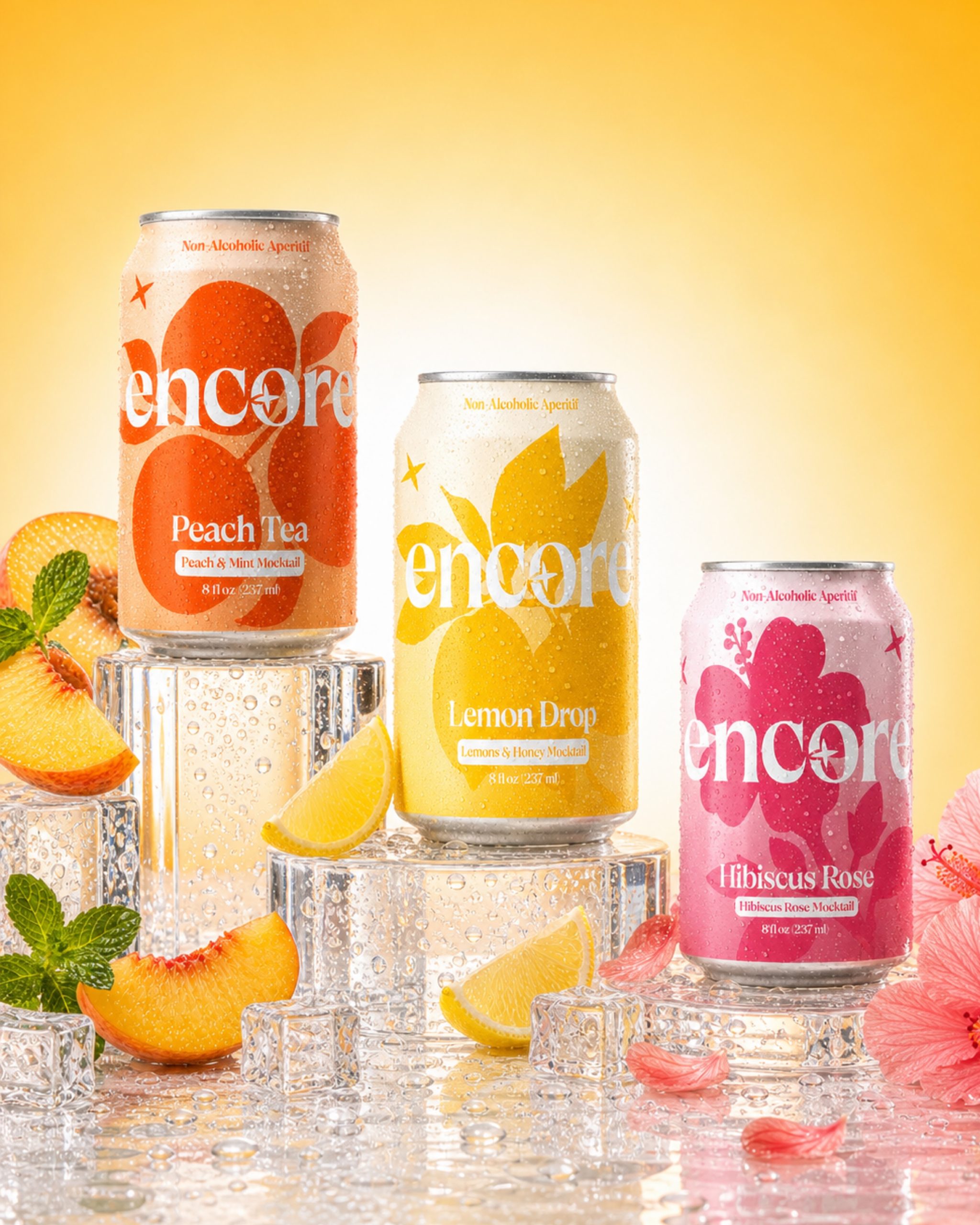
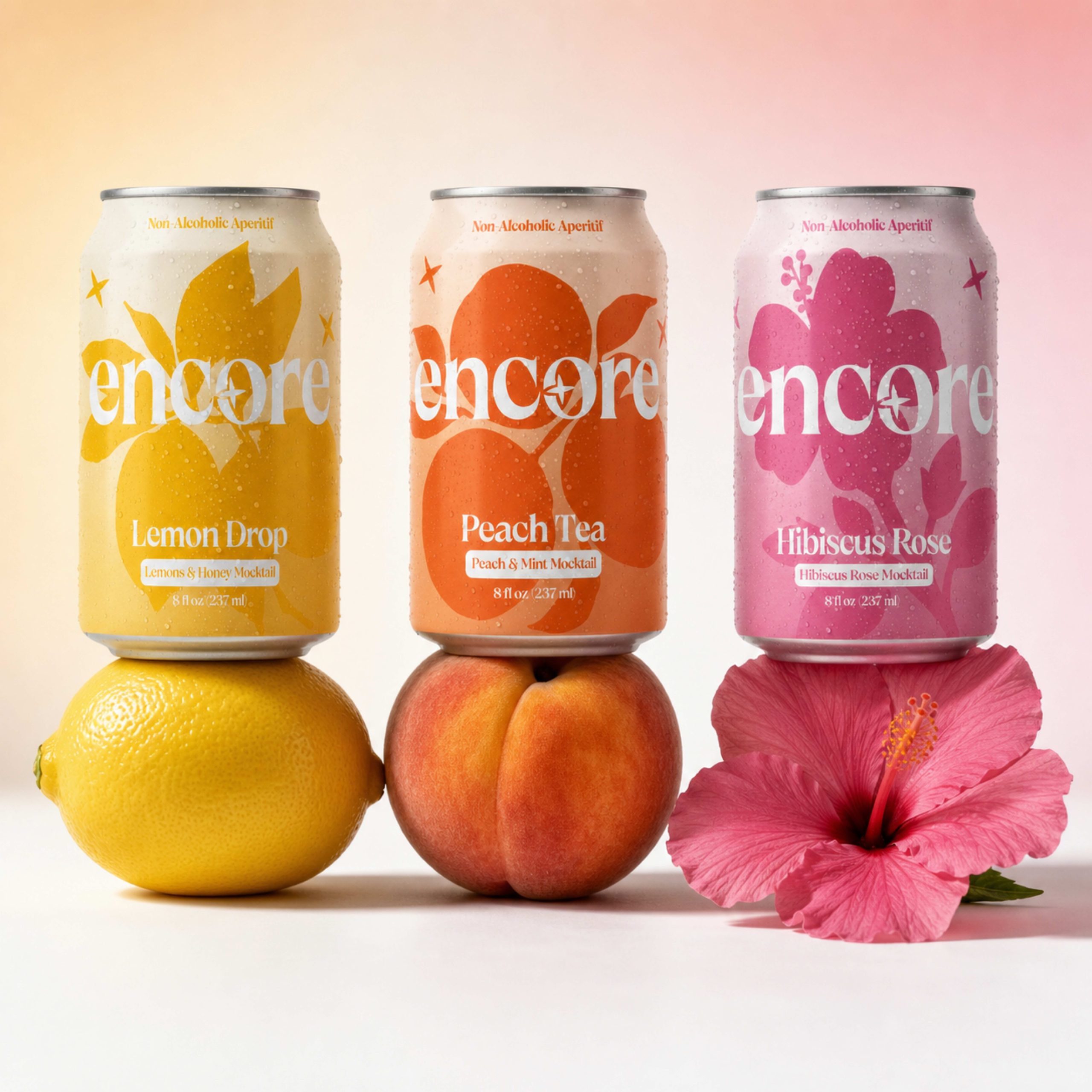
The packaging was designed to bring that same energy to the shelf. I wanted it to feel colorful, bold, and full of personality instead of going in the quiet, minimal direction you often see with non-alcoholic drinks. Each flavor has its own color and oversized ingredient illustration, so you can immediately tell them apart while they still feel like part of the same Encore family.
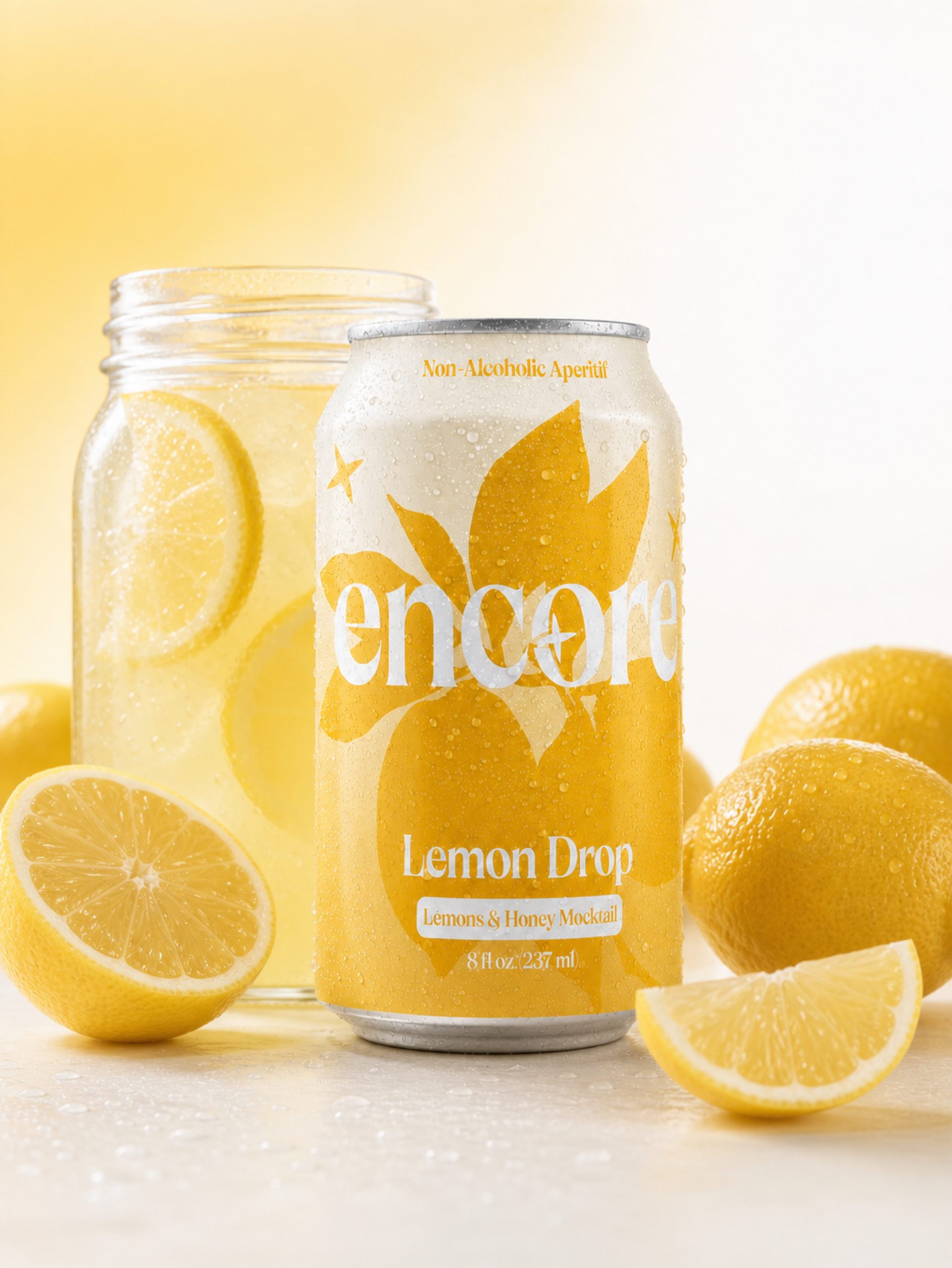
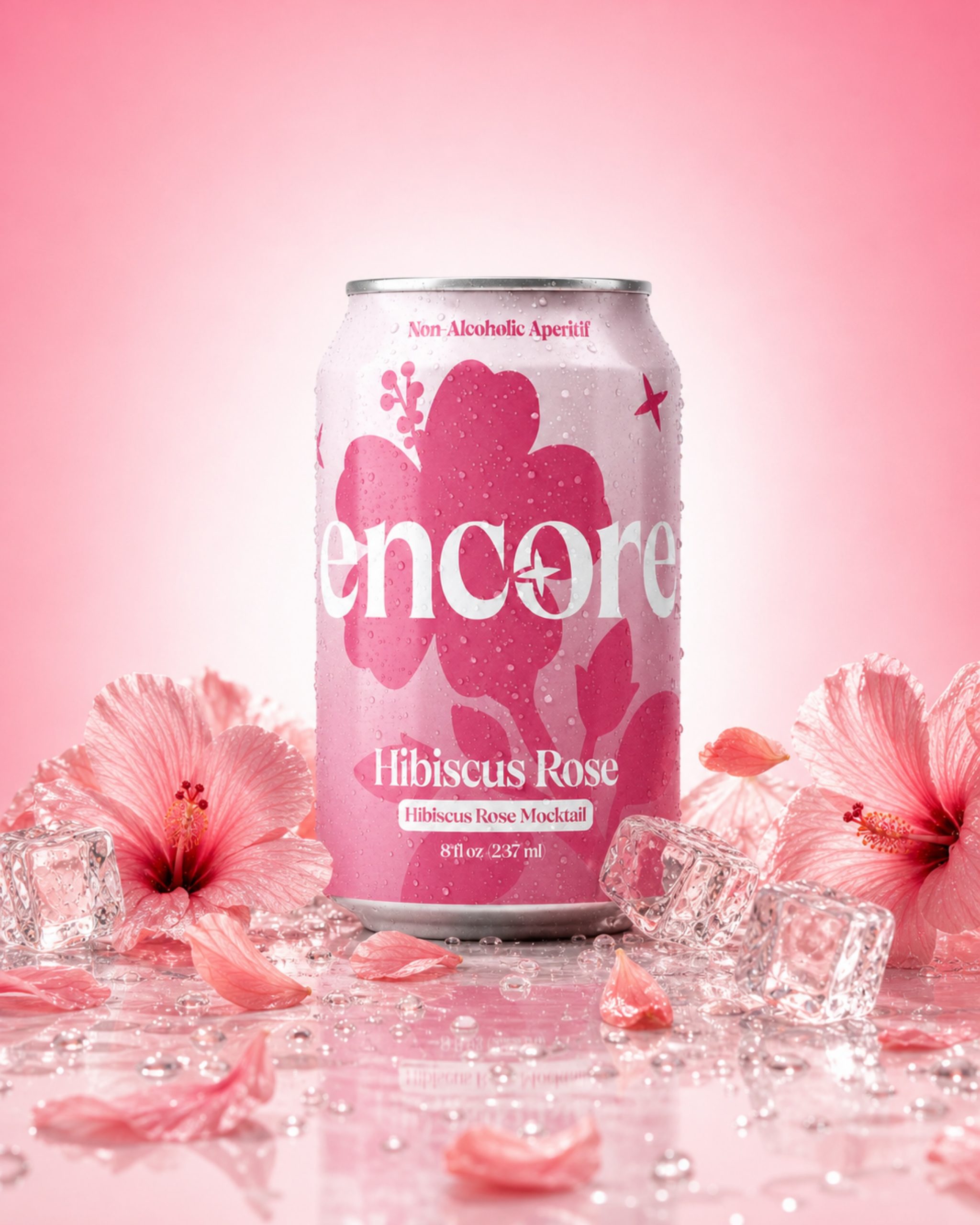
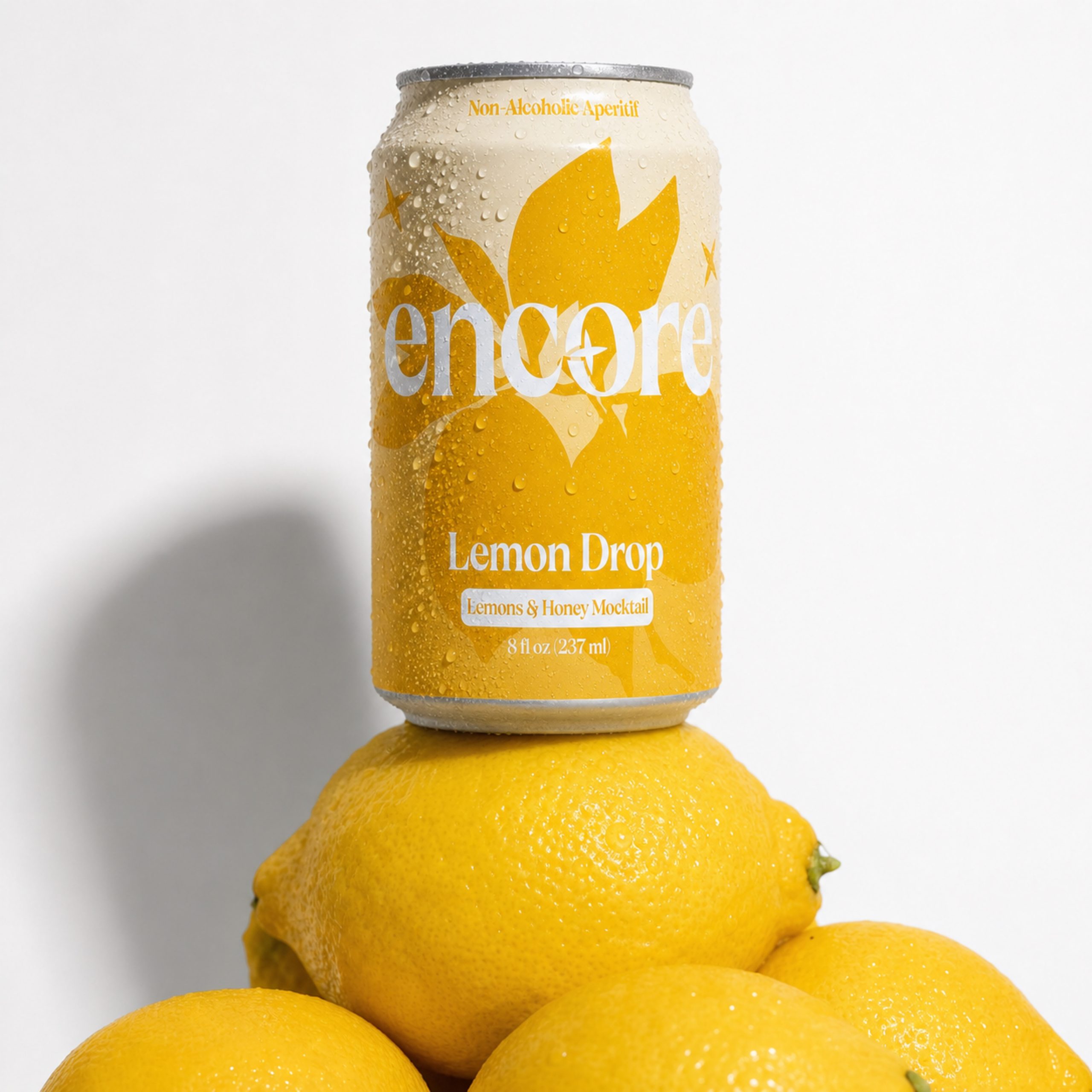
The solution was to build a simple visual system that could work across every flavor. The large fruit and floral graphics give each can its personality, while the oversized Encore wordmark keeps the brand recognizable. Hibiscus Rose uses bright pink florals, Lemon Drop is built around yellow citrus, and Peach Tea uses warm orange peach graphics.
The packaging combines bold botanical illustrations, expressive typography, layered color, and a consistent layout. The ingredient graphics are intentionally oversized and cropped around the can rather than sitting neatly in the center, making the design feel more playful and unexpected.
What makes Encore unique is that it doesn’t try to make a non-alcoholic drink feel serious or overly health-focused. The packaging is designed to feel like something you would actually want to bring to a party, hold in your hand, photograph, or leave out on the table. The cans themselves become part of the experience.
The final result is a packaging system where every flavor can stand on its own, but the three together feel even stronger. The visual identity also gave Encore enough personality to grow beyond the packaging into campaign photography, social content, and a full brand world.
The full experience, just without the alcohol. Nothing to Proof.







 Eclectic M
 Katya Slobodskaia
 Evgenia Beresneva
 CreativeWise
 宏洛图品牌设计HONGLT
 Abbas Sayyed
 Ollie
Ollie Moço Wine Branding
 khadijaaljifri
 Abdulrahman Taha
 Juana Sarabia
 Modern Theory
 Mohammed Nasr Sharfi
 Oksana
 Minim Brand Design
 Asmaa Mohamed
 Aidearte
 Navy Creative
 GIRAFA STUDIO
 Tia Nguyen
 Logoclub99
 monther al omari