

GREEN APPLE – Garden Tools Packaging Redesign
The GREEN APPLE garden tools packaging redesign represents a strategic evolution of a well-established brand identity originally created in 2013. This project marks the first major visual update of the brand’s packaging system, developed to strengthen shelf visibility, improve product navigation, and create a more contemporary and premium perception across retail environments.
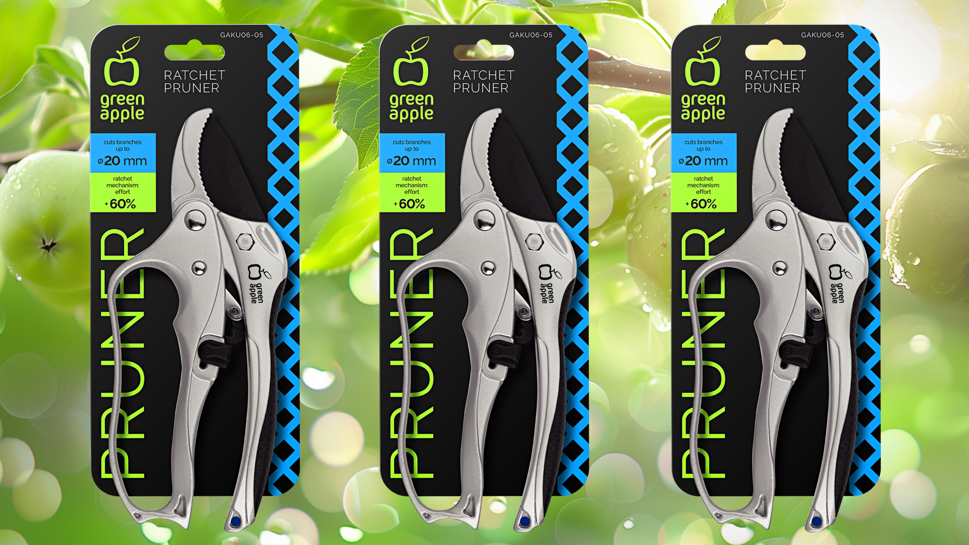
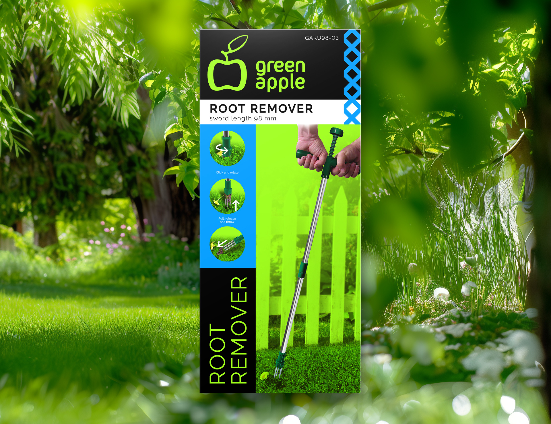
The new packaging concept is built around a bold black background combined with distinctive color accent blocks that help differentiate product categories and simplify the customer journey in store. A dedicated Pantone color is used consistently for the GREEN APPLE logo, reinforcing brand recognition and ensuring visual consistency across various materials and printing technologies.
A key symbolic element of the design is the stylized vertical pergola — a simple yet expressive graphic metaphor representing a well-maintained, уютный garden space. This visual motif connects the product range with the emotional value of gardening: care, comfort, and personal pride in creating an organized outdoor environment.
The layout system is intentionally clean and structured, balancing strong brand presence with functional product communication. Clear typography, modular information zones, and scalable design principles allow the packaging to be easily adapted across multiple SKUs and formats while maintaining a unified brand language.
The redesign also takes into account production efficiency and retail performance. Optimized color usage, consistent iconography, and a flexible grid system support cost-effective implementation and long-term brand development.
This project demonstrates how thoughtful packaging design can refresh brand perception, improve usability, and create a cohesive visual ecosystem that supports both marketing goals and business growth.
Design: Vladimir Shmoylov
 United Creatives Studio
 Kingdom & Sparrow
 Anastasia Bakhmatskaya
 CreativeWise
 Great and Golden
 Ximena Ureta Design Studio.
 Sorted Branding
 Lisa Sirbaugh Creative
 vitoramockup
 YQIAN
YQIAN Navegante
 Anastasia Cherepanova | xtramez
 Polaris Designs
 pavlyai
 Milena Kocharyan
 monther al omari
 Mohamed sherif midoo
 DESIGN CONCEPTS
 mmdesign
 markcreativestudio
 Rosario Lo Iacono