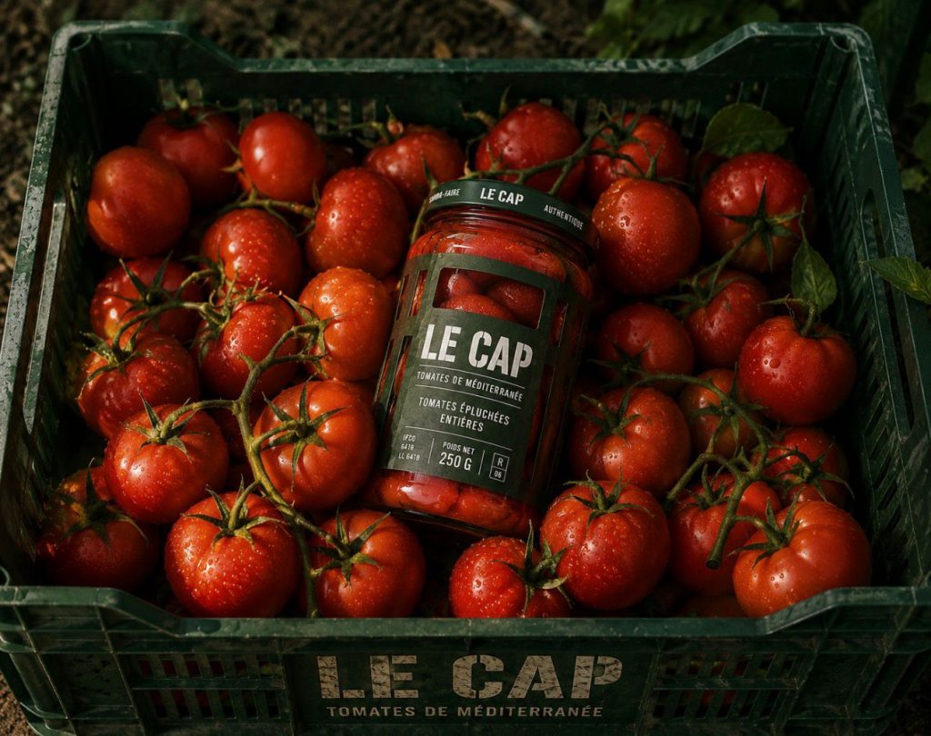

LE CAP — Mediterranean Tomatoes
A packaging system inspired by the humble tomato crate.
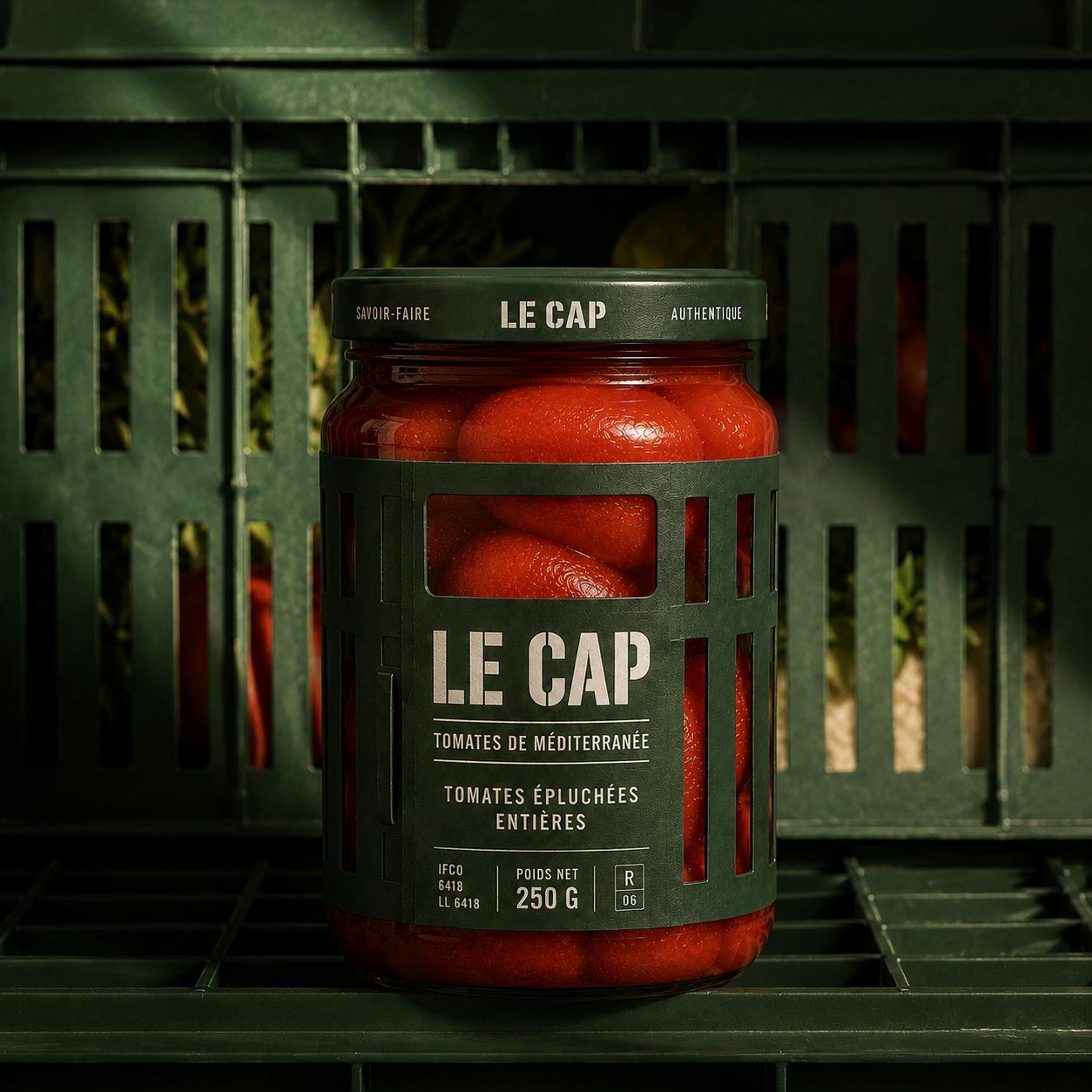
In a category dominated by loud graphics and familiar visual codes, LE CAP takes a radically different approach. Rather than decorating the packaging with images of tomatoes, the design transforms the package itself into the object that protects them.
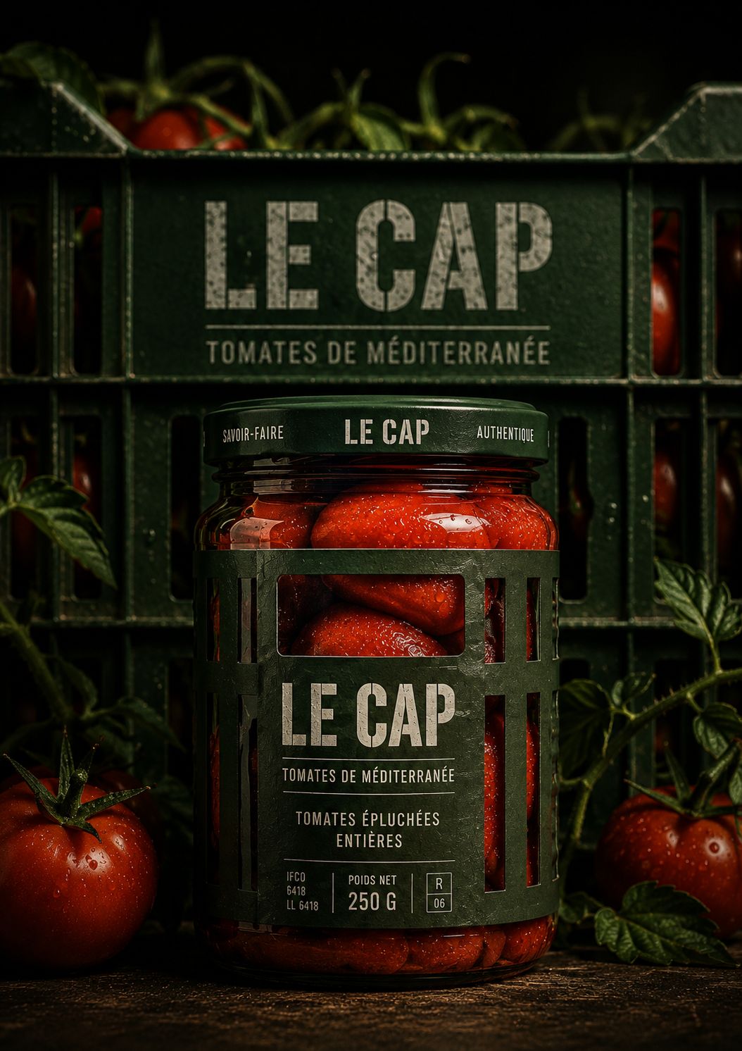
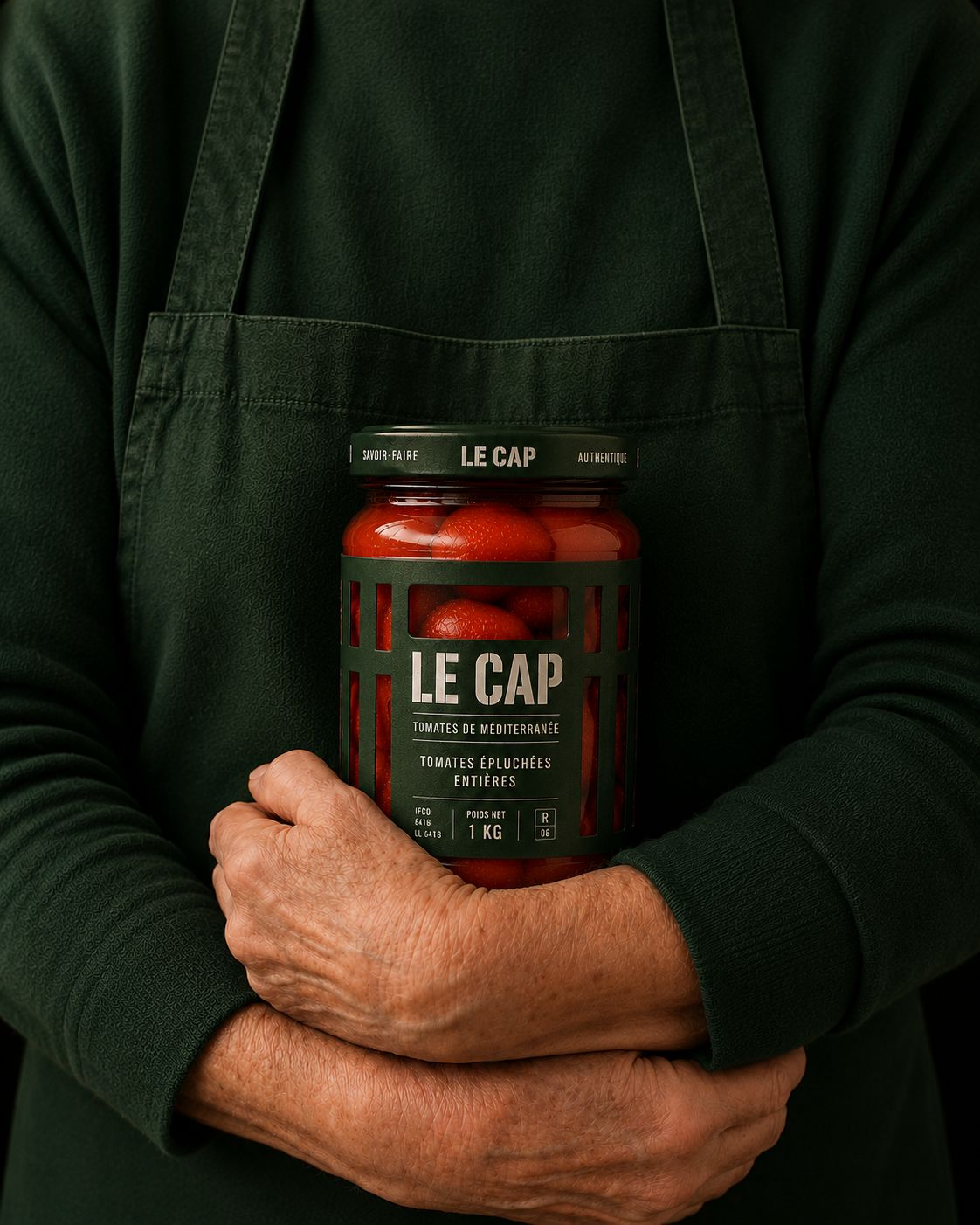
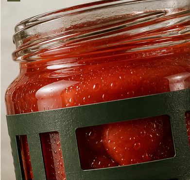
Inspired by the perforated harvest crates used across Mediterranean farms, a deep green structural sleeve wraps each glass jar, creating a series of die-cut windows that reveal the product inside. The tomatoes become the visual identity of the brand. Their natural colour, texture and freshness replace illustration, making the product itself the hero.
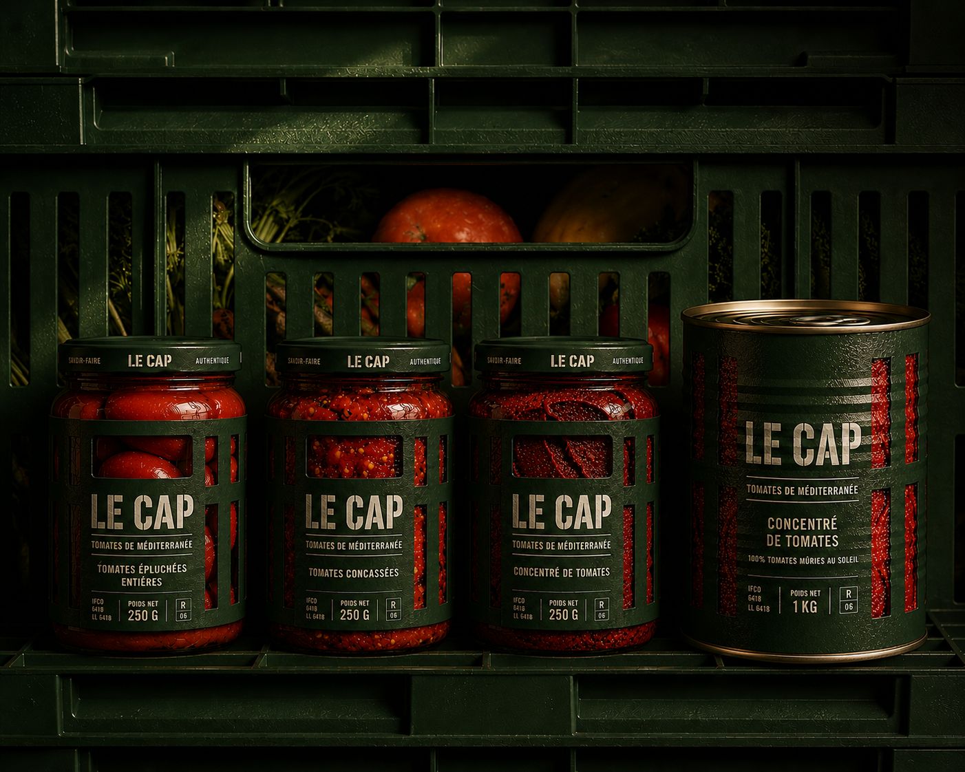
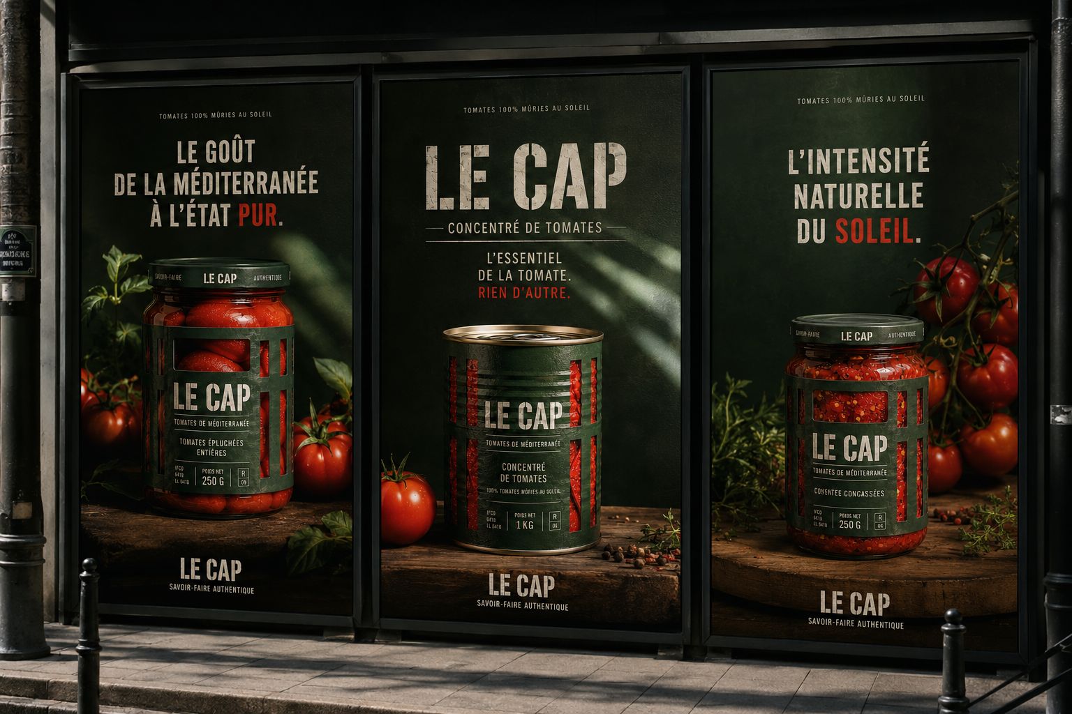
The concept extends seamlessly across the entire range. Each recipe creates a different visual rhythm through the windows—whole peeled tomatoes, chopped tomatoes and tomato concentrate each reveal a unique texture, allowing every SKU to be instantly recognizable while maintaining a coherent family identity.
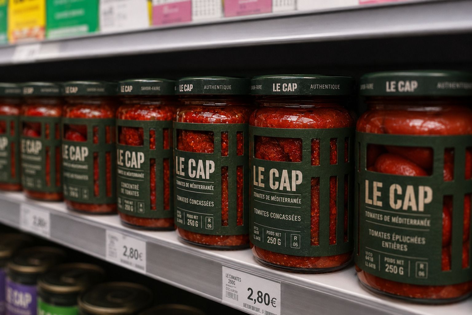
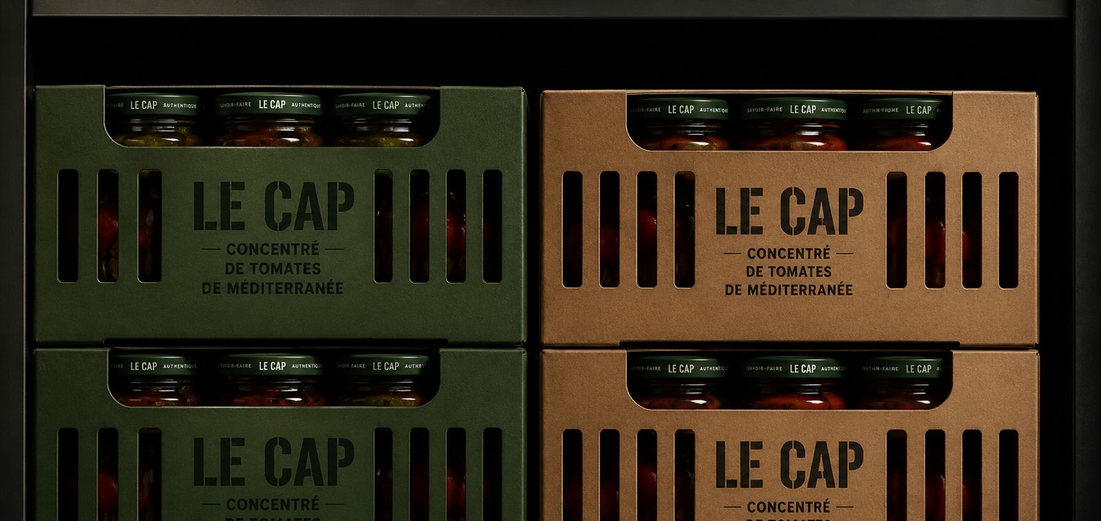
The secondary packaging follows the same philosophy. Shipping cartons and retail displays echo the language of agricultural crates, reinforcing authenticity from production to shelf while creating a striking block effect in-store.
Minimal typography, restrained colour, tactile materials and honest product visibility come together to celebrate Mediterranean craftsmanship with quiet confidence. The result is a packaging system that feels both contemporary and timeless—simple in appearance, yet deeply rooted in the origin of the product.
Rather than telling the story of fresh tomatoes, LE CAP lets consumers see it.
Curator’s Insight
What stands out here is the decision to solve identity through structure rather than surface. Most food packaging in this category relies on photography or illustration to signal freshness. LE CAP instead uses the die-cut as its primary communication tool, letting the physical construction of the sleeve do the work that graphics usually do.
This also solves a real production challenge across a multi-SKU range. Instead of designing separate visual systems for whole tomatoes versus chopped versus concentrate, the brand lets the actual product texture create the differentiation. The window becomes a built-in, self-updating piece of content that changes with what’s inside.
The crate reference is doing double duty too. It’s not just a nostalgic nod to agriculture, it’s a functional structural choice, since perforated sleeves are inherently associated with ventilation and freshness in the produce world. Borrowing that logic from an adjacent category (fresh produce crates) rather than from other jarred goods is what gives this shelf presence its edge over direct competitors.
 habiba hatem
 Up-Brands
 sayadworks
 Kingdom & Sparrow
 furtgoods
 Si me preguntas
 Narrow House Packaging Branding & Design
 Clever Branding
 About House of Ta
 Hossam khalifa
 Valentyna Hradova
 Backbar Studios
 Holy Studio
 Prime
Prime Naeema Raashid
 Buddy Creative
 ezgidesignstudio
 Minim Brand Design
 Nenad Došen Studio
 Atyan
Atyan Massimo Lo Cascio
 Carreto Concepts Design Studio
 Charles Mason
 Pinot Agency