

ABOUT
Leone Bars is a new line of ice cream bars introduced as a fresh and flavourful novelty on the market. The product was created for a target audience that responds strongly to trends, visual attraction and impulse purchases. Because of this, the packaging design needed to communicate freshness, playfulness and full flavour at first glance, while standing out clearly in a highly competitive retail environment.
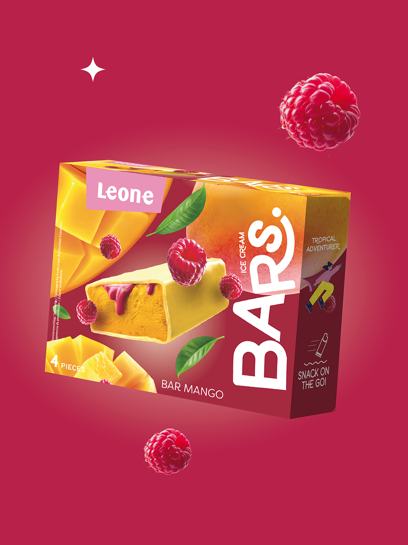
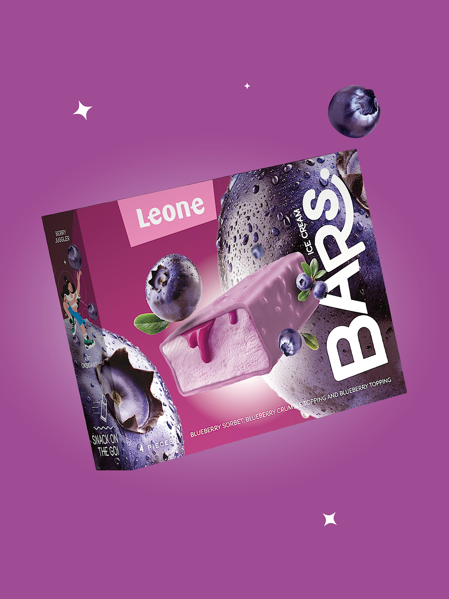
The main concept behind the Leone Bars packaging design is the celebration of taste through colour, fruit and imagination. Each flavour is represented through a carefully selected colour combination, directly connected to the fruits and ingredients it contains. In this way, the packaging immediately suggests the character of each product and creates a strong visual link between flavour and emotion.
SOLUTION
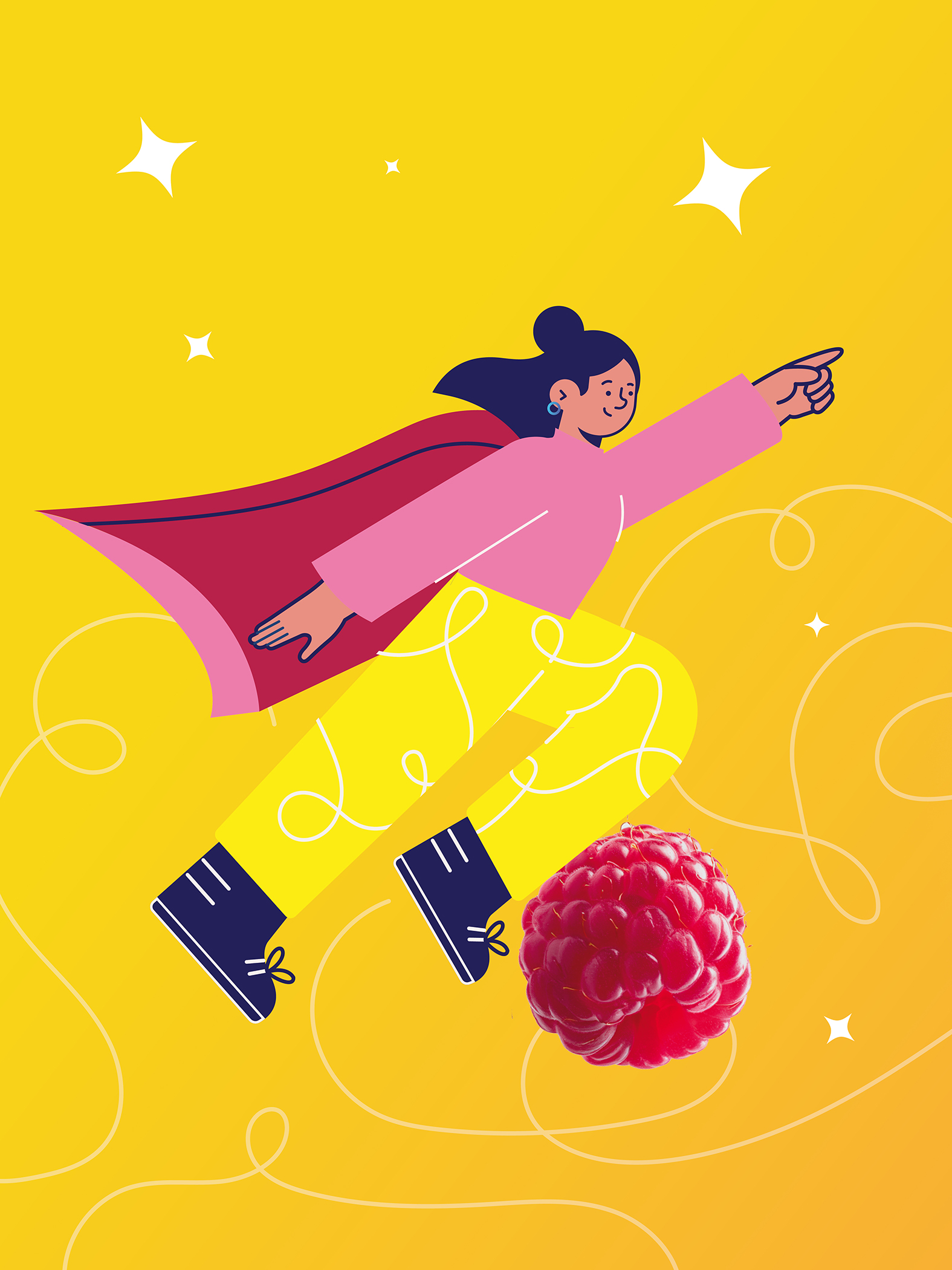
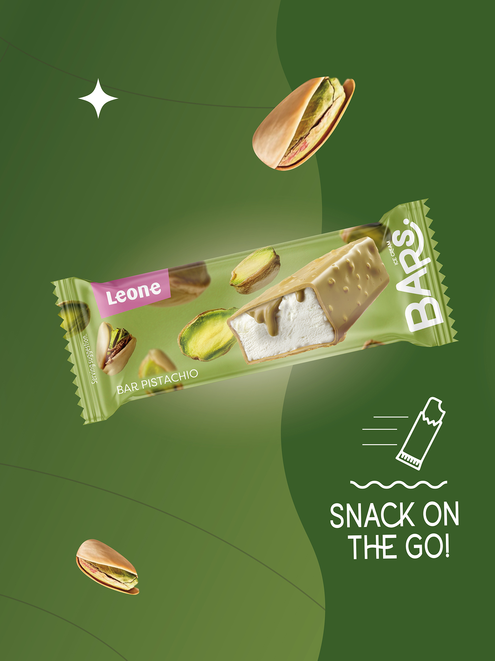
The design approach for Leone Bars is based on a bold combination of vivid colours, fruit photography, playful illustrations and expressive typography. Large fruit visuals were used to emphasize the richness and intensity of flavour, while the photographic elements help communicate freshness and natural appeal. These were combined with illustrations that relate to each individual flavour, opening space for storytelling and adding a layer of imagination to the packaging.
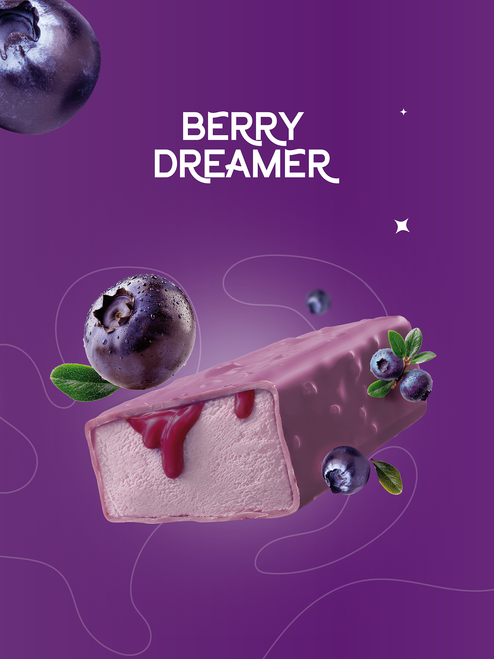
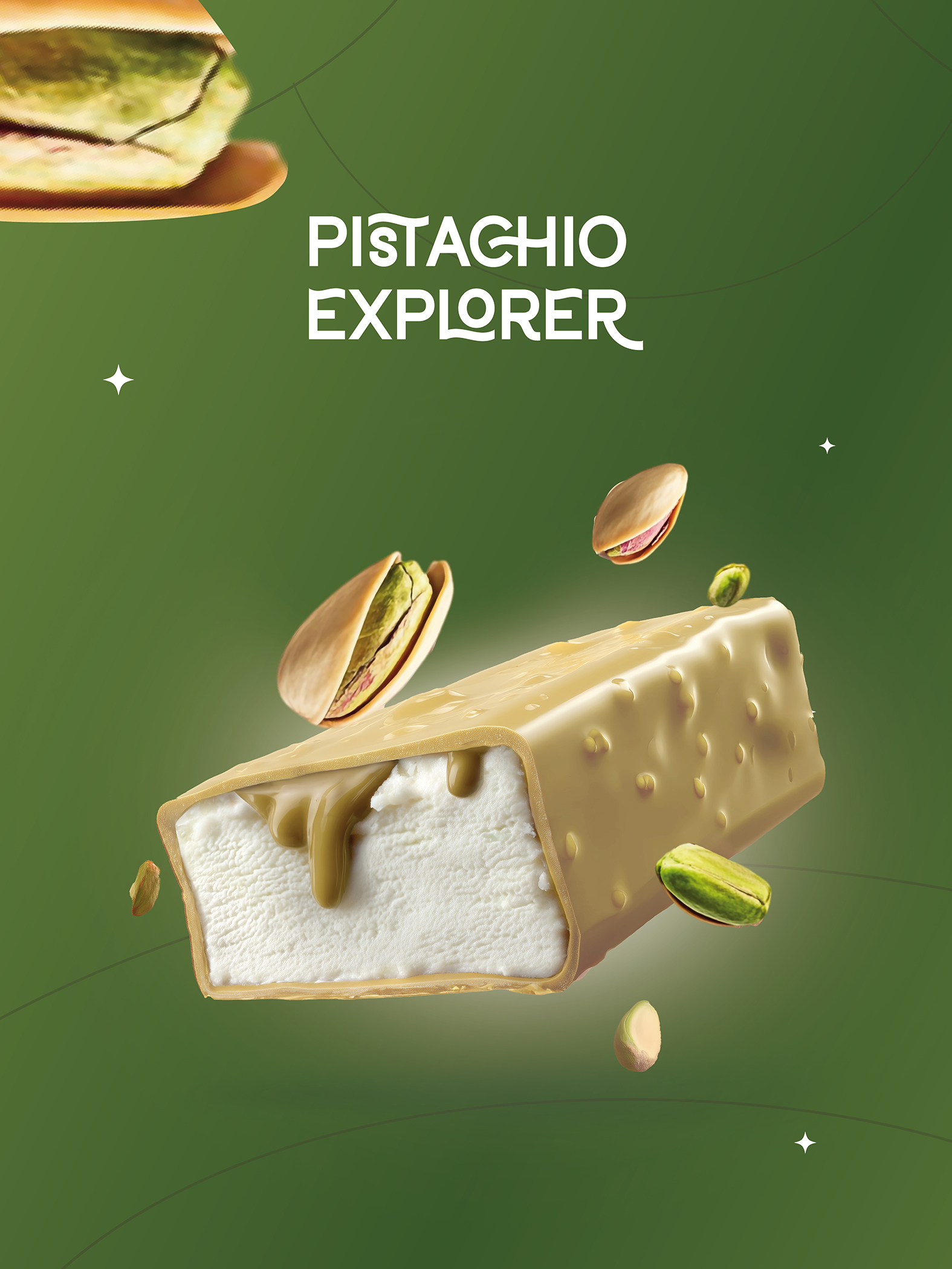
A key part of the visual identity is the 3D model of the ice cream bar itself. As the central element of the packaging, it acts as the main visual magnet and gives the consumer a clear, attractive and appetizing presentation of the product. The product render was carefully designed to enhance the sense of indulgence, texture and freshness, making the Leone Bars ice cream bar feel tangible and desirable even before purchase.
Typography was also used as an important tool to support the playful character of the brand. Its expressive and dynamic appearance strengthens the overall energy of the design and helps the packaging feel modern, accessible and trend-driven.
RESULT
The result is a colourful, playful and highly recognizable packaging system for Leone Bars that clearly communicates freshness, flavour and fun. By combining strong colours, expressive fruit imagery, imaginative illustrations and a striking 3D product visual, the packaging creates a strong shelf presence and appeals directly to consumers looking for something new, exciting and full of taste.
The final design turns each Leone Bars ice cream bar into a small visual story, making the product not only easy to notice, but also easy to remember.





 Derrick Lin
 Biaa
Biaa Petitmoulin Studio
 White Bear Studio
 Eva Chistyakova
 monther al omari
 Atipus
 alchimistestudioParis
 oneandother
 bloomburo
 helocrene
 Shapers Studio
 Denver Design
 Aidearte
 andrew.huerta
 softmachine
 airobtq
 Buzz & Co.
 Ruby
Ruby themythographer
 IDNB Inc.
 viktorflr
 Zenpack