
PAPITTO — A Bright Identity for Everyday Indulgence
PAPITTO is a snack brand created to bring energy, pleasure and instant recognition to the international market. Its identity is built around a simple idea: transforming an everyday sweet break into a joyful and emotionally memorable moment.
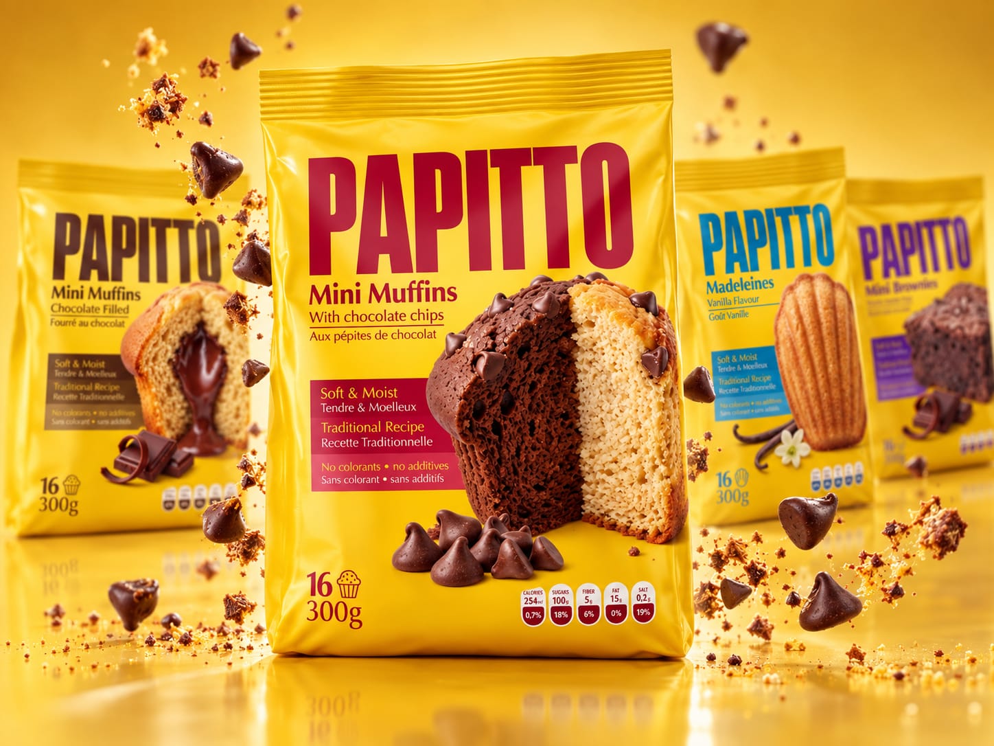
The visual system is dominated by a vibrant yellow that gives the brand exceptional visibility while expressing warmth, optimism and appetite. The bold, condensed PAPITTO wordmark occupies a central place on every package, creating a strong and consistent presence across the entire range.
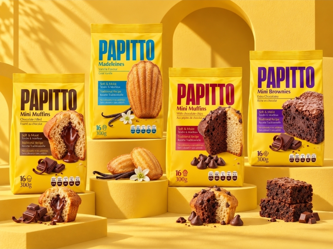
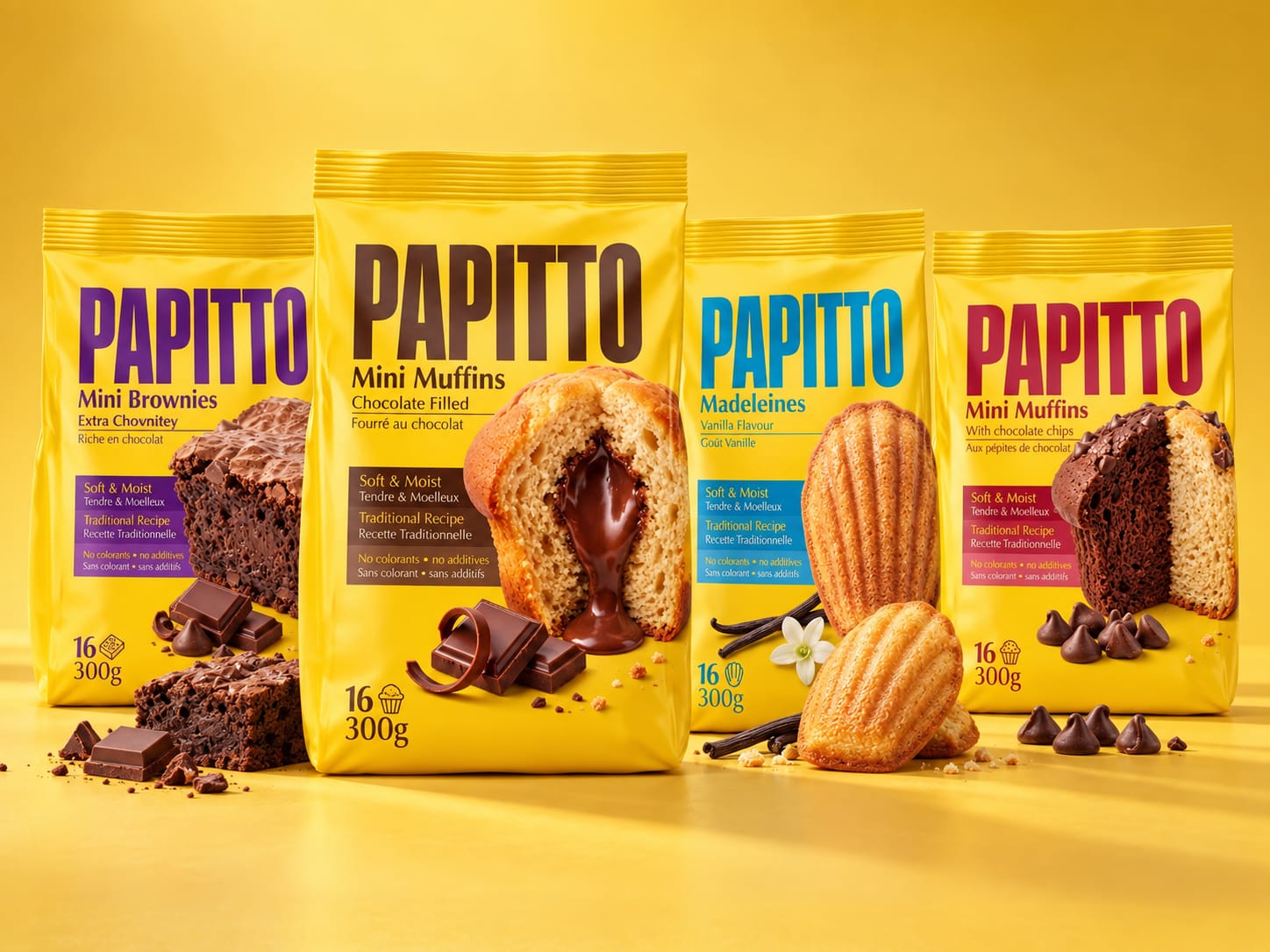
Each product is distinguished by its own contrasting colour: brown for chocolate-filled mini muffins, blue for vanilla madeleines, red for chocolate-chip muffins and purple for brownies. This colour-coded architecture makes the range easy to navigate while preserving a powerful family resemblance.
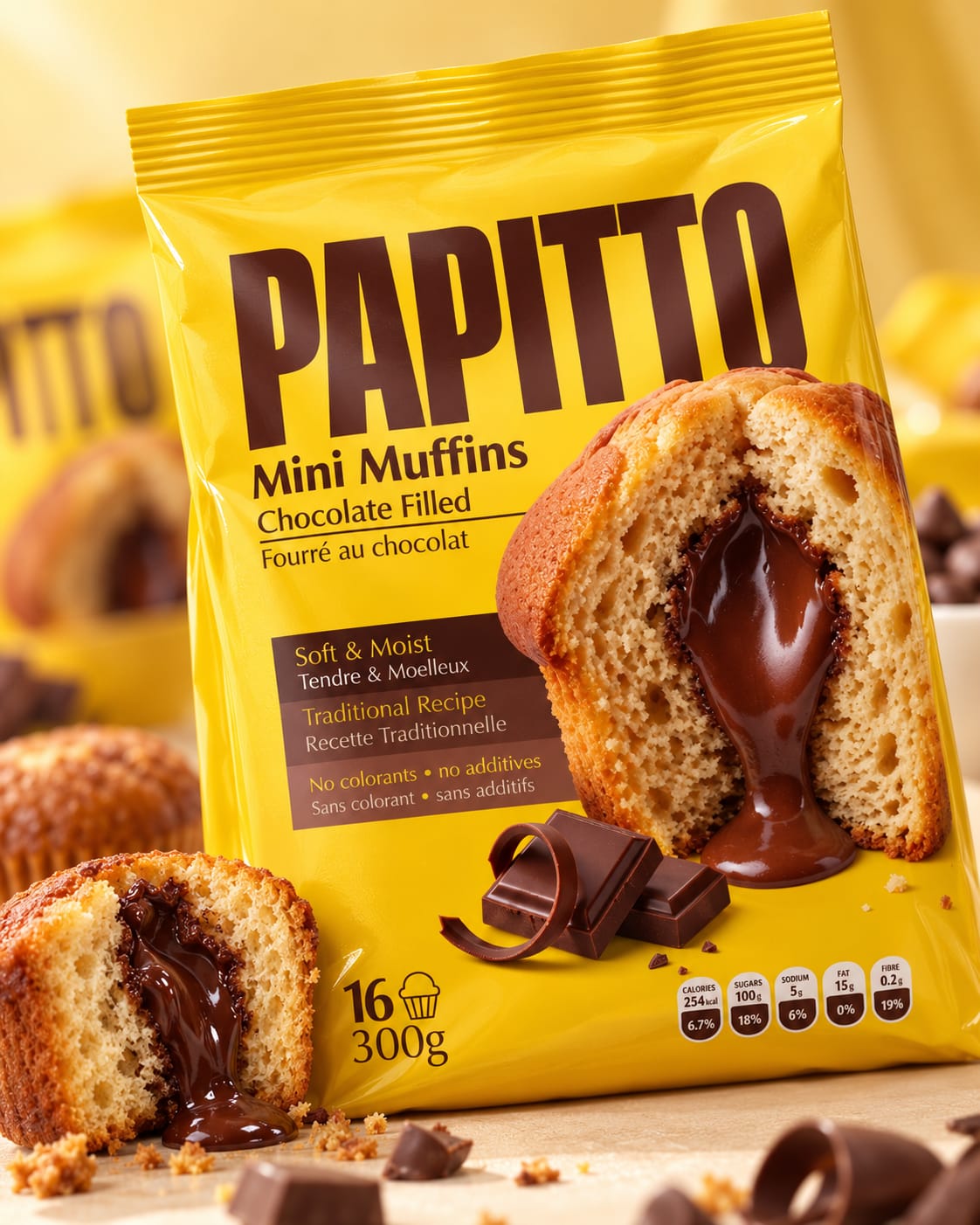
Generous close-up photography reveals the softness, texture and fillings of each product. The packaging does more than identify what is inside: it creates an immediate sensory experience, allowing consumers to imagine the taste before opening the bag.
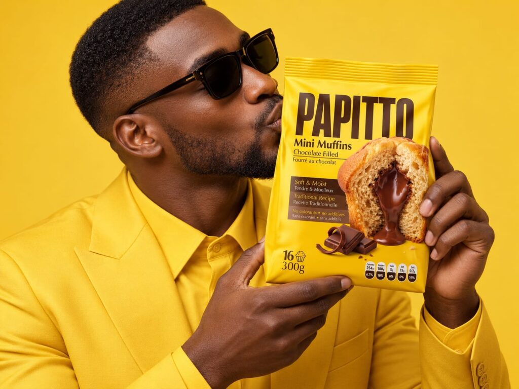
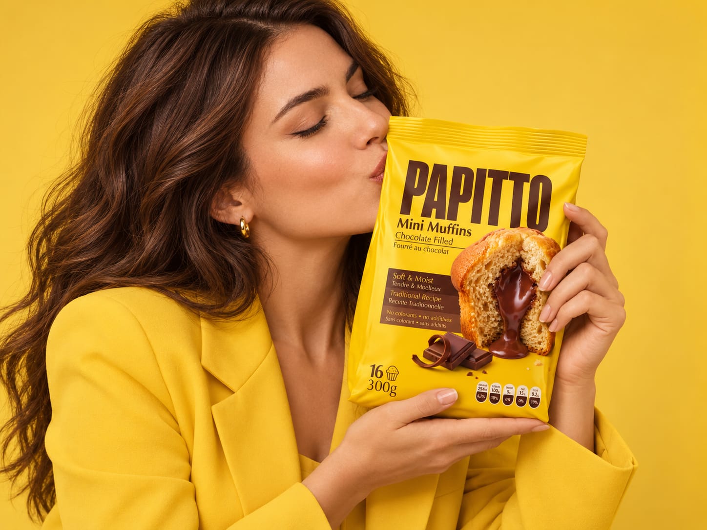
The campaign extends this emotional relationship through expressive characters dressed entirely in yellow. Their affectionate interaction with the packs turns PAPITTO into more than a product—it becomes an object of desire, attachment and everyday happiness.
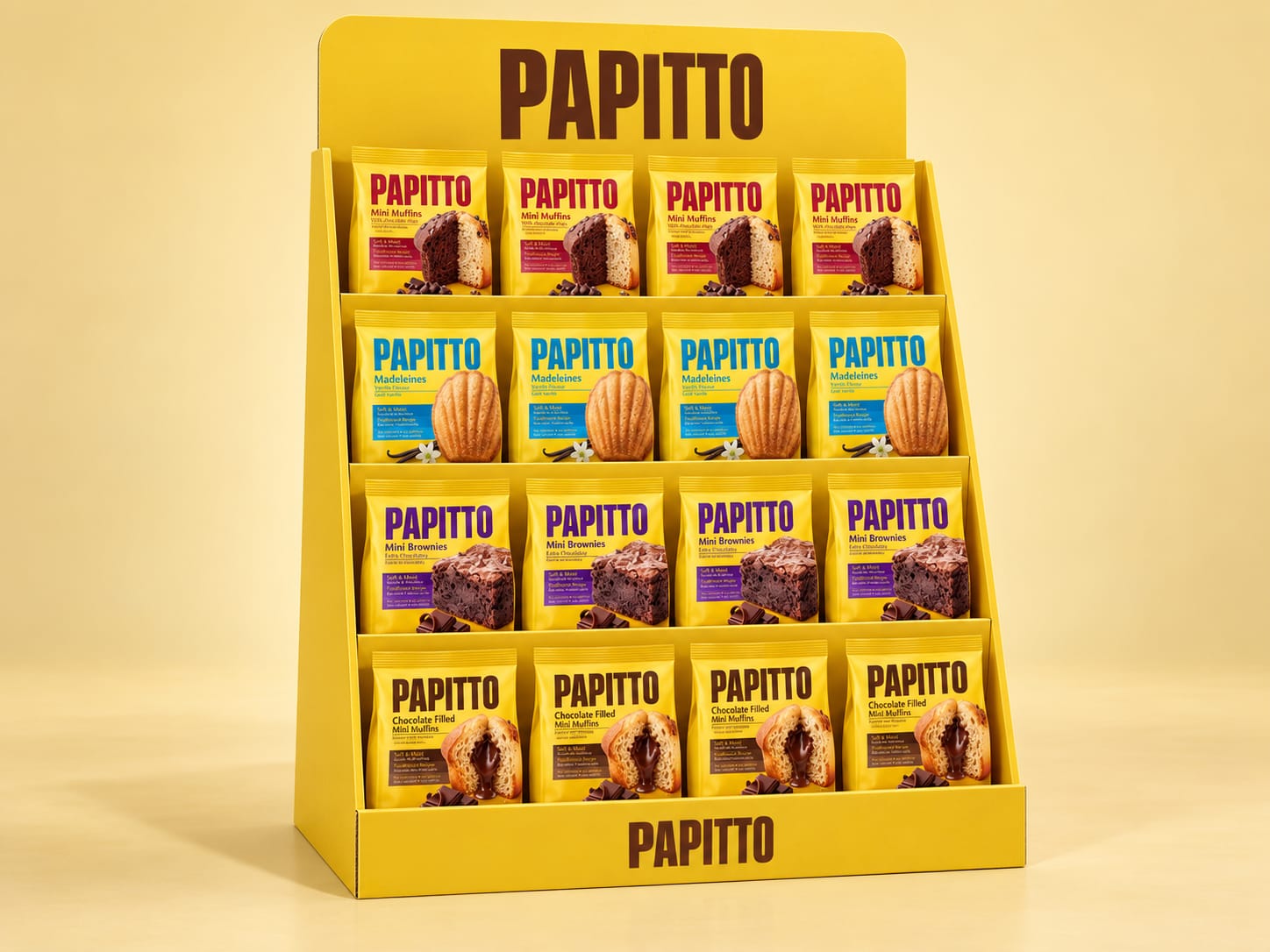
The retail display follows the same philosophy. Designed as a practical and industrially achievable cardboard structure, it creates a solid yellow block in store while presenting the complete range across four clearly organised levels. Its simplicity strengthens recognition and allows the packaging to remain the true visual hero.
Bold, accessible and highly distinctive, PAPITTO combines strong shelf impact with a playful emotional personality—building a coherent brand world designed to travel across cultures and markets.
 NEV
NEV Stefano Bracci
 Alina
Alina monther al omari
 Lizakjx
 JOAOMARCOSDESIGN
 Harriet Neild
 octavio rojo
 宏洛图品牌设计HONGLT
 DESIGN CONCEPTS
 Alexander Skurihin
 Studio K95
 ARMBRAND
 Richa Rai
 houseoferas by Miti
 Agence des Coteaux
 Kushi Eaknath
 Ann Treasa
 Xiao Ning
 krrrrrllii
 babyage
 Deep
Deep Atiq Alam