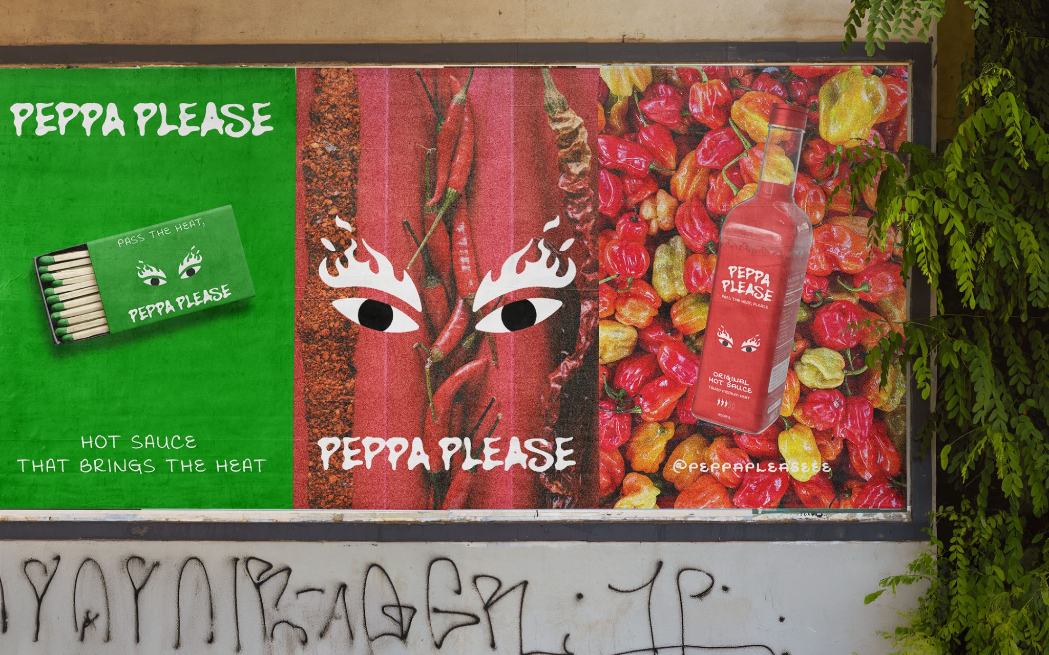

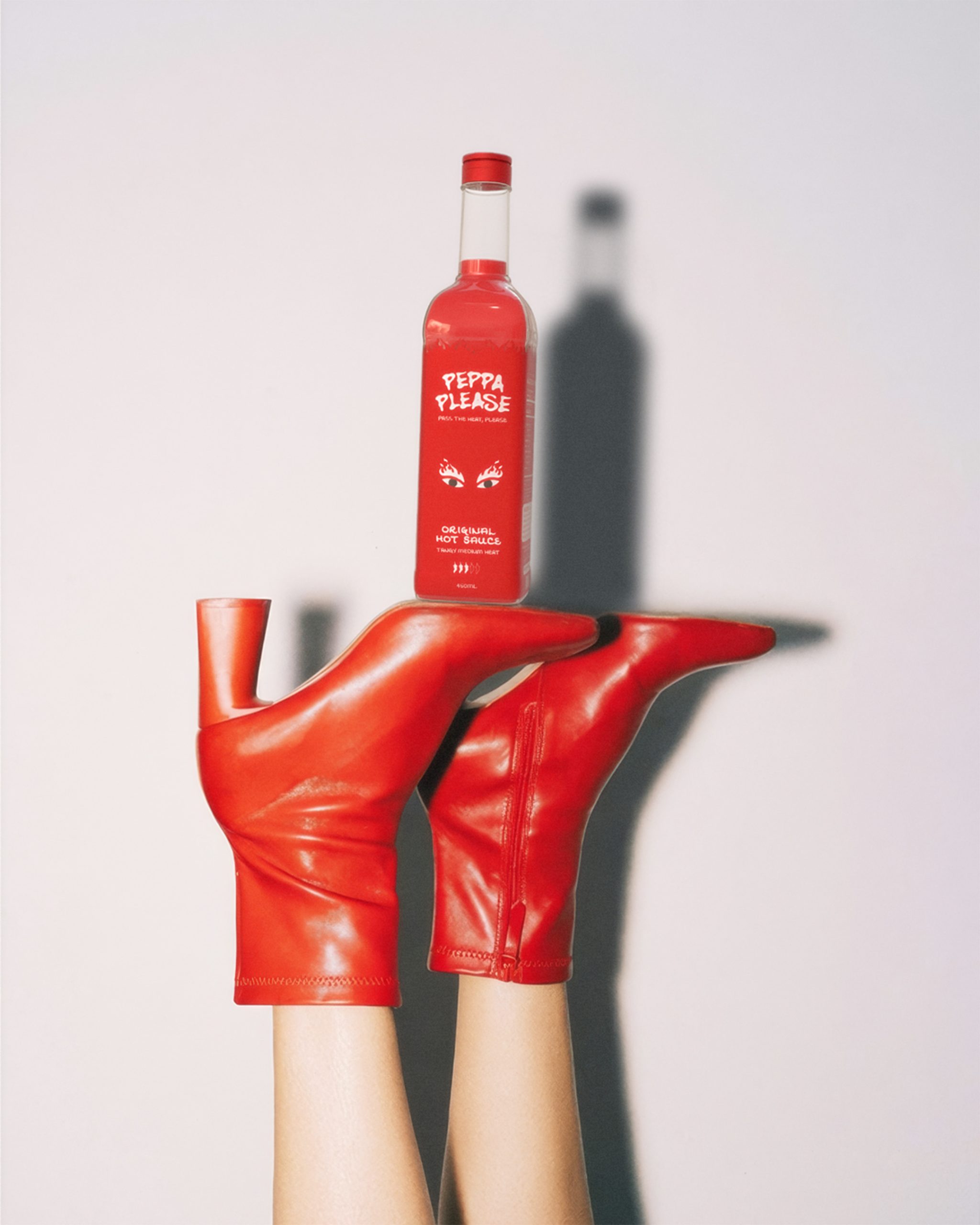
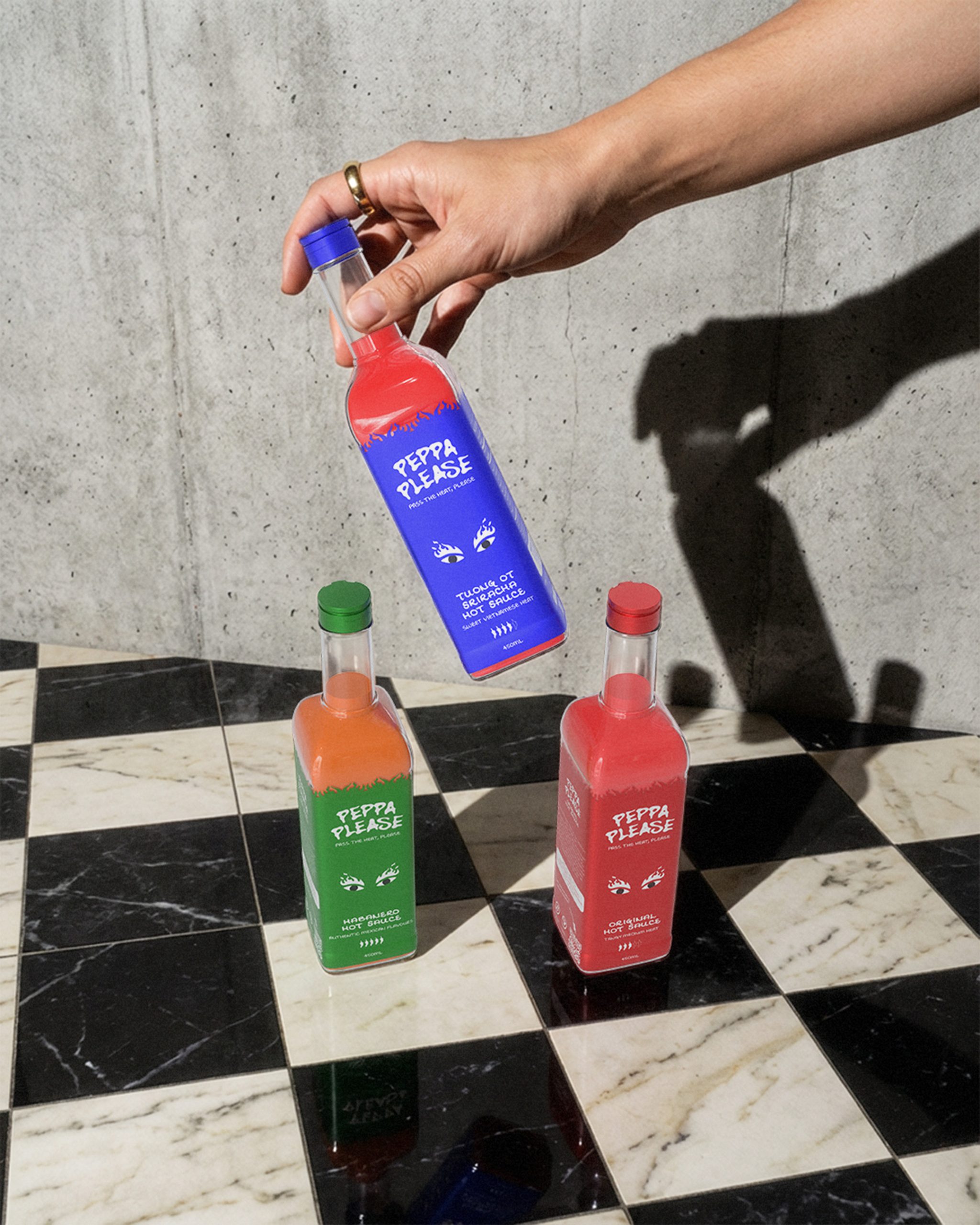
Routine is the enemy of the dinner table. Peppa Please arrived to change that forever with a cheeky sense of humour and a proper kick. Whether it is the tangy Original, the fiery Habanero, or the sweet Vietnamese heat of Tương ớt, each bottle is a conversation starter. I set out to create a contemporary identity that feels just as at home on a designer’s desk as it does in the hands of people who refuse to take life too seriously. But standing out in such a crowded market wasn’t going to be easy.
The hot sauce market is a loud space filled with clichéd flames and aggressive “tough guy” branding. My mission was to break through this noise by creating something that felt fresh and genuinely inviting. The brand needed to look premium enough for a curated Instagram feed, yet remain approachable for a casual Friday night takeaway. Creating a visual language that balanced extreme heat with a playful personality was the ultimate hurdle. So, I decided to take a different path.
The journey began by leaning into the concept of minimalism with maximum impact. I focused on a direct and conversational tone of voice that acts as a slippery slide for the reader. By using the tagline “Pass the heat, please,” I established a brand persona that is polite yet packs a punch. The result is a bold narrative, inviting you to enjoy the ride even if it gets a little uncomfortable.
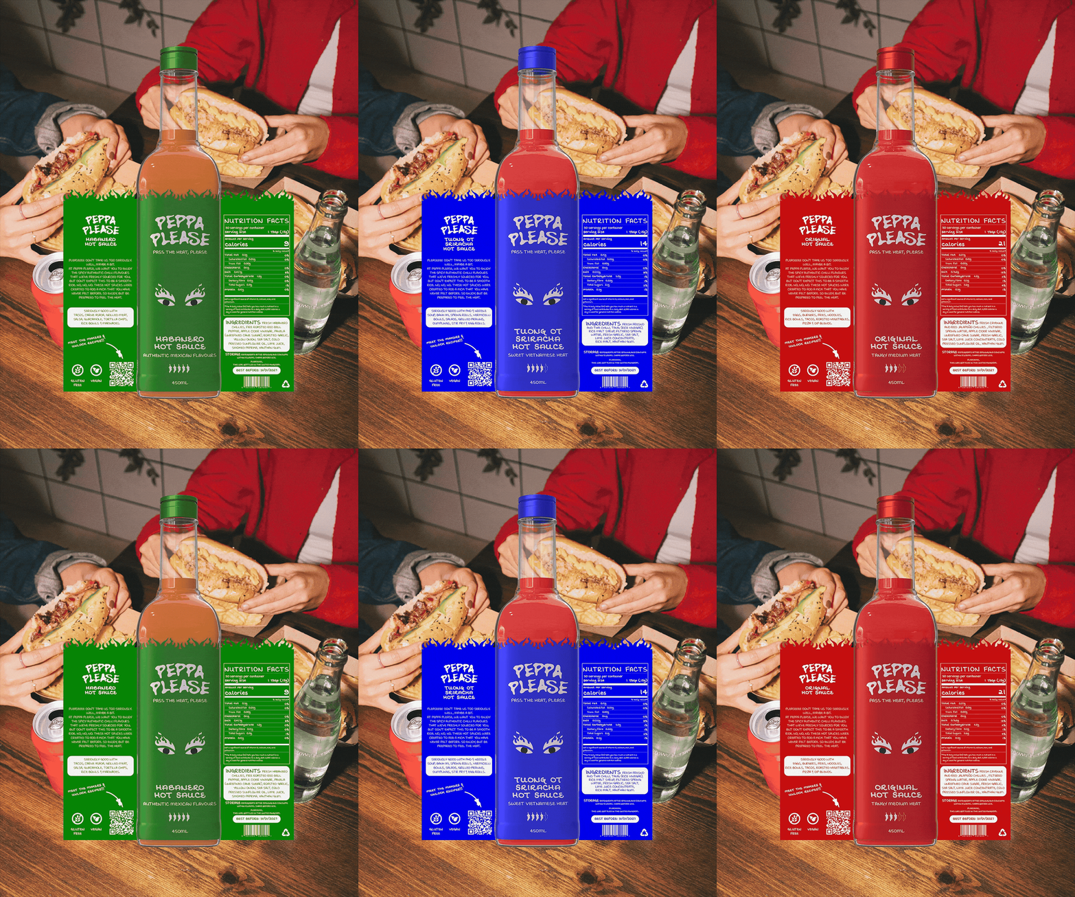
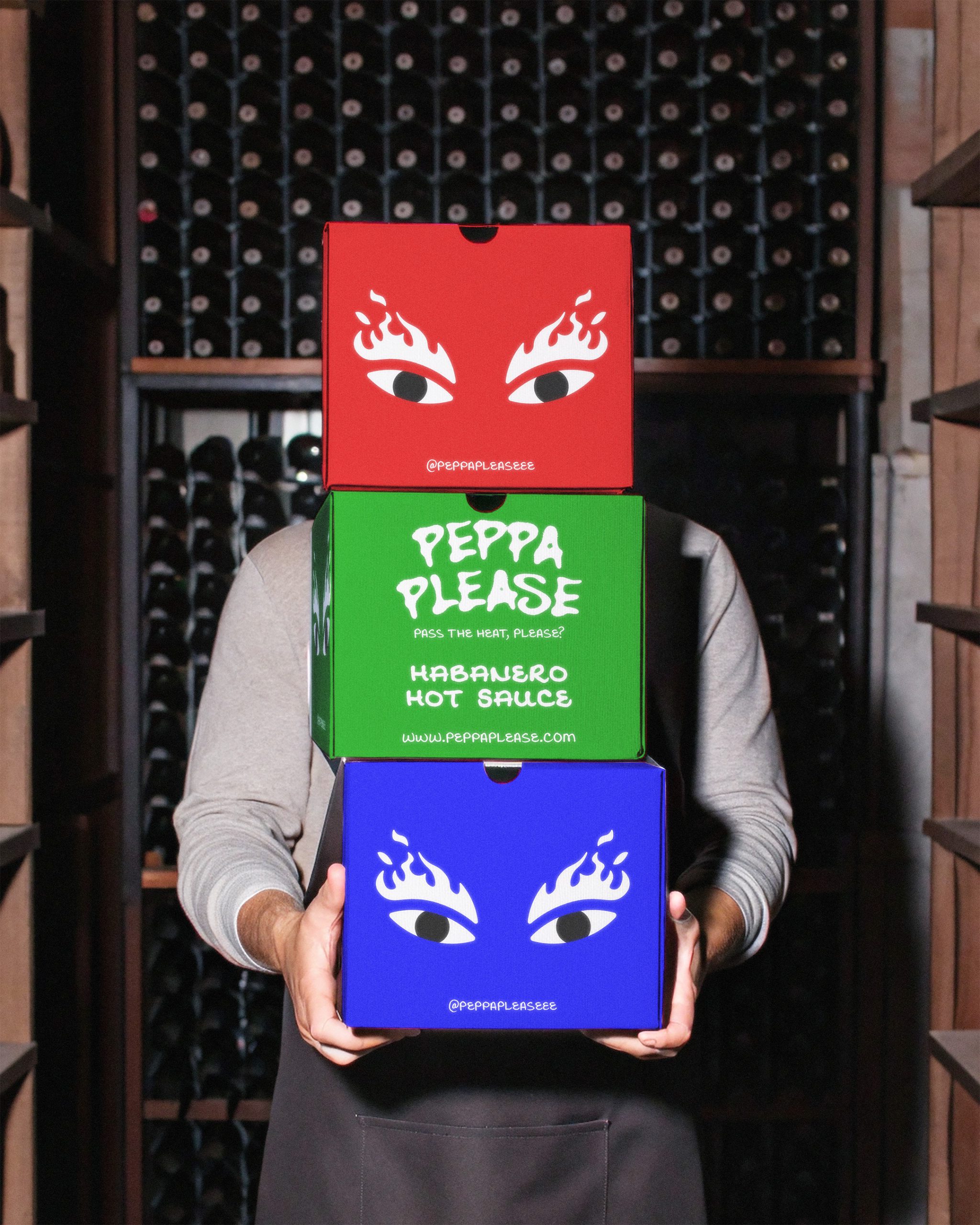
The visual language is defined by a striking trio of primary colours that differentiate the flavour profiles at a glance and create instant recognition. The standout feature is the logo, featuring daring eyes with flaming eyebrows that signal the heat level with a wink. Every element was chosen to ensure the brand was instantly recognisable on any table. The result?
Peppa Please is no longer just a sauce but a bold lifestyle statement. It has successfully turned heads, ignited taste buds, and proved that you don’t need to be aggressive to be impactful. It is ready for any table, anywhere.



 Derrick Lin
 monther al omari
 43oz
43oz lilyz design23
 Modern Theory
 Eighteen Brand Studio
 Bhumika Singh
 MohamedMashaly
 Pixels Studio
 Gulya
Gulya UPRISE
 Lizaveta Kharitonyuk
 Bonsanco Creative Studio
 DesignRepublic
 GIRAFA STUDIO
 PiotrWisniewski
 Sophiagdotcom
 CreativeWise
 SoreThumbStudio®
 Modern World Studio
 Palashcc
 Valérie Colace