
ABOUT
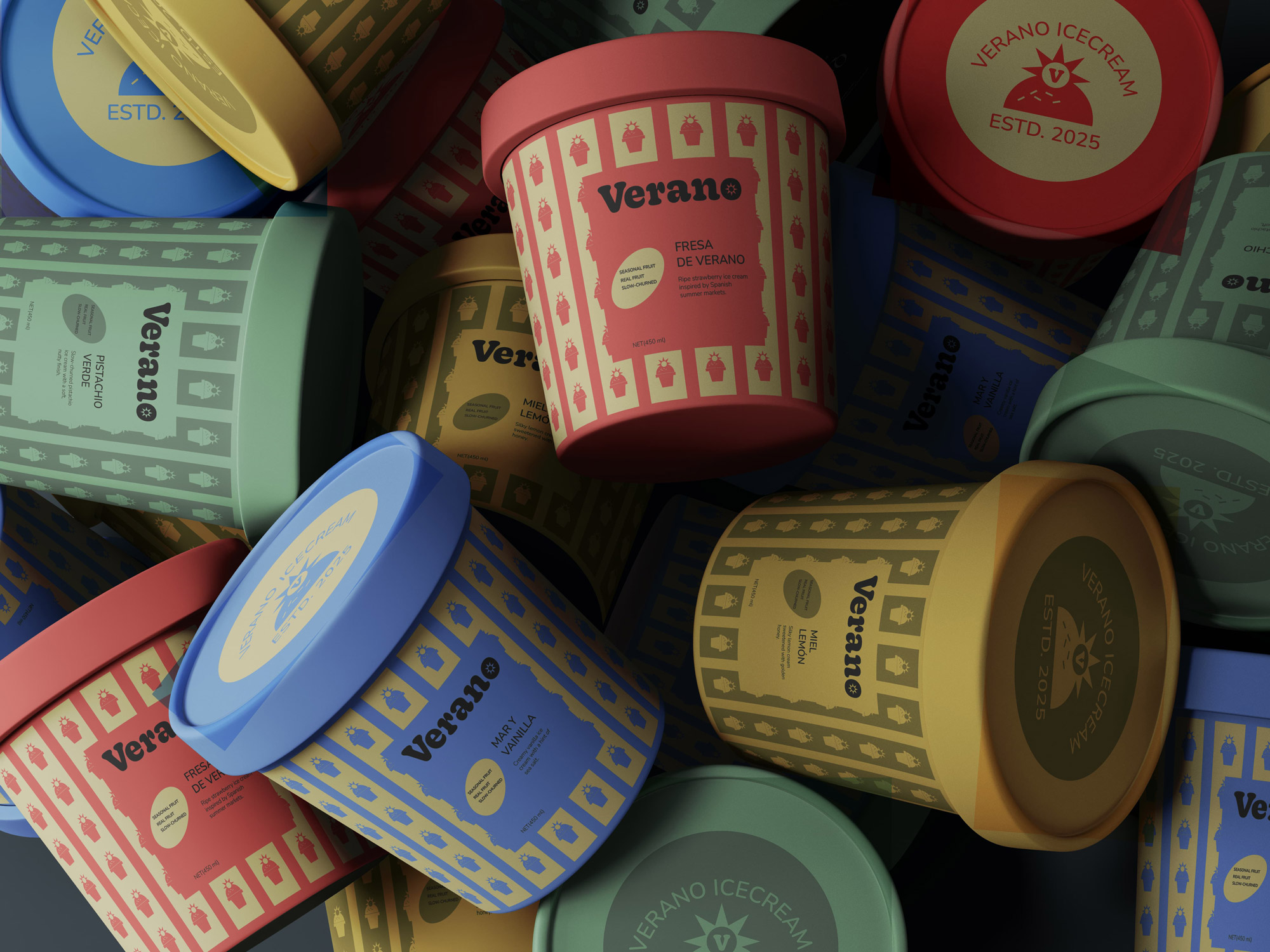
Verano is a conceptual ice cream brand inspired by the warmth, color, and vibrancy of summer. Rooted in the Spanish word for “summer,” the brand captures the joy of seasonal indulgence through a playful yet structured visual identity. Designed to feel both nostalgic and contemporary, Verano positions itself as a product that celebrates simple pleasures through bold flavor and expressive packaging.
CONCEPT
The concept revolves around translating the feeling of summer into a visual system that feels lively, inviting, and instantly recognizable. Drawing inspiration from traditional dessert culture, festive patterns, and sun-soaked environments, the identity blends warmth with repetition and rhythm. The idea was to create a brand that feels cheerful and rich in character, while still maintaining clarity and structure across different flavors and touchpoints.
SOLUTION
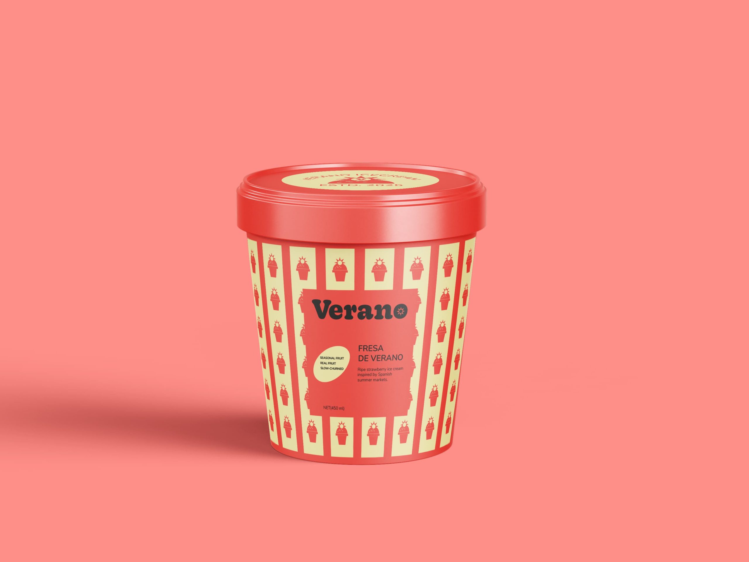
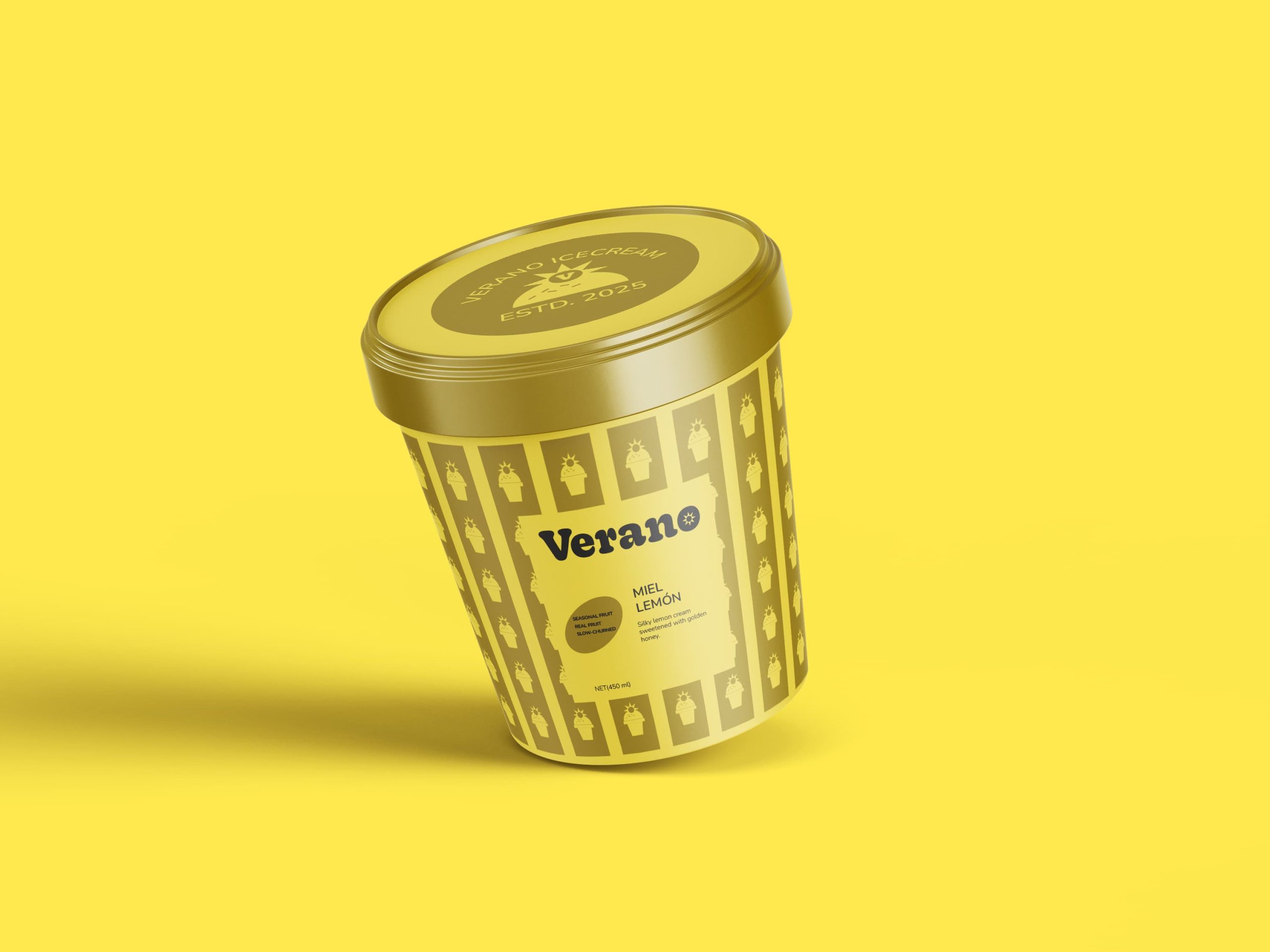
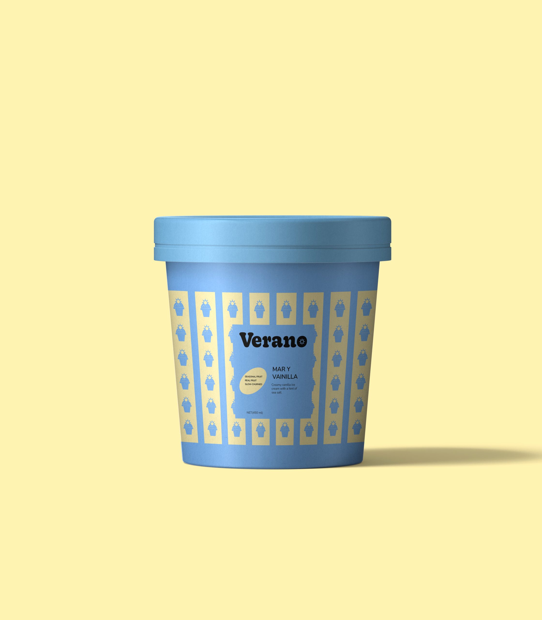
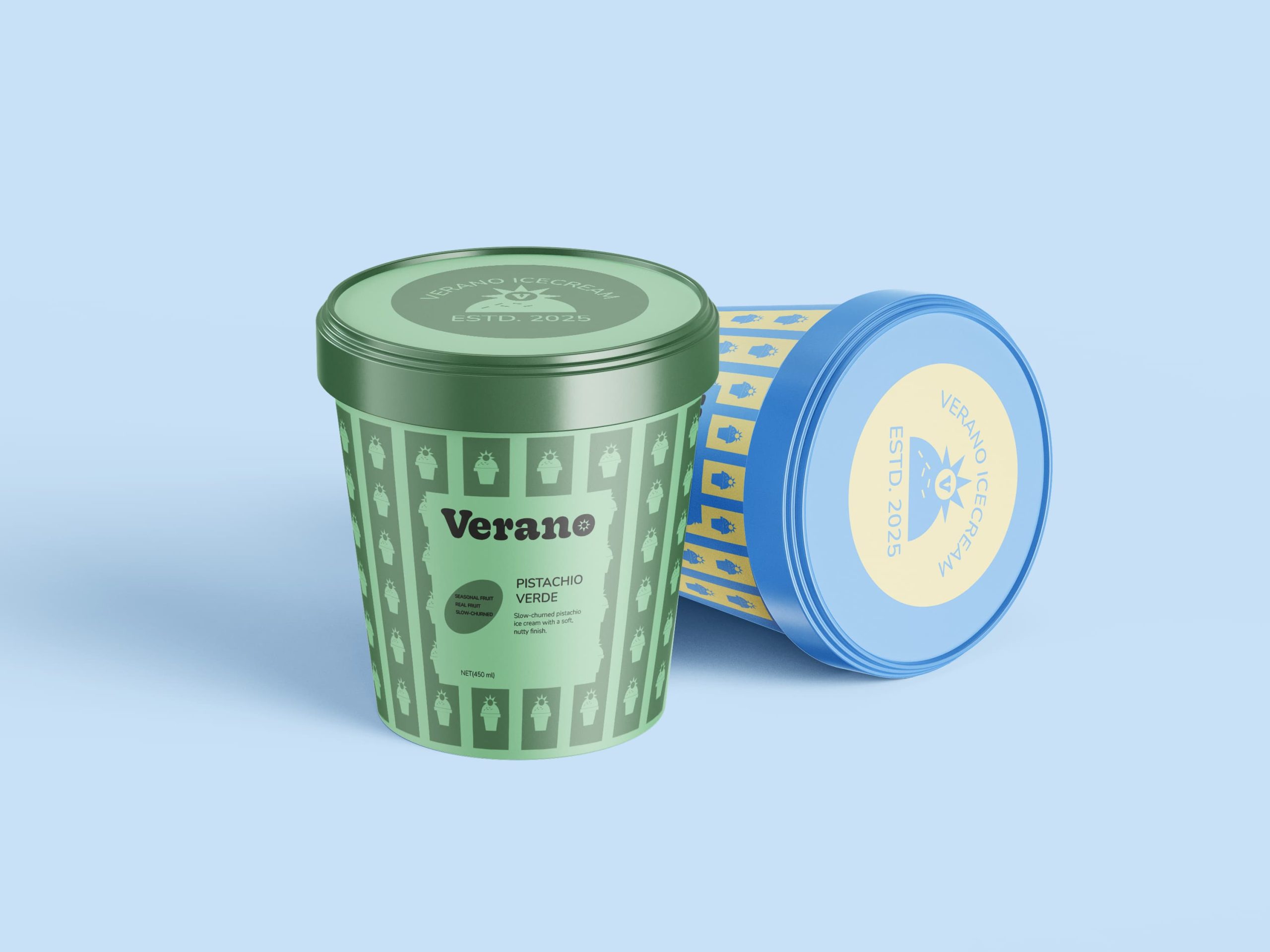
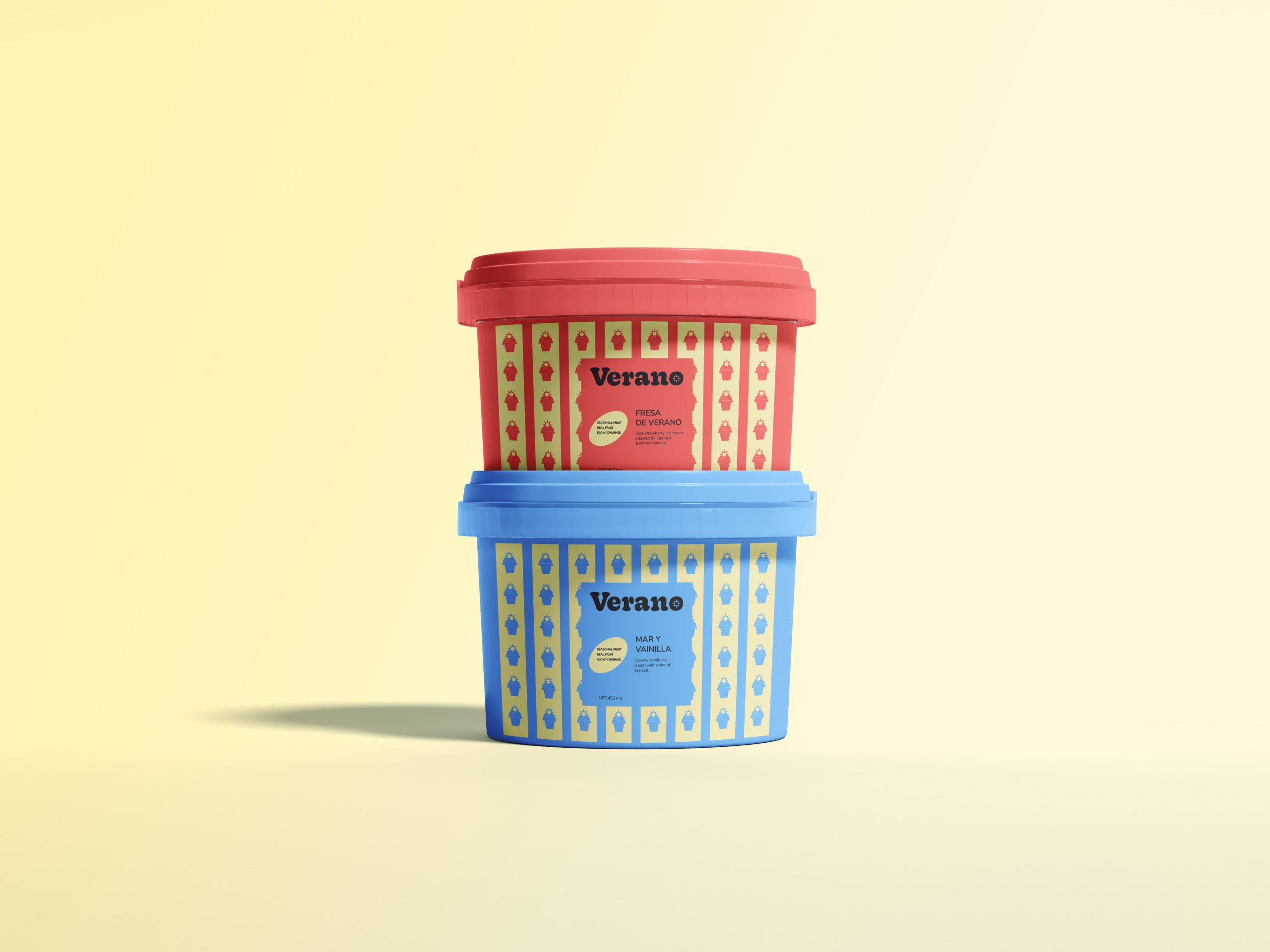
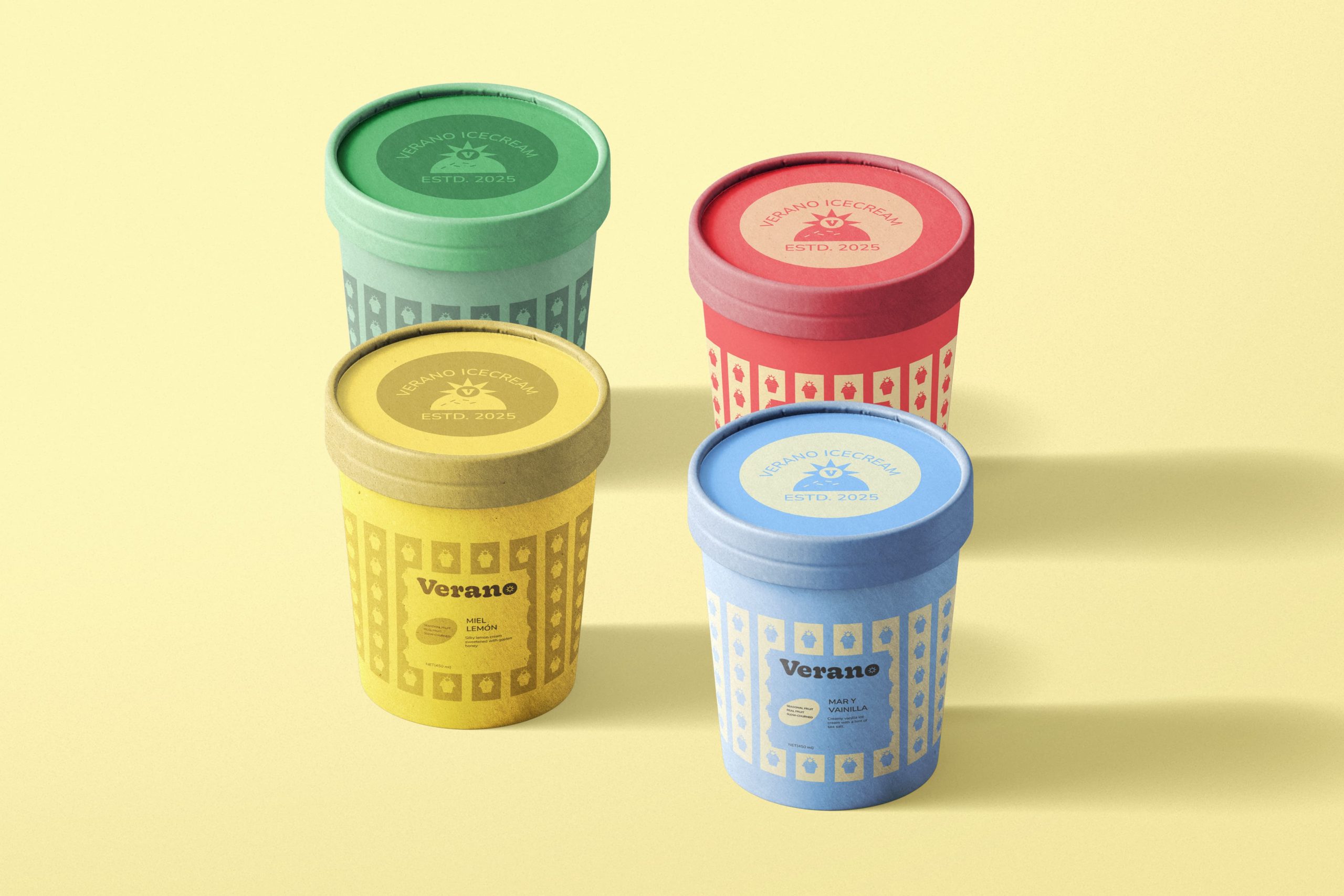
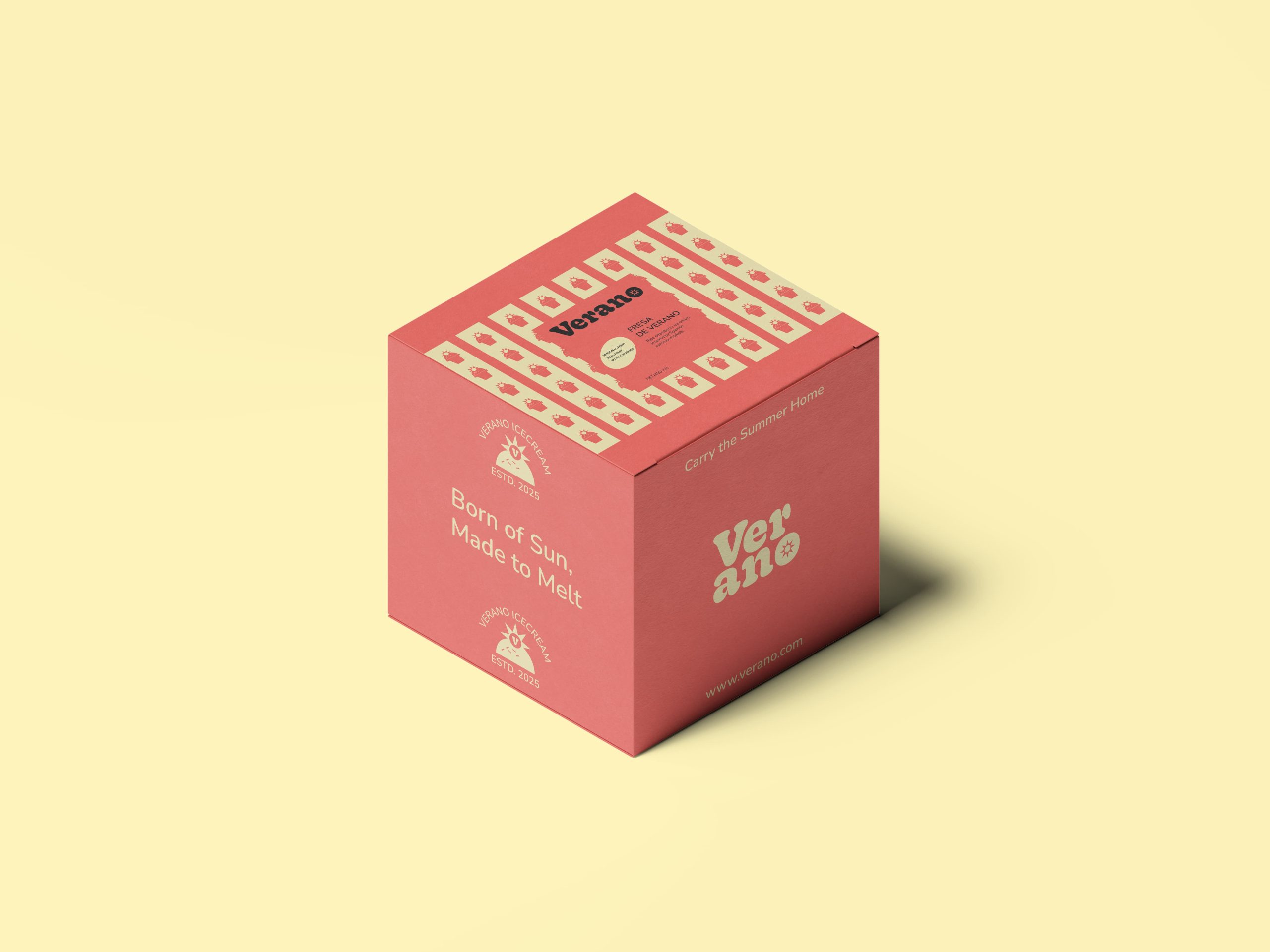
The identity is built around a distinctive packaging system featuring bold color palettes assigned to each flavor, paired with a structured label layout that ensures consistency. A custom pattern language, inspired by simplified iconography and repetitive motifs, adds visual richness and brand recall. Typography is expressive yet controlled, balancing personality with readability. The cylindrical packaging format enhances shelf presence, while the combination of colors, patterns, and layout creates a cohesive yet flexible system adaptable across variants.
RESULT
The final outcome is a vibrant and memorable packaging system that stands out through its use of color, pattern, and form. Verano successfully captures the essence of summer, translating it into a visually engaging brand experience that feels both playful and refined. The system allows for scalability across multiple flavors while maintaining a strong and recognizable identity, positioning the brand as both inviting and distinctive in a competitive market.

 Akshay 11
 monther al omari
 Shustova p
 mutta
 @Allenarts13
 Sirka Agency
 Atiq Alam
 Dozen Agency
 j.substance
 SCD
 Cristian Lepore | crilep Copia
 Chris Creative Works
 Aligned Design Co.
 CreativeWise
 Agence des Coteaux
 Ramyromeo2024
 Grain of Design ®
 Ebbi
 BFS Studio
 butterflyhunters
 Asprey Creative
 About House of Ta
 Up-Brands
 KJS CRAFT
 hello ocean
 PG Branding