ABOUT
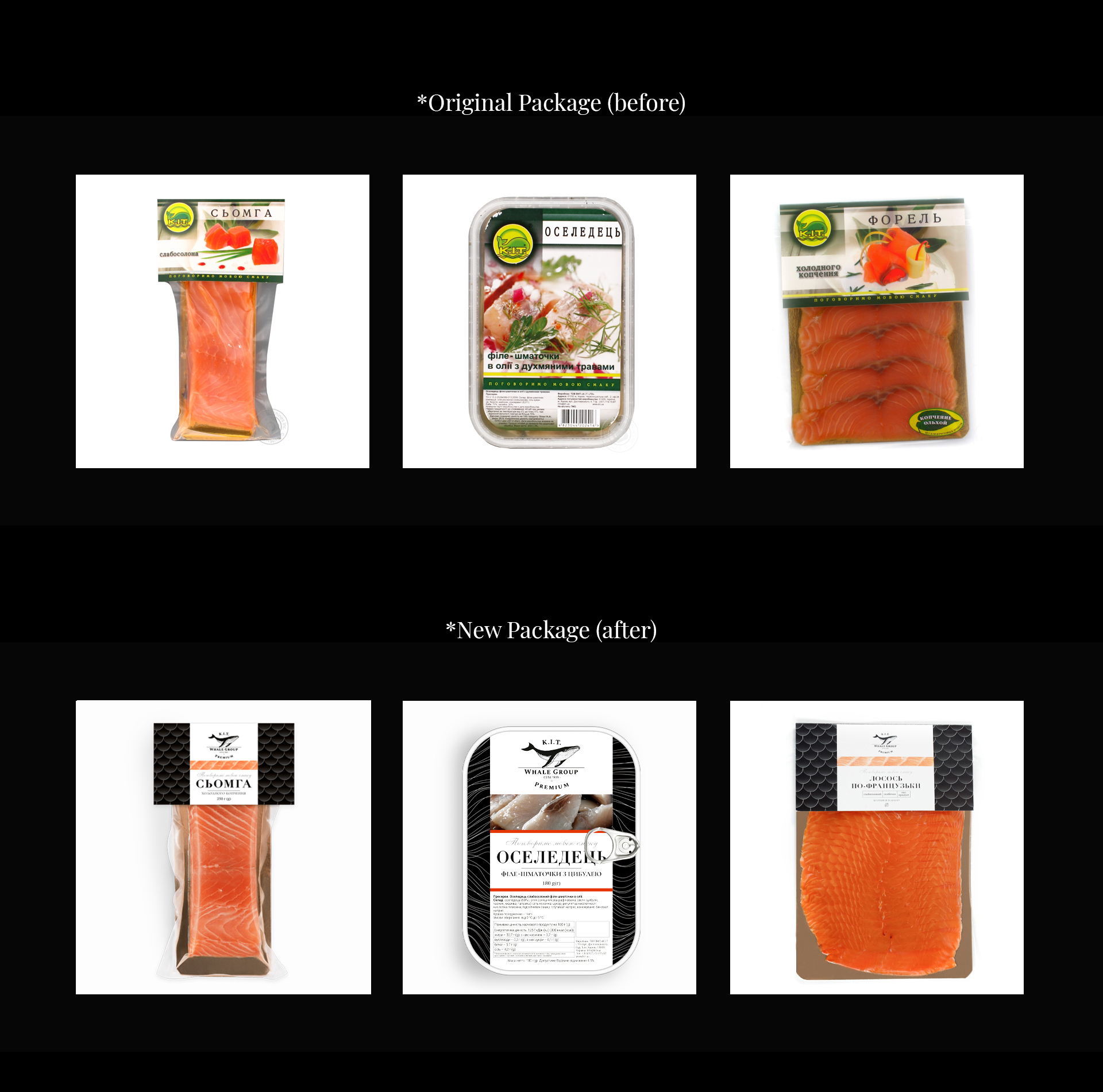
Today K.I.T. is one of the leading companies in the fish market in Ukraine. They have a wide range of fish and preserves, but the design of the existing packaging is no longer relevant, outdated and not selling. So our task was to create a flexible wide system for redesigning existing fish and preserves packaging. The redesign has to be coherent and recognizable.
SOLUTION
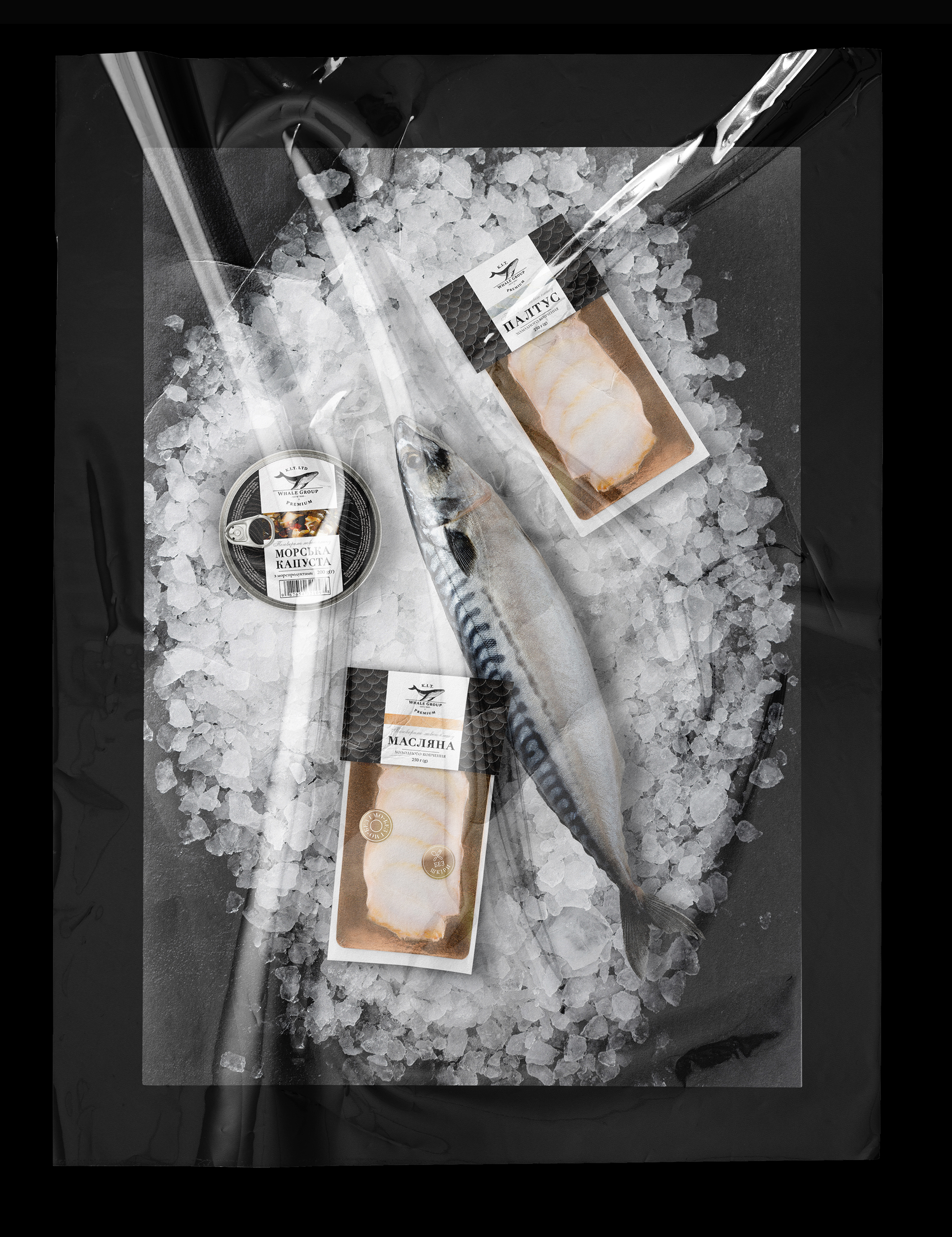
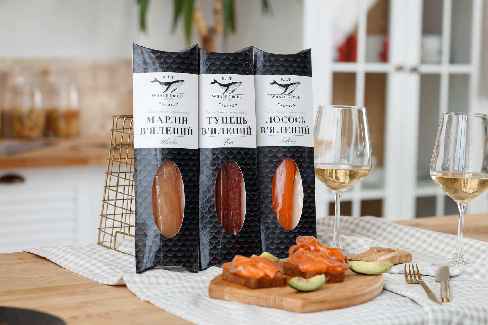
Keeping the core principle of flexibility in mind, we have created patterns from simplified geometric patterns applied to various types of packaging to add personality to each product while ensuring that they look holistic and are part of the K.I.T family.
RESULT
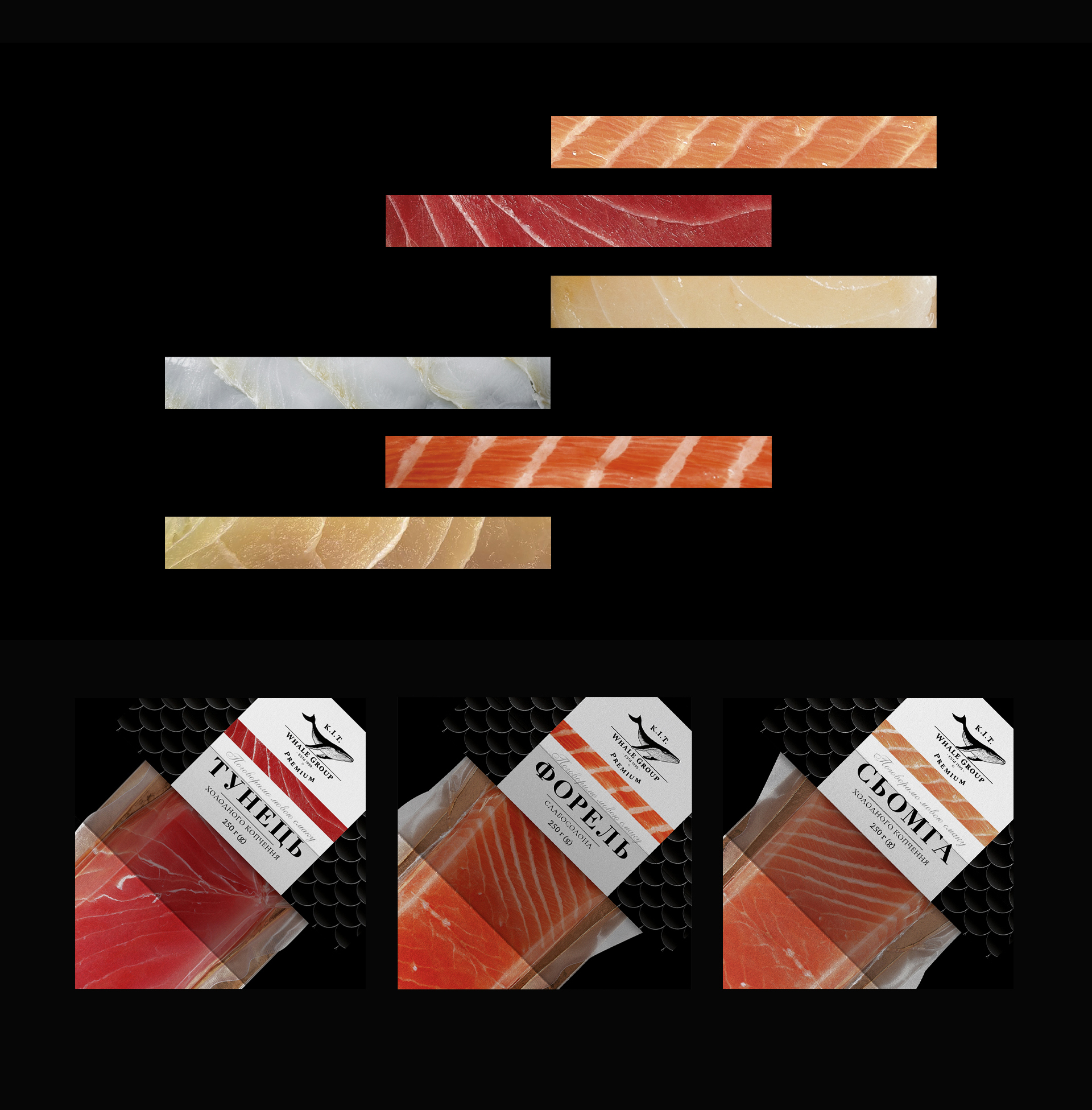
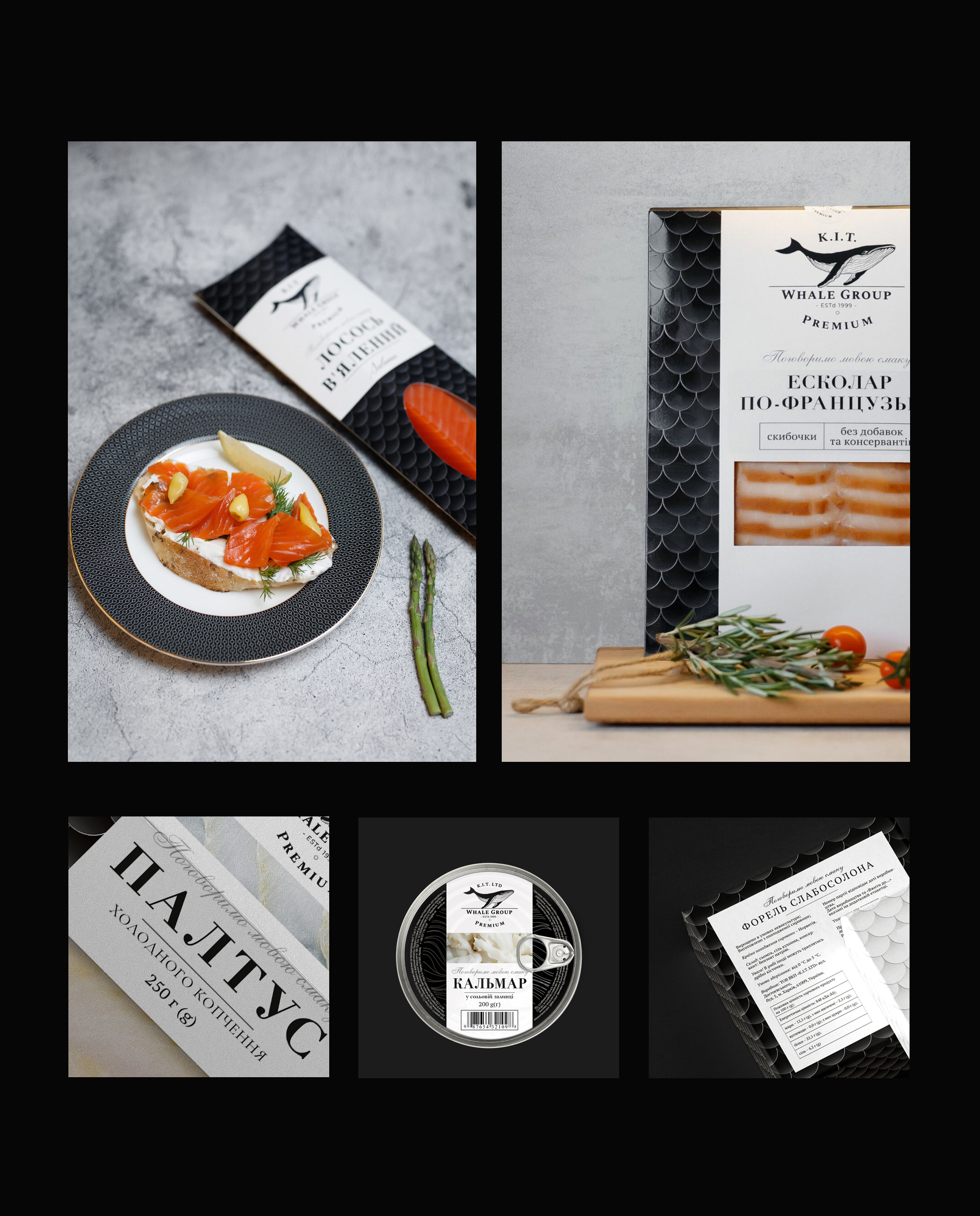
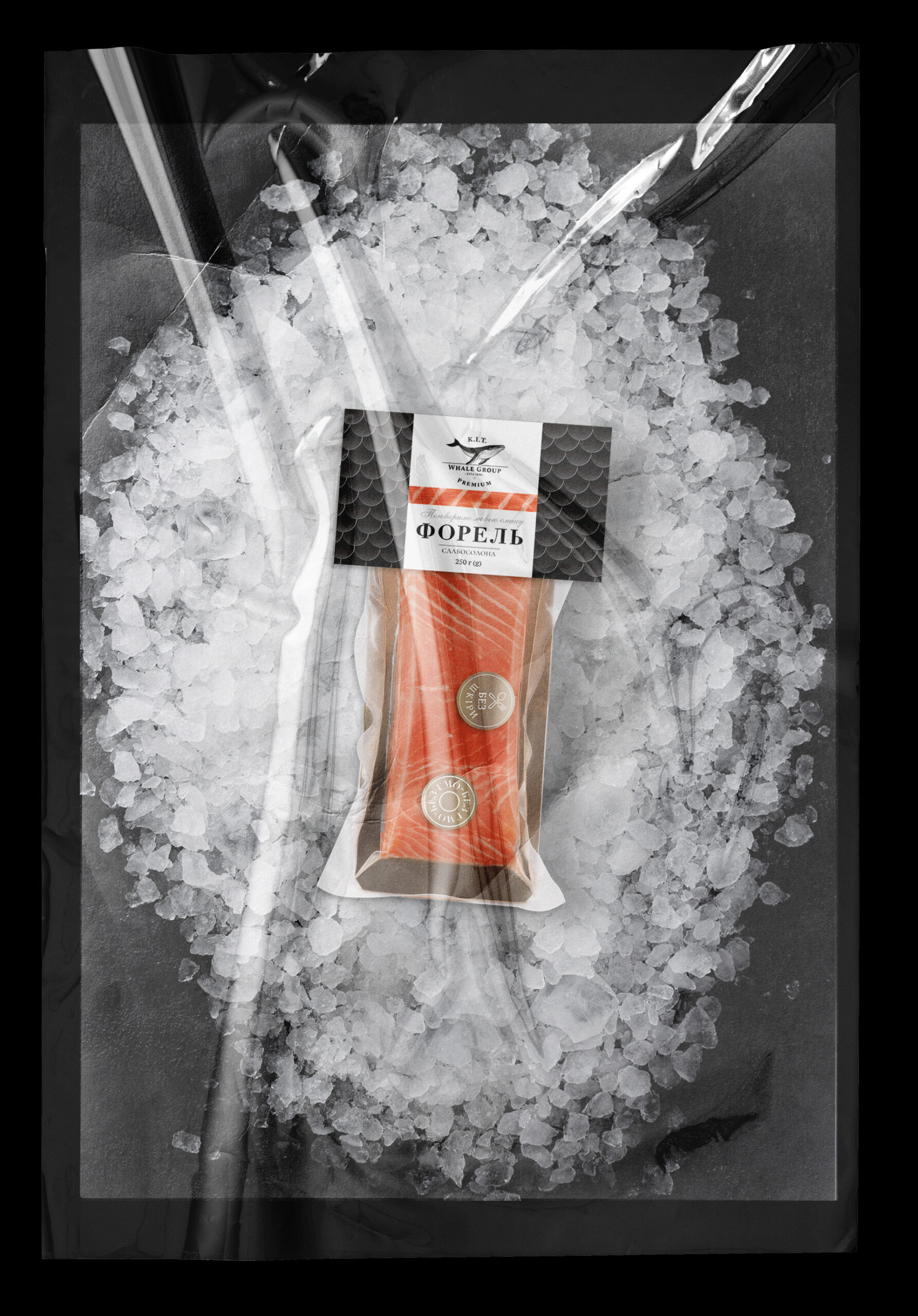
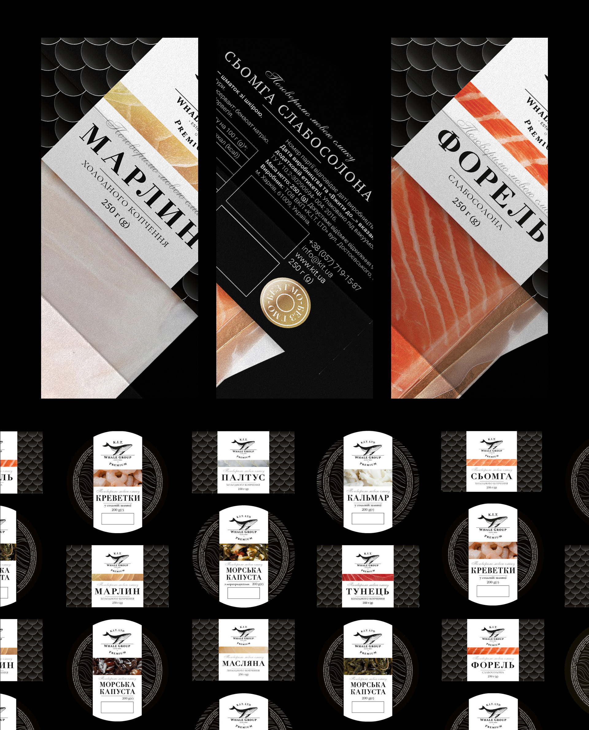
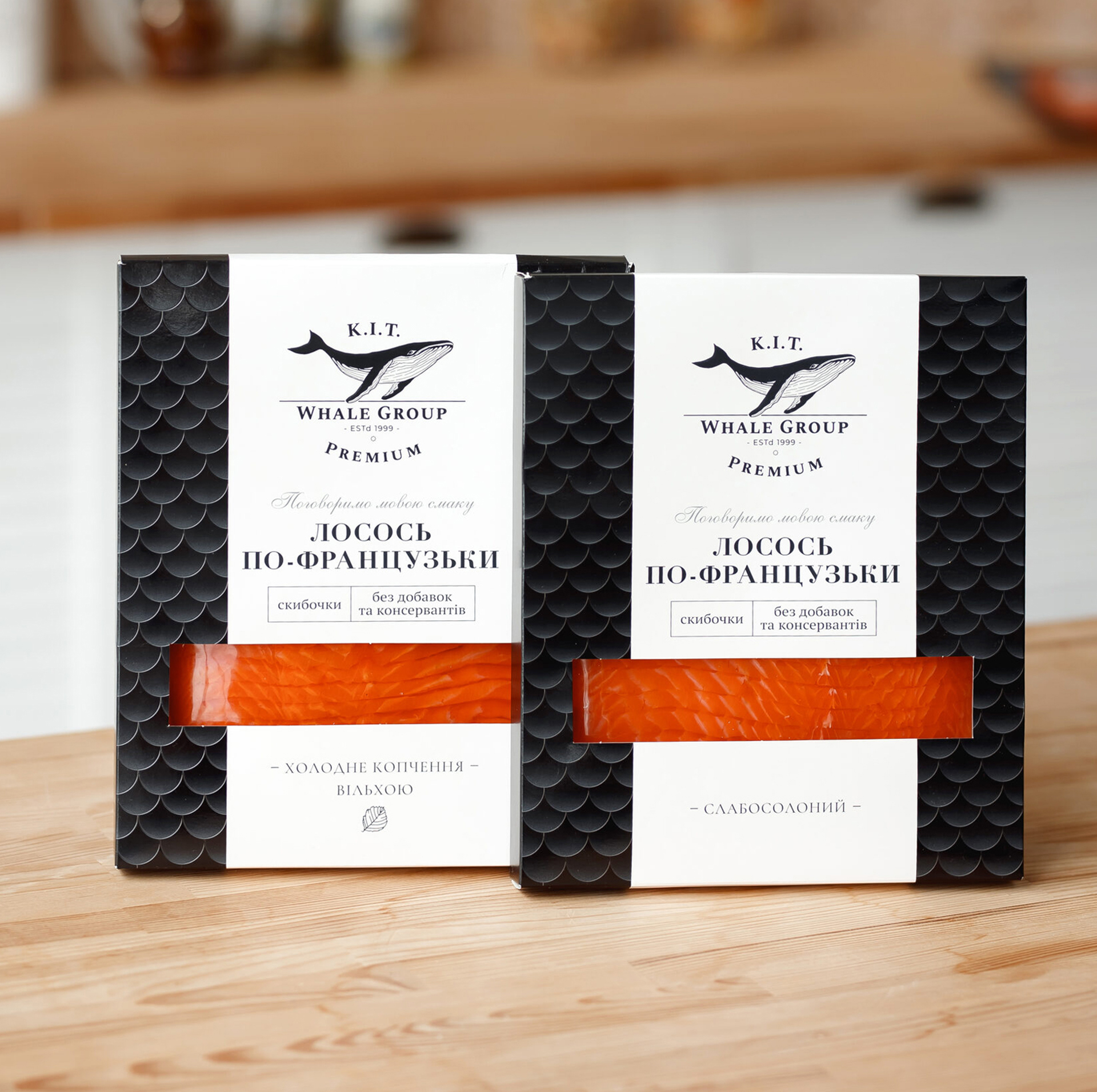
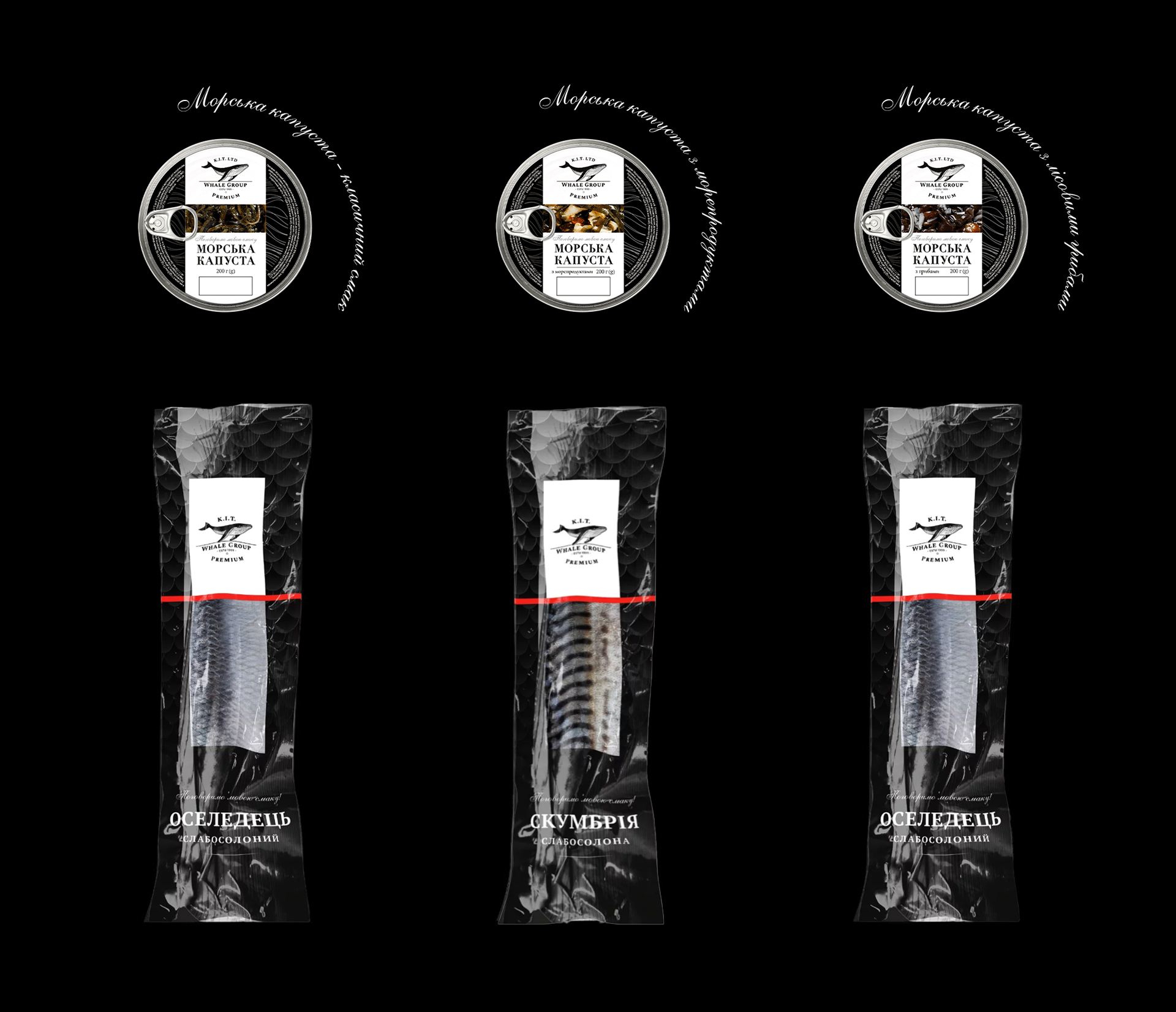
The fish label pattern was inspired by the shapes of fish scales. Also, this pattern easily accepts various forms of packaging, and therefore is practical. We chose black and white colors as the basis to show the premium quality of the product and not to overdo it with colors due to the large size of different types of fish. A distinctive accent on the packaging is a line with a fish texture. The set of preserves is more diverse, therefore, instead of scales, lines are used as a pattern, which symbolizes the waves of the sea and shows the naturalness of the product. The typography in the packaging is minimalistic, the serif headset shows that the product belongs to a more expensive segment of the market.