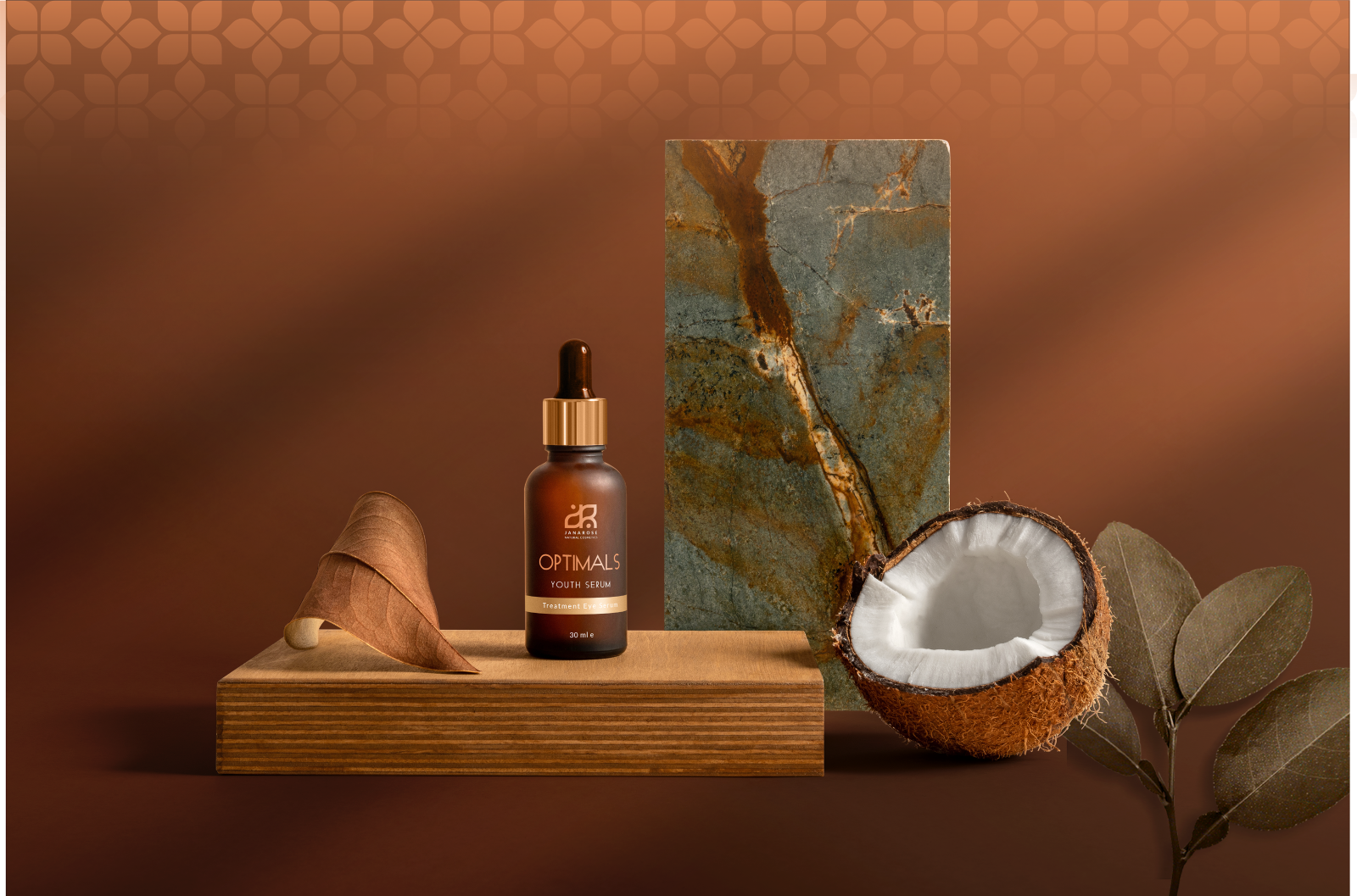
Janarose is a skincare line that started out of a nature love story, inspired by the magic Magnolia petals. Honest & Clean beauty made with pure ingredients, to elevate the daily ritual of skincare. We worked in a full branding: designed a bespoke logotype where sim- plicity and nature soul play a major factor in the design. We designed a symbol that features a Magnolia petal and water drop, and we combined it with the first letters of the brand which also denote the natural extracts present in all the brand’s products.
![](https://i0.wp.com/packagingoftheworld.com/wp-content/uploads/2024/06/f5f53f121885397.60cef680335fe.png?fit=1300%2C900&ssl=1)
![](https://i0.wp.com/packagingoftheworld.com/wp-content/uploads/2024/06/a25542121885397.60cef68036f77.png?fit=1300%2C900&ssl=1)
![](https://i0.wp.com/packagingoftheworld.com/wp-content/uploads/2024/06/06cfae121885397.60cef6803520d-1.png?fit=1600%2C1057&ssl=1)
![](https://i0.wp.com/packagingoftheworld.com/wp-content/uploads/2024/06/c6eb67121885397.60cef68033ea1.png?fit=1600%2C1057&ssl=1)
![](https://i0.wp.com/packagingoftheworld.com/wp-content/uploads/2024/06/5f83f1121885397.60cef68036197.png?fit=1600%2C1057&ssl=1)
![](https://i0.wp.com/packagingoftheworld.com/wp-content/uploads/2024/06/fe258b121885397.60cef68034797.png?fit=1600%2C1066&ssl=1)