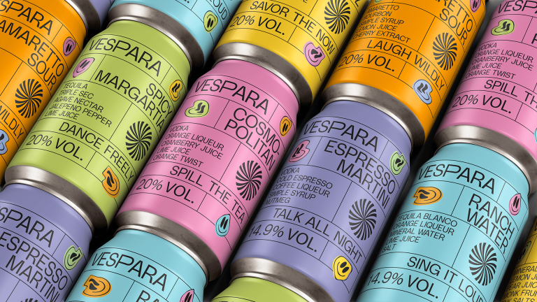
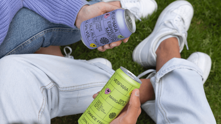
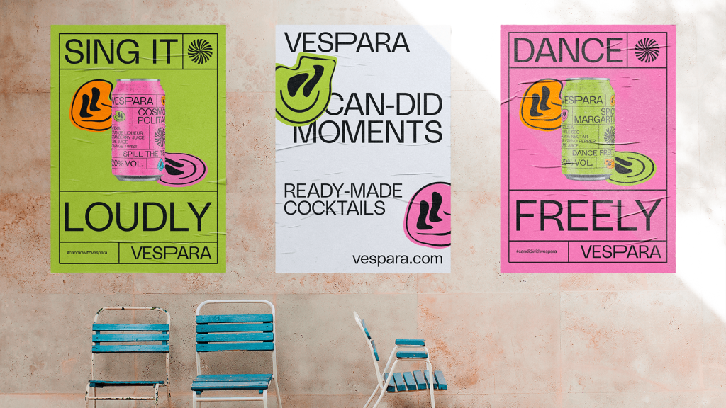
Bold. Hypnotic. Unforgettable. The packaging design for Vespara is more than just eye candy—it’s a visual anthem for those who crave adventure and embrace spontaneity. Inspired by the pulse of a night out and the vibrant energy of social connections, the design had to be as daring as the cocktails themselves. It’s not just packaging; it’s an invitation to live boldly, stand out, and savor every moment.
At its core, the Vespara design captures the essence of a good time: a kaleidoscope of retro-inspired patterns, warped smiley faces, and electric hues that demand attention from across the room. Each can bursts with personality, using dynamic grids and vivid colors to create a sense of motion and energy that mirrors the spirit of the drinker. This is packaging that disrupts expectations—bold enough to stop you in your tracks and cool enough to spark a conversation before it’s even cracked open.
The solution marries playfulness with sophistication, delivering a design that’s both wildly fun and effortlessly premium. By pushing the boundaries of color and form, the design not only stands out on crowded shelves but also feels like a natural extension of the lifestyle Vespara embodies. This is more than a cocktail—it’s a statement piece for the modern socialite, ready to be enjoyed anywhere from casual hangouts to unforgettable parties.
Ultimately, Vespara’s packaging doesn’t just hold a drink; it captures the rush of a moment waiting to happen.


