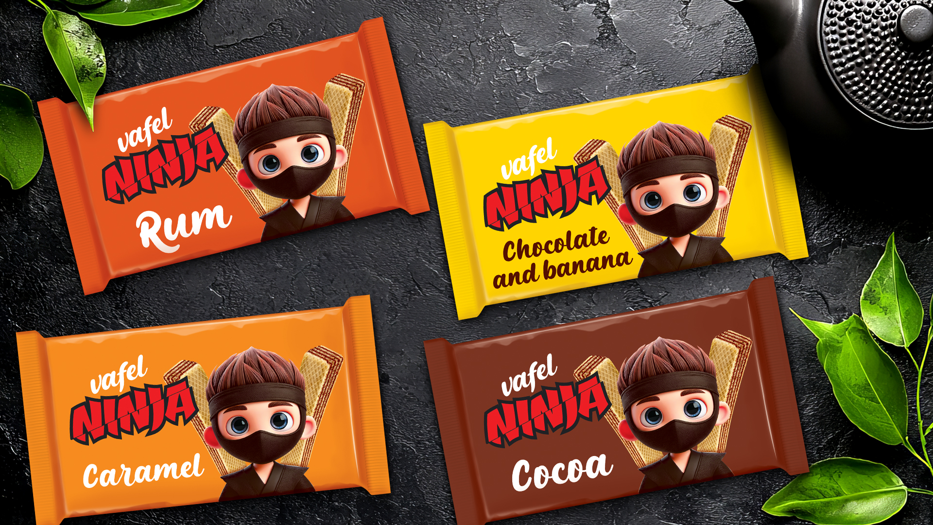

Bold Identity. Playful Energy. Unmistakable Shelf Presence.
Project Overview
Ninja Vafel is a new-generation wafer brand designed to leap off the shelf and instantly capture the imagination of both kids and adults. The brand’s visual identity is centered around a uniquely illustrated and rendered 3D Ninja character, symbolizing agility, playfulness, and a burst of irresistible flavor in every bite.
Design Strategy
Our approach was rooted in the need to create a highly recognizable and emotionally engaging brand, leveraging the power of character-driven storytelling. The Ninja mascot was carefully illustrated, then digitally rendered to achieve a balance between cartoonish approachability and digital sharpness—creating a memorable hero for the brand.
Character Design
The Ninja character stands at the heart of the packaging. We invested in a custom illustration process, followed by high-quality digital rendering, to ensure the character looks dynamic, expressive, and instantly likable. The ninja’s wide, inviting eyes and playful pose build a connection with consumers, while subtle details—like the iconic black mask and headband—pay homage to classic ninja symbolism and reinforce the brand name.
Color System & Flavor Differentiation
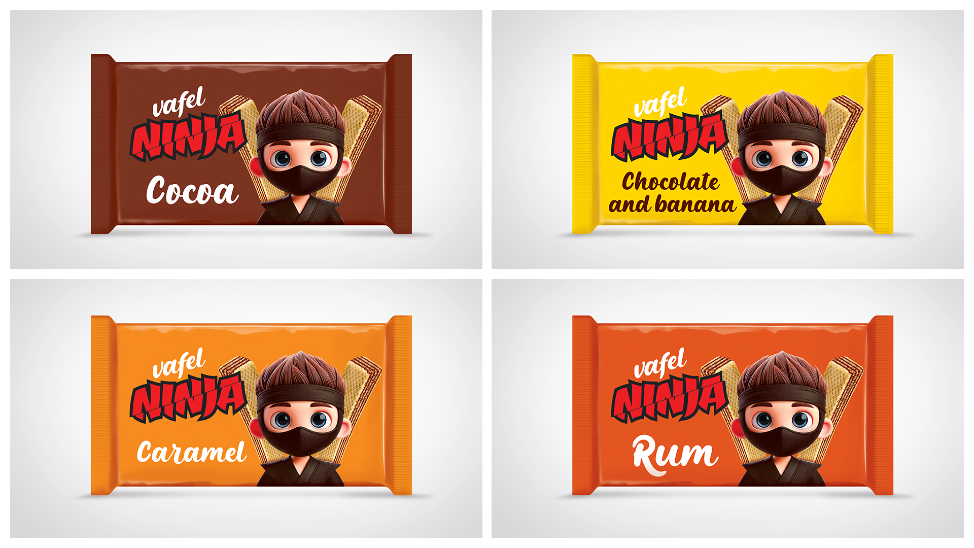
Each flavor is expressed through a bold, flat background color, allowing instant shelf recognition and simple flavor navigation:
- Cocoa: Deep brown background, communicating indulgence and chocolate richness.
- Caramel: Vibrant orange for a sense of warmth and sweet energy.
- Rum: Earthy burnt orange, signaling a more adventurous, grown-up treat.
- Chocolate and Banana: Eye-catching yellow, bringing freshness and playful, fruity notes.
The color blocking system maximizes shelf impact and helps consumers easily distinguish between the four varieties.
Typography & Logo
The logotype “Ninja” is executed in a powerful, hand-drawn, comic-inspired type, designed to evoke action and energy. Its red and black palette gives it an urban, energetic feel—standing out sharply against each colored foil background. The flavor names are written in a friendly, script font, complementing the playful personality of the mascot and supporting effortless readability.
Packaging Structure & Material
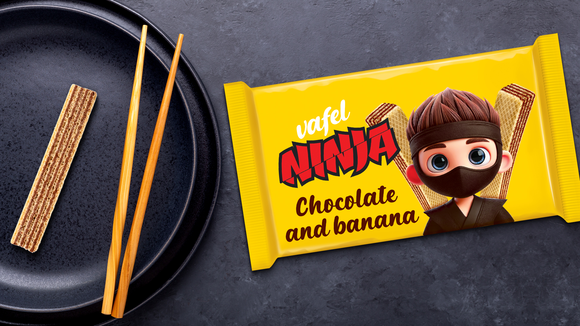
All four flavors are presented in high-gloss foil wrappers, chosen for their contemporary feel, protection, and ability to preserve freshness. The material enhances color vibrancy and gives the product a premium, tactile quality.
Composition
The character is always flanked by realistic wafer renders in the background, creating an immediate association with the product category and taste expectation. This composition anchors the character in context and visually balances the dynamic layout.
Result
The final design system achieves a perfect synergy between playful storytelling, strategic color coding, and bold shelf impact. Ninja Vafel is not just a snack—it’s a brand experience designed to delight and engage, leaving a lasting impression with every pack.
Flavors available:
- Cocoa
- Caramel
- Rum
- Chocolate and Banana


 Otherness
 Alena Chemodurova
 Estudio Argo
 Pomodoro Design Office
 amandacoppeti
 Rabia zouina
 VANESA GARCÍA ESTUDIO
 anima
 Radar Agency
 Aadarsh Jain
 M&A CREATIVE AGENCY
 Valérie Colace
 Antonia Skaraki
 Aurora Baréalisse
 Artrime Graphic Design
 Just Design
 ANONIMA/
 Armoder Arte y Diseño
 eimanbeh
 Biaa
 Hartson Creative
 Karen Danielyan
 AUN BRANDS
 Studio Zak
 Hey Joe Studio