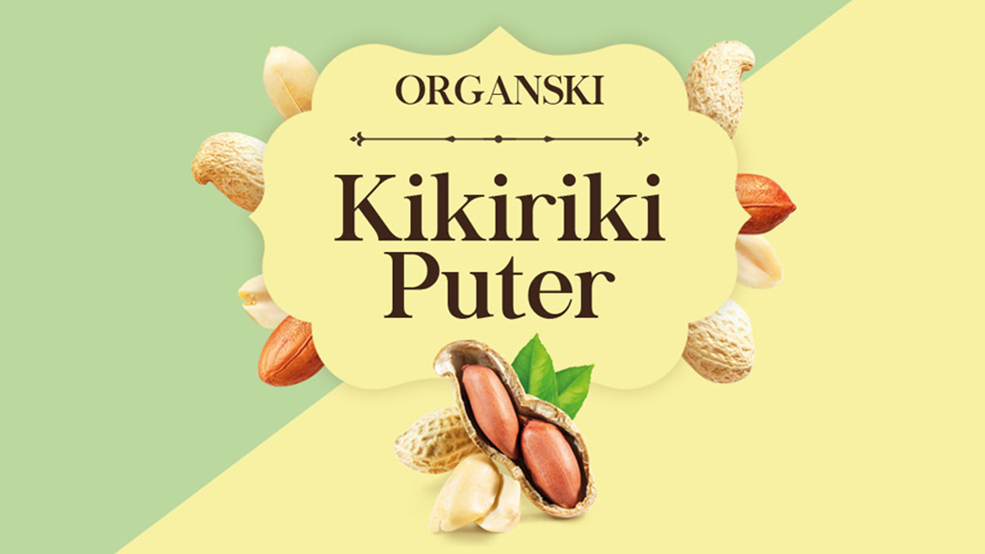
Organic Peanut Butter Packaging Design
Our agency has crafted a vibrant and inviting packaging identity for Organic Peanut Butter, capturing the natural essence and premium quality of the product. The design strategically communicates both the delicious taste and wholesome nutritional benefits, immediately appealing to health-conscious consumers.
Inspired by nature, the color palette harmoniously combines soft pastel greens and yellows, evoking freshness and purity. Distinctive typography with a touch of classic elegance ensures clear brand communication, while playful visuals of peanuts, both whole and shelled, add depth and authenticity to the design.
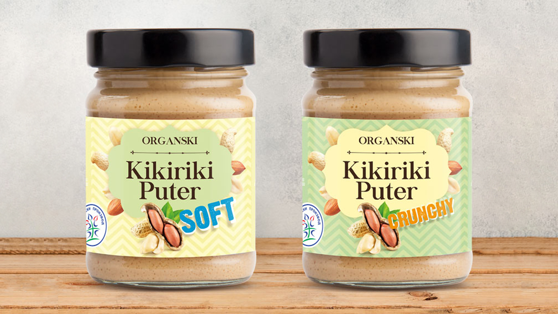
We developed two distinctive variants, clearly differentiated yet cohesively unified under one brand identity: “Soft” and “Crunchy.” Each label prominently highlights the variant, utilizing engaging fonts and subtle yet impactful graphic elements. The “Crunchy” version subtly emphasizes texture through dynamic visuals, whereas the “Soft” variant communicates smoothness and creaminess through softer graphic tones.
Overall, this design perfectly balances contemporary visual appeal with organic authenticity, enhancing shelf presence and clearly positioning the product as a premium, healthy choice for consumers.