SL Choco Biscuit — Redesigning a Modern Classic
Product Range: Choco Biscuit (Dark Chocolate & Petit Beurre, Milk Chocolate & Petit Beurre, Milk Chocolate & Cocoa Biscuit)
Formats: Classic box, vertical pack, pillow pack, single packs
A New Era for a Biscuit Icon
For the SL Choco Biscuit redesign, our mission was clear: to create a distinctive, premium shelf presence while building a flexible packaging system for multiple SKUs and formats. The result is a confident, contemporary identity that elevates every touchpoint of the brand experience—from primary pack to pillow pack, and everything in between.
Brand Strategy & Visual System
We began with a brand audit and identified SL Choco Biscuit’s equity: simple indulgence, approachable premium, and trusted quality. The new identity is anchored by a strong, consistent logo block and a clear color system, making navigation effortless for consumers while amplifying the brand’s visual authority.
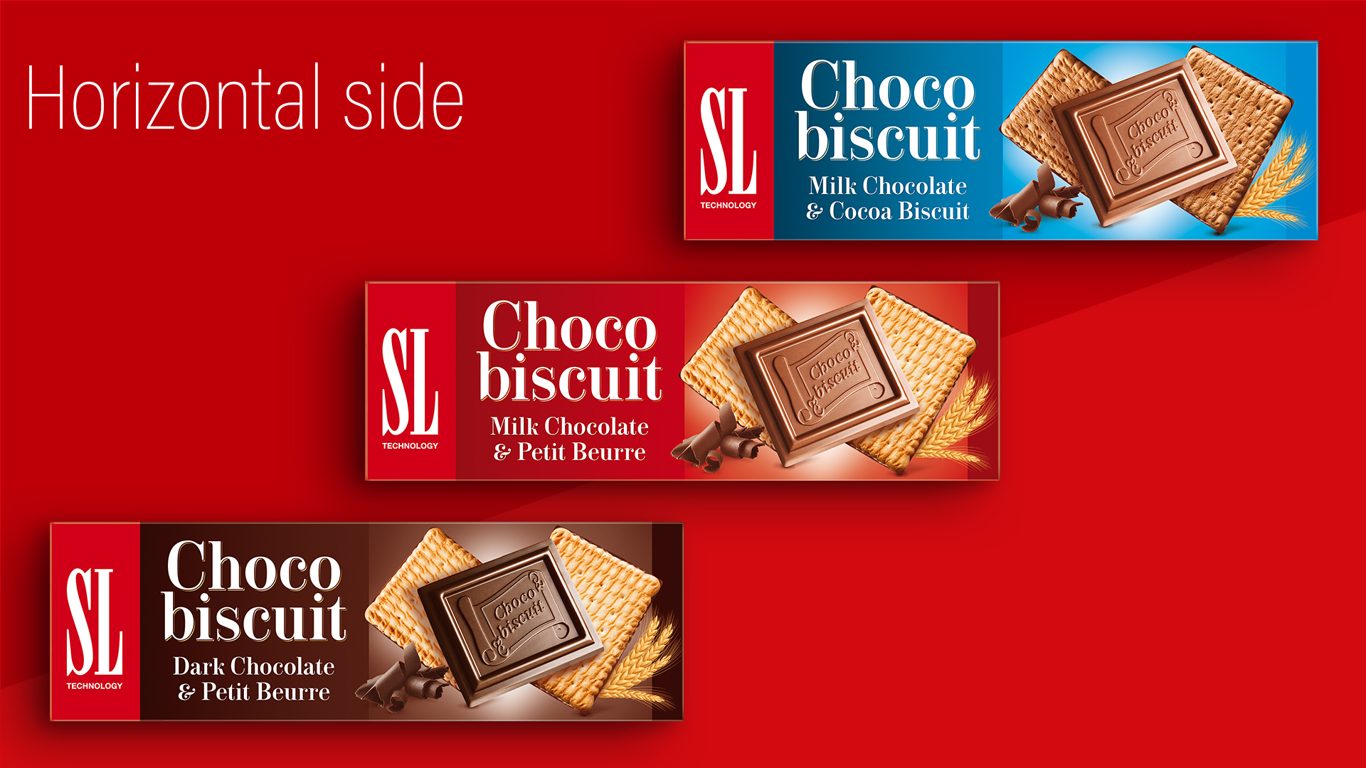
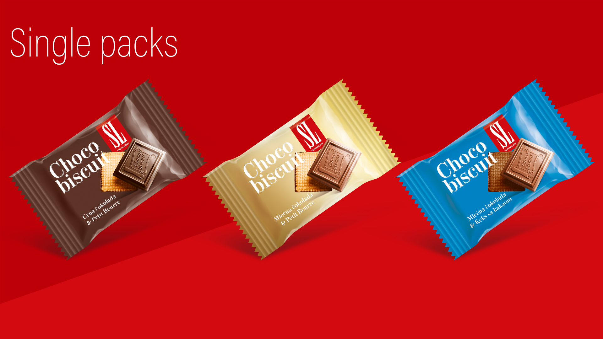
- Color Coding: Each flavor is instantly recognizable through its color—rich brown for dark chocolate, deep red for milk chocolate, and a fresh blue for cocoa biscuit—creating clear product differentiation and range navigation at a glance.
- Typography: A modern serif typeface delivers heritage and indulgence, while precise layout brings clarity and hierarchy. The “Choco biscuit” logotype is deliberately large, maximizing on-shelf impact and supporting fast recognition.
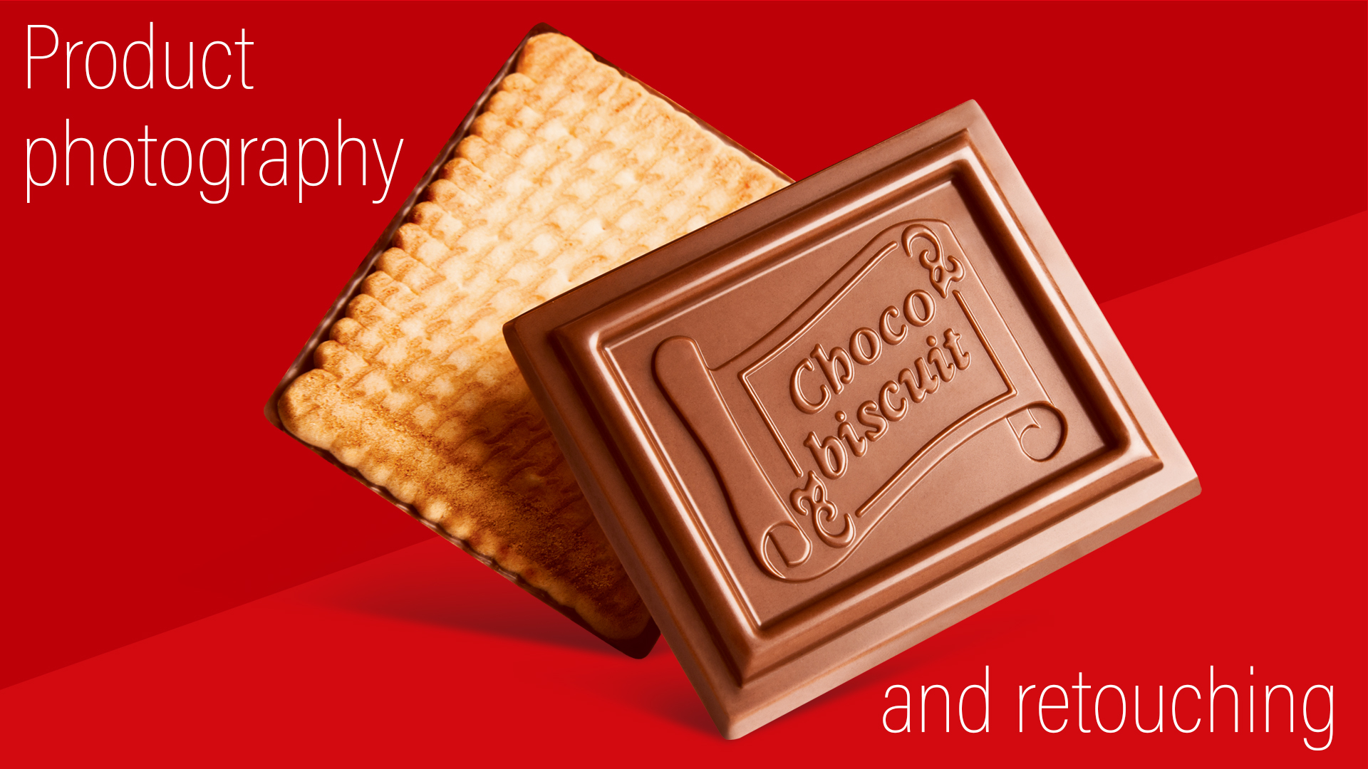
- Photography & Retouching: We conducted and retouched bespoke product photography to showcase the real product: crisp biscuit, glossy chocolate, and textural detail. Each visual is inviting and mouthwatering, setting a new standard for category appetite appeal.
- Material Finish: A semi-matte background with highlighted product renders brings both tactility and visual freshness, hinting at premium quality.
Architecture & Range
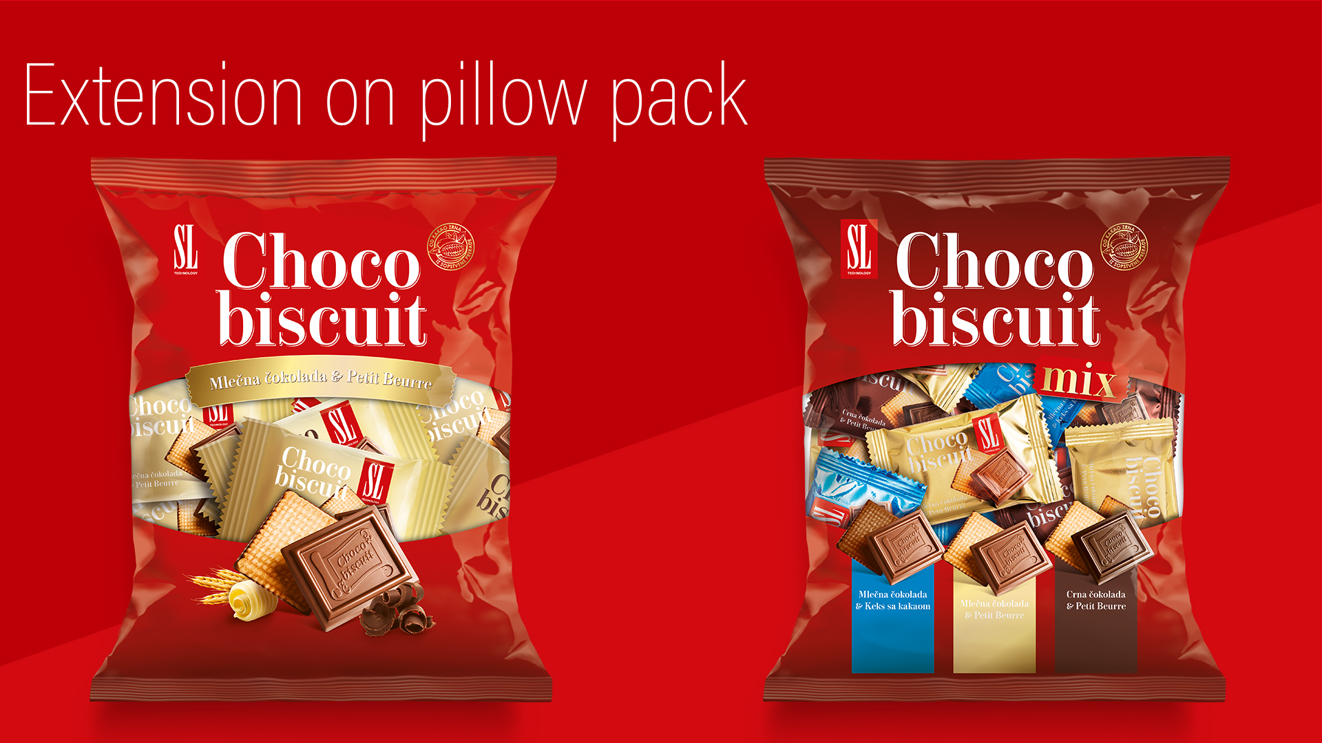
The packaging system supports a full range—from classic box to vertical and horizontal formats, including single-serve flowpacks and family-size pillow packs. Every SKU retains the core visual language while adapting structure and flavor communication.
- Hero Shot Consistency: Across all packs, the iconic chocolate-biscuit pairing is the focal point, ensuring immediate product understanding and emotional connection.
- Scalable System: Whether for individual units, shelf displays, or multipack bags, the design system is robust, flexible, and unmistakably “SL”.
Flavor Experience
- Dark Chocolate & Petit Beurre: Intense cocoa, refined bittersweet notes, classic French biscuit.
- Milk Chocolate & Petit Beurre: Creamy milk chocolate, golden butter biscuit—a timeless favorite.
- Milk Chocolate & Cocoa Biscuit: Decadent, double-cocoa experience with a hint of crunch.
The Result
The new SL Choco Biscuit range is bold, modern, and premium—engineered for standout shelf presence and category leadership. The packaging celebrates the product with authenticity, clarity, and a strong visual identity, designed to connect with both new and loyal consumers.