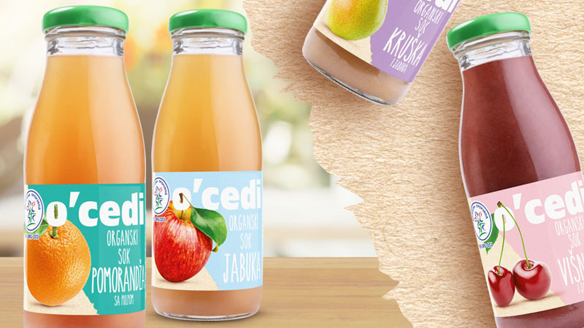
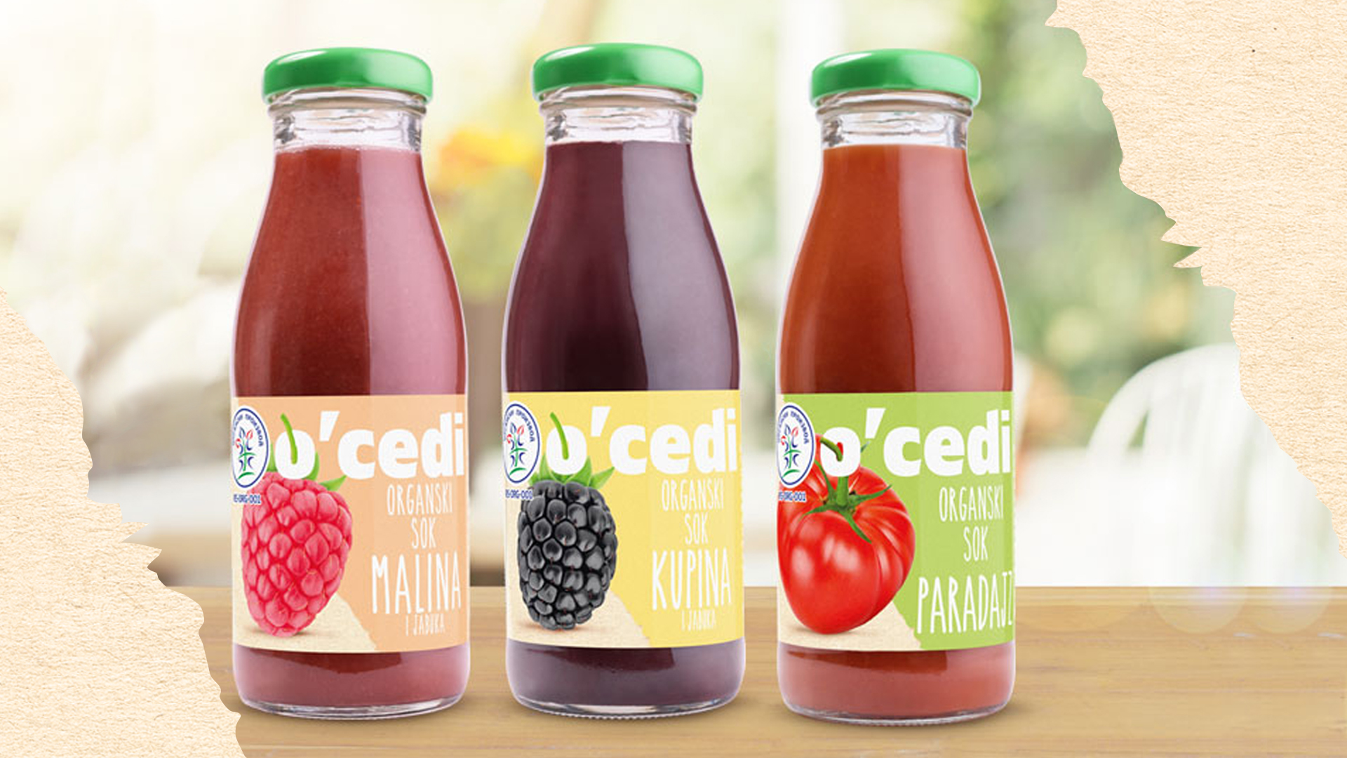
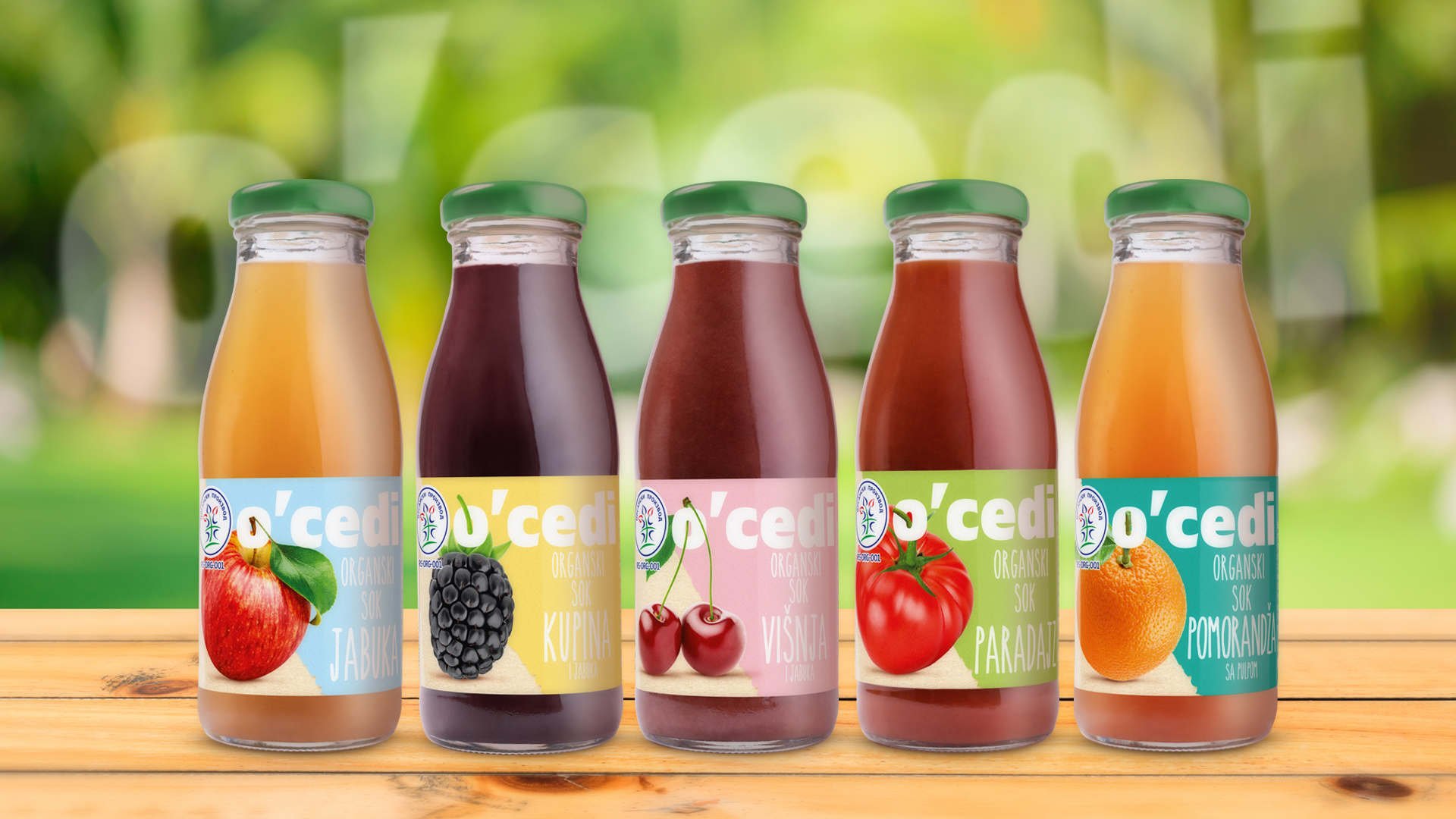
The Visual Identity of the O’cedi Brand
Brief:
introducing new organic juices to the market: To come up with the name and visual identity of the product, to suggest a packaging design, types of paper on the label, brand logo design.
We worked studiously on this project. A dozen brand names were suggested, but the customer eventually opted for the name O’cedi (from Serbian cediti, to squeeze), which actually indicates that the juices are organic and 100 percent squeezed, without added water. The idea was to slip the stem of each fruit through the letter O and thus stress the importance of the fact that they are squeezed organic juices. We decided that the bottle cap should be green and that the (national) sign for organic food should be printed.