The Secret Recipe Product Line Logo and Packaging Design
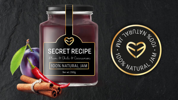
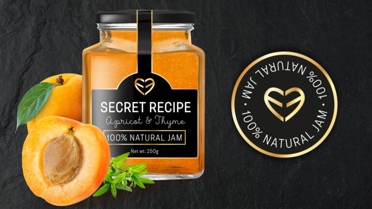
The two letters E mirroring each other represent a heart. The secret lies in the recipe that is prepared with love. It is a passion for making jams in the traditional way, from the heart. Wonderful, isn’t it?! That idea was turned into reality and thus the logo was made. That was followed by the selection of jars and lid colors, and the design of the packaging for a line of three types of jam. Because the jars were small and square-shaped, we didn’t have much space for label design.
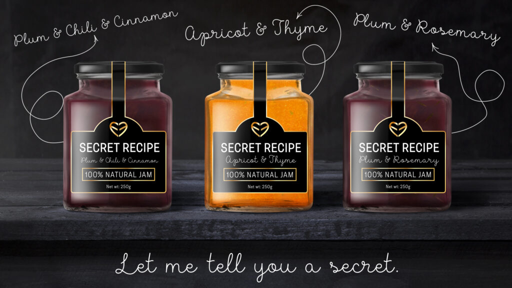
We made several sketches and decided that the label should merge the lid and the glass packaging by way of a circular shape going from the top of the lid downward, along a thin, straight line, until it turns into the shape of a square. The label line follows the product packaging contours. Once the lid is removed, the paper is torn. This top quality premium brand is a combination of special black paper, gold foil, and the white color. We combined two types of fonts: a grotesque and a handwritten one.
All the labels are unified, differing only in the names of the jams and the color of the jar in which a particular product is contained. Each product contains the ‘100% natural’ text in a golden rectangular frame as a guarantee of quality.


