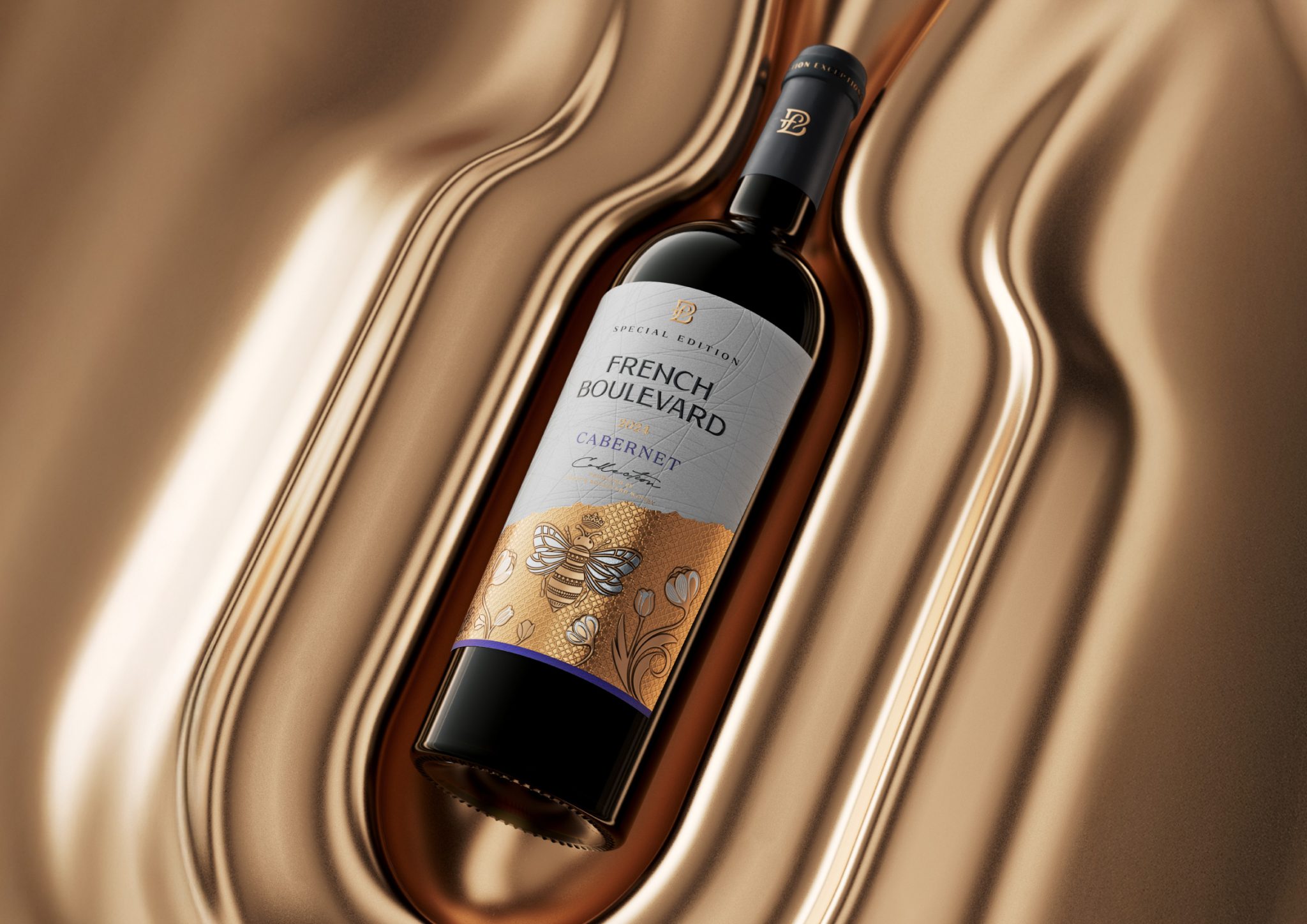

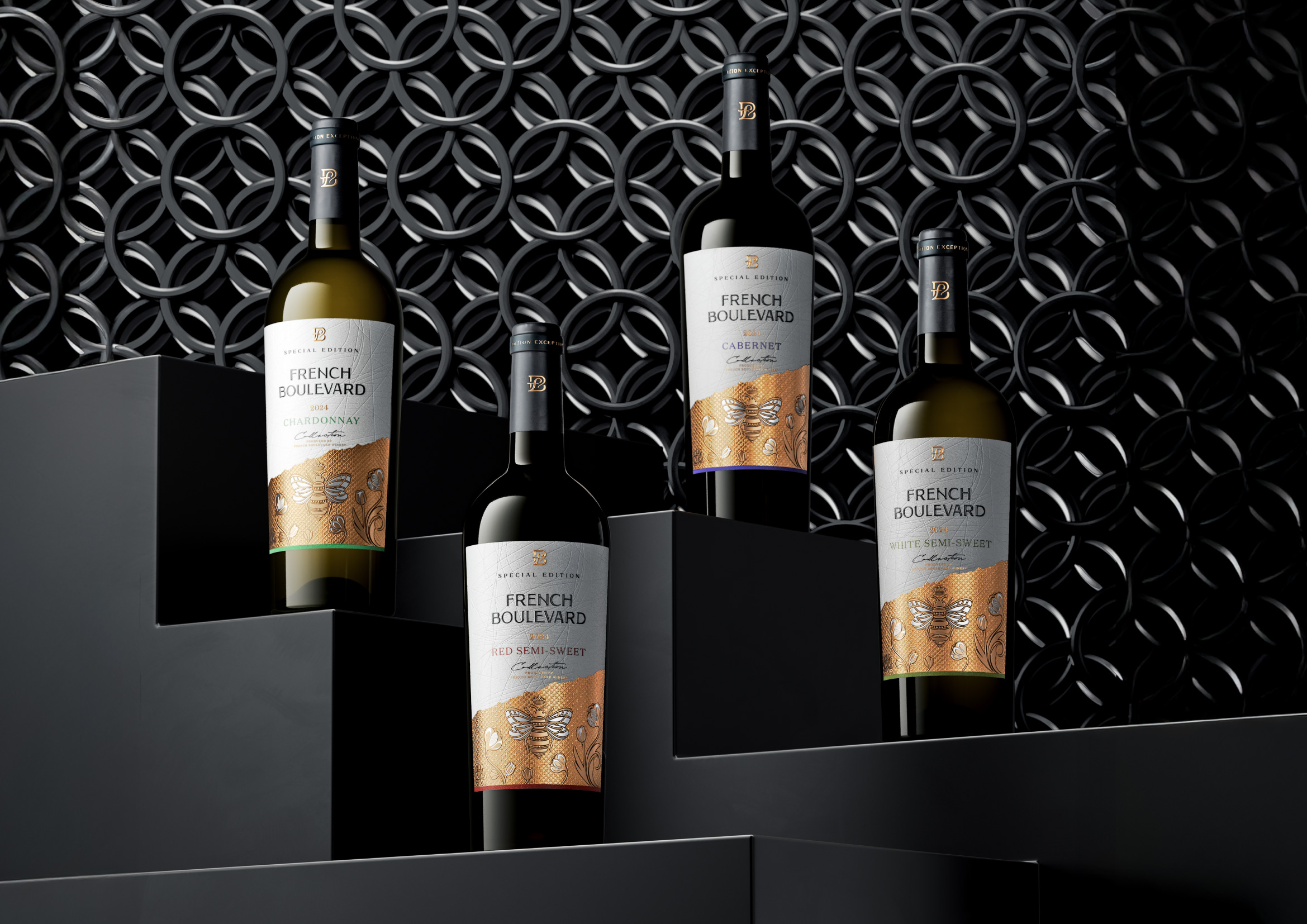
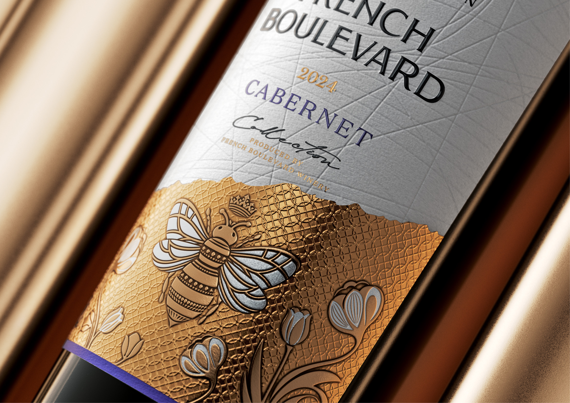
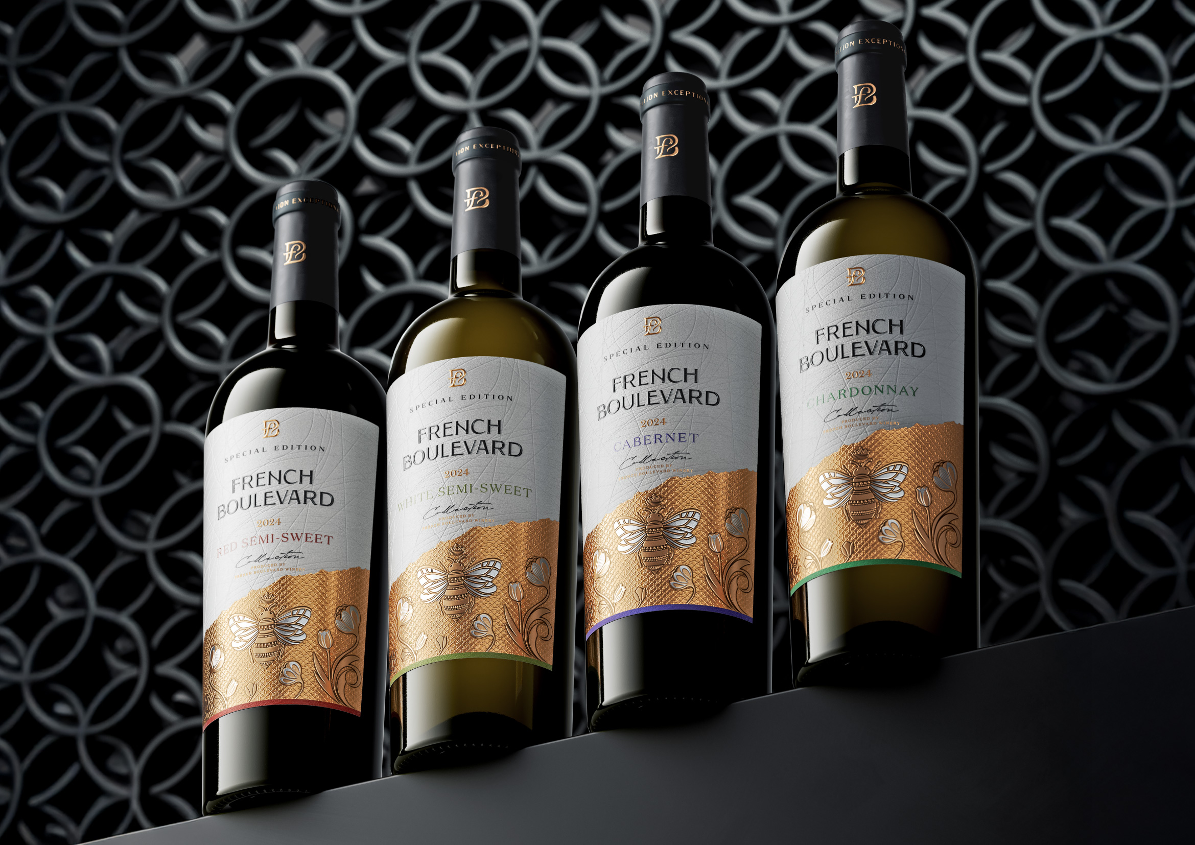
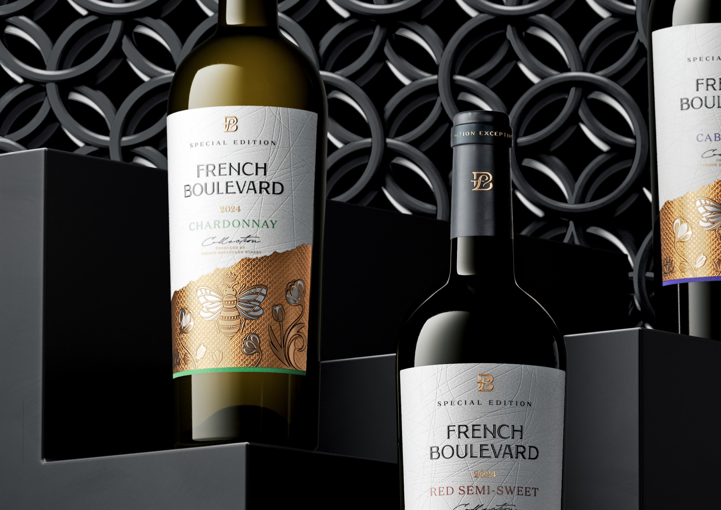
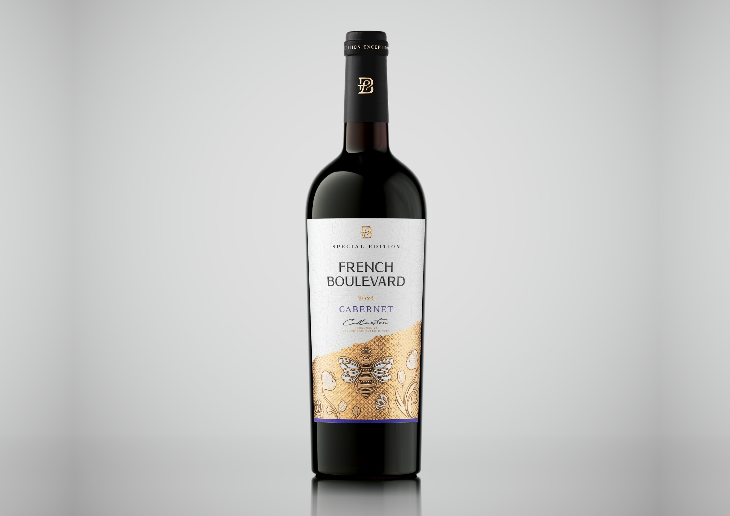
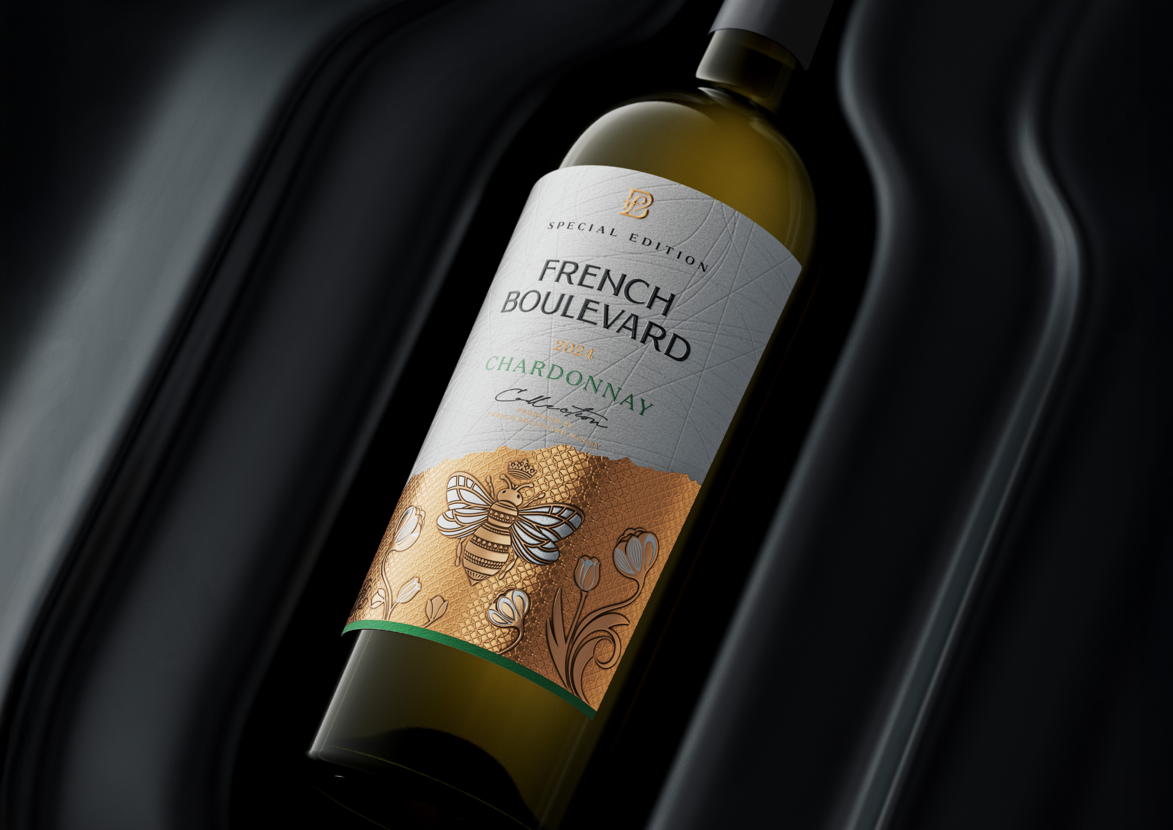
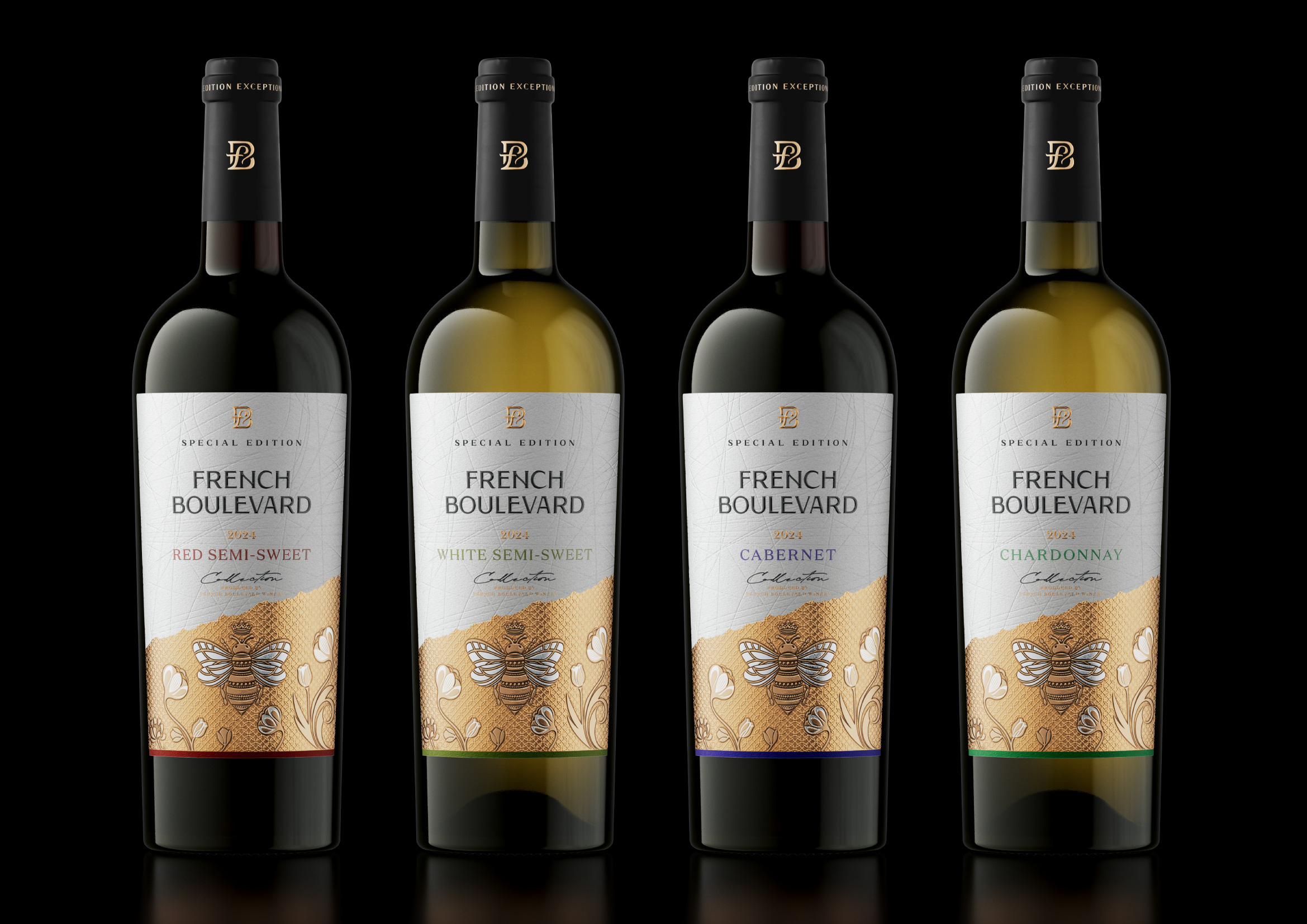
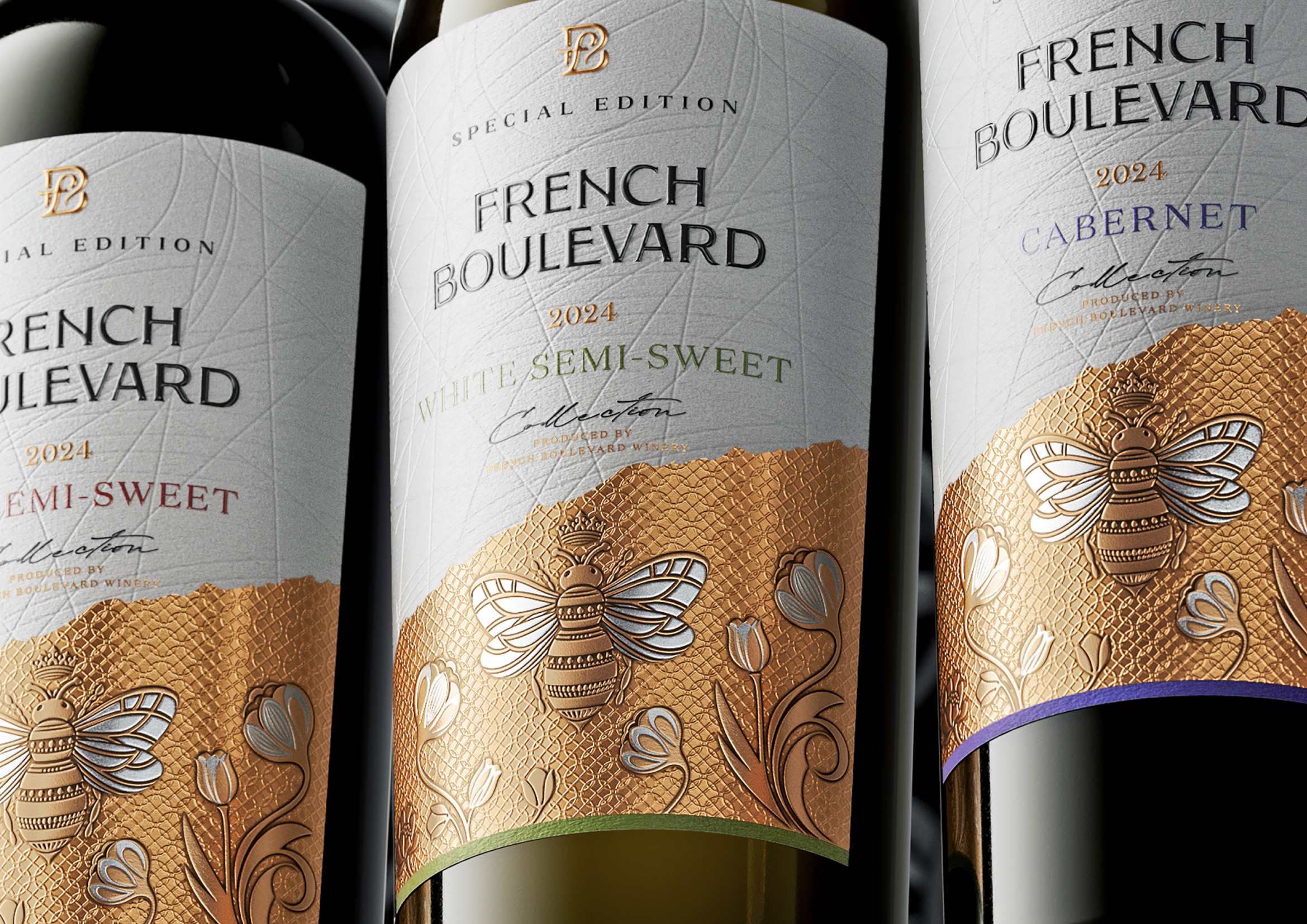
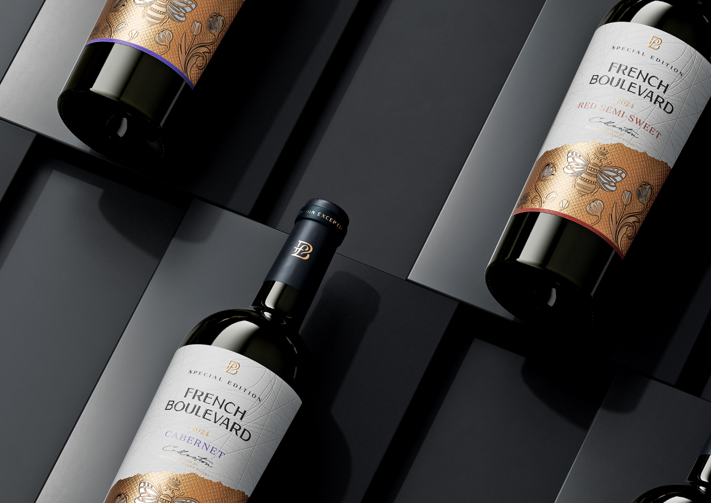
The new design of French Boulevard “Special Edition” features elegant white textured paper, gold embossing with a signature pattern, and modern typography that together create a premium look, instantly catching the eye on the shelf.
The bee serves as the central element of the label design, symbolizing hard work, harmony, and the craftsmanship of the winemakers. It gives the label character and uniqueness, making it easily recognizable and reinforcing associations with naturalness and the exceptional quality of the product.
From a marketing perspective, the design works as a powerful visual trigger thanks to the contrast of textures and colors. The flavor identification is presented traditionally — through color markers at the bottom of the label.

 Eva Chistyakova
 Puigdemont Roca
 marianaaworks
 bloomburo
 andreamarinnn
 Alina
Alina Saadmost
 Bruhken
 Maruf Nishat
 Richest Branding Pvt. Ltd.
 Sophiagdotcom
 saifullahmaslool
 Up-Brands
 Atiq Alam
 daniitenaa
 artworkbysofia
 monther al omari
 Valérie Colace
 Tianqii
 Anum
Anum anisameur
 tauqueer
 SOT B&D
 Palashcc
 Derrick Lin