

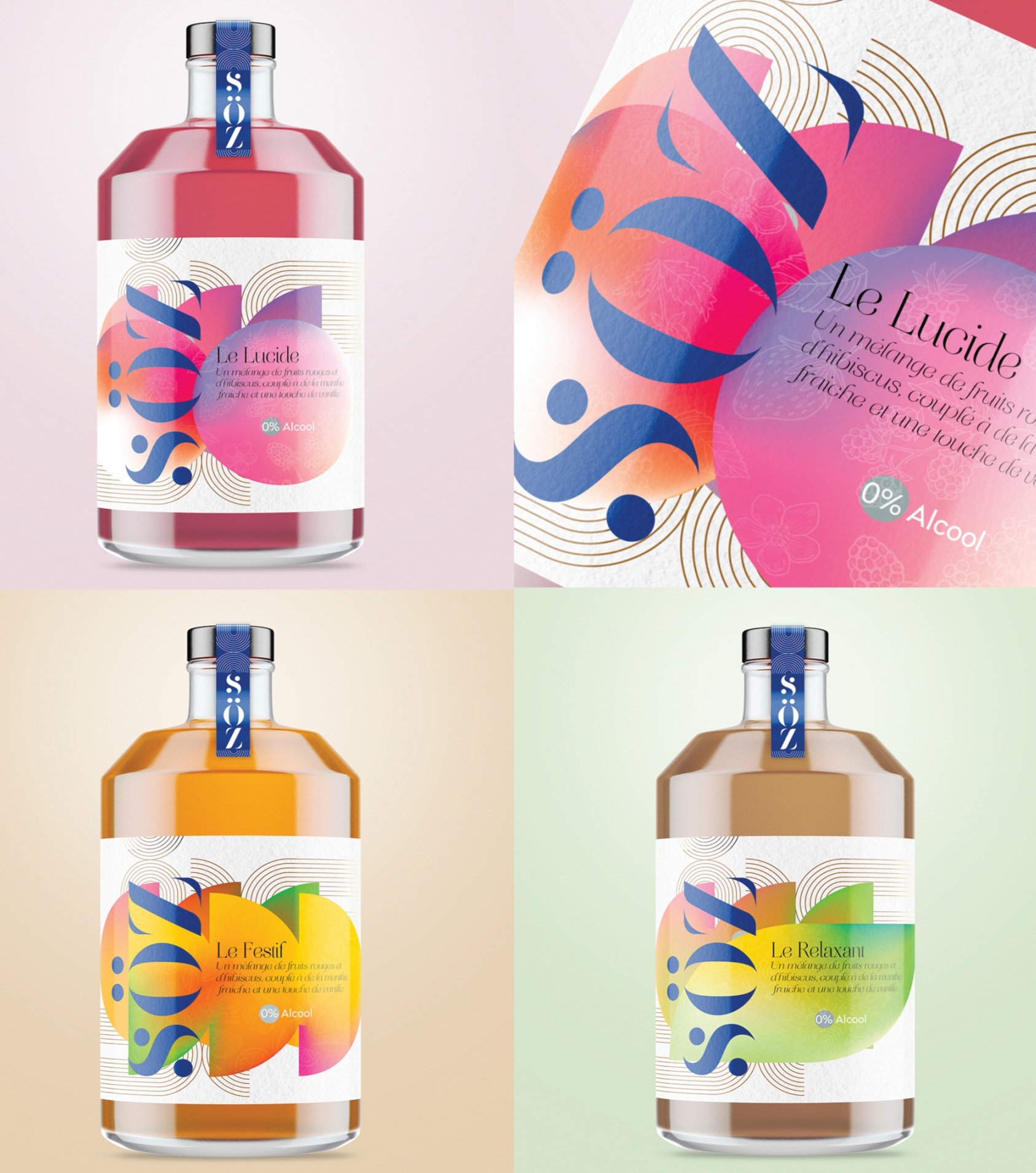
The SÖZ branding and packaging design is more than just a visual identity — it’s about telling a story of balance, joy, and modern conviviality. The bold yet elegant logotype reflects confidence, while the playful umlaut adds a touch of character and uniqueness. Each bottle — Le Lucide, Le Fésil, and Le Relaxant — has its own personality, expressed through vibrant colors and flowing shapes that capture emotions as much as flavors.
This project was designed with people in mind: for those who seek an aperitif that is alcohol-free, but still rich in taste, in style, and in meaning. SÖZ is not just about drinking — it’s about sharing moments, sparking conversations, and enjoying life with clarity and creativity.
 monther al omari
 43oz
43oz Thirst
 Carreto Concepts Design Studio
 M&A CREATIVE AGENCY
 pastellofactory
 Omar Altayeb
 Cocoon Prague
 古戈品牌
古戈品牌 Pascal Riviere Design
 ZIMO Studio
 Valérie Colace
 Platon Ivantsov
 Leyma Design
 Dina Gamal eldin
 clermentza
 Redlana
 anushrishah
 Natania Doshi
 NewFolderStudio
 francapovilla
 Mother Tongue Design
 CJMartins
 Heramb Arora