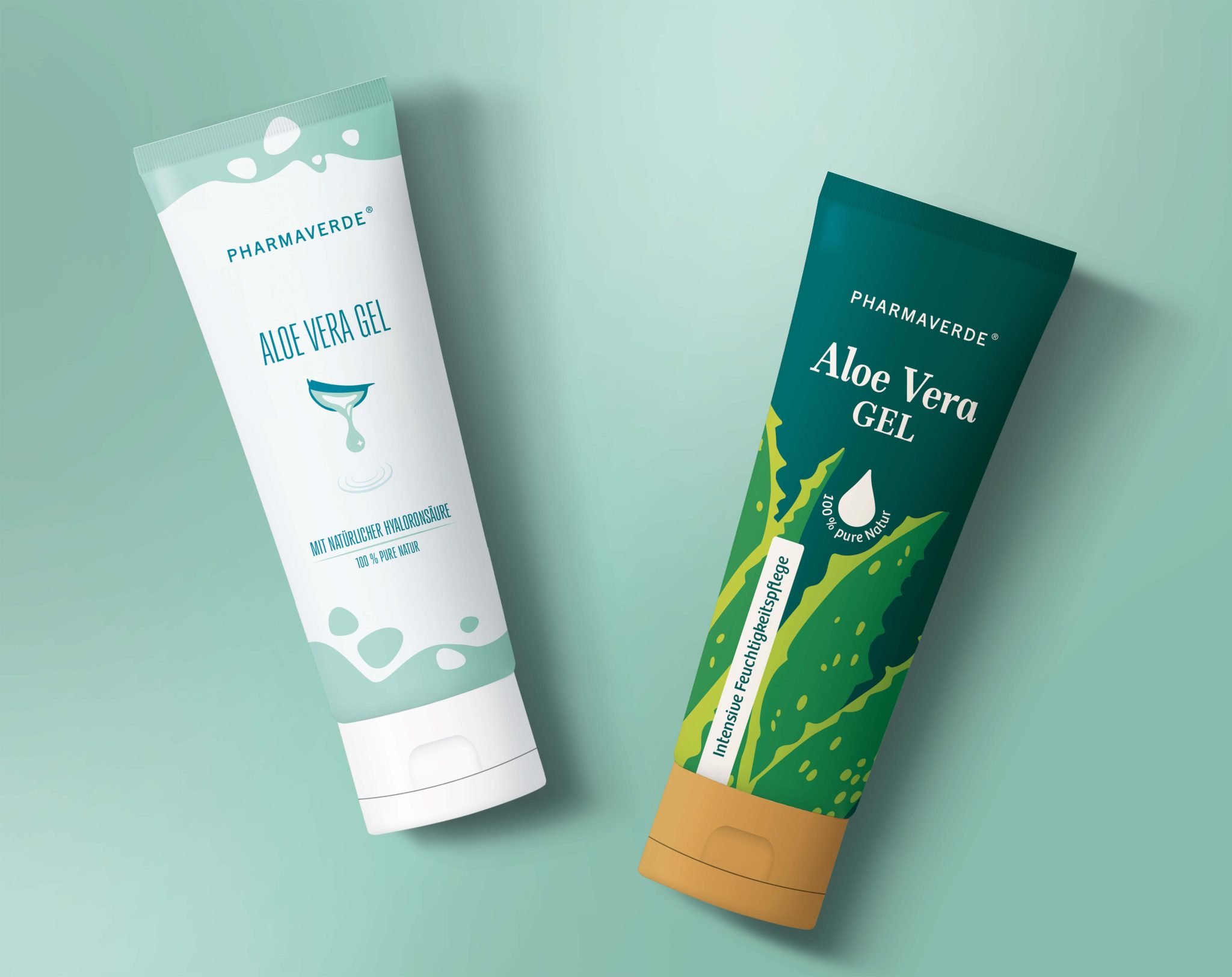

Aloe Vera Gel Packaging Relaunch // Pharmaverde // Maier Pharma
Maier Pharma is a medium-sized, family-run company specializing in pharmaceutical and cosmetic products for pharmacies across Germany, Austria, and Switzerland.
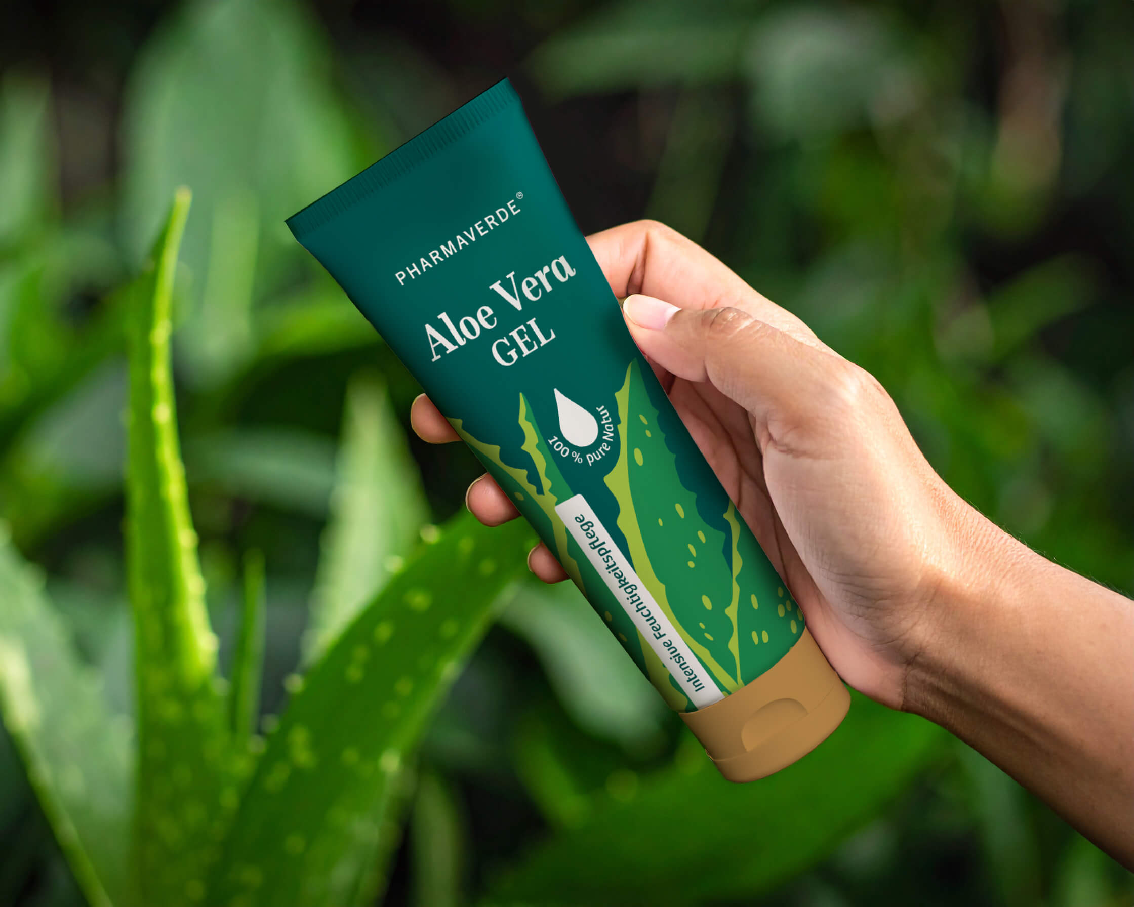
For its in-house cosmetics brand Pharmaverde, I was commissioned to redesign the packaging of the Aloe Vera Gel – a complete creative relaunch without any design restrictions or existing guidelines.
The goal was to give the product a modern, caring, and premium appearance that clearly stands out in the pharmacy market while conveying trust, naturalness, and effectiveness.
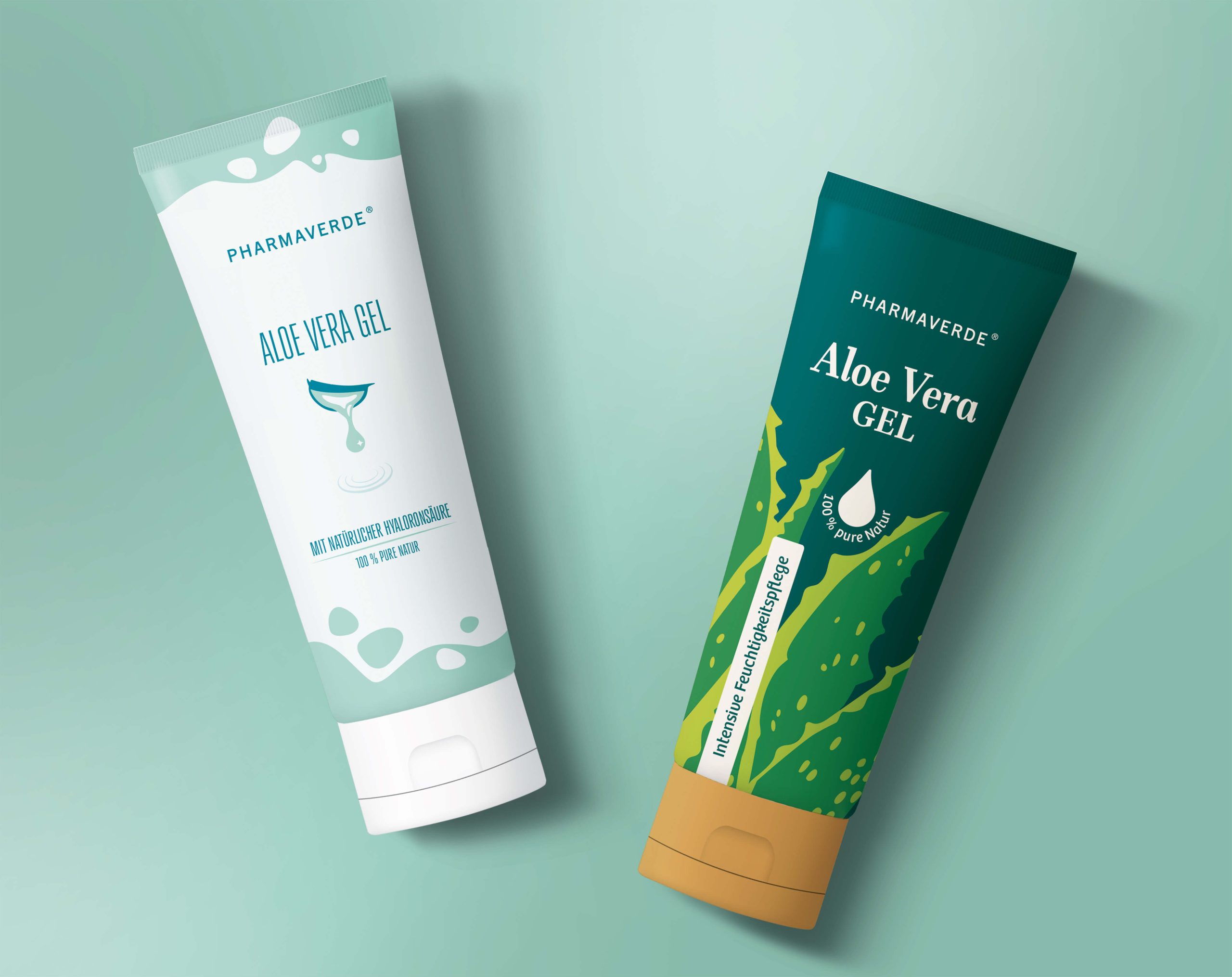
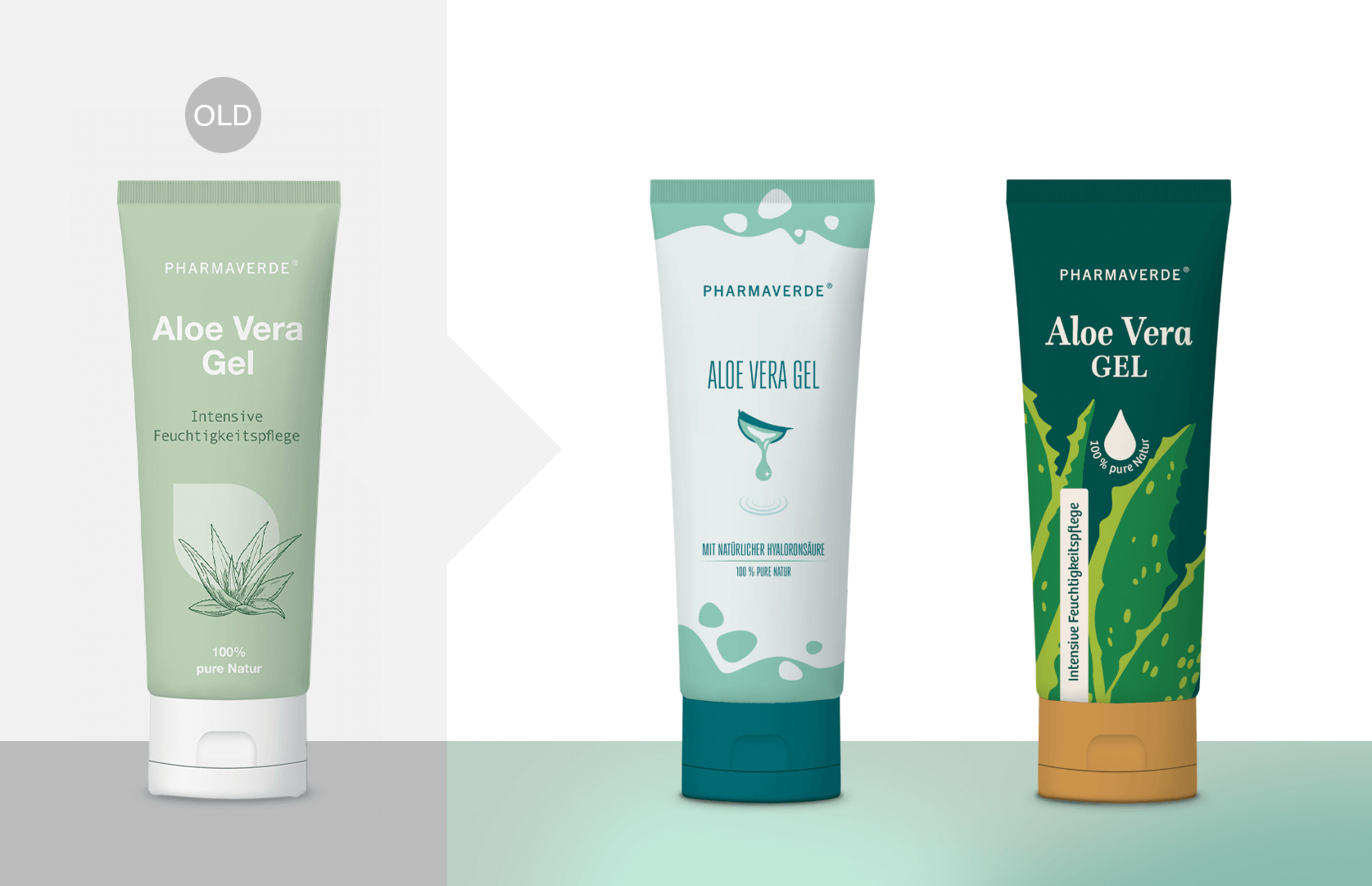
After a concise market and competitor analysis, I developed two strong, illustrative design concepts that reinterpret the brand from different perspectives:
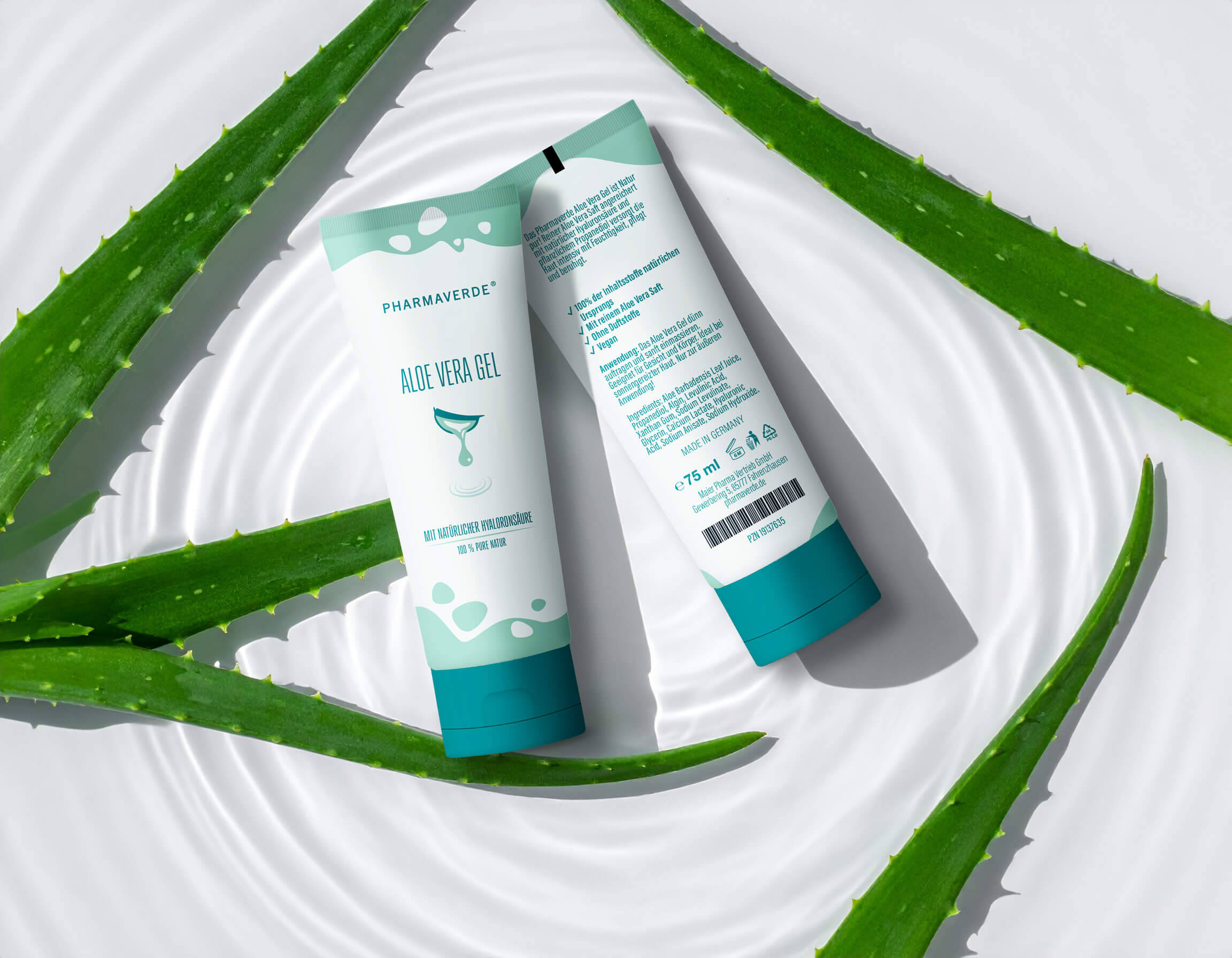
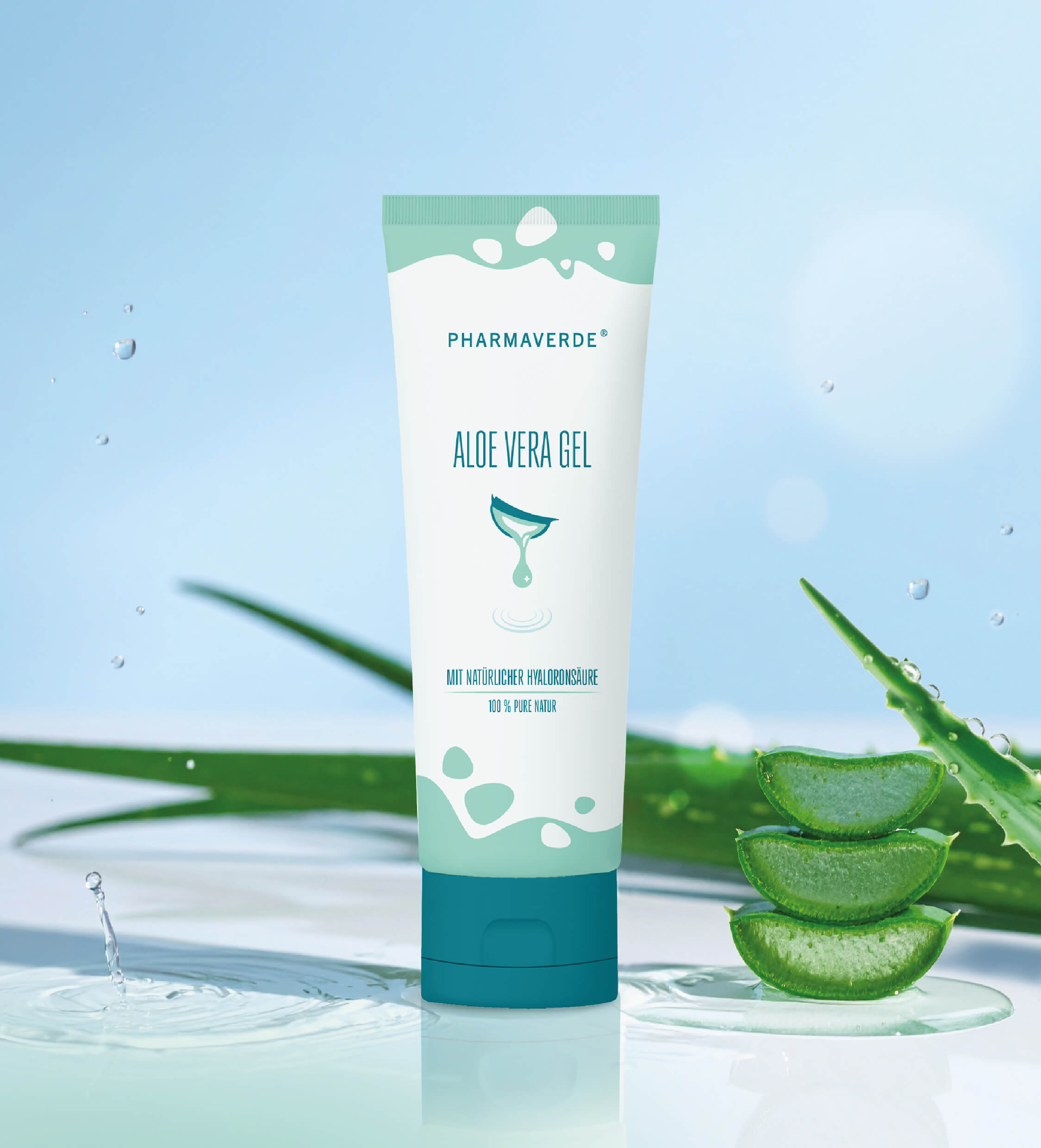
Modern Hydration – A minimalist, contemporary design concept focusing on freshness and deep hydration. The reduced illustration of an Aloe vera plant, combined with soft graphic circles, visualizes the gel’s texture and its moisturizing benefits.
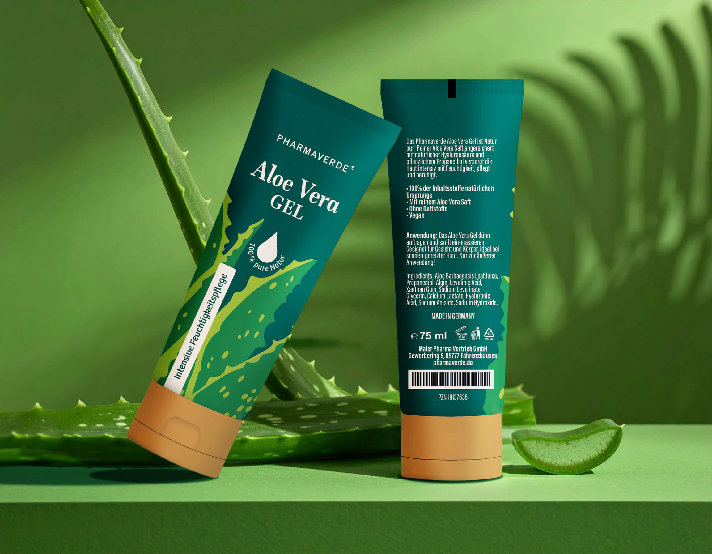
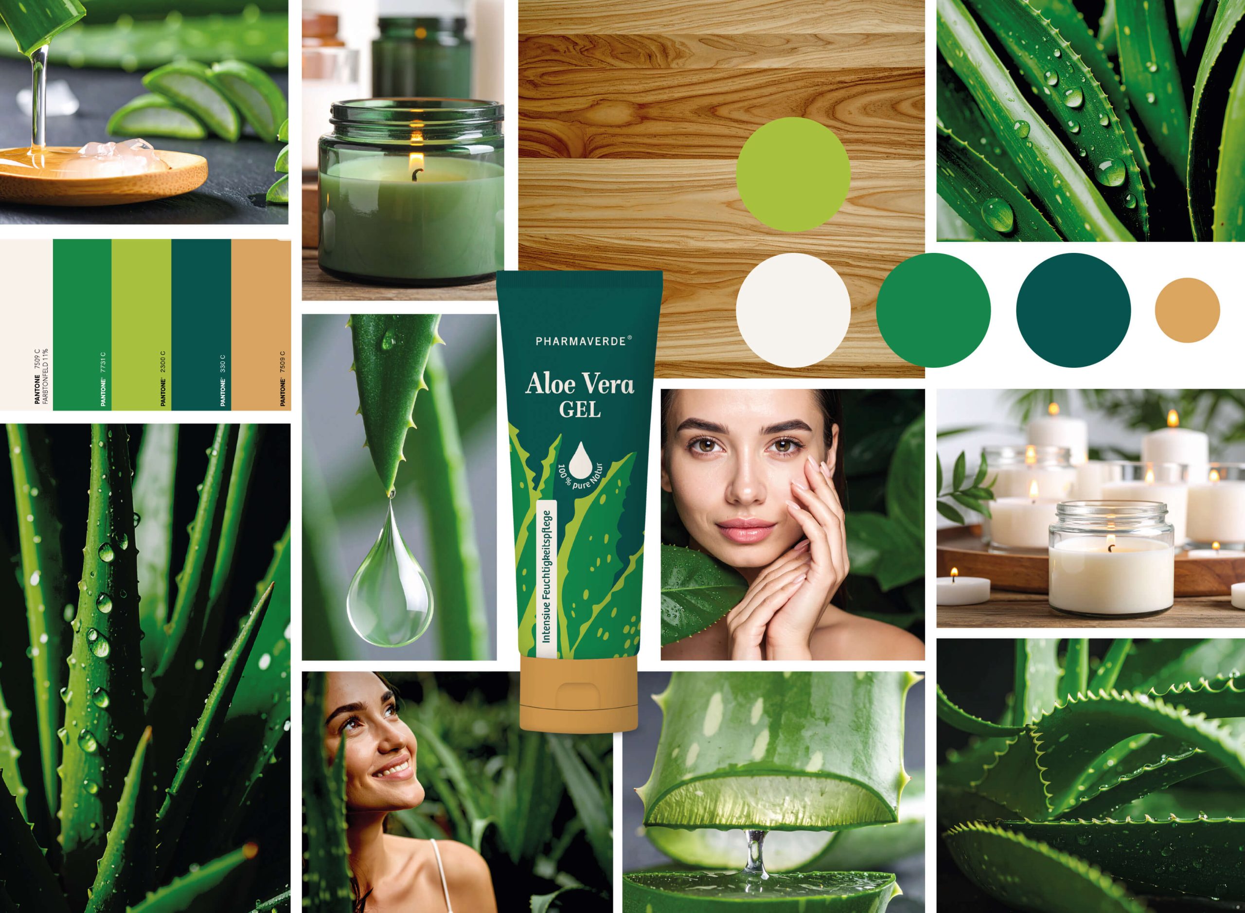
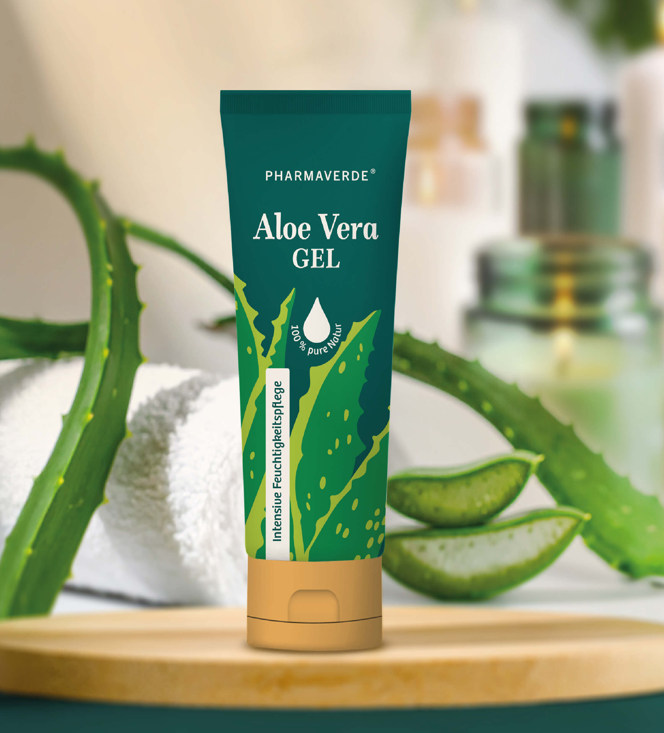
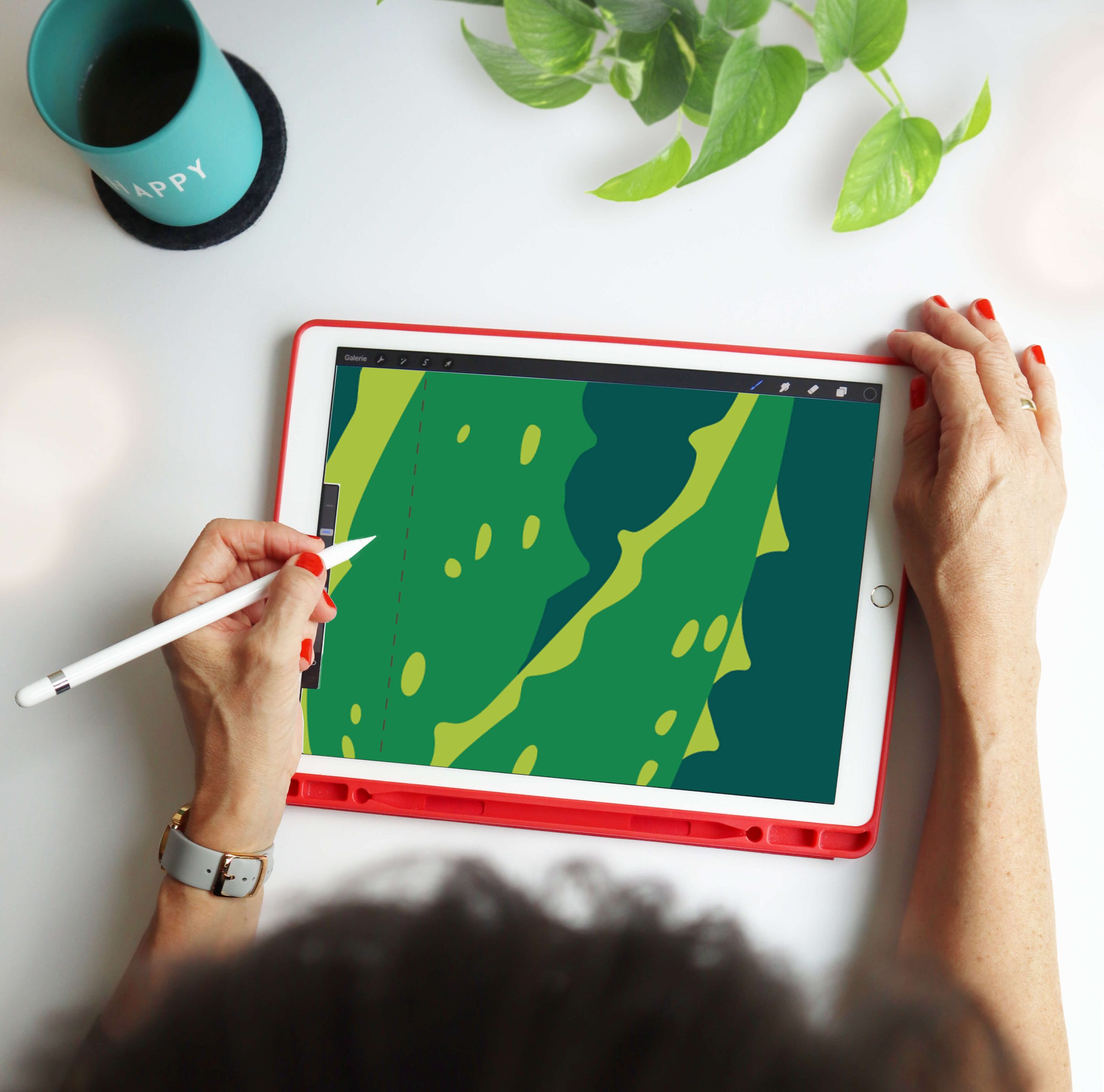
Botanical Power & Lifestyle – A vibrant, nature-inspired concept that highlights the botanical strength and organic purity of the formula. The bold, flat Aloe vera illustration and bamboo-colored cap create a warm, authentic, and lifestyle-oriented look.
Both design routes elevate the brand through a clear visual identity, expressive illustration, and a confident balance between pharmaceutical clarity and emotional storytelling.
Illustrative packaging design strengthens brands, evokes emotions, and makes products visually distinctive. Because successful packaging design combines strategy, brand, and aesthetics — at first glance, and ideally, for lasting impact.
Good design catches the eye, convinces the mind, and connects emotionally — even at first sight.

 Biaa
Biaa Petitmoulin Studio
 White Bear Studio
 Eva Chistyakova
 monther al omari
 Atipus
 alchimistestudioParis
 oneandother
 bloomburo
 helocrene
 Shapers Studio
 Denver Design
 Aidearte
 andrew.huerta
 softmachine
 airobtq
 Buzz & Co.
 Ruby
Ruby themythographer
 IDNB Inc.
 viktorflr
 Zenpack
 Wessam Hussien