
Illustrative Premium Packaging for an Innovative Licorice & Fruit Duo
Packaging design for Jahnke’s innovative new product Licorice & Fruit, commissioned by Cavendish & Harvey.
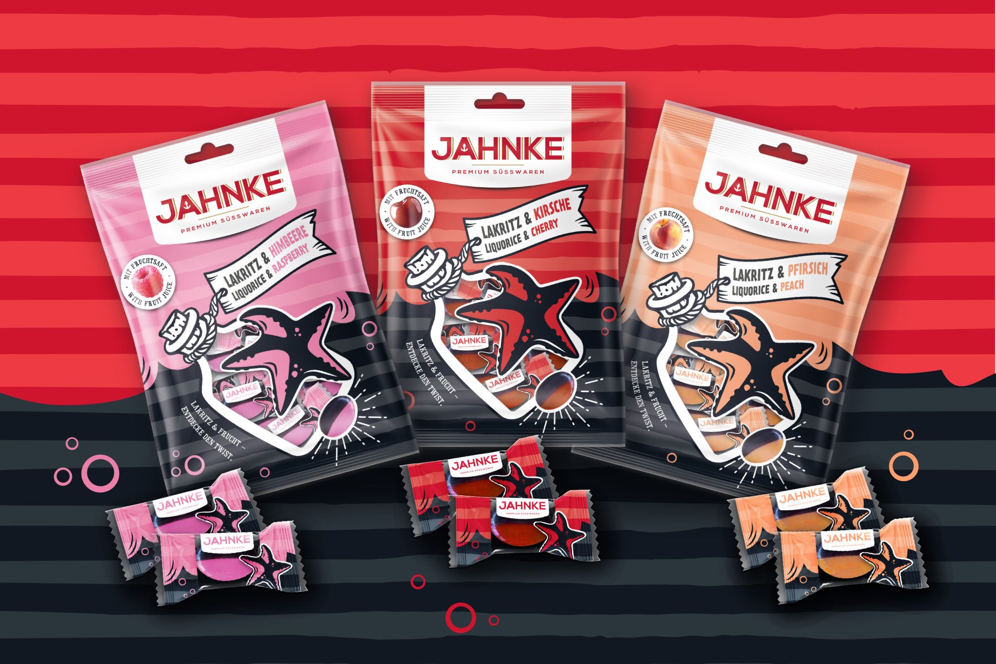
On behalf of Cavendish & Harvey Confectionery GmbH, I developed an illustrative packaging design for Jahnke Süßwaren, covering both window bags and flowpacks for confectionery.
The task was to create a design concept for the innovative duo product that combines licorice and fruit—with a clear goal: strong shelf impact, clear flavor differentiation, and a distinctive visual expression of the duo concept.
The design concept reflects current consumer trends such as storytelling, authentic origin imagery, and reduced yet expressive illustrations, transforming them into a clear and impactful visual structure.
The design continues Jahnke’s Nordic brand positioning and communicates at first glance the confident flavor combination of licorice and fruit. Maritime elements such as a message in a bottle and a starfish in a comic style add an emotional touch and evoke associations of adventure and craftsmanship.
Bold color blocks, strong contrasts, and distinctive typography ensure maximum shelf visibility. The design combines modern aesthetics with a premium feel and appeals to a style-conscious audience.
The new range includes three flavors—Licorice & Raspberry, Licorice & Cherry, and Licorice & Peach—each clearly differentiated by its own characteristic color.
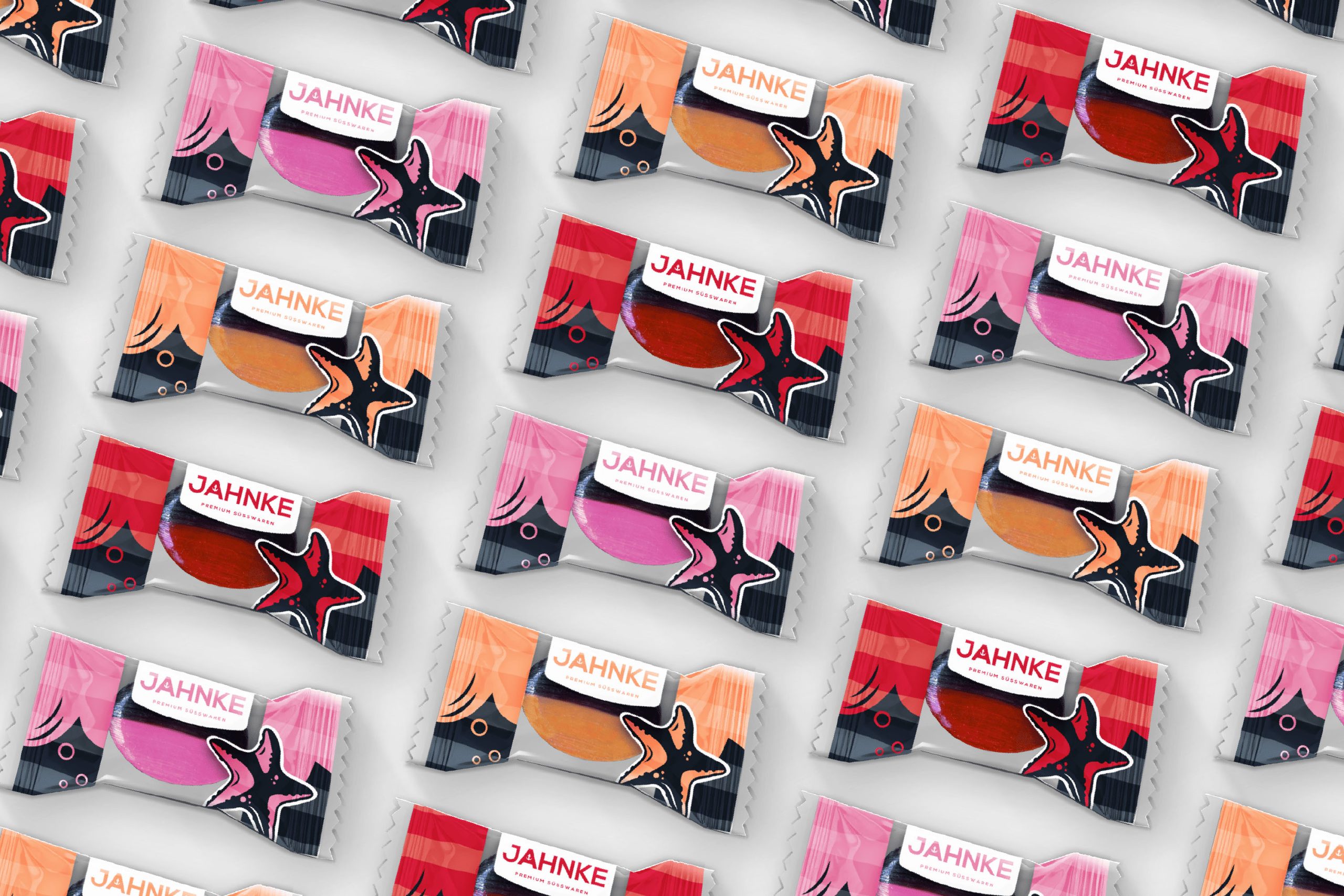
The product is an innovative hard candy made of equal parts licorice and fruit. Each candy is individually sealed in a flowpack whose design visually harmonizes with the bag. The center of the packaging is transparent, allowing a direct view of the product.
The layout for both the bag and the flowpack was created using selected Pantone spot colors to define the flavor nuances. The stripe effect was achieved using 82% tints of the 100% spot colors, giving the packaging surface depth and structure.
To highlight the fruit juice content in an eye-catching and appetizing way, I developed photorealistic fruit illustrations and designed a circular callout symbol for the front of the packaging.
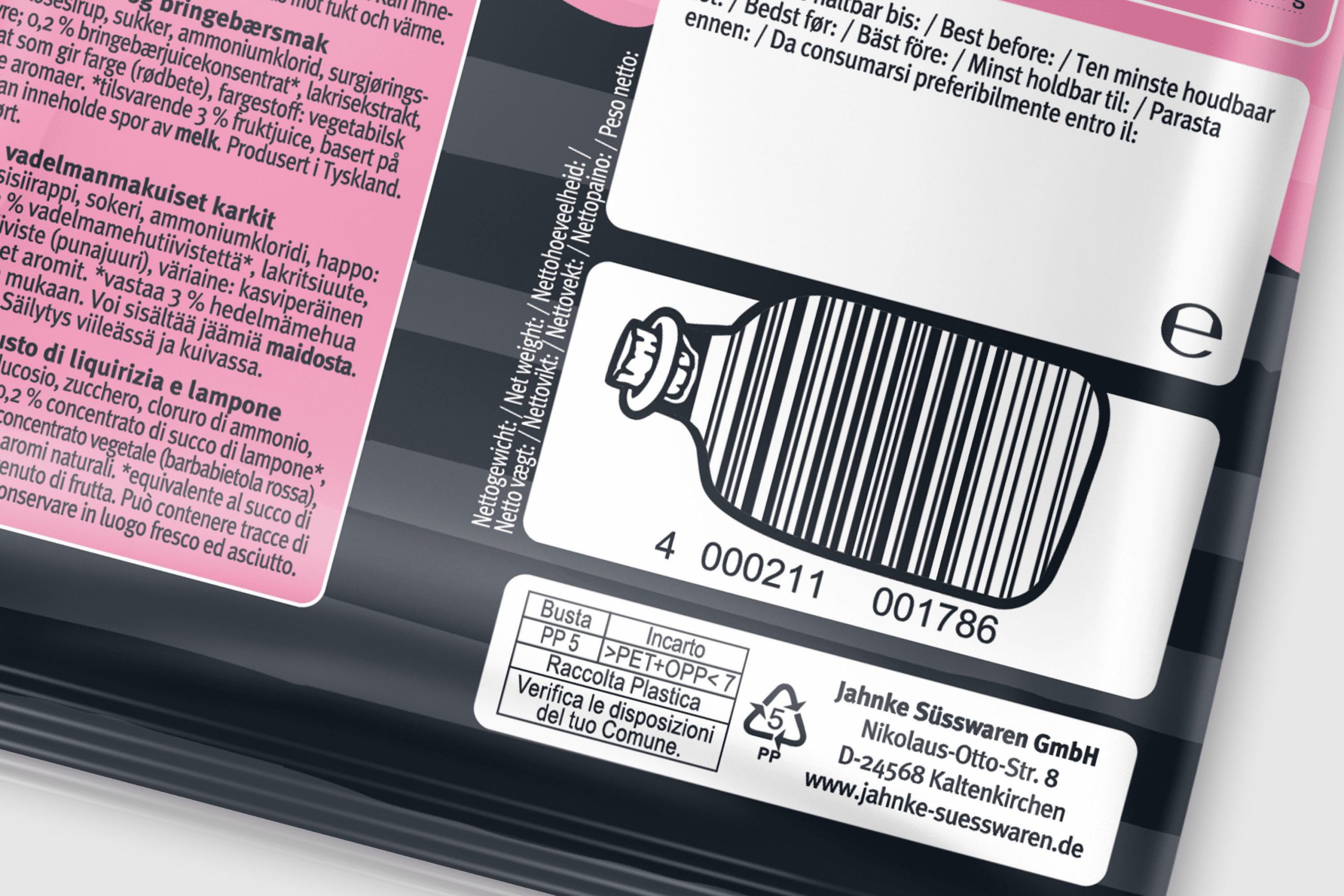
The EAN code on the back continues the maritime design theme from the front and is depicted as a message in a bottle, adding a playful and distinctive touch.
As an experienced illustrator specializing in packaging and brand design, I led the entire creative process—from concept development and defining the visual direction to final layout preparation for lithographic printing.
The design process focused on four key aspects:
Brand Alignment:
Building on Jahnke’s existing maritime comic style, I integrated the brand’s characteristic stripe look and reinterpreted it within a new narrative context.
Illustrative Branding:
Development of a distinctive, comic-like visual language with custom illustrations that clearly express the product’s unique duo character.
Duo-Look Packaging:
The combination of a transparent window, a staged starfish as a central element, and photorealistic candy depictions creates strong visual impact.
Consistent Design System:
Ensuring recognizability across the entire range through a cohesive design approach while maintaining clear flavor differentiation.
The design services included both primary packaging (flowpack) and secondary packaging (window bag), ensuring a consistent brand appearance across all formats.


 Derrick Lin
 Axiniya Knyazeva
 Hadi Samir
 Atiq Alam
 Furt Goods
 宏洛图品牌设计HONGLT
 Ampersand Creative
 Modern Theory
 Palashcc
 neo creative studio
 Anshuman
 Archi Jain
 DESIGN CONCEPTS
 Shapers Studio
 jamajkajakub
 tamara barakat