PACKAGING DESIGN // Badimo
The company Innovalis sells “mobile bidets” among other products in its online shop. Since 2008, this hygiene product has also been available in German pharmacies.
Until then, the packaging had been somewhat neglected, as pharmacy products are sold almost exclusively via the Pharmacy Central Number (PZN).
My task was to successfully position Badimo in the drugstore retail sector with a completely new packaging design.
TARGET GROUP AND DESIGN CONCEPT
Hygienically clean, practical, and environmentally friendly!
Using the Badimo with water helps reduce toilet paper consumption. This mobile bidet is designed for practical use during outdoor activities and travel. The product targets individuals with sensitive skin, those seeking enhanced hygiene during menstruation, and people with incontinence.
However, the primary target group for Badimo consists of individuals with physical or medical conditions—such as postnatal care, hemorrhoids, or post-surgical recovery—who require gentle cleansing of intimate areas.
The packaging design needed to reflect this medical positioning, as the product has been available in pharmacies for many years. Unlike lifestyle-oriented competitors, Badimo’s branding focuses on a clear, unambiguous medical quality promise, reinforced by professional recommendations from midwives and proctologists.
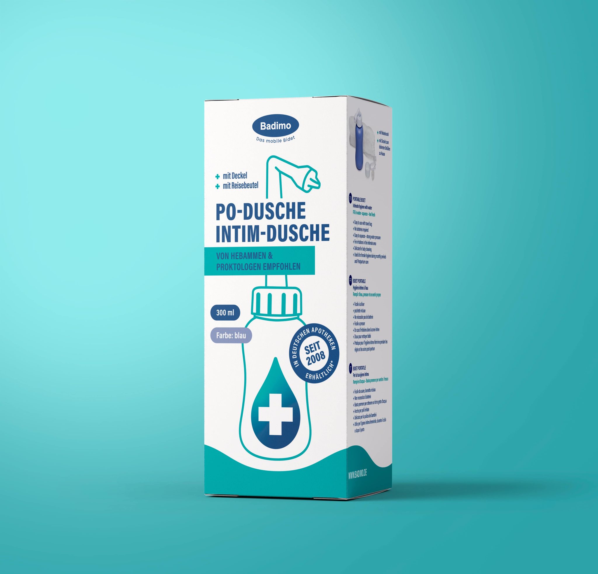
The product’s USP is visually highlighted on the front of Packaging:
A quality promise with a medical claim prominently displayed in a circular badge: “Available in German pharmacies since 2008*” (with an asterisk referencing the PZN at the bottom of the pack).
A professional recommendation from midwives and proctologists, emphasized through a large, rectangular disruptor.
As an additional purchasing incentive, the packaging also highlights that the product includes a lid and travel bag, reinforcing its unique selling point.
I developed a design concept featuring a key visual, defined design elements, a color scheme, and an icon set illustrating various usage scenarios.
A strong visual identity for the product image on the packaging front was also essential. The key visual—placed prominently on the front—consists of a schematic, medically inspired illustration of the product combined with a water droplet in a two-tone gradient. A striking medical cross in the center further reinforces the “medical” positioning and emphasizes its pharmacy and healthcare origins.
The illustration style aligns with the application icons, creating a cohesive design language while ensuring differentiation from competitors’ product illustrations. The overall look aims to be conservative, informative, yet naturally appealing.
To achieve this, I developed a clear, reduced, and structured design with a distinctly medical aesthetic.
The two-tone color scheme, the gradient in the water droplet, and the continuous wave design contribute to a modern, striking, and appealing look.
For improved readability, the specific model features (type designation, capacity) are highlighted using a rounded, attention-grabbing design.
As an additional visual explanation, the left side of the packaging features another product illustration—this time shown “in use,” tilted upside-down with water splashing out.
As part of the packaging redesign for Badimo, I was also responsible for designing and visually developing an icon set representing the product’s various applications.
My goal was to create an independent, distinctive visual language:
medical in appearance yet approachable and friendly.
I defined a two-tone color scheme using a combination of blue and turquoise—a balance of professionalism and warmth that adds vibrancy to the design.Rounded corners are incorporated into the icon design to make the visuals feel more inviting and organic.
My task was to develop a comprehensive packaging branding.
The design includes:
- Creation of the Badimo branding concept for positioning in the drugstore retail sector
- Development of a design language tailored to the target group
- Definition of the visual identity, including color scheme, typography, and design elements
- Illustration of the product
- Layout design for six packaging sides and creating the final artwork
- Creation of an icon set for product applications
- Conceptualization and realization of a key visual
- Development of a brand board
packaging design, branding design, illustration 2024
brand: Badimo
client: Innovalis
All work © Stefanie Twellmann


