The brand builds on the theme of bathing as an experience within the home wellness category. Its product is the bath bomb, its target group is women between the ages of 25-40, its price range is mid-upper/upper. The logotype is made from the serif font Georgia with modifications that refer to the theme and personality of the brand.
The brand colors are energetic, confident and feminine, just like the personas themselves. The clearly transparent hierarchy of the letterhead and business card and the fluidity of the illustration also strengthen these qualities.
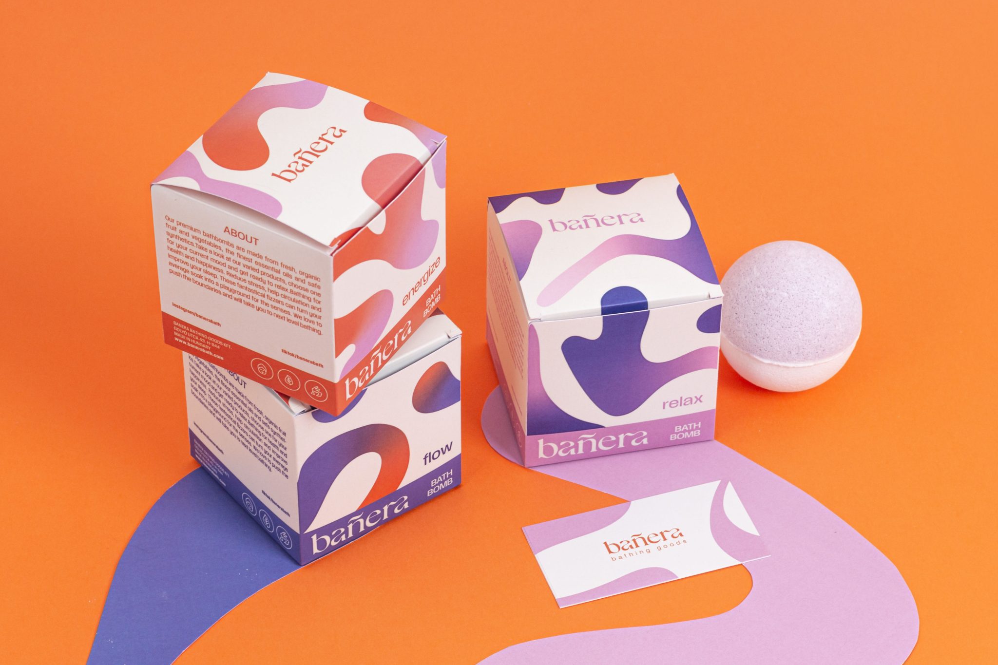
The main aspects of packaging design are the protection of the product, the practicality of packaging storage and transportation, and the representation of the product’s price category. The construction of the box itself is a classic square snap closure, the exact dimensions of the box were determined by the printing parameters and the size of the product. Inside the box, there is an insert into which the spherical bath bomb fits, so it can be transported safely and when opened, its position is ideal for easy removal
Packaging made for three different scented bath bombs, I differentiated them using the brand illustration. Mandatory information and instructions for use were also added to the packaging using the brand’s secondary typography. I typically worked with out-of-line twists, so they support the elegant and clean side of the brand, while the swirling illustration refers to the user experience.


