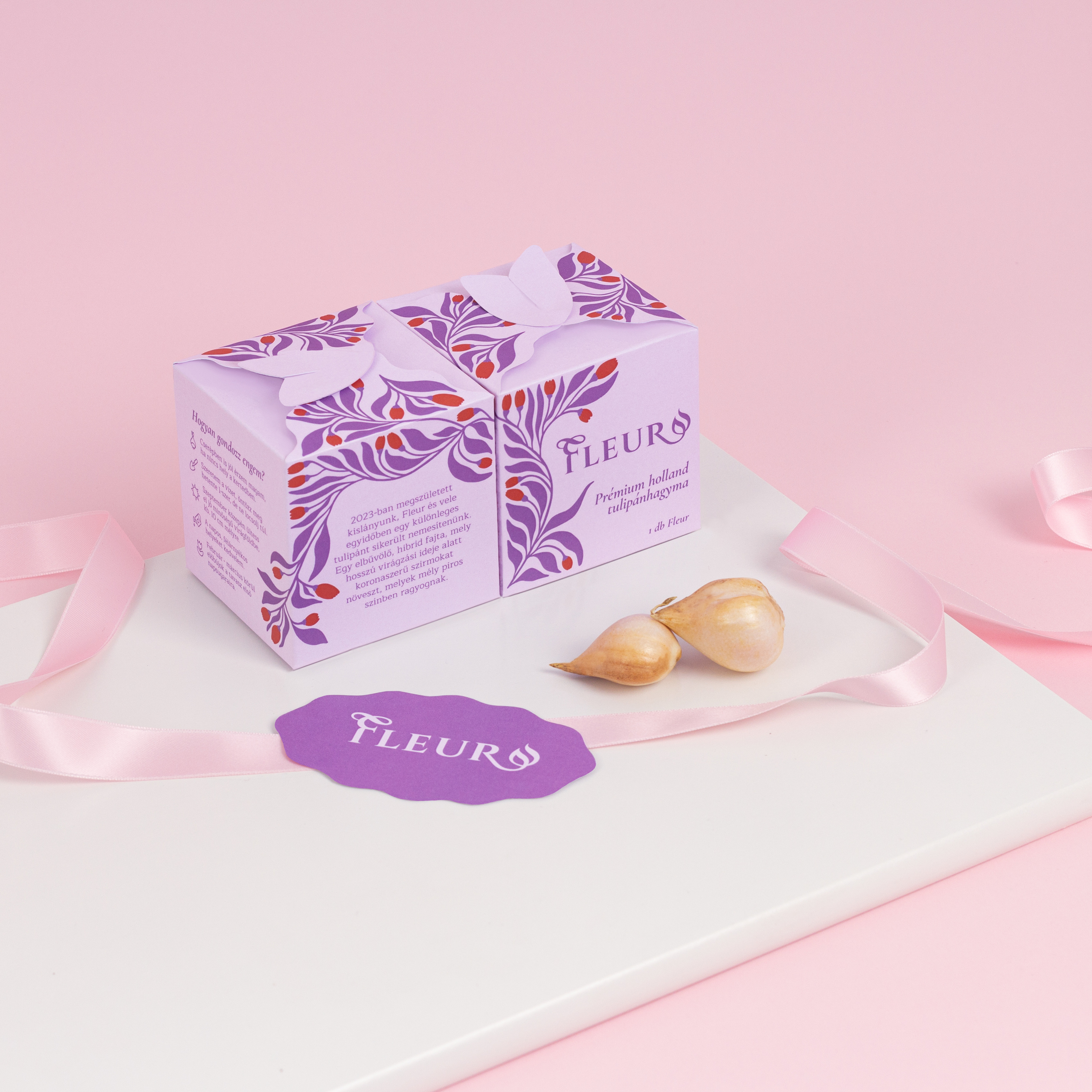
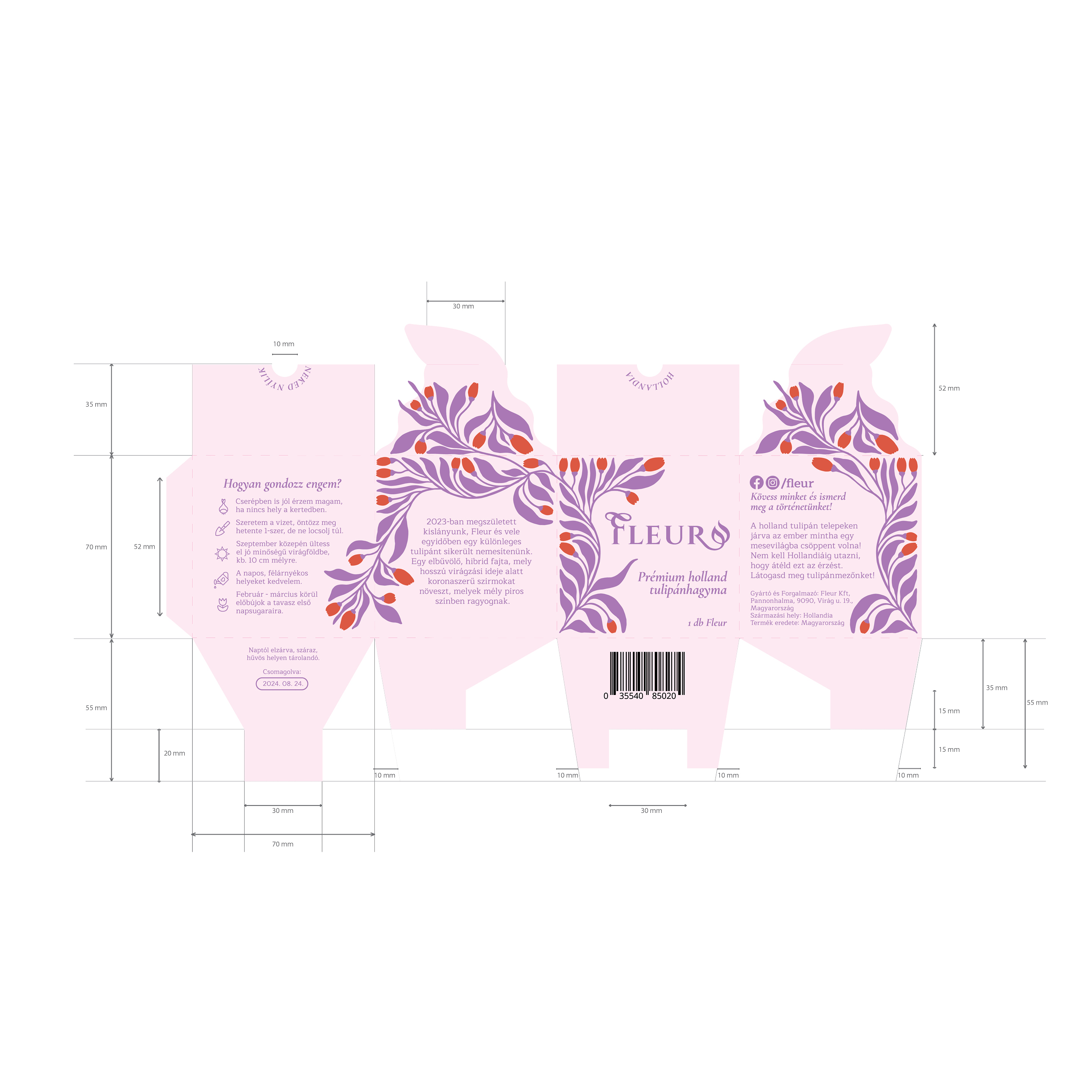
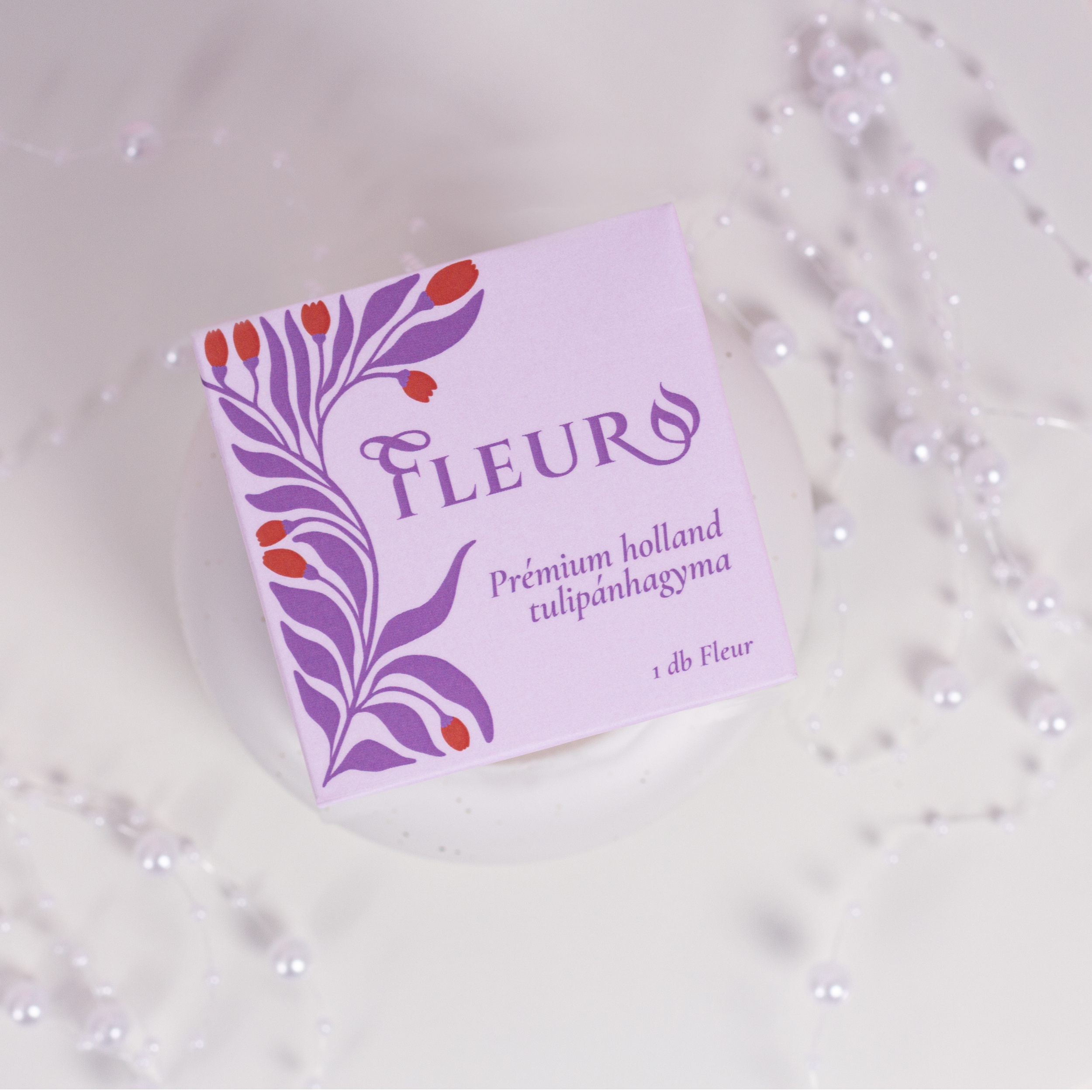
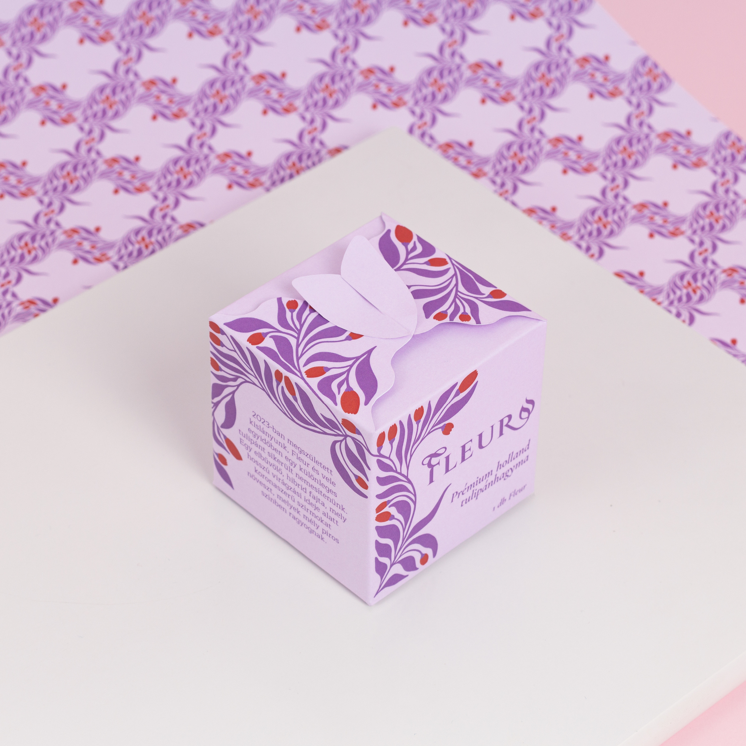
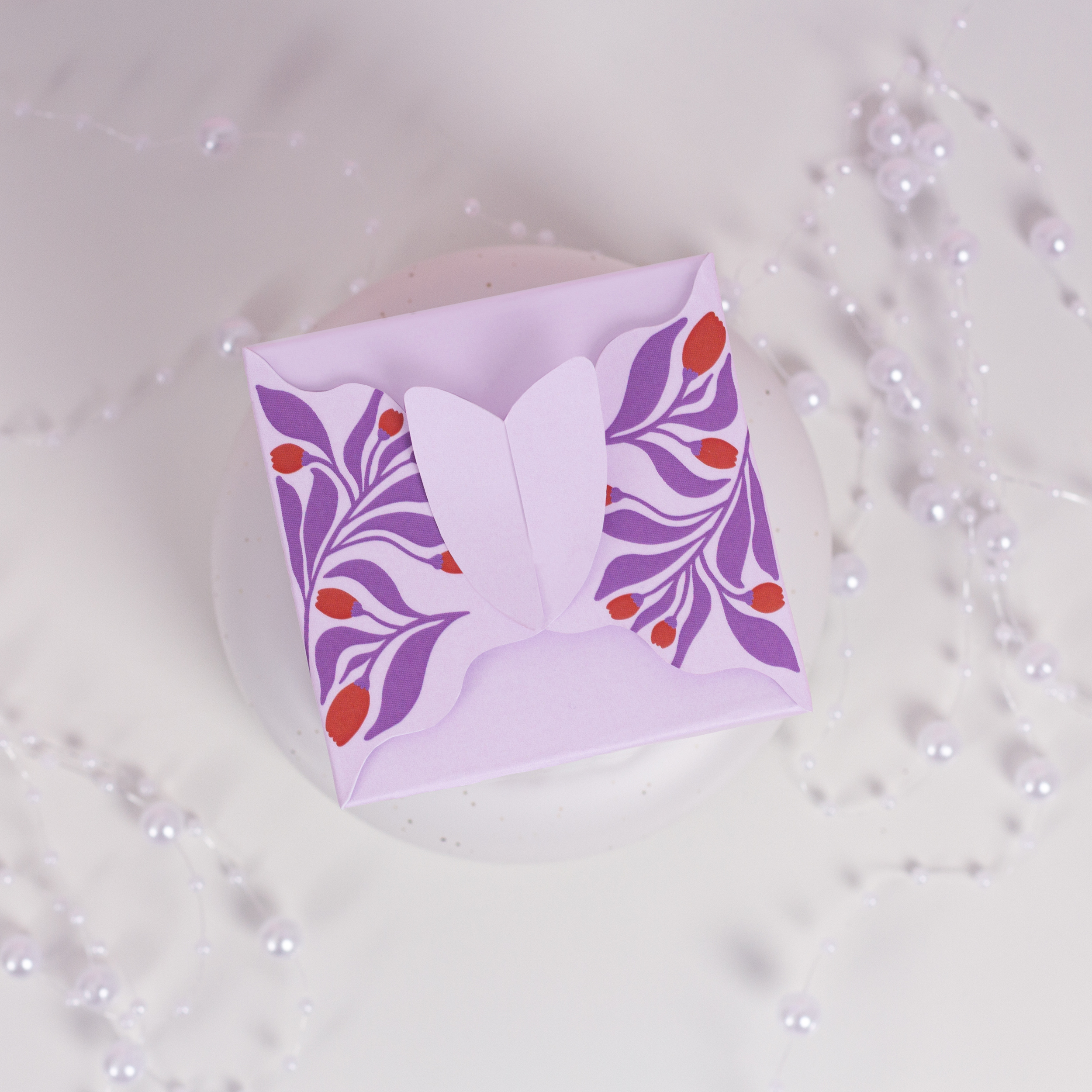
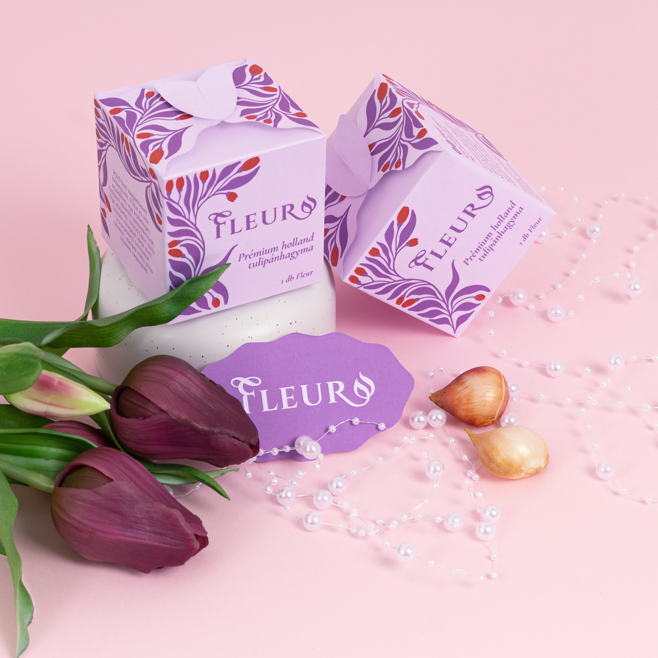
When designing the concept of the packaging, it was important that the form and lines of the Fleur be reflected and that it stand out from the packaging of competitors, showcasing the quality of the tulips. Special emphasis was placed on making the unboxing experience enjoyable, with the top of the box closing in a shape that forms a tulip. Upon unfolding these, the brand’s slogan appears: “Netherlands blooms for you!” All the necessary information is included on the packaging, but I strived to keep it uncluttered and clean. To this end, I used pictograms to help illustrate the care instructions for the tulips. Additionally, I incorporated an illustration that runs across the entire box.