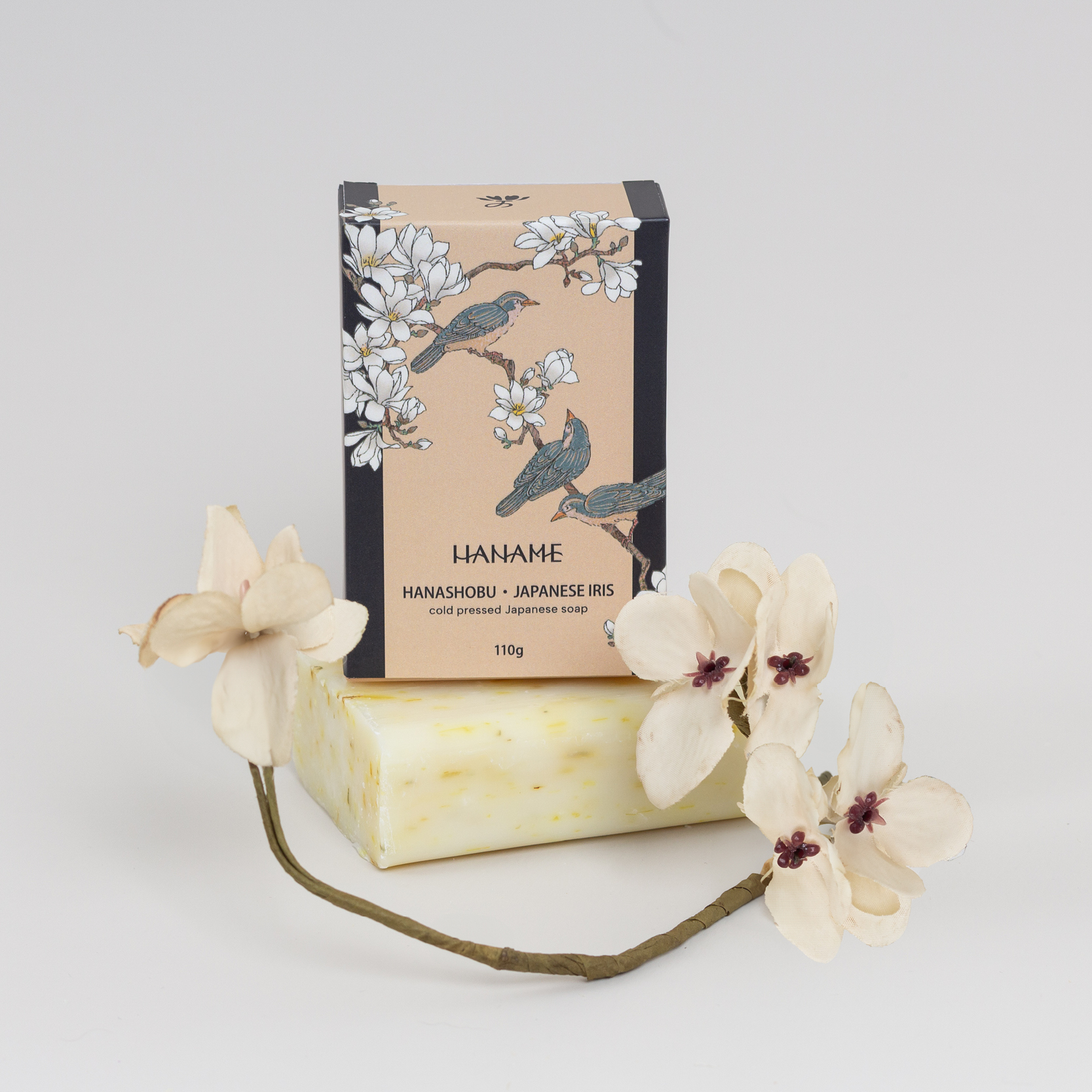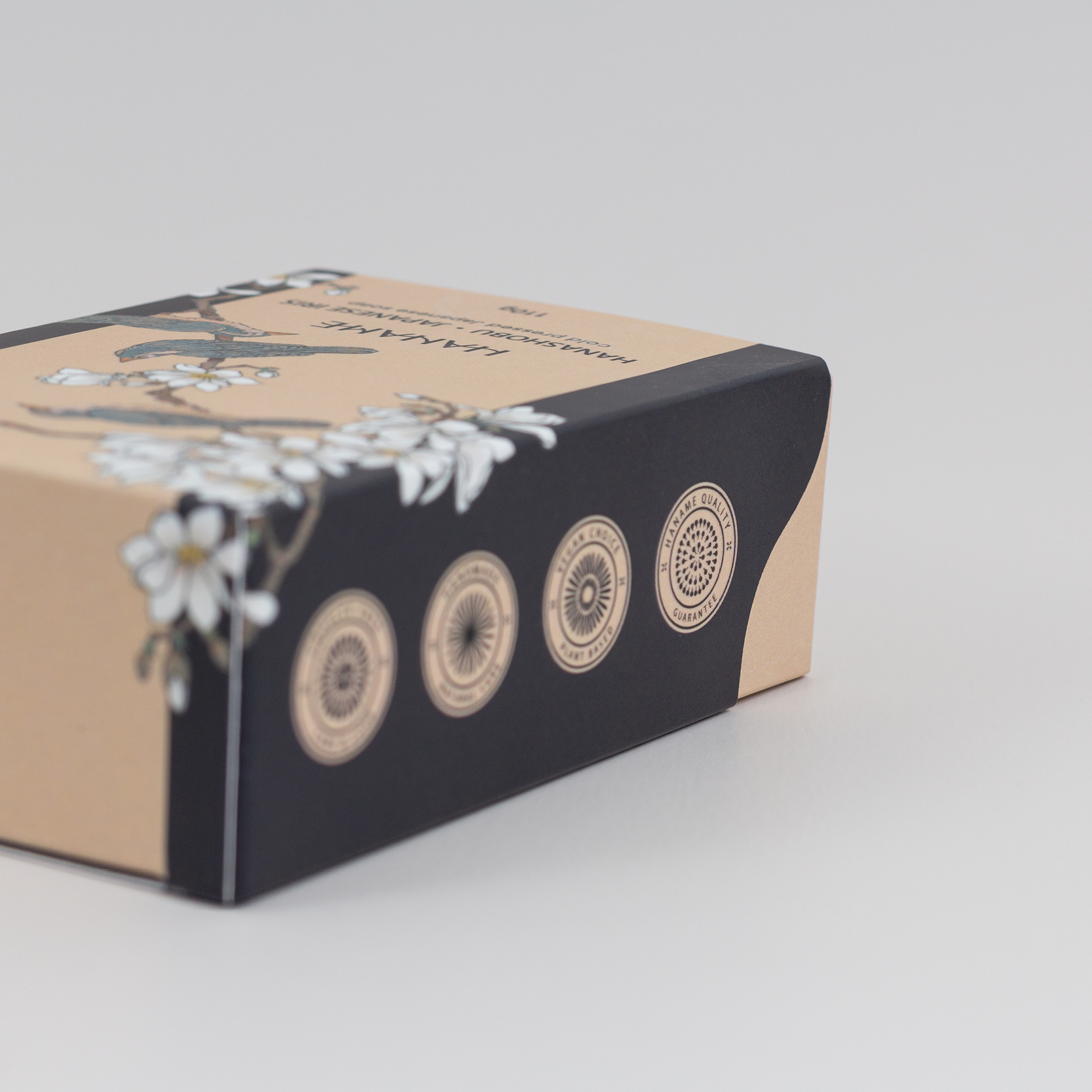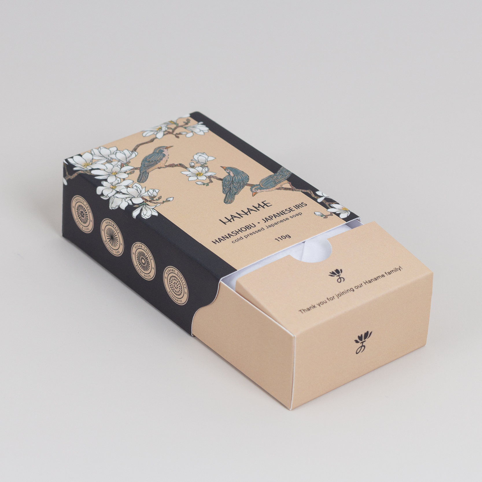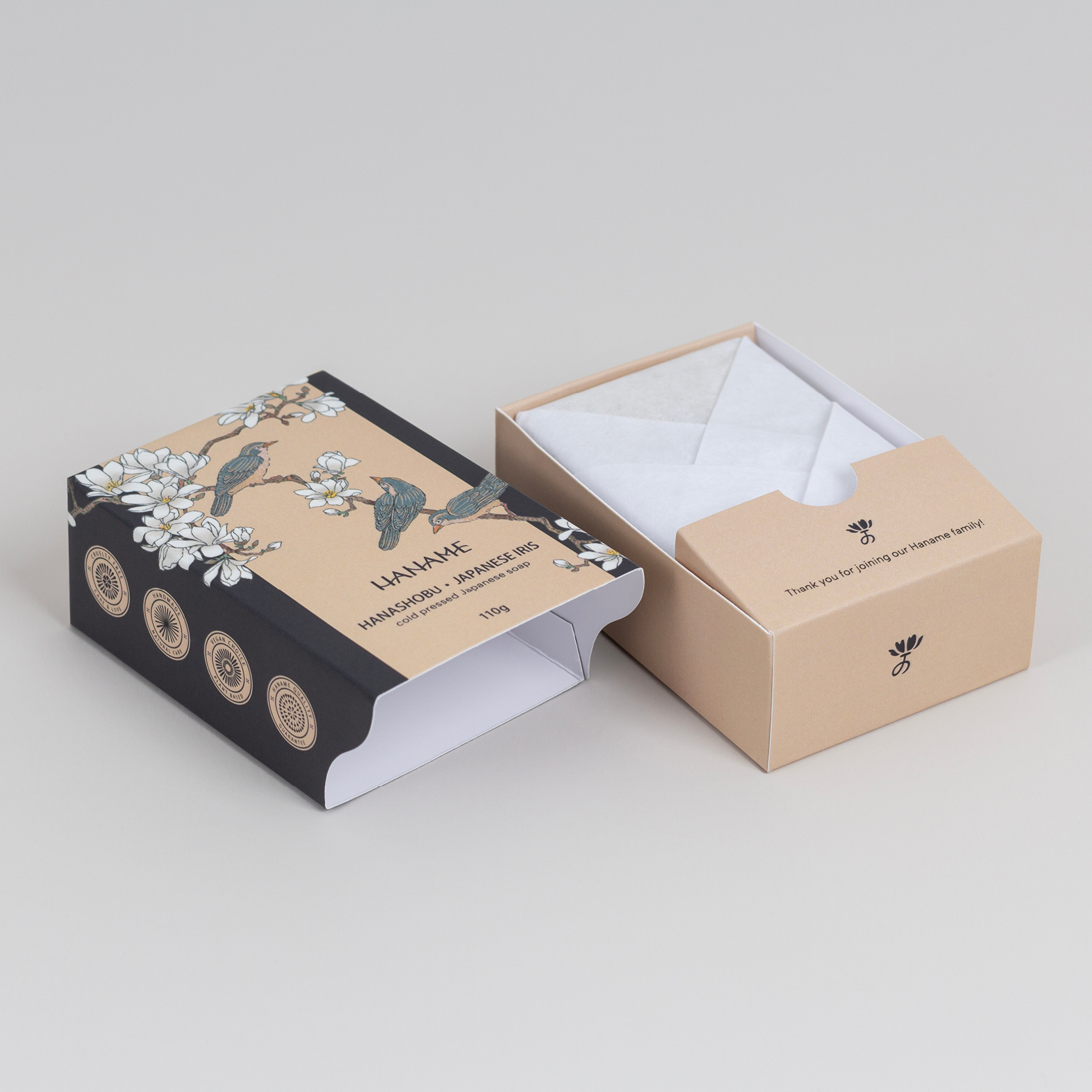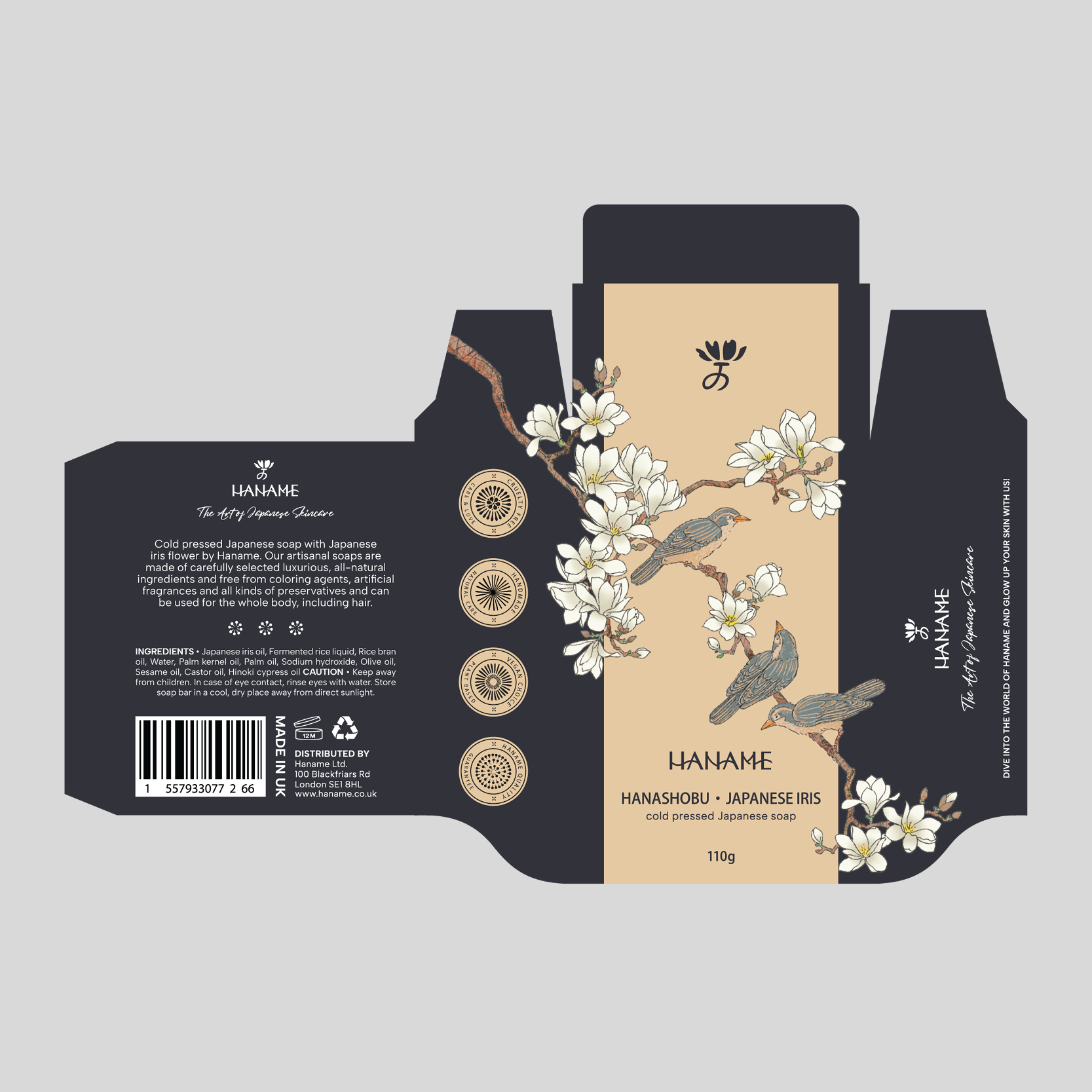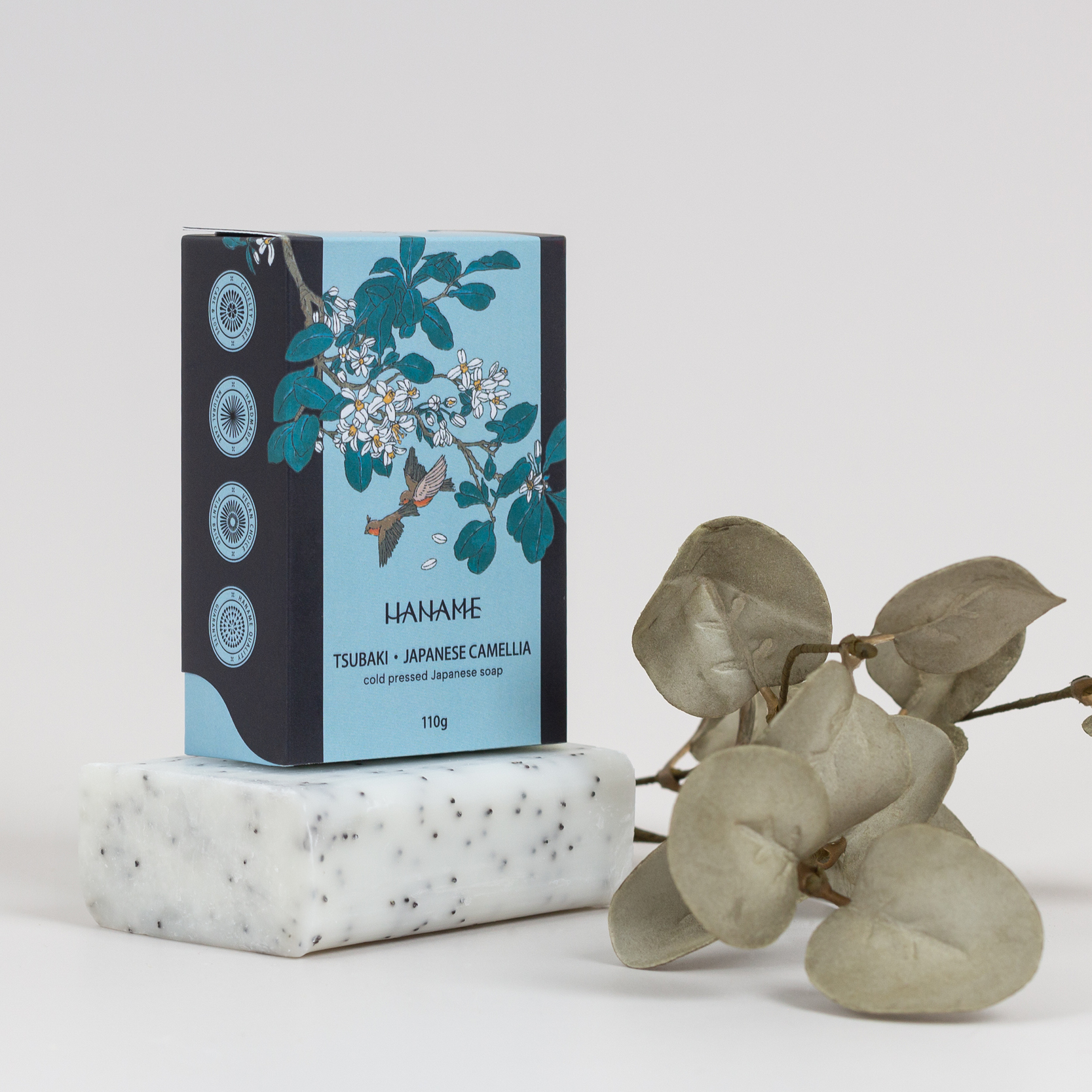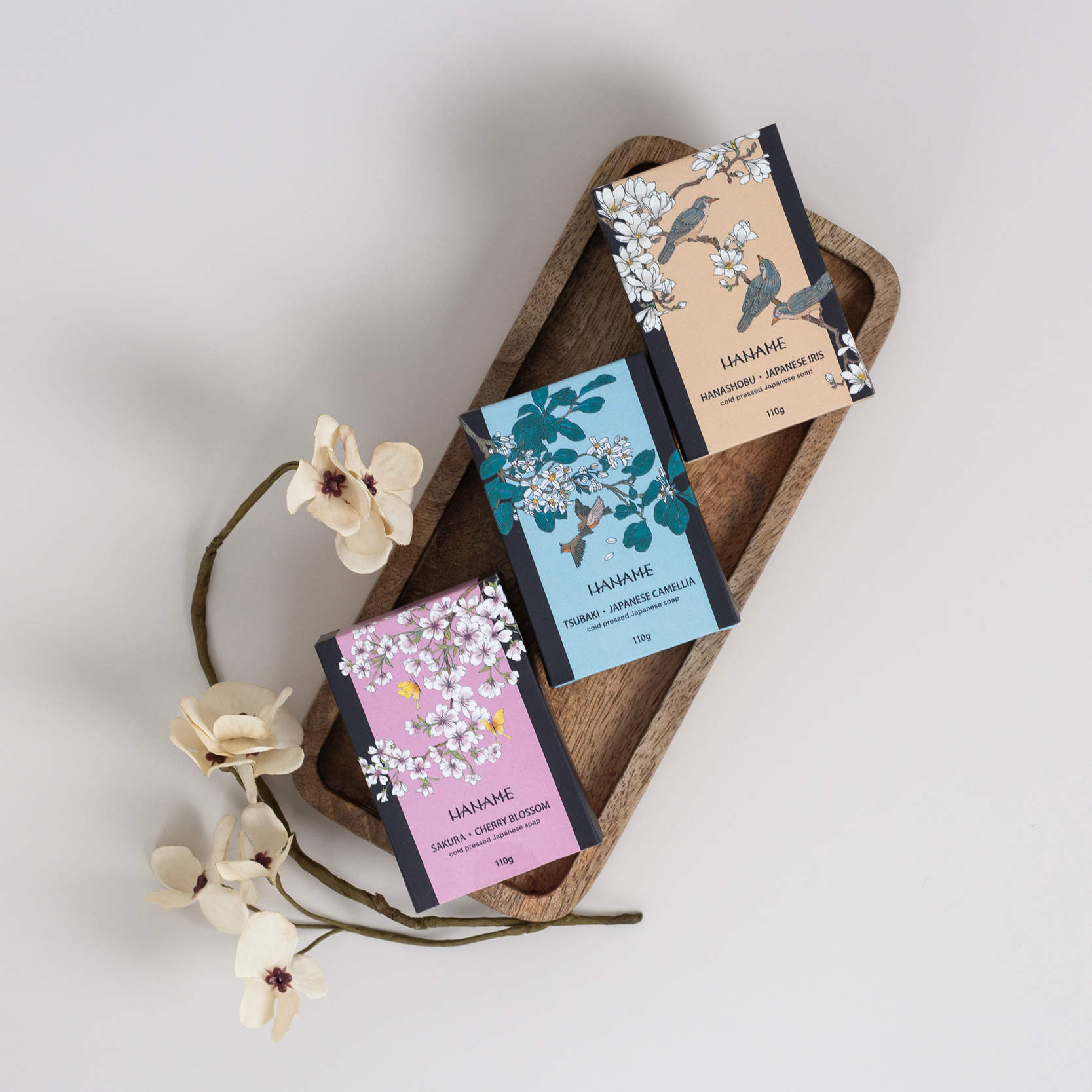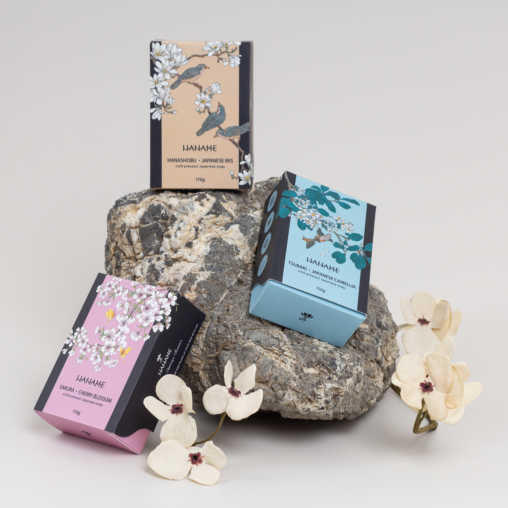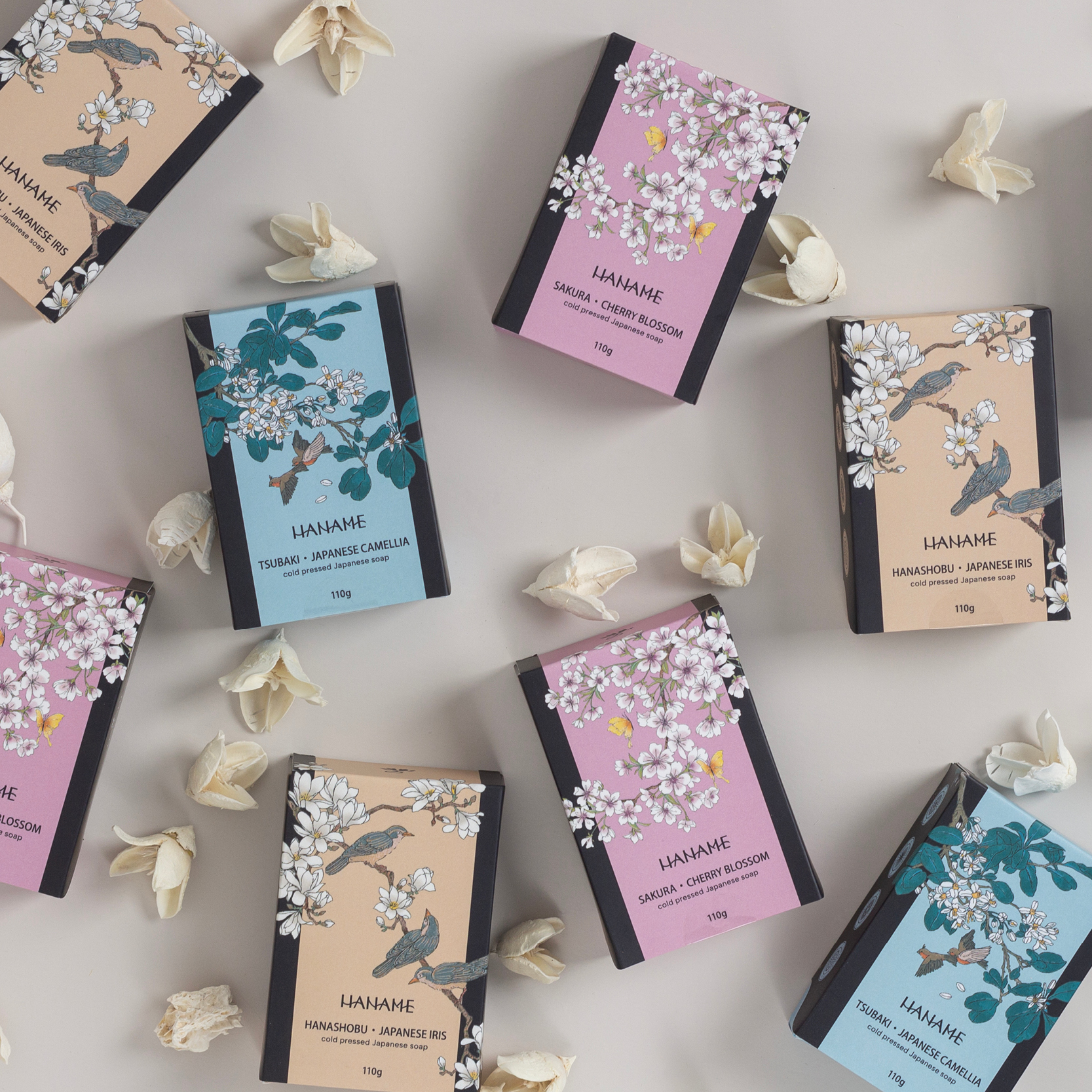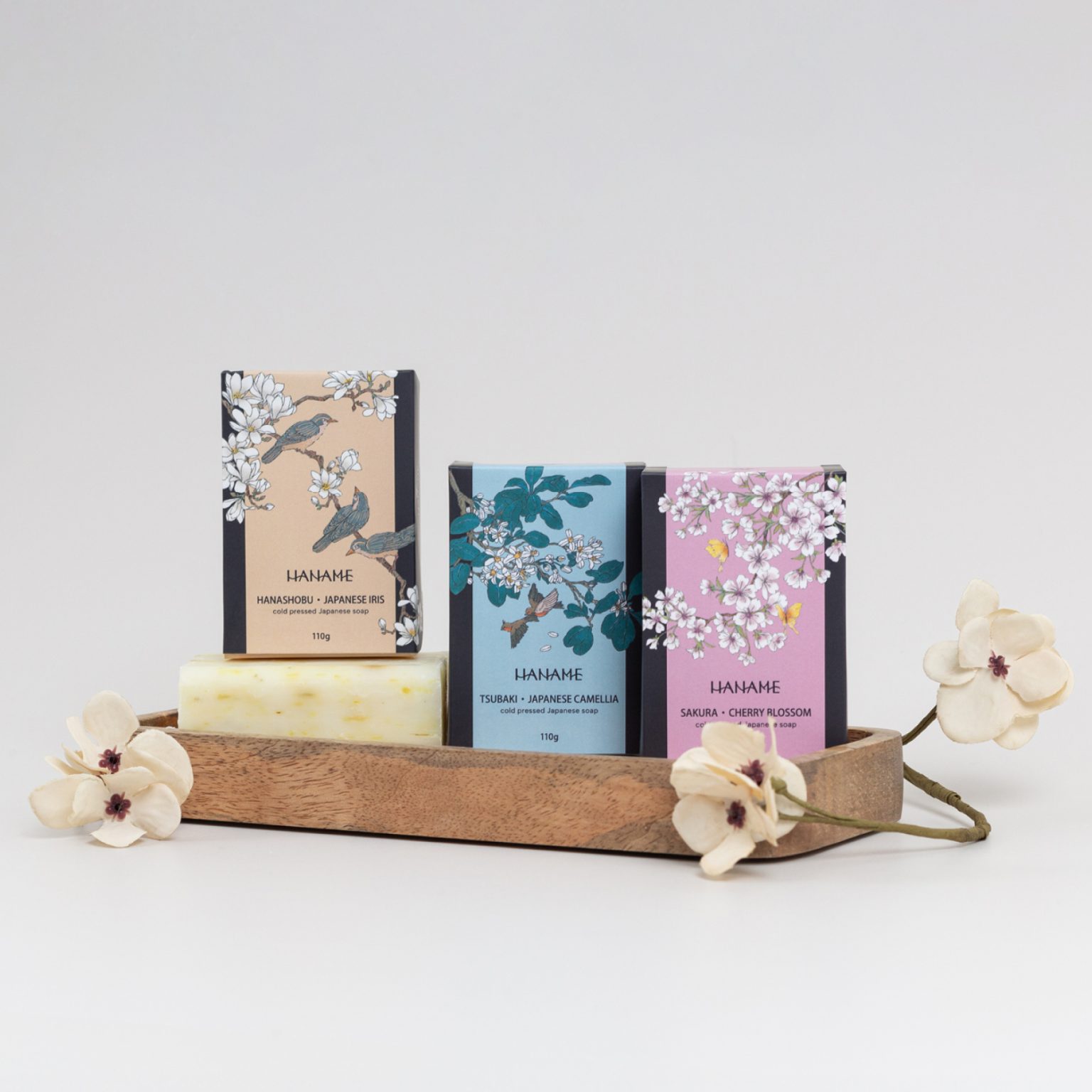
In the initial design phase, my primary goals were to enhance the unboxing experience and reinforce the core values of the Haname brand. The reimagined matchbox construction with its charming opening style proved to be an ideal choice. Drawing inspiration from Japanese painting, I integrated thematic illustrations of flowers, birds, and butterflies into the design, each complemented by its own signature colour. Considering the diversity of the soaps and their ingredients, I employed both primary and secondary colours, which also accommodates future expansions of the product line.